The same plot in 14 other libraries — Python: Altair, Bokeh, lets-plot, Matplotlib, Plotly, plotnine, Pygal, Seaborn; Julia: Makie.jl; JavaScript: Chart.js, D3.js, Apache ECharts, Highcharts, MUI X Charts. Compare all 15 side by side: Annotated Heatmap in Python, R, Julia and JavaScript.
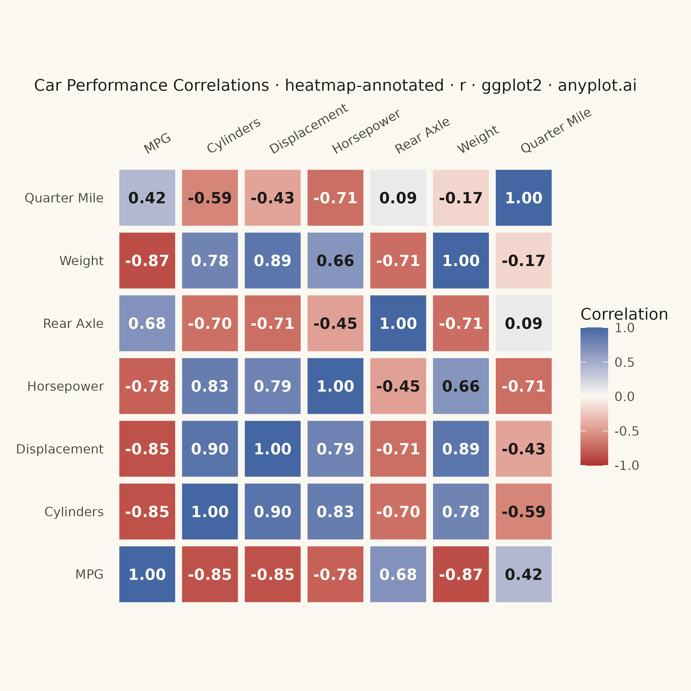
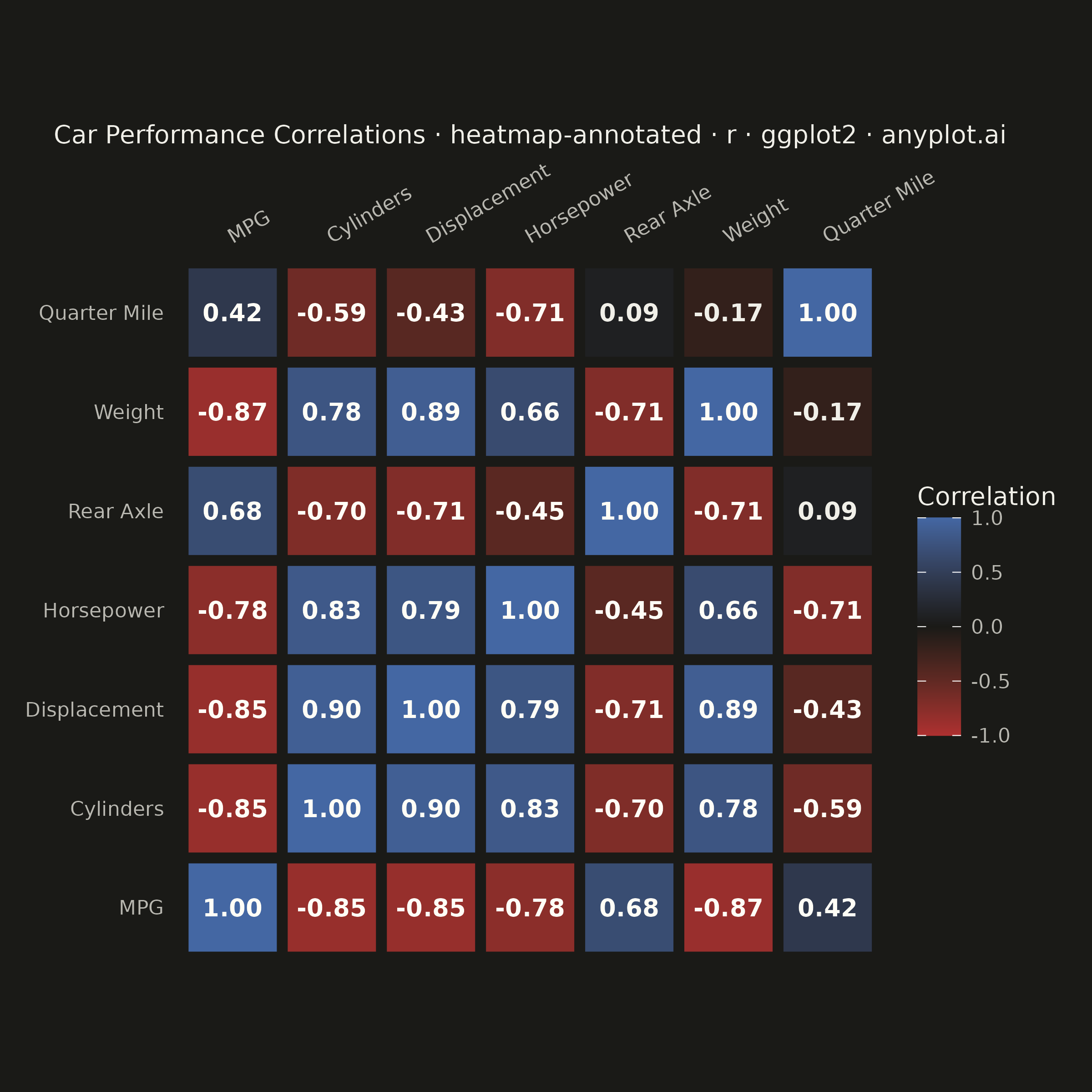
A heatmap with numeric values displayed inside each cell, combining color intensity with exact value labels. Essential for correlation matrices, confusion matrices, and any matrix visualization where both pattern recognition and precise values matter. Text color automatically contrasts with background for readability.
#' anyplot.ai
#' heatmap-annotated: Annotated Heatmap
#' Library: ggplot2 3.5.1 | R 4.4.1
#' Quality: 88/100 | Created: 2026-08-05

library(ggplot2)
library(dplyr)
library(ragg)

set.seed(42)

# --- Theme tokens -------------------------------------------------------
THEME       <- Sys.getenv("ANYPLOT_THEME", "light")
PAGE_BG     <- if (THEME == "light") "#FAF8F1" else "#1A1A17"
INK         <- if (THEME == "light") "#1A1A17" else "#F0EFE8"
INK_SOFT    <- if (THEME == "light") "#4A4A44" else "#B8B7B0"
LIGHT_TEXT  <- "#FFFDF6"  # near-white overlay text for saturated red/blue cells
# Light theme's near-white midpoint keeps mid-magnitude cells pale, so white text
# needs a much higher |value| threshold there than on the dark theme's near-black midpoint.
TEXT_THRESHOLD <- if (THEME == "light") 0.68 else 0.3

# --- Data: correlation matrix of car performance metrics ----------------
metrics <- mtcars %>%
  rename(
    `MPG`      = mpg,
    `Cylinders` = cyl,
    `Displacement` = disp,
    `Horsepower`  = hp,
    `Rear Axle`   = drat,
    `Weight`      = wt,
    `Quarter Mile` = qsec
  )
corr_matrix <- cor(metrics[, c("MPG", "Cylinders", "Displacement", "Horsepower",
                                "Rear Axle", "Weight", "Quarter Mile")])

corr_df <- as.data.frame(as.table(corr_matrix)) %>%
  rename(x = Var1, y = Var2, value = Freq) %>%
  mutate(
    label      = sprintf("%.2f", value),
    text_color = ifelse(abs(value) > TEXT_THRESHOLD, LIGHT_TEXT, INK)
  )

# --- Plot -----------------------------------------------------------------
p <- ggplot(corr_df, aes(x = x, y = y, fill = value)) +
  geom_tile(color = PAGE_BG, linewidth = 2) +
  geom_text(aes(label = label, color = text_color), size = 3.4, fontface = "bold") +
  scale_fill_gradient2(
    low = "#AE3030", mid = PAGE_BG, high = "#4467A3",
    midpoint = 0, limits = c(-1, 1), name = "Correlation"
  ) +
  scale_color_identity() +
  coord_fixed() +
  scale_x_discrete(position = "top") +
  labs(
    title = "Car Performance Correlations · heatmap-annotated · r · ggplot2 · anyplot.ai",
    x = NULL, y = NULL
  ) +
  theme_minimal(base_size = 8) +
  theme(
    plot.background   = element_rect(fill = PAGE_BG, color = PAGE_BG),
    panel.background  = element_rect(fill = PAGE_BG, color = NA),
    panel.grid        = element_blank(),
    axis.text.x       = element_text(color = INK_SOFT, size = 8, angle = 30, hjust = 0),
    axis.text.y       = element_text(color = INK_SOFT, size = 8),
    axis.title        = element_text(color = INK, size = 10),
    plot.title        = element_text(color = INK, size = 10, hjust = 0.5),
    legend.background = element_rect(fill = PAGE_BG, color = NA),
    legend.text       = element_text(color = INK_SOFT, size = 8),
    legend.title      = element_text(color = INK, size = 10),
    legend.position   = "right",
    plot.margin       = margin(10, 10, 10, 10)
  )

# --- Save -------------------------------------------------------------------
ggsave(
  filename = sprintf("plot-%s.png", THEME),
  plot     = p,
  device   = ragg::agg_png,
  width    = 6,
  height   = 6,
  units    = "in",
  dpi      = 400
)
Runnable source as JSON, for any HTTP client: https://api.anyplot.ai/specs/heatmap-annotated/ggplot2/code. Any spec id and library id listed in llms-full.txt fit the same URL shape; every URL below is complete and callable.
{
  "spec_id": "heatmap-annotated",
  "language": "r",
  "library": "ggplot2",
  "page": "https://anyplot.ai/heatmap-annotated/r/ggplot2",
  "hub": "https://anyplot.ai/heatmap-annotated",
  "code_json": "https://api.anyplot.ai/specs/heatmap-annotated/ggplot2/code",
  "spec_json": "https://api.anyplot.ai/specs/heatmap-annotated",
  "render_light_png": "https://storage.googleapis.com/anyplot-images/plots/heatmap-annotated/r/ggplot2/plot-light.png",
  "render_dark_png": "https://storage.googleapis.com/anyplot-images/plots/heatmap-annotated/r/ggplot2/plot-dark.png",
  "quality_score": 88.0,
  "license": "MIT",
  "guide": "https://anyplot.ai/llms.txt"
}
Part of Annotated Heatmap on anyplot.ai.