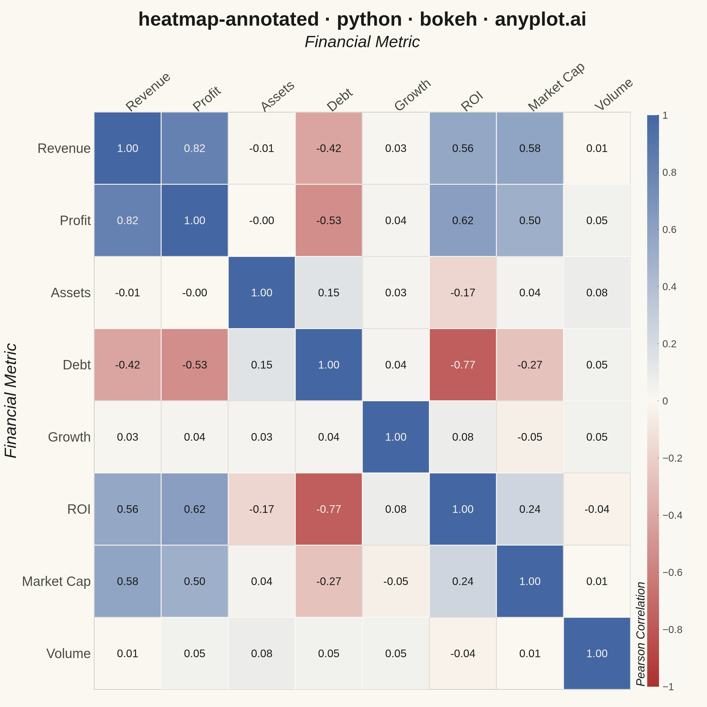
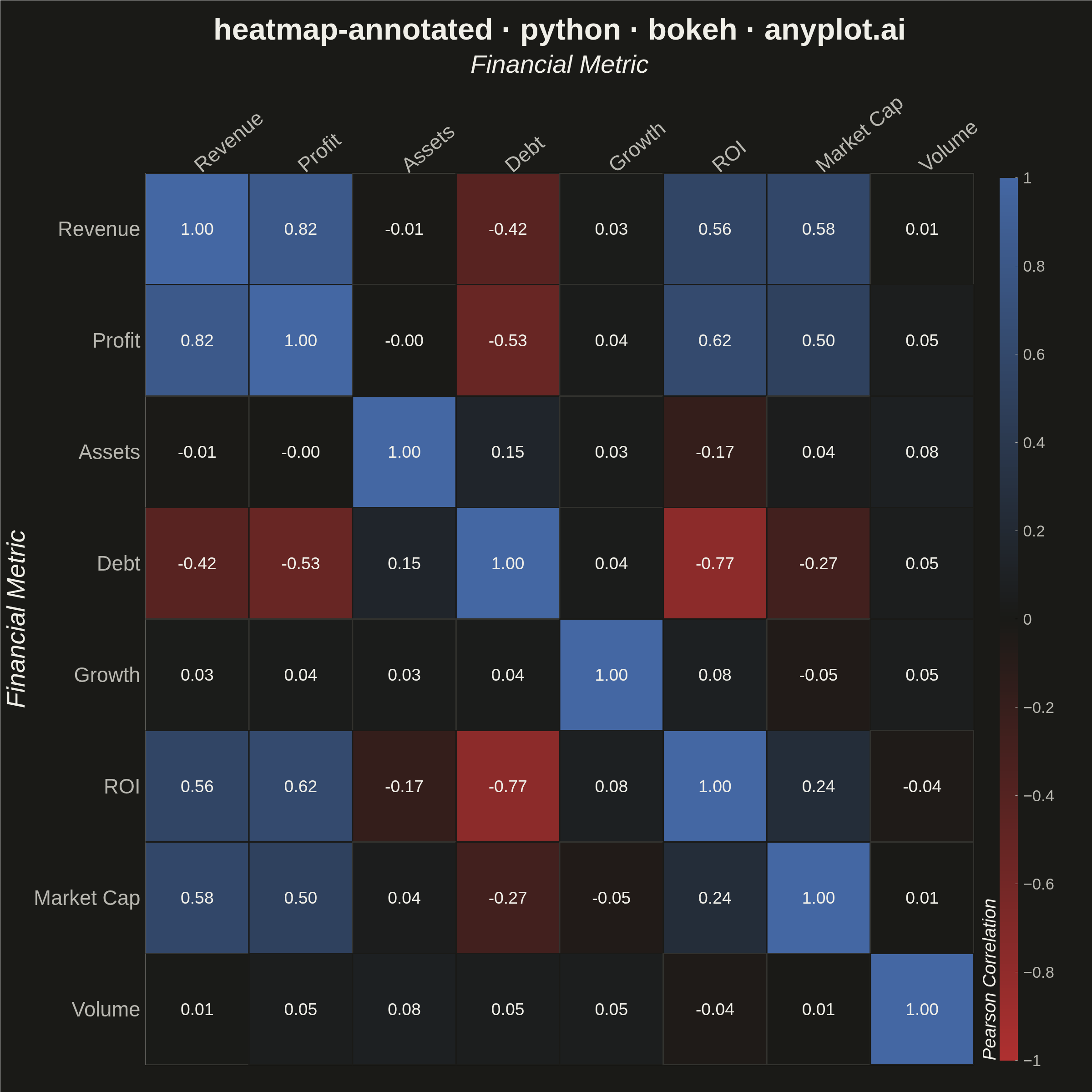
A heatmap with numeric values displayed inside each cell, combining color intensity with exact value labels. Essential for correlation matrices, confusion matrices, and any matrix visualization where both pattern recognition and precise values matter. Text color automatically contrasts with background for readability.
""" anyplot.ai
heatmap-annotated: Annotated Heatmap
Library: bokeh 3.9.2 | Python 3.13.14
Quality: 90/100 | Updated: 2026-08-05
"""

import os
import sys
import time
from pathlib import Path

import numpy as np


# Remove script's own directory from sys.path so 'bokeh' resolves to the installed package
_this_dir = os.path.dirname(os.path.abspath(__file__))
if _this_dir in sys.path:
    sys.path.remove(_this_dir)

from bokeh.io import output_file, save
from bokeh.models import BasicTicker, ColorBar, ColumnDataSource, HoverTool, LinearColorMapper
from bokeh.plotting import figure
from bokeh.transform import transform
from selenium import webdriver
from selenium.webdriver.chrome.options import Options


# Theme tokens
THEME = os.getenv("ANYPLOT_THEME", "light")
PAGE_BG = "#FAF8F1" if THEME == "light" else "#1A1A17"
ELEVATED_BG = "#FFFDF6" if THEME == "light" else "#242420"
INK = "#1A1A17" if THEME == "light" else "#F0EFE8"
INK_SOFT = "#4A4A44" if THEME == "light" else "#B8B7B0"

# Data: Correlation matrix for financial metrics
np.random.seed(42)
variables = ["Revenue", "Profit", "Assets", "Debt", "Growth", "ROI", "Market Cap", "Volume"]
n = len(variables)

# Generate realistic correlation matrix
base = np.random.randn(100, n)
base[:, 1] = base[:, 0] * 0.8 + np.random.randn(100) * 0.5
base[:, 5] = base[:, 1] * 0.7 + np.random.randn(100) * 0.6
base[:, 6] = base[:, 0] * 0.6 + np.random.randn(100) * 0.7
base[:, 3] = -base[:, 5] * 1.0 + np.random.randn(100) * 0.5
corr_matrix = np.corrcoef(base.T)
np.fill_diagonal(corr_matrix, 1.0)


def _lerp_hex(c0, c1, t):
    r0, g0, b0 = (int(c0[i : i + 2], 16) for i in (1, 3, 5))
    r1, g1, b1 = (int(c1[i : i + 2], 16) for i in (1, 3, 5))
    r = int(round(r0 + (r1 - r0) * t))
    g = int(round(g0 + (g1 - g0) * t))
    b = int(round(b0 + (b1 - b0) * t))
    return f"#{r:02X}{g:02X}{b:02X}"


def _luminance(hex_color):
    r, g, b = (int(hex_color[i : i + 2], 16) / 255 for i in (1, 3, 5))
    return 0.2126 * r + 0.7152 * g + 0.0722 * b


def _value_to_hex(v):
    v = max(-1.0, min(1.0, v))
    return _lerp_hex("#AE3030", _midpoint, v + 1.0) if v < 0 else _lerp_hex(_midpoint, "#4467A3", v)


# Imprint diverging colormap (matte-red -> theme-adaptive midpoint -> blue) for
# signed correlation data. Never a library-native cmap (BrBG etc.) — Imprint identity.
_midpoint = "#FAF8F1" if THEME == "light" else "#1A1A17"
ANYPLOT_DIV256 = [_lerp_hex("#AE3030", _midpoint, t / 127.0) for t in range(128)] + [
    _lerp_hex(_midpoint, "#4467A3", t / 127.0) for t in range(128)
]
mapper = LinearColorMapper(palette=ANYPLOT_DIV256, low=-1, high=1)

# Prepare data for bokeh. Text color picks the ink that contrasts with each
# cell's ACTUAL fill (not a fixed light/dark split) — the diverging colormap's
# midpoint equals the page background, so near-zero cells in dark mode render
# near-black and a fixed "black" text would be invisible against them. Cell
# borders get the same near-background treatment, so |value| < 0.05 cells get
# a faint INK_SOFT-tinted border instead of a pure PAGE_BG one to keep the grid
# structure visible where the fill would otherwise vanish into the canvas.
_floor_line = _lerp_hex(PAGE_BG, INK_SOFT, 0.15)
x_coords = []
y_coords = []
values = []
text_values = []
text_colors = []
line_colors = []

for i, row_var in enumerate(variables):
    for j, col_var in enumerate(variables):
        x_coords.append(col_var)
        y_coords.append(row_var)
        val = corr_matrix[i, j]
        values.append(val)
        text_values.append(f"{val:.2f}")
        fill_hex = _value_to_hex(val)
        text_colors.append("#1A1A17" if _luminance(fill_hex) > 0.5 else "#F0EFE8")
        line_colors.append(_floor_line if abs(val) < 0.05 else PAGE_BG)

source = ColumnDataSource(
    data={
        "x": x_coords,
        "y": y_coords,
        "value": values,
        "text": text_values,
        "text_color": text_colors,
        "line_color": line_colors,
    }
)

# Canvas: 2400x2400 px square (hard contract — symmetric matrix, no preferred
# horizontal axis). min_border_top is large because x_axis_location="above"
# stacks the title, x-axis label, and rotated x tick labels all above the plot.
W, H = 2400, 2400
p = figure(
    width=W,
    height=H,
    x_range=variables,
    y_range=list(reversed(variables)),
    title="heatmap-annotated · python · bokeh · anyplot.ai",
    x_axis_location="above",
    toolbar_location=None,  # bokeh's default toolbar shrinks the saved PNG below `height=`
    min_border_top=380,  # title (50pt) + x-axis label (42pt) + rotated x tick labels (34pt)
    min_border_bottom=60,
    min_border_left=260,  # y tick labels (34pt) + y-axis label (42pt)
    min_border_right=260,  # ColorBar + its tick/title labels
)

# Add heatmap rectangles
p.rect(
    x="x",
    y="y",
    width=1,
    height=1,
    source=source,
    fill_color=transform("value", mapper),
    line_color="line_color",
    line_width=3,
)

# Add text annotations
p.text(
    x="x",
    y="y",
    text="text",
    source=source,
    text_align="center",
    text_baseline="middle",
    text_font_size="28pt",
    text_color="text_color",
)

# Add hover tooltip for interactivity
hover = HoverTool(
    tooltips=[("Row Metric", "@y"), ("Column Metric", "@x"), ("Pearson Correlation", "@value{0.00}")], mode="mouse"
)
p.add_tools(hover)

# Style the figure
p.background_fill_color = PAGE_BG
p.border_fill_color = PAGE_BG
p.outline_line_color = INK_SOFT

p.title.text_font_size = "50pt"
p.title.text_color = INK
p.title.align = "center"

p.xaxis.axis_label = "Financial Metric"
p.yaxis.axis_label = "Financial Metric"
p.xaxis.axis_label_text_font_size = "42pt"
p.yaxis.axis_label_text_font_size = "42pt"
p.xaxis.axis_label_text_color = INK
p.yaxis.axis_label_text_color = INK
p.xaxis.major_label_text_font_size = "34pt"
p.yaxis.major_label_text_font_size = "34pt"
p.xaxis.major_label_text_color = INK_SOFT
p.yaxis.major_label_text_color = INK_SOFT
p.xaxis.axis_line_color = INK_SOFT
p.yaxis.axis_line_color = INK_SOFT
p.xaxis.major_tick_line_color = None
p.yaxis.major_tick_line_color = None
p.xaxis.major_label_orientation = 0.7
p.axis.axis_line_color = None
p.axis.major_tick_line_color = None
p.grid.grid_line_color = None

# Add colorbar — text colors set explicitly theme-adaptive; the ColorBar's own
# panel sits against border_fill_color (PAGE_BG), so Bokeh's default (black)
# label color is unreadable in dark mode unless overridden here.
color_bar = ColorBar(
    color_mapper=mapper,
    ticker=BasicTicker(desired_num_ticks=9),
    label_standoff=12,
    major_label_text_font_size="26pt",
    major_label_text_color=INK_SOFT,
    title="Pearson Correlation",
    title_text_font_size="30pt",
    title_text_color=INK,
    major_tick_line_color=INK_SOFT,
    background_fill_color=PAGE_BG,
    border_line_color=None,
    width=40,
    location=(0, 0),
)
p.add_layout(color_bar, "right")


# Save
output_file(f"plot-{THEME}.html")
save(p)

# Screenshot with headless Chrome via Selenium (do NOT use export_png — chromedriver snap issues)
opts = Options()
for arg in (
    "--headless=new",
    "--no-sandbox",
    "--disable-dev-shm-usage",
    "--disable-gpu",
    f"--window-size={W},{H + 200}",
    "--hide-scrollbars",
    "--force-device-scale-factor=1",
):
    opts.add_argument(arg)
driver = webdriver.Chrome(options=opts)
# IMPORTANT: headless Chrome's --window-size sets the OUTER window, which still
# reserves a phantom title-bar height even headless — pin the viewport exactly via CDP.
driver.execute_cdp_cmd(
    "Emulation.setDeviceMetricsOverride", {"width": W, "height": H, "deviceScaleFactor": 1, "mobile": False}
)
driver.get(f"file://{Path(f'plot-{THEME}.html').resolve()}")
time.sleep(3)  # let bokeh's JS render the canvas
driver.save_screenshot(f"plot-{THEME}.png")
driver.quit()
Runnable source as JSON, for any HTTP client: https://api.anyplot.ai/specs/heatmap-annotated/bokeh/code. Any spec id and library id listed in llms-full.txt fit the same URL shape; every URL below is complete and callable.
{
  "spec_id": "heatmap-annotated",
  "language": "python",
  "library": "bokeh",
  "page": "https://anyplot.ai/heatmap-annotated/python/bokeh",
  "hub": "https://anyplot.ai/heatmap-annotated",
  "code_json": "https://api.anyplot.ai/specs/heatmap-annotated/bokeh/code",
  "spec_json": "https://api.anyplot.ai/specs/heatmap-annotated",
  "render_light_png": "https://storage.googleapis.com/anyplot-images/plots/heatmap-annotated/python/bokeh/plot-light.png",
  "render_dark_png": "https://storage.googleapis.com/anyplot-images/plots/heatmap-annotated/python/bokeh/plot-dark.png",
  "interactive_light_html": "https://storage.googleapis.com/anyplot-images/plots/heatmap-annotated/python/bokeh/plot-light.html",
  "interactive_dark_html": "https://storage.googleapis.com/anyplot-images/plots/heatmap-annotated/python/bokeh/plot-dark.html",
  "quality_score": 90.0,
  "license": "MIT",
  "guide": "https://anyplot.ai/llms.txt"
}
Part of Annotated Heatmap on anyplot.ai.