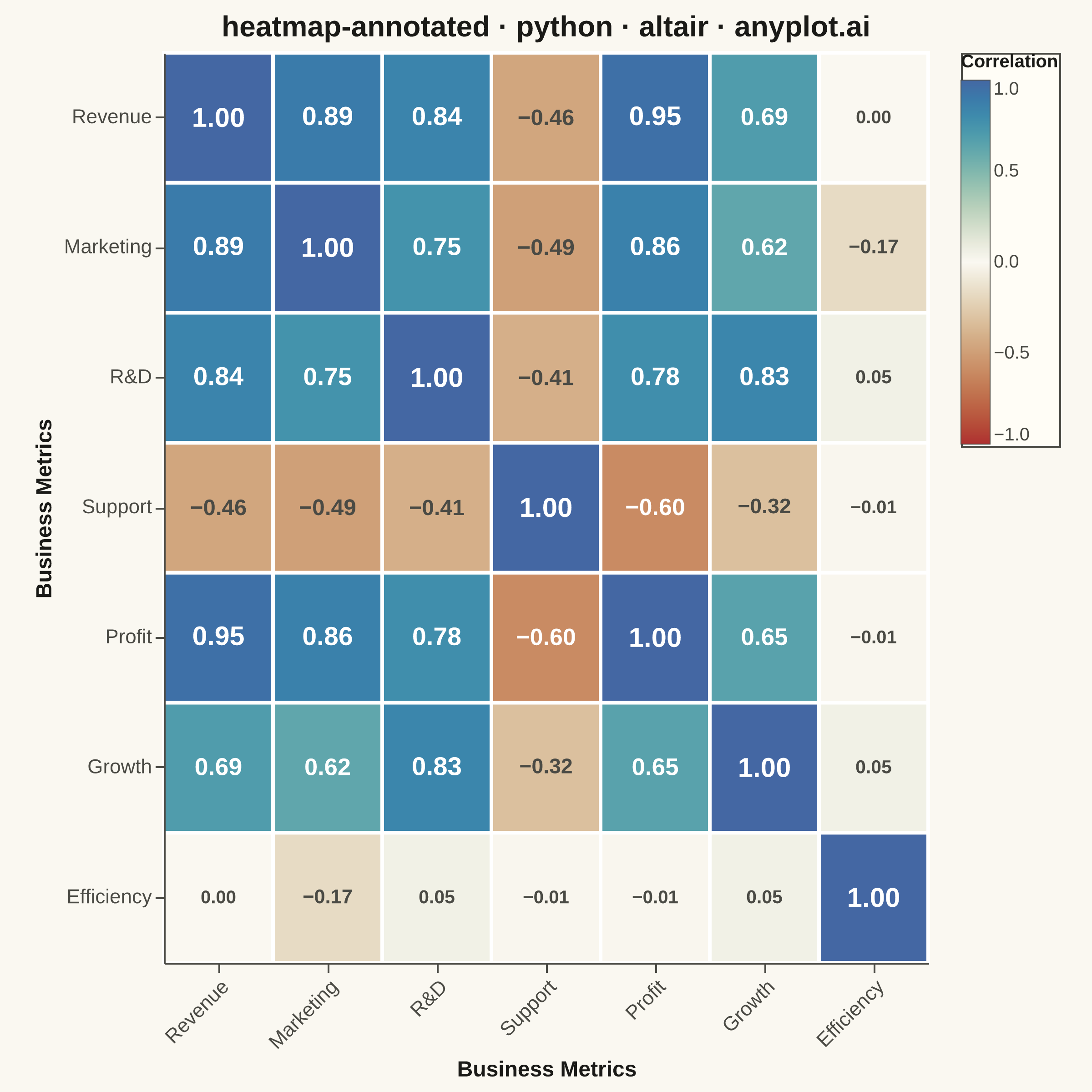
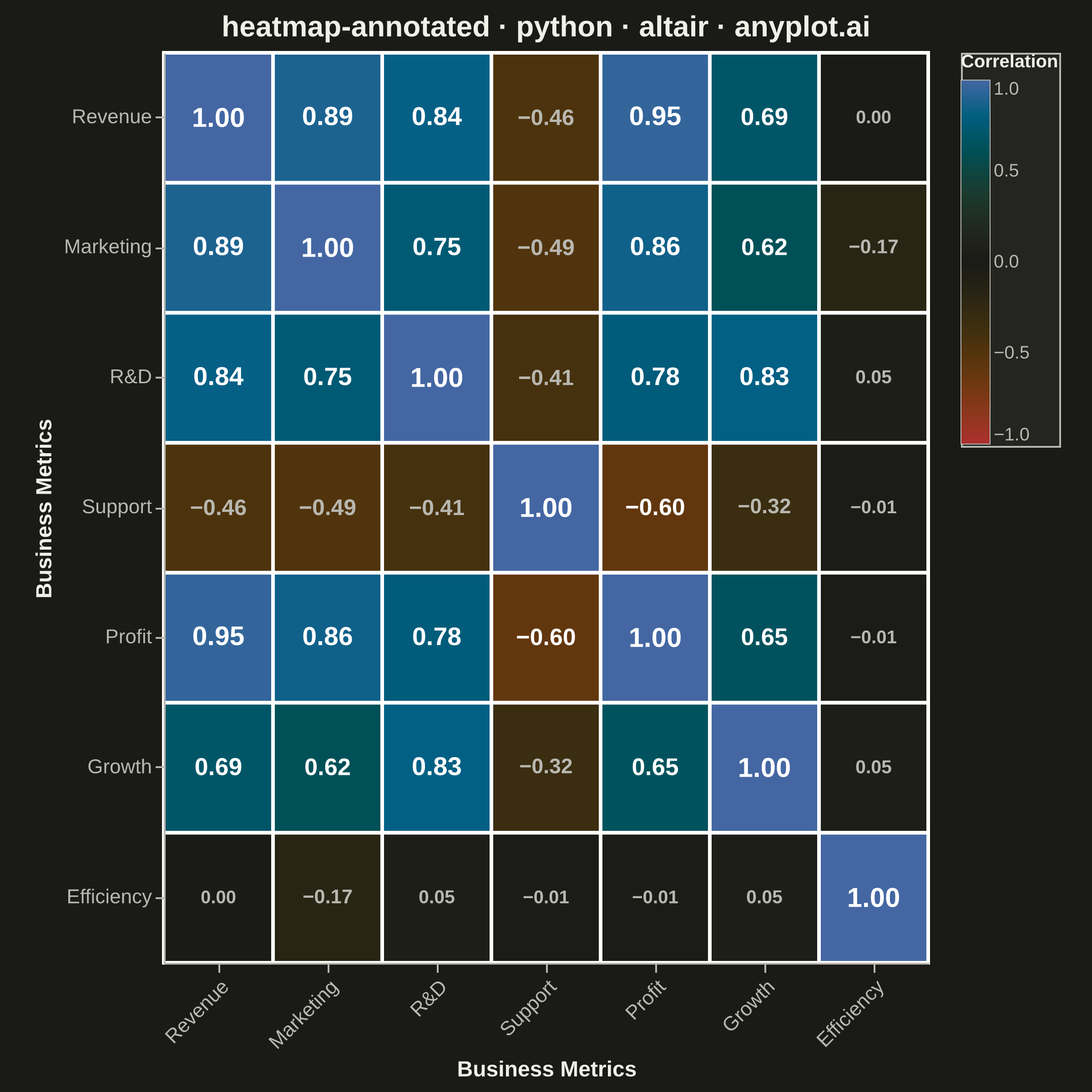
A heatmap with numeric values displayed inside each cell, combining color intensity with exact value labels. Essential for correlation matrices, confusion matrices, and any matrix visualization where both pattern recognition and precise values matter. Text color automatically contrasts with background for readability.
""" anyplot.ai
heatmap-annotated: Annotated Heatmap
Library: altair 6.2.2 | Python 3.13.14
Quality: 88/100 | Updated: 2026-08-05
"""

import os

import altair as alt
import numpy as np
import pandas as pd
from PIL import Image


# Theme tokens
THEME = os.getenv("ANYPLOT_THEME", "light")
PAGE_BG = "#FAF8F1" if THEME == "light" else "#1A1A17"
ELEVATED_BG = "#FFFDF6" if THEME == "light" else "#242420"
INK = "#1A1A17" if THEME == "light" else "#F0EFE8"
INK_SOFT = "#4A4A44" if THEME == "light" else "#B8B7B0"

# Data: Create a correlation matrix with better representation of positive/negative correlations
np.random.seed(42)

# Business metrics with meaningful correlations
metrics = ["Revenue", "Marketing", "R&D", "Support", "Profit", "Growth", "Efficiency"]
n_metrics = len(metrics)

# Generate base data with controlled correlations
base_data = np.random.randn(150, n_metrics)

# Introduce realistic correlations
base_data[:, 1] = base_data[:, 0] * 0.7 + np.random.randn(150) * 0.3  # Marketing ↔ Revenue
base_data[:, 2] = base_data[:, 0] * 0.6 + np.random.randn(150) * 0.4  # R&D ↔ Revenue
base_data[:, 3] = -base_data[:, 1] * 0.5 + np.random.randn(150) * 0.5  # Support ↔ Marketing (inverse)
base_data[:, 4] = base_data[:, 0] * 0.8 - base_data[:, 3] * 0.3 + np.random.randn(150) * 0.2  # Profit
base_data[:, 5] = base_data[:, 2] * 0.65 + np.random.randn(150) * 0.35  # Growth ↔ R&D
base_data[:, 6] = -base_data[:, 1] * 0.4 + base_data[:, 0] * 0.3 + np.random.randn(150) * 0.5  # Efficiency

# Calculate correlation matrix
corr_matrix = np.corrcoef(base_data.T)

# Create long-format DataFrame for Altair
rows = []
for i, row_metric in enumerate(metrics):
    for j, col_metric in enumerate(metrics):
        value = round(corr_matrix[i, j], 2)
        rows.append({"x": col_metric, "y": row_metric, "correlation": value, "abs_correlation": abs(value)})

df = pd.DataFrame(rows)

# Create base heatmap with rectangles
base_chart = (
    alt.Chart(df)
    .mark_rect(stroke="white", strokeWidth=2)
    .encode(
        x=alt.X(
            "x:N",
            title="Business Metrics",
            sort=metrics,
            axis=alt.Axis(labelFontSize=11, titleFontSize=12, labelAngle=-45),
        ),
        y=alt.Y("y:N", title="Business Metrics", sort=metrics, axis=alt.Axis(labelFontSize=11, titleFontSize=12)),
        color=alt.Color(
            "correlation:Q",
            # imprint_div (Imprint diverging cmap): matte-red <-> theme-adaptive midpoint <-> blue
            scale=alt.Scale(range=["#AE3030", PAGE_BG, "#4467A3"], domain=[-1, 1], domainMid=0),
            legend=alt.Legend(
                title="Correlation",
                titleFontSize=10,
                labelFontSize=10,
                fillColor=ELEVATED_BG,
                strokeColor=INK_SOFT,
                gradientStrokeColor=INK_SOFT,
                gradientStrokeWidth=0.5,
            ),
        ),
        tooltip=[
            alt.Tooltip("x:N", title="Column"),
            alt.Tooltip("y:N", title="Row"),
            alt.Tooltip("correlation:Q", title="Correlation", format=".2f"),
        ],
    )
)

# Create text layer for annotations with conditional color.
# Annotation size scales with |correlation| so the strongest relationships
# visually dominate the grid, while weak/near-zero cells recede further.
text = (
    alt.Chart(df)
    .mark_text(fontWeight="bold")
    .encode(
        x=alt.X("x:N", sort=metrics),
        y=alt.Y("y:N", sort=metrics),
        text=alt.Text("correlation:Q", format=".2f"),
        size=alt.Size("abs_correlation:Q", scale=alt.Scale(domain=[0, 1], range=[10, 15]), legend=None),
        color=alt.condition(
            (alt.datum.correlation > 0.5) | (alt.datum.correlation < -0.5), alt.value("white"), alt.value(INK_SOFT)
        ),
    )
)

# Combine heatmap and text
chart = (
    (base_chart + text)
    .properties(
        width=420,
        height=500,
        padding={"left": 0, "right": 0, "top": 0, "bottom": 0},
        title=alt.Title("heatmap-annotated · python · altair · anyplot.ai", fontSize=16, anchor="middle"),
        background=PAGE_BG,
    )
    .configure_view(fill=PAGE_BG, stroke=INK_SOFT, strokeWidth=0)
    .configure_axis(
        domainColor=INK_SOFT,
        tickColor=INK_SOFT,
        gridColor=INK_SOFT,
        gridOpacity=0.0,
        labelColor=INK_SOFT,
        titleColor=INK,
    )
    .configure_title(color=INK, fontSize=16, anchor="middle")
    .configure_legend(
        fillColor=ELEVATED_BG,
        strokeColor=INK_SOFT,
        labelColor=INK_SOFT,
        titleColor=INK,
        titleFontSize=10,
        labelFontSize=10,
    )
)

# Save as PNG — hard target: 2400x2400 (square). See prompts/library/altair.md "Canvas".
chart.save(f"plot-{THEME}.png", scale_factor=4.0)

# vl-convert pads the view with title/axis/legend extents outside width/height,
# so the raw save rarely lands exactly on target — pad (never crop) to match.
TW, TH = 2400, 2400
_img = Image.open(f"plot-{THEME}.png").convert("RGB")
_w, _h = _img.size
if _w > TW or _h > TH:
    raise SystemExit(
        f"altair vl-convert produced {_w}x{_h}, exceeds target {TW}x{TH}. "
        f"Shrink chart .properties(width=, height=) values and re-render."
    )
if _w < TW or _h < TH:
    _canvas = Image.new("RGB", (TW, TH), PAGE_BG)
    _canvas.paste(_img, ((TW - _w) // 2, (TH - _h) // 2))
    _canvas.save(f"plot-{THEME}.png")

# Save as HTML for interactive version
chart.save(f"plot-{THEME}.html")
Runnable source as JSON, for any HTTP client: https://api.anyplot.ai/specs/heatmap-annotated/altair/code. Any spec id and library id listed in llms-full.txt fit the same URL shape; every URL below is complete and callable.
{
  "spec_id": "heatmap-annotated",
  "language": "python",
  "library": "altair",
  "page": "https://anyplot.ai/heatmap-annotated/python/altair",
  "hub": "https://anyplot.ai/heatmap-annotated",
  "code_json": "https://api.anyplot.ai/specs/heatmap-annotated/altair/code",
  "spec_json": "https://api.anyplot.ai/specs/heatmap-annotated",
  "render_light_png": "https://storage.googleapis.com/anyplot-images/plots/heatmap-annotated/python/altair/plot-light.png",
  "render_dark_png": "https://storage.googleapis.com/anyplot-images/plots/heatmap-annotated/python/altair/plot-dark.png",
  "interactive_light_html": "https://storage.googleapis.com/anyplot-images/plots/heatmap-annotated/python/altair/plot-light.html",
  "interactive_dark_html": "https://storage.googleapis.com/anyplot-images/plots/heatmap-annotated/python/altair/plot-dark.html",
  "quality_score": 88.0,
  "license": "MIT",
  "guide": "https://anyplot.ai/llms.txt"
}
Part of Annotated Heatmap on anyplot.ai.