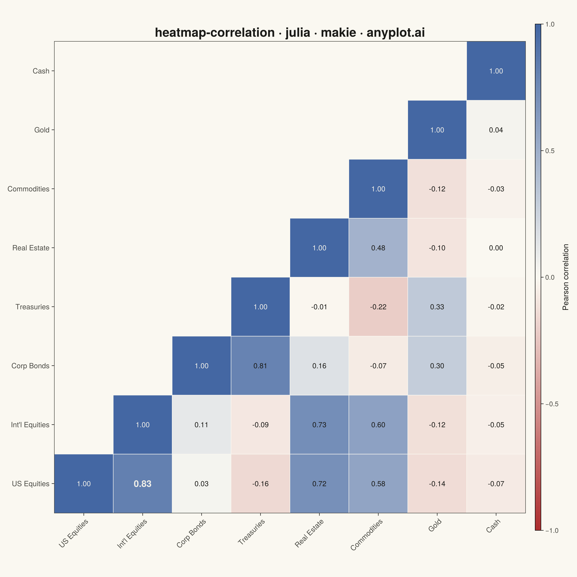
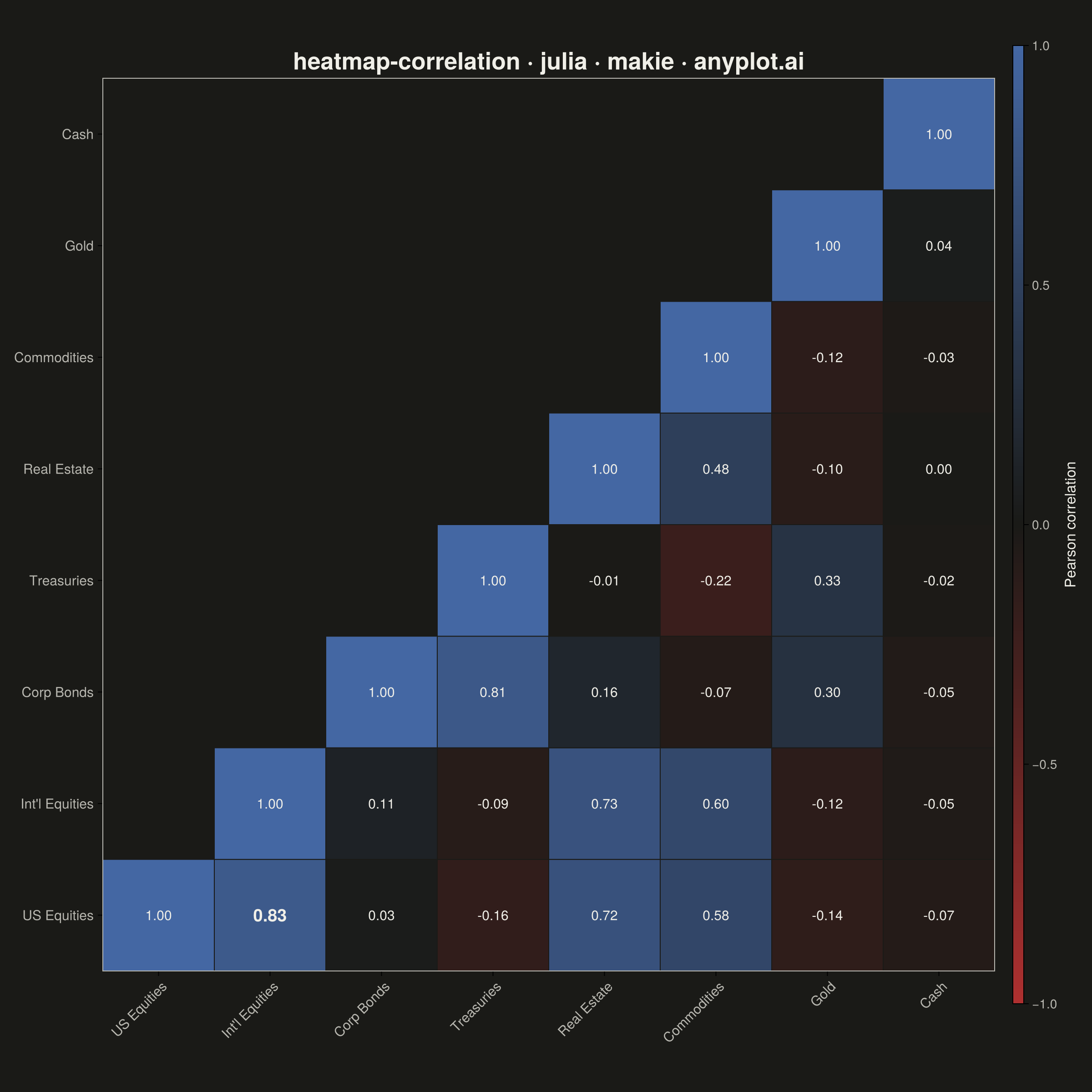
The same plot in 14 other libraries — Python: Altair, Bokeh, lets-plot, Matplotlib, Plotly, plotnine, Pygal, Seaborn; R: ggplot2; JavaScript: Chart.js, D3.js, Apache ECharts, Highcharts, MUI X Charts. Compare all 15 side by side: Correlation Matrix Heatmap in Python, R, Julia and JavaScript.
A heatmap specifically designed to display correlation coefficients between variables, using a diverging color scheme centered at zero. The symmetric matrix visualization makes it easy to identify positive correlations, negative correlations, and independent variables at a glance. Essential for exploratory data analysis, feature engineering, and multicollinearity detection in statistical and machine learning workflows.
# anyplot.ai
# heatmap-correlation: Correlation Matrix Heatmap
# Library: makie 0.21.9 | Julia 1.11.9
# Quality: 90/100 | Created: 2026-08-20

using CairoMakie
using Colors
using ColorSchemes
using Printf
using Random
using Statistics

Random.seed!(42)

# --- Theme tokens -------------------------------------------------------
THEME    = get(ENV, "ANYPLOT_THEME", "light")
PAGE_BG  = THEME == "light" ? colorant"#FAF8F1" : colorant"#1A1A17"
INK      = THEME == "light" ? colorant"#1A1A17" : colorant"#F0EFE8"
INK_SOFT = THEME == "light" ? colorant"#4A4A44" : colorant"#B8B7B0"
DIV_MID  = THEME == "light" ? colorant"#FAF8F1" : colorant"#1A1A17"
IMPRINT_DIV = cgrad([colorant"#AE3030", DIV_MID, colorant"#4467A3"])

# --- Data -----------------------------------------------------------------
# Monthly returns for 8 asset classes driven by two latent macro factors
# (equity beta, rate sensitivity) plus idiosyncratic noise, then reduced
# to a Pearson correlation matrix — a portfolio-diversification scenario.
asset_names = ["US Equities", "Int'l Equities", "Corp Bonds", "Treasuries",
               "Real Estate", "Commodities", "Gold", "Cash"]
n_assets = length(asset_names)
n_periods = 300

market_factor = randn(n_periods)
rate_factor = randn(n_periods)
market_loadings = [0.95, 0.85, 0.10, -0.15, 0.55, 0.35, -0.05, 0.0]
rate_loadings = [-0.10, -0.05, 0.80, 0.90, 0.05, -0.10, 0.15, 0.0]

returns = zeros(n_periods, n_assets)
for i in 1:n_assets
    returns[:, i] = market_loadings[i] .* market_factor .+
                    rate_loadings[i] .* rate_factor .+
                    0.4 .* randn(n_periods)
end

corr_matrix = cor(returns)

# --- Plot -------------------------------------------------------------------
fig = Figure(
    resolution      = (1200, 1200),
    fontsize        = 16,
    backgroundcolor = PAGE_BG,
)

ax = Axis(
    fig[1, 1];
    title              = "heatmap-correlation · julia · makie · anyplot.ai",
    titlesize          = 26,
    titlecolor         = INK,
    xticks             = (1:n_assets, asset_names),
    yticks             = (1:n_assets, asset_names),
    xticklabelrotation = π / 4,
    xticklabelsize     = 15,
    yticklabelsize     = 15,
    xticklabelcolor    = INK_SOFT,
    yticklabelcolor    = INK_SOFT,
    backgroundcolor    = PAGE_BG,
    aspect             = 1,
    yreversed          = true,
    leftspinecolor     = INK_SOFT,
    rightspinecolor    = INK_SOFT,
    topspinecolor      = INK_SOFT,
    bottomspinecolor   = INK_SOFT,
    xgridvisible       = false,
    ygridvisible       = false,
)

# Strongest off-diagonal pair gets a bolder annotation as a focal point.
off_diag_pairs = [(i, j) for i in 1:n_assets, j in 1:n_assets if i > j]
strongest_i, strongest_j = off_diag_pairs[argmax(abs(corr_matrix[i, j]) for (i, j) in off_diag_pairs)]

# Draw each filled cell as its own rectangle (rather than a single heatmap!)
# so a thin PAGE_BG stroke can separate cells — Heatmap doesn't support
# strokewidth/strokecolor in this Makie version, poly! does.
for i in 1:n_assets, j in 1:n_assets
    if i >= j
        value = corr_matrix[i, j]
        cell_color = get(IMPRINT_DIV, (value + 1) / 2)
        poly!(ax, Rect2f(i - 0.5, j - 0.5, 1, 1);
              color = cell_color, strokewidth = 1, strokecolor = PAGE_BG)

        luminance = 0.299 * cell_color.r + 0.587 * cell_color.g + 0.114 * cell_color.b
        label_color = luminance > 0.5 ? colorant"#1A1A17" : colorant"#F0EFE8"
        is_strongest = (i, j) == (strongest_i, strongest_j)
        text!(ax, i, j; text = @sprintf("%.2f", value),
              align = (:center, :center),
              fontsize = is_strongest ? 19 : 15,
              font = is_strongest ? :bold : :regular,
              color = label_color)
    end
end

limits!(ax, 0.5, n_assets + 0.5, 0.5, n_assets + 0.5)

Colorbar(
    fig[1, 2];
    colormap       = IMPRINT_DIV,
    limits         = (-1, 1),
    label          = "Pearson correlation",
    labelcolor     = INK,
    labelsize      = 16,
    ticklabelcolor = INK_SOFT,
    ticklabelsize  = 14,
    ticks          = -1:0.5:1,
)

colgap!(fig.layout, 20)

# --- Save -------------------------------------------------------------------
save("plot-$(THEME).png", fig; px_per_unit = 2)
Runnable source as JSON, for any HTTP client: https://api.anyplot.ai/specs/heatmap-correlation/makie/code. Any spec id and library id listed in llms-full.txt fit the same URL shape; every URL below is complete and callable.
{
  "spec_id": "heatmap-correlation",
  "language": "julia",
  "library": "makie",
  "page": "https://anyplot.ai/heatmap-correlation/julia/makie",
  "hub": "https://anyplot.ai/heatmap-correlation",
  "code_json": "https://api.anyplot.ai/specs/heatmap-correlation/makie/code",
  "spec_json": "https://api.anyplot.ai/specs/heatmap-correlation",
  "render_light_png": "https://storage.googleapis.com/anyplot-images/plots/heatmap-correlation/julia/makie/plot-light.png",
  "render_dark_png": "https://storage.googleapis.com/anyplot-images/plots/heatmap-correlation/julia/makie/plot-dark.png",
  "quality_score": 90.0,
  "license": "MIT",
  "guide": "https://anyplot.ai/llms.txt"
}
Part of Correlation Matrix Heatmap on anyplot.ai.