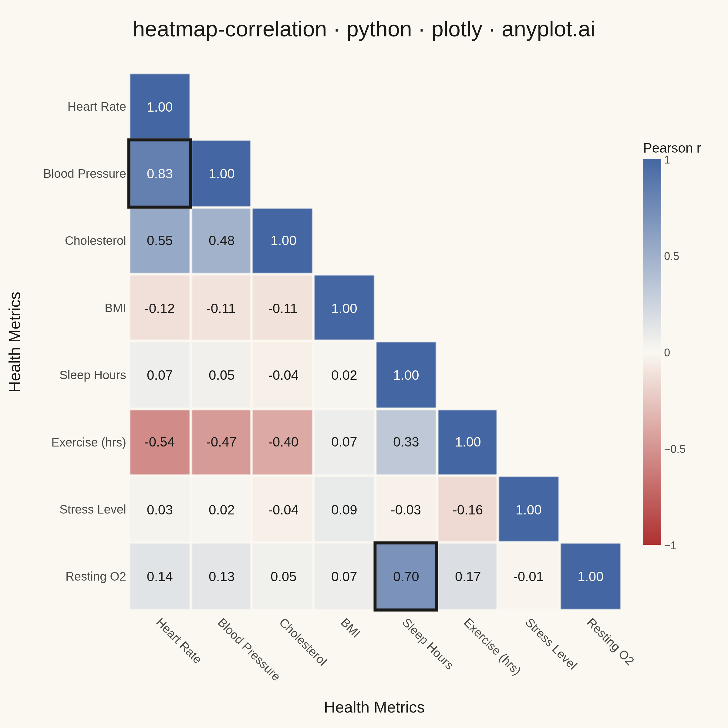
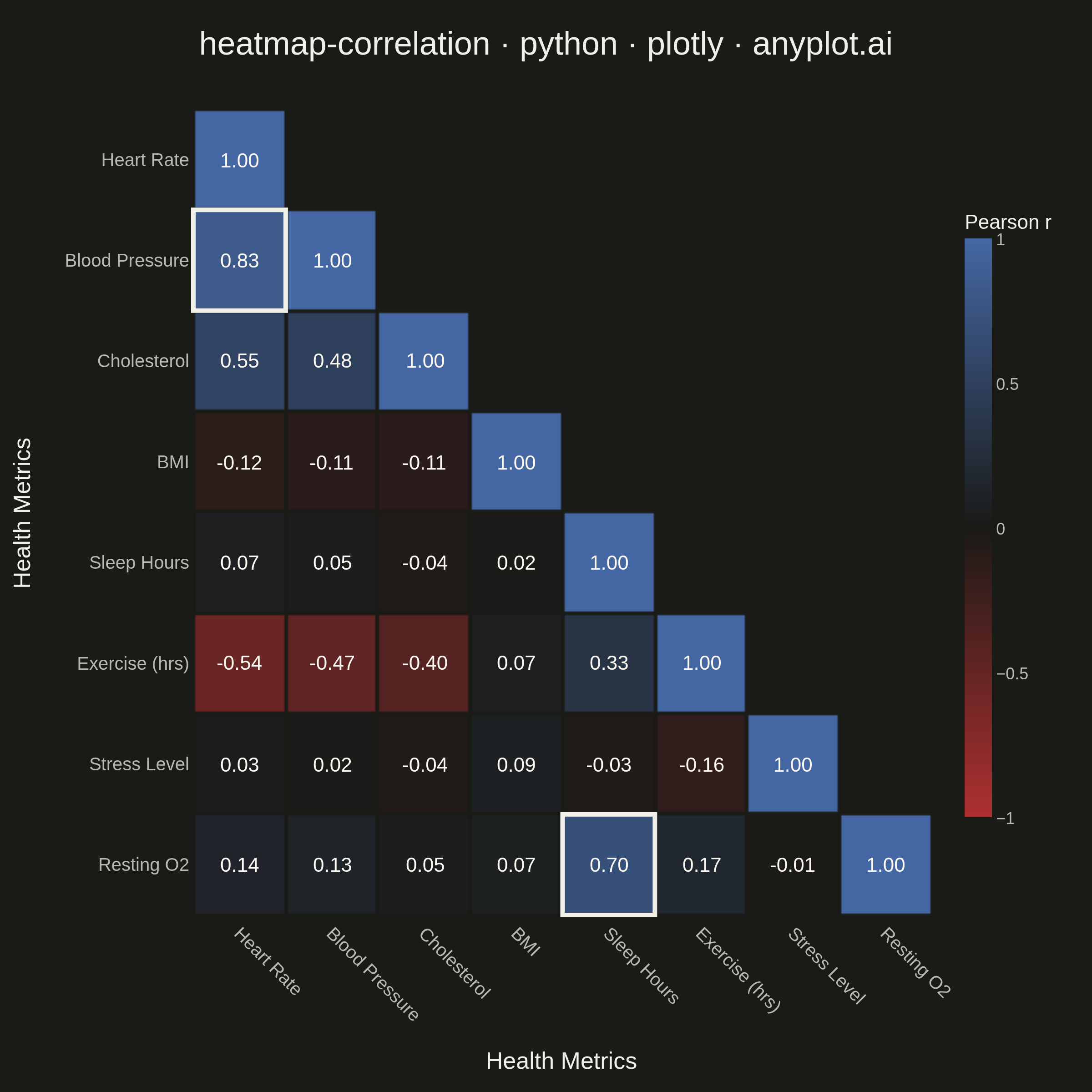
A heatmap specifically designed to display correlation coefficients between variables, using a diverging color scheme centered at zero. The symmetric matrix visualization makes it easy to identify positive correlations, negative correlations, and independent variables at a glance. Essential for exploratory data analysis, feature engineering, and multicollinearity detection in statistical and machine learning workflows.
""" anyplot.ai
heatmap-correlation: Correlation Matrix Heatmap
Library: plotly 6.9.0 | Python 3.13.15
Quality: 94/100 | Updated: 2026-08-18
"""

import os

import numpy as np
import plotly.graph_objects as go


# Theme tokens
THEME = os.getenv("ANYPLOT_THEME", "light")
PAGE_BG = "#FAF8F1" if THEME == "light" else "#1A1A17"
INK = "#1A1A17" if THEME == "light" else "#F0EFE8"
INK_SOFT = "#4A4A44" if THEME == "light" else "#B8B7B0"

# Imprint diverging colormap — matte red (negative) -> theme midpoint -> blue (positive)
midpoint = PAGE_BG
imprint_div = [[0.0, "#AE3030"], [0.5, midpoint], [1.0, "#4467A3"]]


def hex_to_rgb(hex_color):
    hex_color = hex_color.lstrip("#")
    return tuple(int(hex_color[i : i + 2], 16) for i in (0, 2, 4))


def cell_text_color(r, mid_rgb):
    # Re-derive the interpolated cell color to pick a legibly-contrasting text
    # color — the midpoint stop is theme-adaptive, so a fixed threshold on |r|
    # would pick the wrong tone for one of the two themes.
    red_rgb, blue_rgb = hex_to_rgb("#AE3030"), hex_to_rgb("#4467A3")
    position = (r + 1) / 2
    lo, hi, t = (red_rgb, mid_rgb, position / 0.5) if position <= 0.5 else (mid_rgb, blue_rgb, (position - 0.5) / 0.5)
    cell_rgb = [lo[k] + (hi[k] - lo[k]) * t for k in range(3)]
    luminance = 0.299 * cell_rgb[0] + 0.587 * cell_rgb[1] + 0.114 * cell_rgb[2]
    return "#1A1A17" if luminance > 140 else "#FAF8F1"


# Data - Healthcare metrics correlation matrix
np.random.seed(42)
variables = [
    "Heart Rate",
    "Blood Pressure",
    "Cholesterol",
    "BMI",
    "Sleep Hours",
    "Exercise (hrs)",
    "Stress Level",
    "Resting O2",
]

# Create realistic correlation matrix with meaningful health relationships
n_vars = len(variables)
base = np.random.randn(200, n_vars)

# Add realistic correlations based on health domain knowledge
base[:, 1] = base[:, 0] * 0.65 + np.random.randn(200) * 0.4  # BP ~ Heart Rate
base[:, 2] = base[:, 0] * 0.5 + base[:, 3] * 0.6 + np.random.randn(200) * 0.4  # Cholesterol
base[:, 3] = np.random.randn(200)  # BMI (independent)
base[:, 4] = -base[:, 6] * 0.7 + np.random.randn(200) * 0.4  # Sleep ~ -Stress
base[:, 5] = (
    -base[:, 0] * 0.5 - base[:, 6] * 0.4 + np.random.randn(200) * 0.5
)  # Exercise inversely related to HR and Stress
base[:, 6] = np.random.randn(200)  # Stress (independent)
base[:, 7] = base[:, 4] * 0.6 + np.random.randn(200) * 0.5  # O2 ~ Sleep

# Calculate correlation matrix
correlation_matrix = np.corrcoef(base.T)

# Mask the strict upper triangle so each unique pair is shown once
mask = np.triu(np.ones_like(correlation_matrix, dtype=bool), k=1)
masked_corr = np.where(mask, np.nan, correlation_matrix)

# Numeric axis positions keep shape placement simple (see strong-pair highlight below)
positions = list(range(n_vars))
mid_rgb = hex_to_rgb(midpoint)

# Cell annotations — text color follows the actual interpolated cell color so it
# stays legible whether that cell renders light (near the theme midpoint) or a
# fully saturated red/blue (near the fixed scale endpoints).
annotations = []
for i in range(n_vars):
    for j in range(n_vars):
        if mask[i, j]:
            continue
        r = correlation_matrix[i, j]
        annotations.append(
            {
                "x": j,
                "y": i,
                "text": f"{r:.2f}",
                "showarrow": False,
                "font": {"size": 11, "color": cell_text_color(r, mid_rgb)},
            }
        )

# Rich hover text interpreting correlation strength and direction
hover_text = []
for i in range(n_vars):
    row = []
    for j in range(n_vars):
        if mask[i, j]:
            row.append("")
        else:
            r = correlation_matrix[i, j]
            if abs(r) >= 0.7:
                strength = "Strong"
            elif abs(r) >= 0.4:
                strength = "Moderate"
            else:
                strength = "Weak"
            direction = "positive" if r > 0 else "negative" if r < 0 else "none"
            row.append(
                f"<b>{variables[i]}</b> vs <b>{variables[j]}</b><br>"
                f"Correlation: <b>{r:.3f}</b><br>"
                f"Strength: {strength} {direction}"
            )
    hover_text.append(row)

# Heatmap — Imprint diverging scale, thin page-background gaps replace axis gridlines
fig = go.Figure(
    data=go.Heatmap(
        z=masked_corr,
        x=positions,
        y=positions,
        colorscale=imprint_div,
        zmin=-1,
        zmax=1,
        xgap=2,
        ygap=2,
        colorbar={
            "title": {"text": "Pearson r", "font": {"size": 11, "color": INK}},
            "tickfont": {"size": 9, "color": INK_SOFT},
            "thickness": 15,
            "len": 0.8,
            "tickvals": [-1, -0.5, 0, 0.5, 1],
            "outlinewidth": 0,
        },
        hoverongaps=False,
        hovertemplate="%{customdata}<extra></extra>",
        customdata=hover_text,
    )
)

# Highlight strong pairs (|r| >= 0.7, off-diagonal) with an outlined cell border —
# a real data-driven emphasis, not a simulated interaction. The stroke color
# contrasts against PAGE_BG (the xgap/ygap color the border sits on top of), not
# against the cell fill — otherwise a fill that interpolates near PAGE_BG makes
# the border blend into the surrounding gap and disappear.
for i in range(n_vars):
    for j in range(i):
        r = correlation_matrix[i, j]
        if abs(r) >= 0.7:
            fig.add_shape(
                type="rect",
                x0=j - 0.5,
                x1=j + 0.5,
                y0=i - 0.5,
                y1=i + 0.5,
                line={"color": INK, "width": 2.5},
                fillcolor="rgba(0,0,0,0)",
                layer="above",
            )

# Layout for 2400x2400 px (square — symmetric matrix)
fig.update_layout(
    autosize=False,
    title={
        "text": "heatmap-correlation · python · plotly · anyplot.ai",
        "font": {"size": 18, "color": INK},
        "x": 0.5,
        "xanchor": "center",
    },
    xaxis={
        "title": {"text": "Health Metrics", "font": {"size": 13, "color": INK}},
        "tickfont": {"size": 10, "color": INK_SOFT},
        "tickmode": "array",
        "tickvals": positions,
        "ticktext": variables,
        "side": "bottom",
        "tickangle": 45,
        "showgrid": False,
        "zeroline": False,
        "showline": False,
    },
    yaxis={
        "title": {"text": "Health Metrics", "font": {"size": 13, "color": INK}},
        "tickfont": {"size": 10, "color": INK_SOFT},
        "tickmode": "array",
        "tickvals": positions,
        "ticktext": variables,
        "autorange": "reversed",
        "showgrid": False,
        "zeroline": False,
        "showline": False,
    },
    annotations=annotations,
    paper_bgcolor=PAGE_BG,
    plot_bgcolor=PAGE_BG,
    font={"color": INK},
    margin={"l": 70, "r": 30, "t": 60, "b": 90},
    width=600,
    height=600,
)

# Save as PNG and HTML with theme-suffixed filenames
fig.write_image(f"plot-{THEME}.png", width=600, height=600, scale=4)
fig.write_html(f"plot-{THEME}.html", include_plotlyjs="cdn")
Runnable source as JSON, for any HTTP client: https://api.anyplot.ai/specs/heatmap-correlation/plotly/code. Any spec id and library id listed in llms-full.txt fit the same URL shape; every URL below is complete and callable.
{
  "spec_id": "heatmap-correlation",
  "language": "python",
  "library": "plotly",
  "page": "https://anyplot.ai/heatmap-correlation/python/plotly",
  "hub": "https://anyplot.ai/heatmap-correlation",
  "code_json": "https://api.anyplot.ai/specs/heatmap-correlation/plotly/code",
  "spec_json": "https://api.anyplot.ai/specs/heatmap-correlation",
  "render_light_png": "https://storage.googleapis.com/anyplot-images/plots/heatmap-correlation/python/plotly/plot-light.png",
  "render_dark_png": "https://storage.googleapis.com/anyplot-images/plots/heatmap-correlation/python/plotly/plot-dark.png",
  "interactive_light_html": "https://storage.googleapis.com/anyplot-images/plots/heatmap-correlation/python/plotly/plot-light.html",
  "interactive_dark_html": "https://storage.googleapis.com/anyplot-images/plots/heatmap-correlation/python/plotly/plot-dark.html",
  "quality_score": 94.0,
  "license": "MIT",
  "guide": "https://anyplot.ai/llms.txt"
}
Part of Correlation Matrix Heatmap on anyplot.ai.