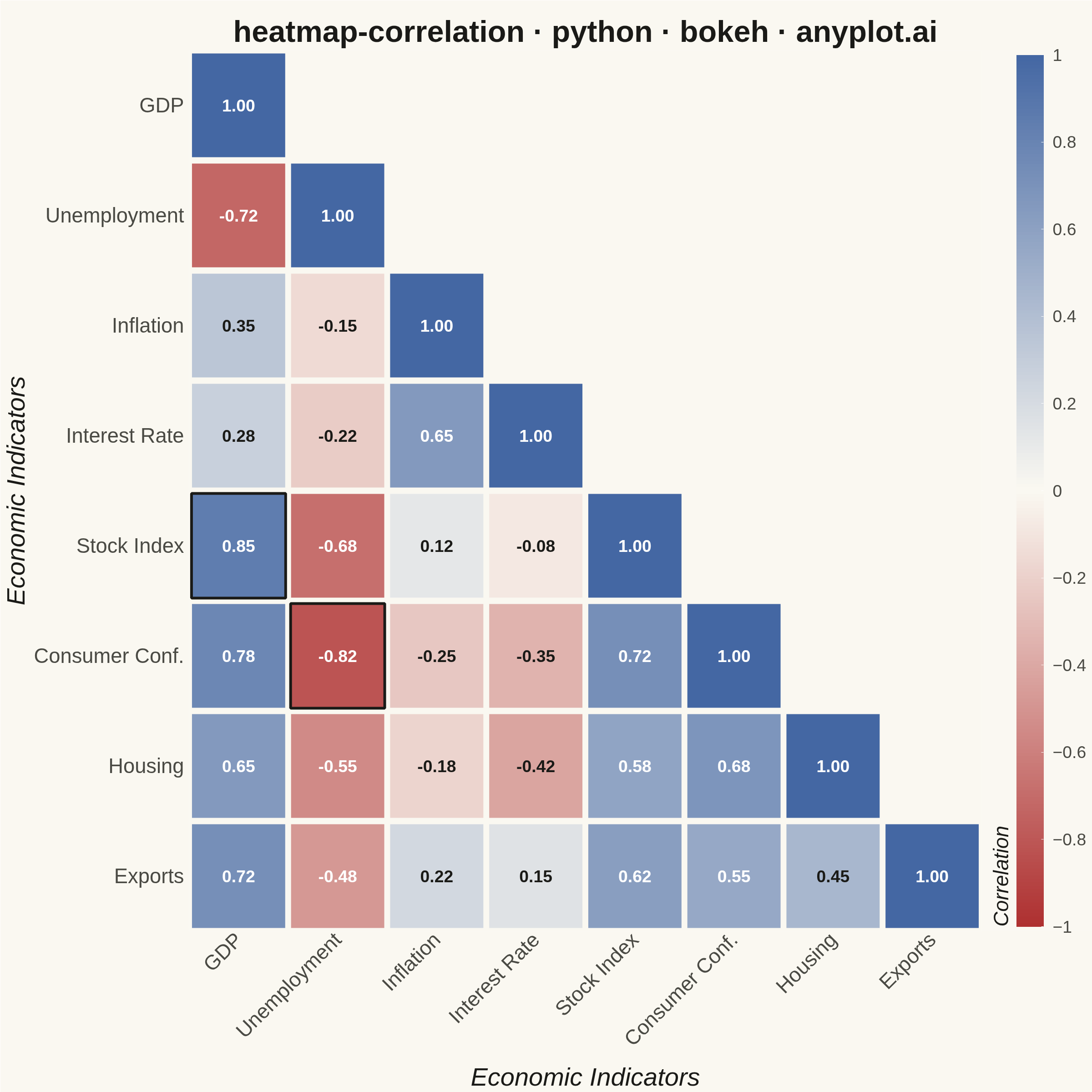
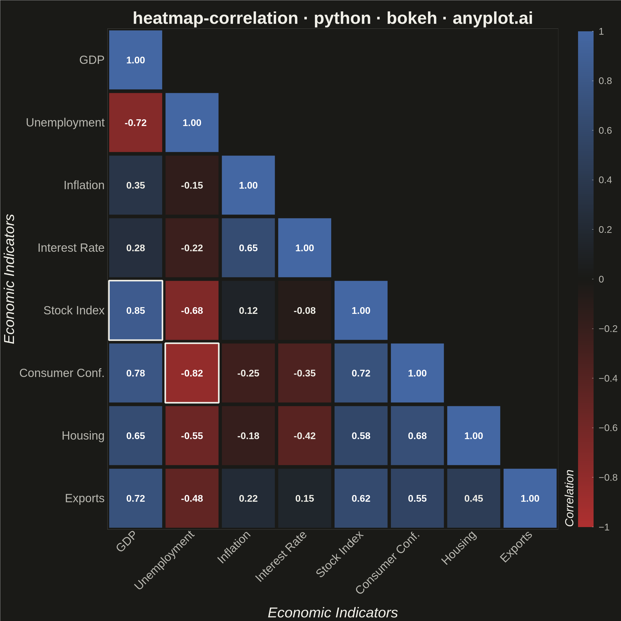
A heatmap specifically designed to display correlation coefficients between variables, using a diverging color scheme centered at zero. The symmetric matrix visualization makes it easy to identify positive correlations, negative correlations, and independent variables at a glance. Essential for exploratory data analysis, feature engineering, and multicollinearity detection in statistical and machine learning workflows.
""" anyplot.ai
heatmap-correlation: Correlation Matrix Heatmap
Library: bokeh 3.9.2 | Python 3.13.15
Quality: 93/100 | Updated: 2026-08-18
"""
import os
import time
from pathlib import Path
import numpy as np
from bokeh.io import output_file, save
from bokeh.models import BasicTicker, ColorBar, ColumnDataSource, HoverTool, LabelSet, LinearColorMapper
from bokeh.plotting import figure
from selenium import webdriver
from selenium.webdriver.chrome.options import Options
# Theme tokens
THEME = os.getenv("ANYPLOT_THEME", "light")
PAGE_BG = "#FAF8F1" if THEME == "light" else "#1A1A17"
ELEVATED_BG = "#FFFDF6" if THEME == "light" else "#242420"
INK = "#1A1A17" if THEME == "light" else "#F0EFE8"
INK_SOFT = "#4A4A44" if THEME == "light" else "#B8B7B0"
# Data - realistic financial/economic indicators
variables = ["GDP", "Unemployment", "Inflation", "Interest Rate", "Stock Index", "Consumer Conf.", "Housing", "Exports"]
n_vars = len(variables)
# Generate realistic correlation matrix with known economic relationships
base_corr = np.array(
[
[1.00, -0.72, 0.35, 0.28, 0.85, 0.78, 0.65, 0.72], # GDP
[-0.72, 1.00, -0.15, -0.22, -0.68, -0.82, -0.55, -0.48], # Unemployment
[0.35, -0.15, 1.00, 0.65, 0.12, -0.25, -0.18, 0.22], # Inflation
[0.28, -0.22, 0.65, 1.00, -0.08, -0.35, -0.42, 0.15], # Interest Rate
[0.85, -0.68, 0.12, -0.08, 1.00, 0.72, 0.58, 0.62], # Stock Index
[0.78, -0.82, -0.25, -0.35, 0.72, 1.00, 0.68, 0.55], # Consumer Confidence
[0.65, -0.55, -0.18, -0.42, 0.58, 0.68, 1.00, 0.45], # Housing
[0.72, -0.48, 0.22, 0.15, 0.62, 0.55, 0.45, 1.00], # Exports
]
)
# Mask upper triangle (above the diagonal) to avoid redundant mirrored cells
mask = np.triu(np.ones_like(base_corr, dtype=bool), k=1)
corr_matrix = np.where(mask, np.nan, base_corr)
# Prepare data for heatmap — text color adapts per-cell so it stays legible
# against both the strongly-saturated ends AND the near-zero midpoint, which
# is itself theme-adaptive (near-white on light, near-black on dark).
x_data = []
y_data = []
values = []
text_values = []
text_colors = []
cell_ij = []
for i, var_y in enumerate(variables):
for j, var_x in enumerate(variables):
if not np.isnan(corr_matrix[i, j]):
x_data.append(var_x)
y_data.append(var_y)
val = corr_matrix[i, j]
values.append(val)
text_values.append(f"{val:.2f}")
text_colors.append("#FFFFFF" if abs(val) > 0.45 else INK)
cell_ij.append((i, j))
# Highlight the two strongest off-diagonal relationships with a bold outline
# so the viewer's eye lands on the most important correlations first.
off_diag = [(idx, abs(v)) for idx, (v, (i, j)) in enumerate(zip(values, cell_ij, strict=True)) if i != j]
strongest = {idx for idx, _ in sorted(off_diag, key=lambda pair: pair[1], reverse=True)[:2]}
cell_line_colors = [INK if idx in strongest else PAGE_BG for idx in range(len(values))]
cell_line_widths = [6 if idx in strongest else 2 for idx in range(len(values))]
source = ColumnDataSource(
data={
"x": x_data,
"y": y_data,
"values": values,
"text": text_values,
"text_color": text_colors,
"line_color": cell_line_colors,
"line_width": cell_line_widths,
}
)
# Imprint diverging colormap (matte-red <-> theme-adaptive midpoint <-> blue),
# built as a 256-stop ramp — see prompts/library/bokeh.md "Colors".
def _lerp_hex(c0, c1, t):
r0, g0, b0 = (int(c0[i : i + 2], 16) for i in (1, 3, 5))
r1, g1, b1 = (int(c1[i : i + 2], 16) for i in (1, 3, 5))
r, g, b = (int(round(a + (b - a) * t)) for a, b in ((r0, r1), (g0, g1), (b0, b1)))
return f"#{r:02X}{g:02X}{b:02X}"
_midpoint = PAGE_BG
imprint_div = [_lerp_hex("#AE3030", _midpoint, t / 127.0) for t in range(128)] + [
_lerp_hex(_midpoint, "#4467A3", t / 127.0) for t in range(128)
]
mapper = LinearColorMapper(palette=imprint_div, low=-1, high=1)
title = "heatmap-correlation · python · bokeh · anyplot.ai"
# Square canvas — see prompts/library/bokeh.md "Canvas — hard rule, no deviation".
# `min_border_*` reserve room for the 34/42pt tick + axis-label stack so
# nothing clips at the PNG edges; `toolbar_location=None` is mandatory —
# bokeh's default toolbar adds ~30-50px above the plot that would shrink
# the saved screenshot below the target height.
p = figure(
width=2400,
height=2400,
x_range=variables,
y_range=list(reversed(variables)),
x_axis_location="below",
title=title,
toolbar_location=None,
tools="",
min_border_bottom=160,
min_border_left=180,
min_border_top=110,
min_border_right=50,
)
# Draw rectangles for heatmap
rects = p.rect(
x="x",
y="y",
width=0.95,
height=0.95,
source=source,
fill_color={"field": "values", "transform": mapper},
line_color="line_color",
line_width="line_width",
)
# Refined hover tooltip — theme-aware card instead of the plain default table
hover = HoverTool(
renderers=[rects],
tooltips=f"""
<div style="background-color:{ELEVATED_BG}; border:1px solid {INK_SOFT};
border-radius:4px; padding:8px 10px; font-size:14px; color:{INK};">
<div><b>@y</b> × <b>@x</b></div>
<div style="color:{INK_SOFT}; margin-top:2px;">Correlation: <b>@text</b></div>
</div>
""",
)
p.add_tools(hover)
# Text annotations with per-cell adaptive color (see data-prep above)
labels = LabelSet(
x="x",
y="y",
text="text",
text_color="text_color",
source=source,
text_align="center",
text_baseline="middle",
text_font_size="28pt",
text_font_style="bold",
)
p.add_layout(labels)
# Colorbar (fixed -1..1 range for consistent cross-plot interpretation)
color_bar = ColorBar(
color_mapper=mapper,
ticker=BasicTicker(desired_num_ticks=11),
label_standoff=20,
width=60,
location=(0, 0),
title="Correlation",
title_text_font_size="34pt",
major_label_text_font_size="28pt",
title_standoff=15,
)
p.add_layout(color_bar, "right")
# Theme-adaptive chrome
p.background_fill_color = PAGE_BG
p.border_fill_color = PAGE_BG
p.outline_line_color = None
p.title.text_font_size = "50pt"
p.title.align = "center"
p.title.text_color = INK
# Domain-specific axis labels
p.xaxis.axis_label = "Economic Indicators"
p.yaxis.axis_label = "Economic Indicators"
p.xaxis.axis_label_text_font_size = "42pt"
p.yaxis.axis_label_text_font_size = "42pt"
p.xaxis.axis_label_text_color = INK
p.yaxis.axis_label_text_color = INK
p.xaxis.major_label_text_font_size = "34pt"
p.yaxis.major_label_text_font_size = "34pt"
p.xaxis.major_label_text_color = INK_SOFT
p.yaxis.major_label_text_color = INK_SOFT
p.xaxis.major_label_orientation = 0.785 # 45 degrees in radians
# Grid and axis line styling — no grid needed on a fully-tiled matrix
p.xgrid.visible = False
p.ygrid.visible = False
p.axis.axis_line_color = None
p.axis.major_tick_line_color = None
# Colorbar styling — bokeh defaults ColorBar.background_fill_color to white,
# which stays a stark white box on the dark theme unless overridden here.
color_bar.background_fill_color = PAGE_BG
color_bar.title_text_color = INK
color_bar.major_label_text_color = INK_SOFT
# Save as HTML (required catalog artifact)
output_file(f"plot-{THEME}.html")
save(p)
# Screenshot with headless Chrome
W, H = 2400, 2400
opts = Options()
for arg in (
"--headless=new",
"--no-sandbox",
"--disable-dev-shm-usage",
"--disable-gpu",
f"--window-size={W},{H}",
"--hide-scrollbars",
):
opts.add_argument(arg)
driver = webdriver.Chrome(options=opts)
driver.set_window_size(W, H)
driver.get(f"file://{Path(f'plot-{THEME}.html').resolve()}")
# Headless Chrome's --window-size sets the OUTER window, which still reserves
# a phantom title-bar height even headless; pin the viewport exactly via CDP.
driver.execute_cdp_cmd(
"Emulation.setDeviceMetricsOverride", {"width": W, "height": H, "deviceScaleFactor": 1, "mobile": False}
)
time.sleep(3)
driver.save_screenshot(f"plot-{THEME}.png")
driver.quit()
Runnable source as JSON, for any HTTP client: https://api.anyplot.ai/specs/heatmap-correlation/bokeh/code. Any spec id and library id listed in llms-full.txt fit the same URL shape; every URL below is complete and callable.
{
  "spec_id": "heatmap-correlation",
  "language": "python",
  "library": "bokeh",
  "page": "https://anyplot.ai/heatmap-correlation/python/bokeh",
  "hub": "https://anyplot.ai/heatmap-correlation",
  "code_json": "https://api.anyplot.ai/specs/heatmap-correlation/bokeh/code",
  "spec_json": "https://api.anyplot.ai/specs/heatmap-correlation",
  "render_light_png": "https://storage.googleapis.com/anyplot-images/plots/heatmap-correlation/python/bokeh/plot-light.png",
  "render_dark_png": "https://storage.googleapis.com/anyplot-images/plots/heatmap-correlation/python/bokeh/plot-dark.png",
  "interactive_light_html": "https://storage.googleapis.com/anyplot-images/plots/heatmap-correlation/python/bokeh/plot-light.html",
  "interactive_dark_html": "https://storage.googleapis.com/anyplot-images/plots/heatmap-correlation/python/bokeh/plot-dark.html",
  "quality_score": 93.0,
  "license": "MIT",
  "guide": "https://anyplot.ai/llms.txt"
}
Part of Correlation Matrix Heatmap on anyplot.ai.