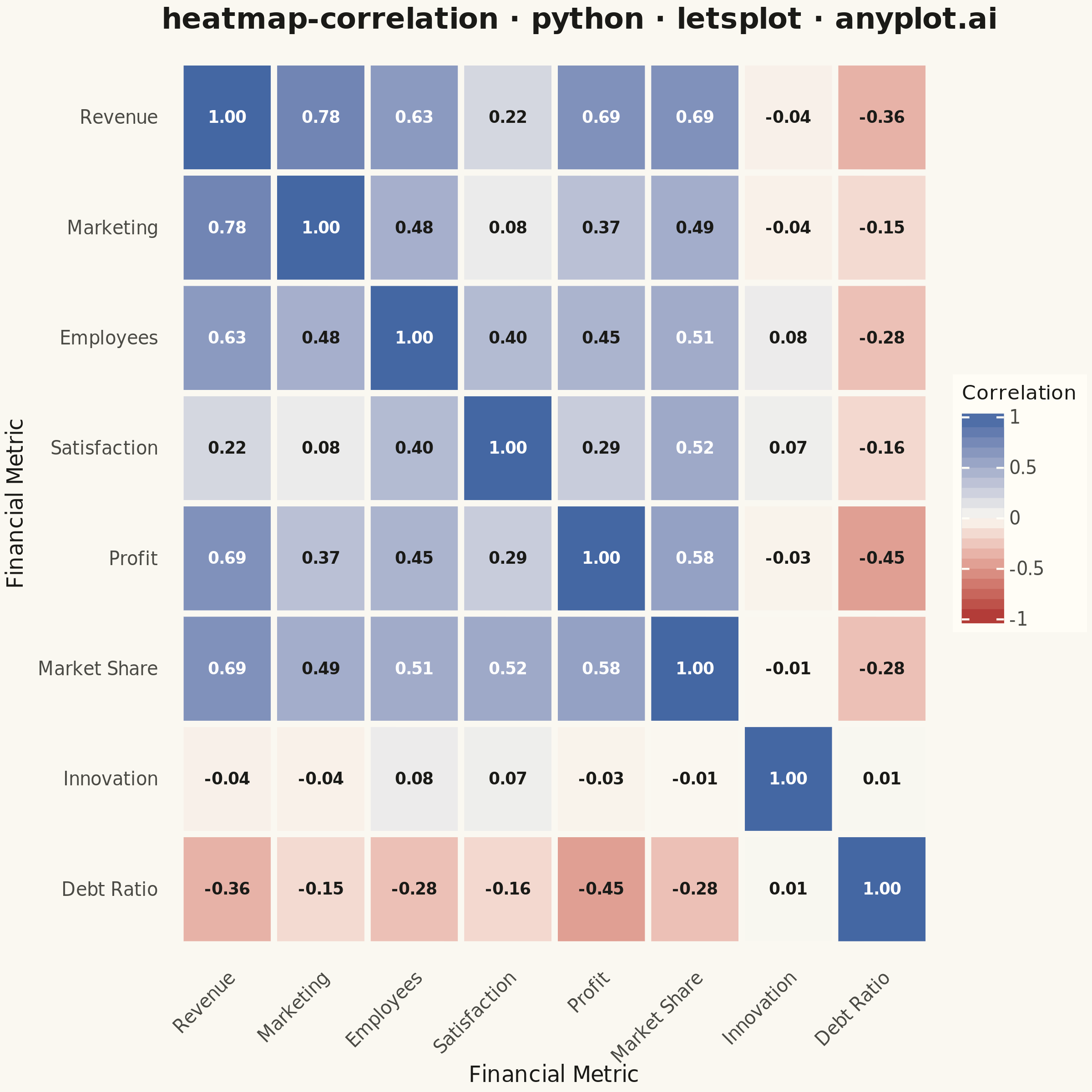
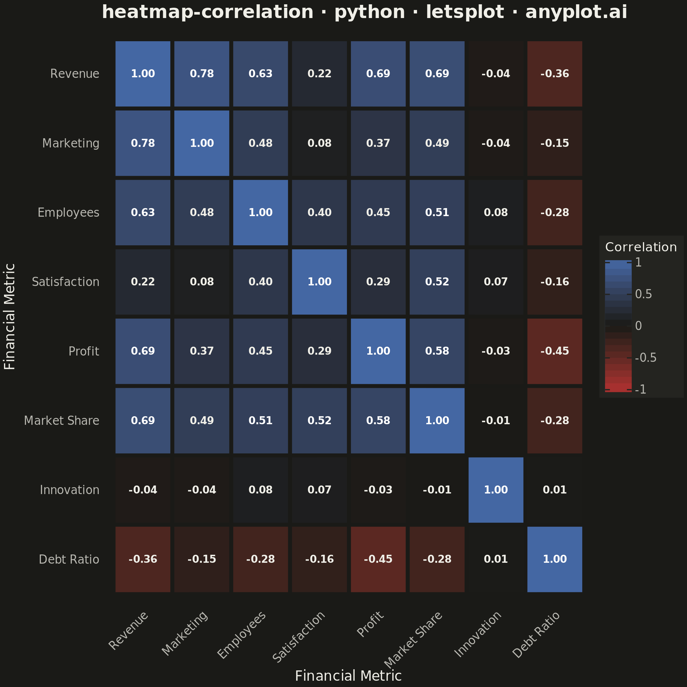
A heatmap specifically designed to display correlation coefficients between variables, using a diverging color scheme centered at zero. The symmetric matrix visualization makes it easy to identify positive correlations, negative correlations, and independent variables at a glance. Essential for exploratory data analysis, feature engineering, and multicollinearity detection in statistical and machine learning workflows.
""" anyplot.ai
heatmap-correlation: Correlation Matrix Heatmap
Library: letsplot 4.11.0 | Python 3.13.15
Quality: 88/100 | Updated: 2026-08-18
"""

import os

import numpy as np
import pandas as pd
from lets_plot import (
    LetsPlot,
    aes,
    element_blank,
    element_rect,
    element_text,
    geom_text,
    geom_tile,
    ggplot,
    ggsave,
    ggsize,
    labs,
    scale_color_identity,
    scale_fill_gradient2,
    theme,
)


LetsPlot.setup_html()

# Theme tokens (see prompts/default-style-guide.md "Theme-adaptive Chrome")
THEME = os.getenv("ANYPLOT_THEME", "light")
PAGE_BG = "#FAF8F1" if THEME == "light" else "#1A1A17"
ELEVATED_BG = "#FFFDF6" if THEME == "light" else "#242420"
INK = "#1A1A17" if THEME == "light" else "#F0EFE8"
INK_SOFT = "#4A4A44" if THEME == "light" else "#B8B7B0"
MIDPOINT = PAGE_BG  # imprint_div midpoint is theme-adaptive

# Data - realistic dataset with meaningful correlations
np.random.seed(42)
n = 200

revenue = np.random.normal(100, 20, n)
marketing_spend = 0.3 * revenue + np.random.normal(10, 5, n)
employees = 0.5 * revenue + np.random.normal(20, 10, n)
customer_satisfaction = 0.4 * employees - 0.1 * marketing_spend + np.random.normal(50, 15, n)
profit = 0.7 * revenue - 0.5 * marketing_spend + np.random.normal(20, 10, n)
market_share = 0.3 * revenue + 0.2 * customer_satisfaction + np.random.normal(15, 5, n)
innovation_index = np.random.normal(60, 20, n)  # Independent variable
debt_ratio = -0.4 * profit + np.random.normal(30, 10, n)

df = pd.DataFrame(
    {
        "Revenue": revenue,
        "Marketing": marketing_spend,
        "Employees": employees,
        "Satisfaction": customer_satisfaction,
        "Profit": profit,
        "Market Share": market_share,
        "Innovation": innovation_index,
        "Debt Ratio": debt_ratio,
    }
)

corr_matrix = df.corr()
variables = corr_matrix.columns.tolist()
var_pos = {v: i for i, v in enumerate(variables)}

# Long format for geom_tile; annotation color adapts to per-cell contrast
# (near-zero cells sit on the theme-adaptive midpoint, extremes on saturated
# red/blue) rather than a single hardcoded color. Upper triangle is masked
# (spec: "Consider masking upper or lower triangle to reduce redundancy") —
# every pair is symmetric, so only the lower triangle + diagonal is kept.
corr_data = []
for var_y in variables:
    for var_x in variables:
        if var_pos[var_x] > var_pos[var_y]:
            continue
        corr_val = corr_matrix.loc[var_y, var_x]
        corr_data.append(
            {
                "x": var_x,
                "y": var_y,
                "correlation": corr_val,
                "label": f"{corr_val:.2f}",
                "text_color": "#FFFFFF" if abs(corr_val) > 0.5 else INK,
            }
        )

corr_df = pd.DataFrame(corr_data)
corr_df["x"] = pd.Categorical(corr_df["x"], categories=variables, ordered=True)
corr_df["y"] = pd.Categorical(corr_df["y"], categories=variables[::-1], ordered=True)

# Storytelling focal point: outline the strongest off-diagonal correlation
# so the reader's eye lands on the standout relationship, not just a flat grid.
off_diagonal = corr_df[corr_df["x"].astype(str) != corr_df["y"].astype(str)]
strongest = off_diagonal.loc[off_diagonal["correlation"].abs().idxmax()]
highlight_df = pd.DataFrame([strongest])

# Title — mandated format, scaled per prompts/plot-generator.md
title = "heatmap-correlation · python · letsplot · anyplot.ai"
title_fontsize = round(16 * min(1.0, 67 / len(title)))

# Plot — square canvas for a symmetric matrix (600x600 @ scale=4 -> 2400x2400)
plot = (
    ggplot(corr_df, aes(x="x", y="y", fill="correlation"))
    + geom_tile(color=PAGE_BG, size=1.5)
    + geom_tile(data=highlight_df, fill=PAGE_BG, alpha=0, color=INK, size=3, tooltips="none")
    + geom_text(aes(label="label", color="text_color"), size=4.5, fontface="bold", tooltips="none")
    + scale_color_identity()
    + scale_fill_gradient2(
        low="#AE3030",  # Imprint diverging — negative correlation
        mid=MIDPOINT,  # theme-adaptive midpoint
        high="#4467A3",  # Imprint diverging — positive correlation
        midpoint=0,
        limits=[-1, 1],
        name="Correlation",
    )
    + labs(x="Financial Metric", y="Financial Metric", title=title)
    + theme(
        plot_background=element_rect(fill=PAGE_BG, color=PAGE_BG),
        panel_background=element_rect(fill=PAGE_BG, color=PAGE_BG),
        panel_grid=element_blank(),
        axis_ticks=element_blank(),
        axis_line=element_blank(),
        plot_title=element_text(size=title_fontsize, face="bold", color=INK),
        axis_title=element_text(size=12, color=INK),
        axis_text_x=element_text(size=10, color=INK_SOFT, angle=45, hjust=1),
        axis_text_y=element_text(size=10, color=INK_SOFT),
        legend_background=element_rect(fill=ELEVATED_BG, color=INK_SOFT),
        legend_title=element_text(size=11, color=INK),
        legend_text=element_text(size=10, color=INK_SOFT),
    )
    + ggsize(600, 600)
)

# Save (PNG + interactive HTML)
ggsave(plot, f"plot-{THEME}.png", path=".", scale=4)
ggsave(plot, f"plot-{THEME}.html", path=".")
Runnable source as JSON, for any HTTP client: https://api.anyplot.ai/specs/heatmap-correlation/letsplot/code. Any spec id and library id listed in llms-full.txt fit the same URL shape; every URL below is complete and callable.
{
  "spec_id": "heatmap-correlation",
  "language": "python",
  "library": "letsplot",
  "page": "https://anyplot.ai/heatmap-correlation/python/letsplot",
  "hub": "https://anyplot.ai/heatmap-correlation",
  "code_json": "https://api.anyplot.ai/specs/heatmap-correlation/letsplot/code",
  "spec_json": "https://api.anyplot.ai/specs/heatmap-correlation",
  "render_light_png": "https://storage.googleapis.com/anyplot-images/plots/heatmap-correlation/python/letsplot/plot-light.png",
  "render_dark_png": "https://storage.googleapis.com/anyplot-images/plots/heatmap-correlation/python/letsplot/plot-dark.png",
  "interactive_light_html": "https://storage.googleapis.com/anyplot-images/plots/heatmap-correlation/python/letsplot/plot-light.html",
  "interactive_dark_html": "https://storage.googleapis.com/anyplot-images/plots/heatmap-correlation/python/letsplot/plot-dark.html",
  "quality_score": 88.0,
  "license": "MIT",
  "guide": "https://anyplot.ai/llms.txt"
}
Part of Correlation Matrix Heatmap on anyplot.ai.