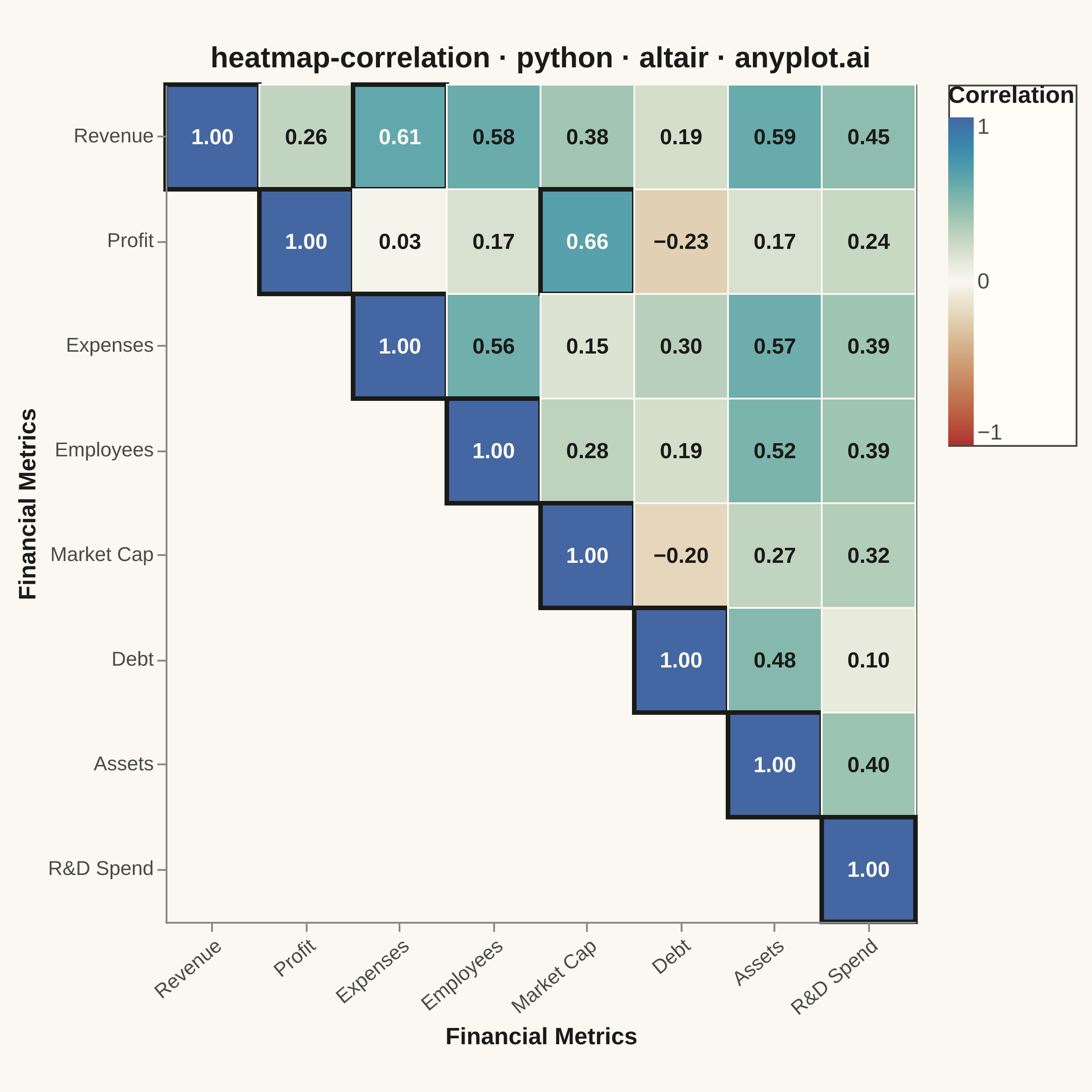
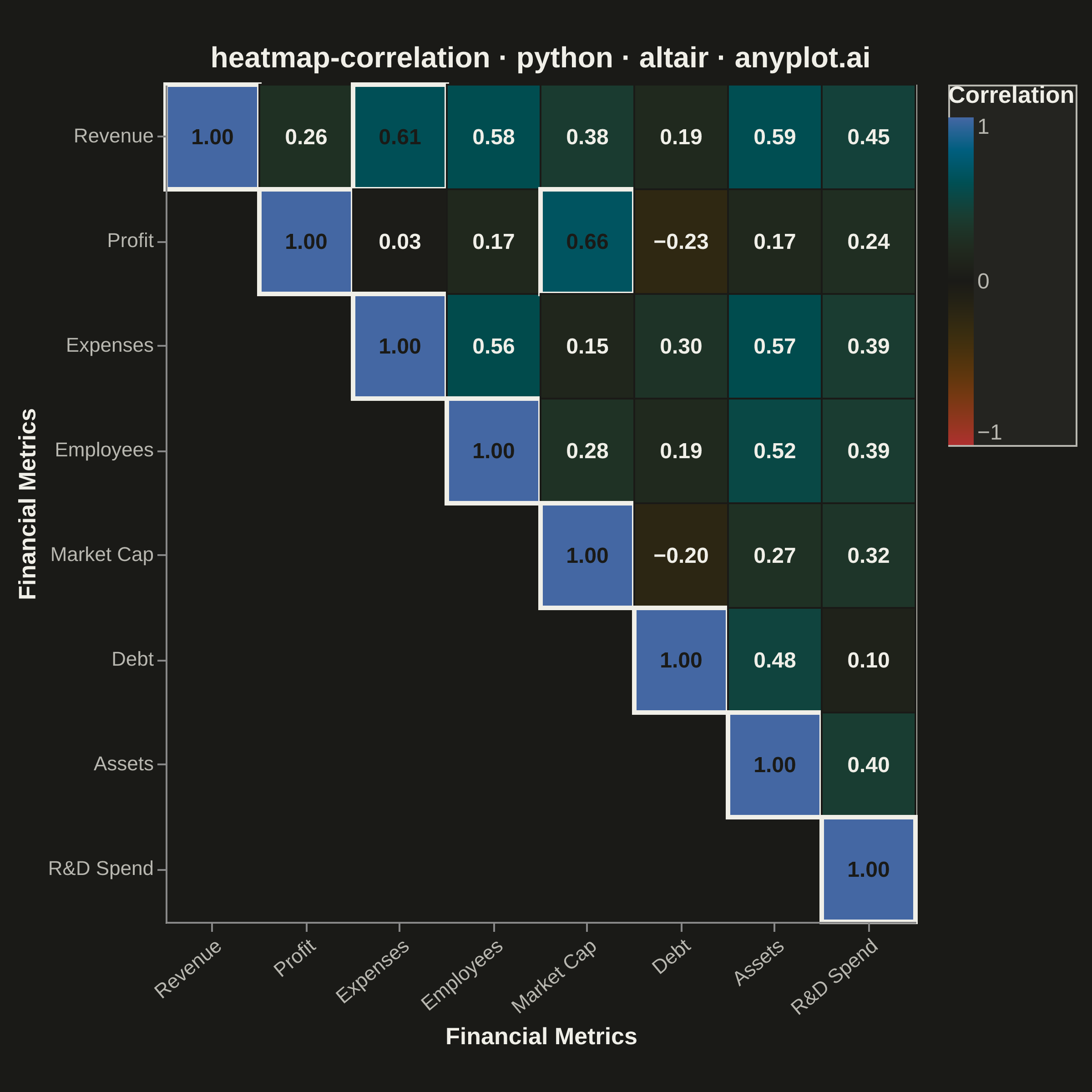
A heatmap specifically designed to display correlation coefficients between variables, using a diverging color scheme centered at zero. The symmetric matrix visualization makes it easy to identify positive correlations, negative correlations, and independent variables at a glance. Essential for exploratory data analysis, feature engineering, and multicollinearity detection in statistical and machine learning workflows.
""" anyplot.ai
heatmap-correlation: Correlation Matrix Heatmap
Library: altair 6.2.2 | Python 3.13.15
Quality: 92/100 | Updated: 2026-08-18
"""

import os

import altair as alt
import numpy as np
import pandas as pd
from PIL import Image


# Theme tokens (Imprint palette — theme-adaptive chrome)
THEME = os.getenv("ANYPLOT_THEME", "light")
PAGE_BG = "#FAF8F1" if THEME == "light" else "#1A1A17"
ELEVATED_BG = "#FFFDF6" if THEME == "light" else "#242420"
INK = "#1A1A17" if THEME == "light" else "#F0EFE8"
INK_SOFT = "#4A4A44" if THEME == "light" else "#B8B7B0"

# Data - realistic financial metrics correlation matrix
np.random.seed(42)

variables = ["Revenue", "Profit", "Expenses", "Employees", "Market Cap", "Debt", "Assets", "R&D Spend"]
n = len(variables)

# Latent-factor model ("company scale", "profitability", "leverage") so relationships
# read as economically sensible: bigger companies have more Revenue/Expenses/Employees/
# Assets (scale factor), Profit tracks Market Cap (profitability factor), and Debt scales
# with leverage independent of profitability.
loadings = np.array(
    [
        [0.82, 0.15, 0.00],  # Revenue
        [0.20, 0.85, -0.10],  # Profit
        [0.84, -0.15, 0.05],  # Expenses
        [0.65, 0.05, 0.00],  # Employees
        [0.35, 0.82, -0.10],  # Market Cap
        [0.30, -0.30, 0.78],  # Debt
        [0.72, 0.10, 0.42],  # Assets
        [0.42, 0.15, 0.00],  # R&D Spend
    ]
)
idiosyncratic = np.diag(0.30 + 0.15 * np.random.rand(n))
covariance = loadings @ loadings.T + idiosyncratic
D = np.sqrt(np.diag(covariance))
correlation = covariance / np.outer(D, D)
np.fill_diagonal(correlation, 1.0)
correlation = np.round(correlation, 2)

# Convert to long format for Altair, masking the upper triangle to avoid redundancy
rows = [
    {"Variable 1": variables[i], "Variable 2": variables[j], "Correlation": correlation[i, j]}
    for i in range(n)
    for j in range(n)
    if i >= j
]
df = pd.DataFrame(rows)

# Highlight strong correlations (|r| > 0.6) with an ink outline for visual hierarchy
strong = (alt.datum.Correlation > 0.6) | (alt.datum.Correlation < -0.6)

title = "heatmap-correlation · python · altair · anyplot.ai"
title_fontsize = round(16 * (67 / len(title) if len(title) > 67 else 1.0))

base = alt.Chart(df).encode(
    x=alt.X(
        "Variable 1:N",
        title="Financial Metrics",
        sort=variables,
        axis=alt.Axis(
            labelAngle=-40,
            labelFontSize=11,
            labelColor=INK_SOFT,
            titleColor=INK,
            titleFontSize=13,
            titleFontWeight="bold",
            grid=False,
        ),
    ),
    y=alt.Y(
        "Variable 2:N",
        title="Financial Metrics",
        sort=variables,
        axis=alt.Axis(
            labelFontSize=11, labelColor=INK_SOFT, titleColor=INK, titleFontSize=13, titleFontWeight="bold", grid=False
        ),
    ),
)

# Heatmap cells: Imprint diverging colormap centered on zero, fixed -1..1 domain
heatmap = base.mark_rect().encode(
    color=alt.Color(
        "Correlation:Q",
        scale=alt.Scale(domain=[-1, 1], range=["#AE3030", PAGE_BG, "#4467A3"], domainMid=0),
        legend=alt.Legend(
            title="Correlation",
            titleFontSize=13,
            titleColor=INK,
            labelFontSize=12,
            labelColor=INK_SOFT,
            gradientLength=180,
            gradientThickness=14,
            fillColor=ELEVATED_BG,
            strokeColor=INK_SOFT,
        ),
    ),
    stroke=alt.condition(strong, alt.value(INK), alt.value(PAGE_BG)),
    strokeWidth=alt.condition(strong, alt.value(2.5), alt.value(1)),
    tooltip=[
        alt.Tooltip("Variable 1:N", title="X Variable"),
        alt.Tooltip("Variable 2:N", title="Y Variable"),
        alt.Tooltip("Correlation:Q", title="Correlation", format=".3f"),
    ],
)

# Correlation value annotations, with contrast-aware text color per cell
text = base.mark_text(fontSize=12, fontWeight="bold").encode(
    text=alt.Text("Correlation:Q", format=".2f"), color=alt.condition(strong, alt.value(PAGE_BG), alt.value(INK))
)

chart = (
    (heatmap + text)
    .properties(
        background=PAGE_BG,
        width=412,
        height=460,
        title=alt.Title(title, fontSize=title_fontsize, fontWeight="bold", anchor="middle", color=INK),
    )
    .configure_view(fill=PAGE_BG, stroke=INK_SOFT, continuousWidth=412, continuousHeight=460)
)

# Hard target: 2400 x 2400 (square). See prompts/library/altair.md "Canvas".
chart.save(f"plot-{THEME}.png", scale_factor=4.0)

TW, TH = 2400, 2400
_img = Image.open(f"plot-{THEME}.png").convert("RGB")
_w, _h = _img.size
if _w > TW or _h > TH:
    raise SystemExit(
        f"altair vl-convert produced {_w}x{_h}, exceeds target {TW}x{TH}. "
        f"Shrink chart .properties(width=, height=) values and re-render."
    )
if _w < TW or _h < TH:
    _canvas = Image.new("RGB", (TW, TH), PAGE_BG)
    _canvas.paste(_img, ((TW - _w) // 2, (TH - _h) // 2))
    _canvas.save(f"plot-{THEME}.png")

chart.save(f"plot-{THEME}.html")
Runnable source as JSON, for any HTTP client: https://api.anyplot.ai/specs/heatmap-correlation/altair/code. Any spec id and library id listed in llms-full.txt fit the same URL shape; every URL below is complete and callable.
{
  "spec_id": "heatmap-correlation",
  "language": "python",
  "library": "altair",
  "page": "https://anyplot.ai/heatmap-correlation/python/altair",
  "hub": "https://anyplot.ai/heatmap-correlation",
  "code_json": "https://api.anyplot.ai/specs/heatmap-correlation/altair/code",
  "spec_json": "https://api.anyplot.ai/specs/heatmap-correlation",
  "render_light_png": "https://storage.googleapis.com/anyplot-images/plots/heatmap-correlation/python/altair/plot-light.png",
  "render_dark_png": "https://storage.googleapis.com/anyplot-images/plots/heatmap-correlation/python/altair/plot-dark.png",
  "interactive_light_html": "https://storage.googleapis.com/anyplot-images/plots/heatmap-correlation/python/altair/plot-light.html",
  "interactive_dark_html": "https://storage.googleapis.com/anyplot-images/plots/heatmap-correlation/python/altair/plot-dark.html",
  "quality_score": 92.0,
  "license": "MIT",
  "guide": "https://anyplot.ai/llms.txt"
}
Part of Correlation Matrix Heatmap on anyplot.ai.