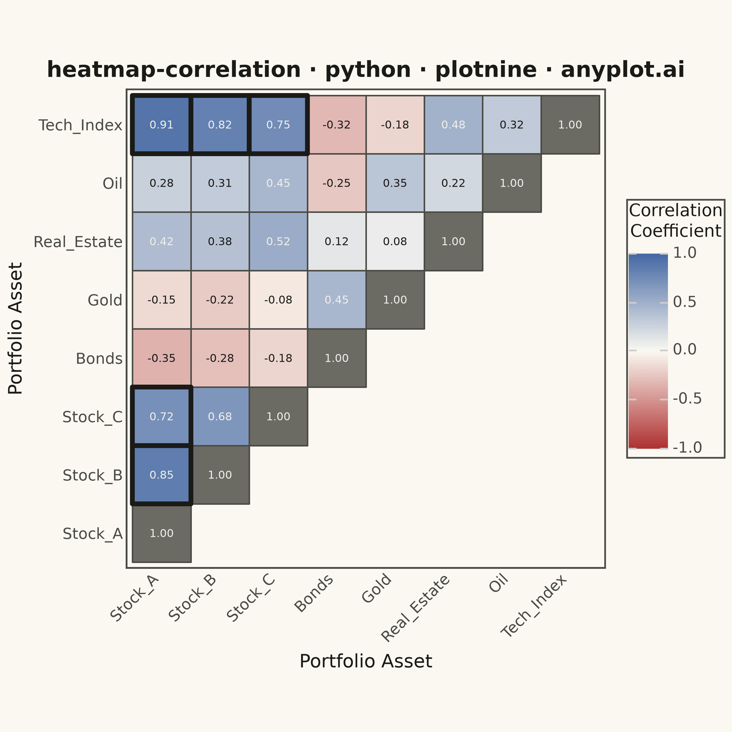
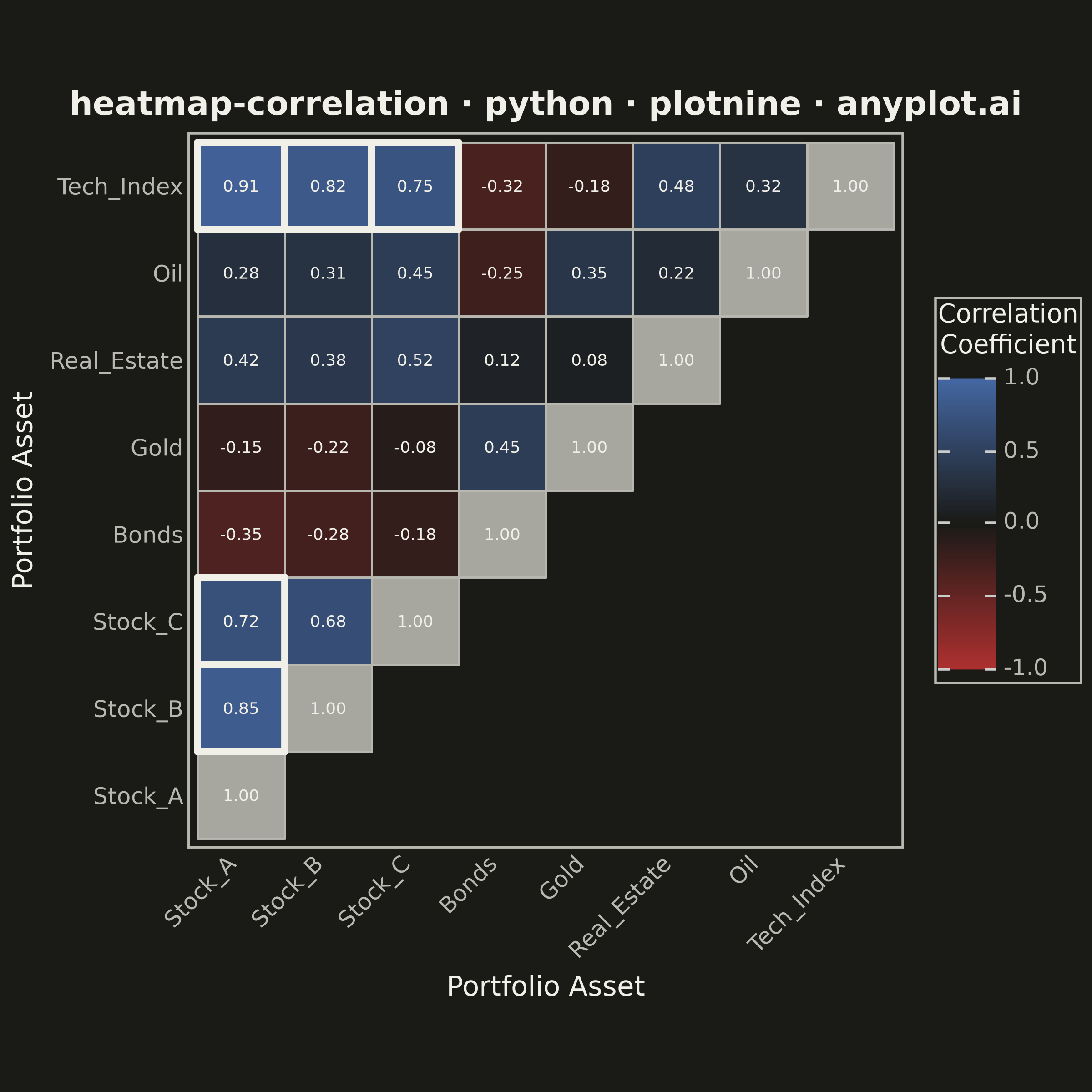
A heatmap specifically designed to display correlation coefficients between variables, using a diverging color scheme centered at zero. The symmetric matrix visualization makes it easy to identify positive correlations, negative correlations, and independent variables at a glance. Essential for exploratory data analysis, feature engineering, and multicollinearity detection in statistical and machine learning workflows.
""" anyplot.ai
heatmap-correlation: Correlation Matrix Heatmap
Library: plotnine 0.15.8 | Python 3.13.15
Quality: 90/100 | Updated: 2026-08-18
"""

import os

import numpy as np
import pandas as pd
from plotnine import (
    aes,
    coord_fixed,
    element_blank,
    element_line,
    element_rect,
    element_text,
    geom_text,
    geom_tile,
    ggplot,
    labs,
    scale_color_identity,
    scale_fill_gradient2,
    theme,
    theme_minimal,
)


# Theme tokens
THEME = os.getenv("ANYPLOT_THEME", "light")
PAGE_BG = "#FAF8F1" if THEME == "light" else "#1A1A17"
INK = "#1A1A17" if THEME == "light" else "#F0EFE8"
INK_SOFT = "#4A4A44" if THEME == "light" else "#B8B7B0"
INK_MUTED = "#6B6A63" if THEME == "light" else "#A8A79F"

# Imprint diverging colormap (imprint_div) — matte-red <-> page background <-> blue
DIV_LOW = "#AE3030"
DIV_HIGH = "#4467A3"
DARK_TEXT = "#1A1A17"
LIGHT_TEXT = "#F0EFE8"


def _hex_to_rgb(hex_color):
    hex_color = hex_color.lstrip("#")
    return tuple(int(hex_color[i : i + 2], 16) / 255 for i in (0, 2, 4))


def _lerp_hex(hex_a, hex_b, t):
    ra, ga, ba = _hex_to_rgb(hex_a)
    rb, gb, bb = _hex_to_rgb(hex_b)
    r = round((ra + (rb - ra) * t) * 255)
    g = round((ga + (gb - ga) * t) * 255)
    b = round((ba + (bb - ba) * t) * 255)
    return f"#{r:02x}{g:02x}{b:02x}"


def _relative_luminance(hex_color):
    def channel(c):
        return c / 12.92 if c <= 0.03928 else ((c + 0.055) / 1.055) ** 2.4

    r, g, b = _hex_to_rgb(hex_color)
    return 0.2126 * channel(r) + 0.7152 * channel(g) + 0.0722 * channel(b)


def cell_fill_hex(value):
    """Mirror scale_fill_gradient2's low/mid/high interpolation so annotation
    text color can be judged against the cell's actual rendered background
    rather than against the page-level theme token."""
    if value <= 0:
        return _lerp_hex(DIV_LOW, PAGE_BG, value + 1)
    return _lerp_hex(PAGE_BG, DIV_HIGH, value)


def text_color_for(hex_color):
    return DARK_TEXT if _relative_luminance(hex_color) > 0.5 else LIGHT_TEXT


# Data - realistic financial/portfolio variables for correlation analysis
np.random.seed(42)

variables = ["Stock_A", "Stock_B", "Stock_C", "Bonds", "Gold", "Real_Estate", "Oil", "Tech_Index"]

# Realistic correlation matrix: positive correlations among stocks, negative
# correlations for bonds vs. stocks, and near-zero correlations for gold.
base_corr = np.array(
    [
        [1.00, 0.85, 0.72, -0.35, -0.15, 0.42, 0.28, 0.91],  # Stock_A
        [0.85, 1.00, 0.68, -0.28, -0.22, 0.38, 0.31, 0.82],  # Stock_B
        [0.72, 0.68, 1.00, -0.18, -0.08, 0.52, 0.45, 0.75],  # Stock_C
        [-0.35, -0.28, -0.18, 1.00, 0.45, 0.12, -0.25, -0.32],  # Bonds
        [-0.15, -0.22, -0.08, 0.45, 1.00, 0.08, 0.35, -0.18],  # Gold
        [0.42, 0.38, 0.52, 0.12, 0.08, 1.00, 0.22, 0.48],  # Real_Estate
        [0.28, 0.31, 0.45, -0.25, 0.35, 0.22, 1.00, 0.32],  # Oil
        [0.91, 0.82, 0.75, -0.32, -0.18, 0.48, 0.32, 1.00],  # Tech_Index
    ]
)

# Long format, lower triangle only (incl. diagonal) to avoid redundancy.
# The diagonal is trivially 1.00 for every asset, so its fill is masked to a
# neutral tone (still annotated with the real value) — this keeps the two
# strong-color endpoints reserved for genuinely informative relationships.
rows = []
for i, var1 in enumerate(variables):
    for j, var2 in enumerate(variables):
        if i >= j:
            value = base_corr[i, j]
            is_diagonal = i == j
            fill_hex = INK_MUTED if is_diagonal else cell_fill_hex(value)
            rows.append(
                {
                    "Var1": var1,
                    "Var2": var2,
                    "Correlation": value,
                    "Correlation_fill": np.nan if is_diagonal else value,
                    "text_color": text_color_for(fill_hex),
                    "is_strong": (not is_diagonal) and abs(value) >= 0.7,
                }
            )

df = pd.DataFrame(rows)
df["Var1"] = pd.Categorical(df["Var1"], categories=variables, ordered=True)
df["Var2"] = pd.Categorical(df["Var2"], categories=variables, ordered=True)

# Strong relationships (|r| >= 0.7) get a bolder outline — a lightweight,
# distinctive cue that draws the eye to the correlations worth acting on.
strong_df = df[df["is_strong"]]

plot = (
    ggplot(df, aes(x="Var2", y="Var1"))
    + geom_tile(aes(fill="Correlation_fill"), color=INK_SOFT, size=0.5)
    + geom_tile(data=strong_df, mapping=aes(x="Var2", y="Var1"), fill=None, color=INK, size=1.6)
    + geom_text(aes(label="Correlation", color="text_color"), format_string="{:.2f}", size=6.5)
    + scale_fill_gradient2(
        low=DIV_LOW,
        mid=PAGE_BG,
        high=DIV_HIGH,
        midpoint=0,
        limits=(-1, 1),
        na_value=INK_MUTED,
        name="Correlation\nCoefficient",
    )
    + scale_color_identity()
    + coord_fixed(ratio=1)
    + labs(title="heatmap-correlation · python · plotnine · anyplot.ai", x="Portfolio Asset", y="Portfolio Asset")
    + theme_minimal()
    + theme(
        figure_size=(6, 6),  # 6x6 at 400 DPI = 2400x2400 px
        plot_background=element_rect(fill=PAGE_BG, color=PAGE_BG),
        panel_background=element_rect(fill=PAGE_BG),
        panel_grid_major=element_blank(),
        panel_grid_minor=element_blank(),
        panel_border=element_rect(color=INK_SOFT, fill=None),
        plot_title=element_text(size=13, color=INK, ha="center", weight="bold"),
        axis_title_x=element_text(size=11, color=INK),
        axis_title_y=element_text(size=11, color=INK),
        axis_text_x=element_text(size=9, color=INK_SOFT, rotation=45, ha="right"),
        axis_text_y=element_text(size=9, color=INK_SOFT),
        axis_line=element_line(color=INK_SOFT),
        legend_background=element_rect(fill=PAGE_BG, color=INK_SOFT),
        legend_title=element_text(size=10, color=INK),
        legend_text=element_text(size=9, color=INK_SOFT),
    )
)

# Save at 400 DPI for 2400x2400 pixel output
script_dir = os.path.dirname(os.path.abspath(__file__))
os.chdir(script_dir)
plot.save(f"plot-{THEME}.png", dpi=400, width=6, height=6, units="in")
Runnable source as JSON, for any HTTP client: https://api.anyplot.ai/specs/heatmap-correlation/plotnine/code. Any spec id and library id listed in llms-full.txt fit the same URL shape; every URL below is complete and callable.
{
  "spec_id": "heatmap-correlation",
  "language": "python",
  "library": "plotnine",
  "page": "https://anyplot.ai/heatmap-correlation/python/plotnine",
  "hub": "https://anyplot.ai/heatmap-correlation",
  "code_json": "https://api.anyplot.ai/specs/heatmap-correlation/plotnine/code",
  "spec_json": "https://api.anyplot.ai/specs/heatmap-correlation",
  "render_light_png": "https://storage.googleapis.com/anyplot-images/plots/heatmap-correlation/python/plotnine/plot-light.png",
  "render_dark_png": "https://storage.googleapis.com/anyplot-images/plots/heatmap-correlation/python/plotnine/plot-dark.png",
  "quality_score": 90.0,
  "license": "MIT",
  "guide": "https://anyplot.ai/llms.txt"
}
Part of Correlation Matrix Heatmap on anyplot.ai.