The same plot in 14 other libraries — JavaScript: D3.js, Apache ECharts, Highcharts, MUI X Charts; Python: Altair, Bokeh, lets-plot, Matplotlib, Plotly, plotnine, Pygal, Seaborn; R: ggplot2; Julia: Makie.jl. Compare all 15 side by side: Epidemic Curve (Epi Curve) in Python, R, Julia and JavaScript.
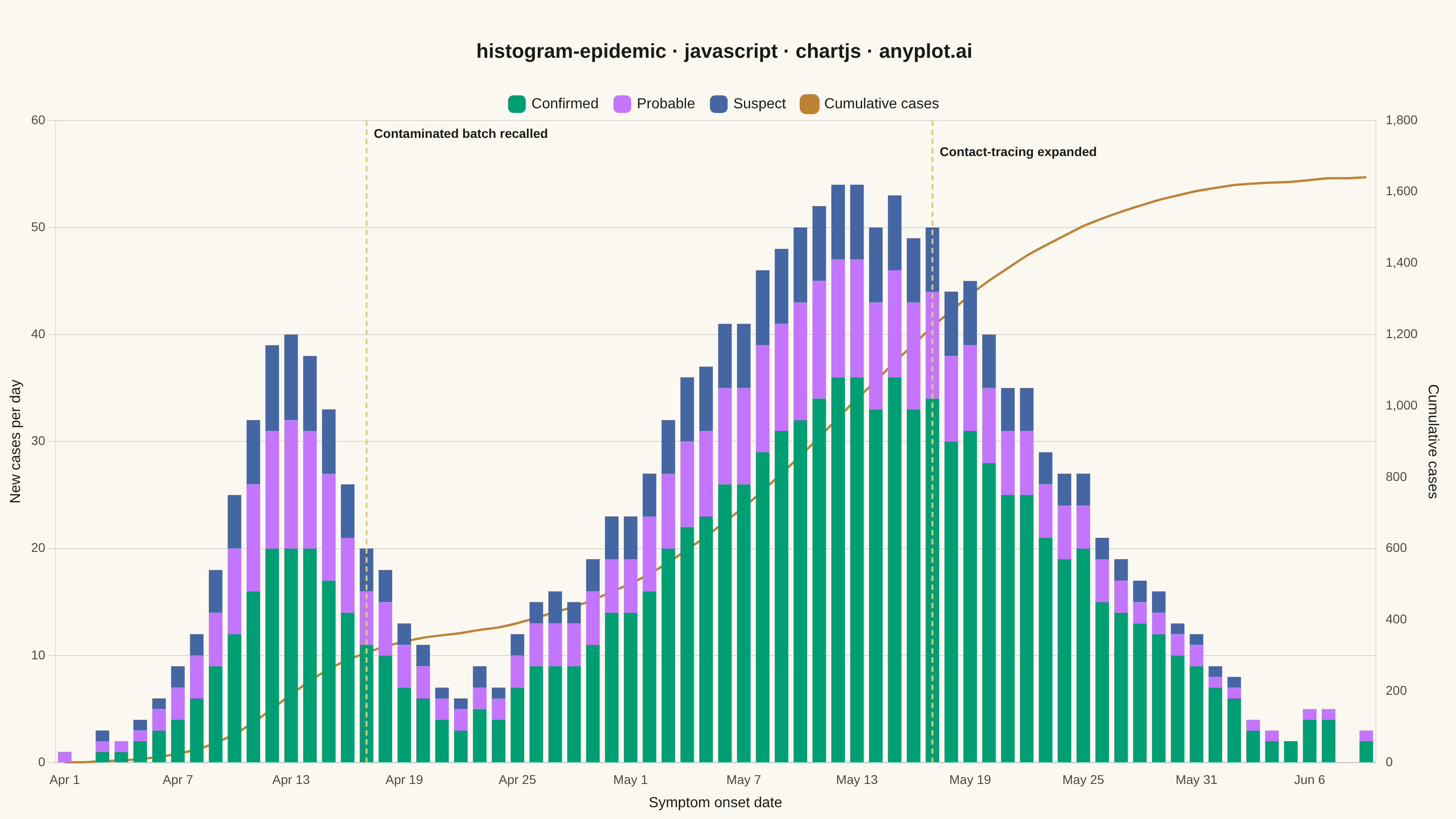
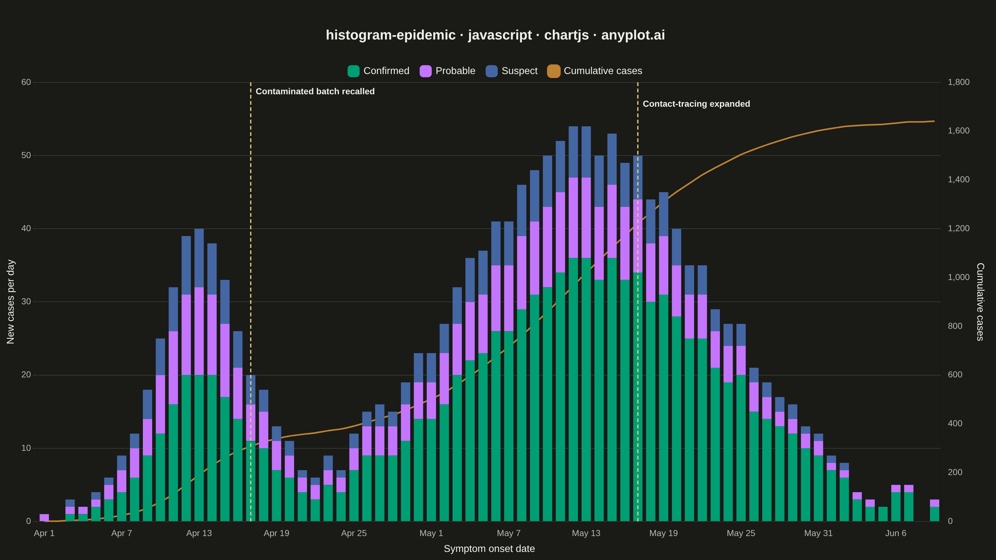
An epidemic curve (epi curve) is a histogram showing the number of new disease cases over time, plotted by date of symptom onset. The shape of the curve reveals the outbreak pattern: a sharp peak indicates a point source, successive waves suggest propagated transmission, and a plateau indicates continuous exposure. It is fundamental to epidemiological investigation and public health surveillance.
// anyplot.ai
// histogram-epidemic: Epidemic Curve (Epi Curve)
// Library: chartjs 4.4.7 | JavaScript 22.23.2
// Quality: 90/100 | Created: 2026-08-26

const t = window.ANYPLOT_TOKENS;

// --- Data (in-memory, deterministic) ----------------------------------------
// Simulates a 70-day foodborne-then-propagated outbreak of symptom-onset dates:
// a sharp point-source peak (contaminated batch) followed by a broader second
// wave (person-to-person spread). Confirmed/probable/suspect mirrors real
// surveillance triage; the confirmed share rises over time as lab capacity
// catches up with the caseload.
let seed = 42;
const nextRand = () => {
  seed = (seed * 1103515245 + 12345) & 0x7fffffff;
  return seed / 0x7fffffff;
};

const DAYS = 70;
const START_DATE = new Date("2024-04-01T00:00:00Z");
const MONTH_ABBR = ["Jan", "Feb", "Mar", "Apr", "May", "Jun", "Jul", "Aug", "Sep", "Oct", "Nov", "Dec"];

const gaussian = (x, mean, std, amplitude) => amplitude * Math.exp(-((x - mean) ** 2) / (2 * std * std));

const dateLabels = [];
const confirmed = [];
const probable = [];
const suspect = [];
const cumulative = [];
let runningTotal = 0;

for (let day = 0; day < DAYS; day++) {
  const d = new Date(START_DATE);
  d.setUTCDate(d.getUTCDate() + day);
  dateLabels.push(`${MONTH_ABBR[d.getUTCMonth()]} ${d.getUTCDate()}`);

  const pointSource = gaussian(day, 12, 3.5, 38);
  const propagatedWave = gaussian(day, 42, 10, 52);
  const dailyTotal = Math.max(0, Math.round(pointSource + propagatedWave + (nextRand() - 0.5) * 5));

  // Lab confirmation capacity improves as the outbreak matures.
  const confirmedShare = 0.45 + 0.35 * (day / (DAYS - 1));
  const confirmedCount = Math.round(dailyTotal * confirmedShare);
  const remaining = dailyTotal - confirmedCount;
  const probableCount = Math.round(remaining * 0.6);
  const suspectCount = remaining - probableCount;

  confirmed.push(confirmedCount);
  probable.push(probableCount);
  suspect.push(suspectCount);

  runningTotal += confirmedCount + probableCount + suspectCount;
  cumulative.push(runningTotal);
}

// Intervention events called out on the epi curve, per surveillance convention.
const interventions = [
  { dayIndex: 16, label: "Contaminated batch recalled" },
  { dayIndex: 46, label: "Contact-tracing expanded" },
];

// Dashed vertical markers + labels for the intervention events, drawn with
// Chart.js's native per-chart plugin hook (no external annotation plugin).
const interventionMarkerPlugin = {
  id: "interventionMarkers",
  afterDraw(chart) {
    const { ctx, chartArea, scales } = chart;
    ctx.save();
    interventions.forEach((event, i) => {
      const x = scales.x.getPixelForValue(dateLabels[event.dayIndex], event.dayIndex);
      ctx.strokeStyle = t.amber;
      ctx.lineWidth = 2;
      ctx.setLineDash([6, 4]);
      ctx.beginPath();
      ctx.moveTo(x, chartArea.top);
      ctx.lineTo(x, chartArea.bottom);
      ctx.stroke();

      ctx.setLineDash([]);
      ctx.fillStyle = t.ink;
      ctx.font = "600 14px sans-serif";
      ctx.textAlign = "left";
      ctx.textBaseline = "top";
      ctx.fillText(event.label, x + 8, chartArea.top + 8 + i * 20);
    });
    ctx.restore();
  },
};

// --- Mount -------------------------------------------------------------------
const canvas = document.createElement("canvas");
document.getElementById("container").appendChild(canvas);

// --- Chart -------------------------------------------------------------------
new Chart(canvas, {
  data: {
    labels: dateLabels,
    datasets: [
      {
        type: "bar",
        label: "Confirmed",
        data: confirmed,
        backgroundColor: t.palette[0],
        stack: "cases",
        yAxisID: "y",
      },
      {
        type: "bar",
        label: "Probable",
        data: probable,
        backgroundColor: t.palette[1],
        stack: "cases",
        yAxisID: "y",
      },
      {
        type: "bar",
        label: "Suspect",
        data: suspect,
        backgroundColor: t.palette[2],
        stack: "cases",
        yAxisID: "y",
      },
      {
        type: "line",
        label: "Cumulative cases",
        data: cumulative,
        borderColor: t.palette[3],
        backgroundColor: t.palette[3],
        borderWidth: 2.5,
        pointRadius: 0,
        tension: 0.2,
        yAxisID: "y1",
      },
    ],
  },
  plugins: [interventionMarkerPlugin],
  options: {
    responsive: true,
    maintainAspectRatio: false,
    animation: false,
    interaction: { intersect: false, mode: "index" },
    layout: { padding: { top: 40, right: 12, bottom: 4, left: 4 } },
    plugins: {
      title: {
        display: true,
        text: "histogram-epidemic · javascript · chartjs · anyplot.ai",
        color: t.ink,
        font: { size: 22, weight: "bold" },
        padding: { top: 4, bottom: 18 },
      },
      legend: {
        labels: { color: t.ink, font: { size: 16 }, usePointStyle: true, pointStyle: "rectRounded", padding: 18 },
      },
    },
    scales: {
      x: {
        stacked: true,
        ticks: { color: t.inkSoft, font: { size: 14 }, maxTicksLimit: 12, maxRotation: 0 },
        grid: { display: false },
        title: { display: true, text: "Symptom onset date", color: t.ink, font: { size: 16 } },
      },
      y: {
        stacked: true,
        beginAtZero: true,
        position: "left",
        ticks: { color: t.inkSoft, font: { size: 14 } },
        grid: { color: t.grid },
        title: { display: true, text: "New cases per day", color: t.ink, font: { size: 16 } },
      },
      y1: {
        beginAtZero: true,
        position: "right",
        ticks: { color: t.inkSoft, font: { size: 14 } },
        grid: { display: false },
        title: { display: true, text: "Cumulative cases", color: t.ink, font: { size: 16 } },
      },
    },
  },
});
Runnable source as JSON, for any HTTP client: https://api.anyplot.ai/specs/histogram-epidemic/chartjs/code. Any spec id and library id listed in llms-full.txt fit the same URL shape; every URL below is complete and callable.
{
  "spec_id": "histogram-epidemic",
  "language": "javascript",
  "library": "chartjs",
  "page": "https://anyplot.ai/histogram-epidemic/javascript/chartjs",
  "hub": "https://anyplot.ai/histogram-epidemic",
  "code_json": "https://api.anyplot.ai/specs/histogram-epidemic/chartjs/code",
  "spec_json": "https://api.anyplot.ai/specs/histogram-epidemic",
  "render_light_png": "https://storage.googleapis.com/anyplot-images/plots/histogram-epidemic/javascript/chartjs/plot-light.png",
  "render_dark_png": "https://storage.googleapis.com/anyplot-images/plots/histogram-epidemic/javascript/chartjs/plot-dark.png",
  "interactive_light_html": "https://storage.googleapis.com/anyplot-images/plots/histogram-epidemic/javascript/chartjs/plot-light.html",
  "interactive_dark_html": "https://storage.googleapis.com/anyplot-images/plots/histogram-epidemic/javascript/chartjs/plot-dark.html",
  "quality_score": 90.0,
  "license": "MIT",
  "guide": "https://anyplot.ai/llms.txt"
}
Part of Epidemic Curve (Epi Curve) on anyplot.ai.