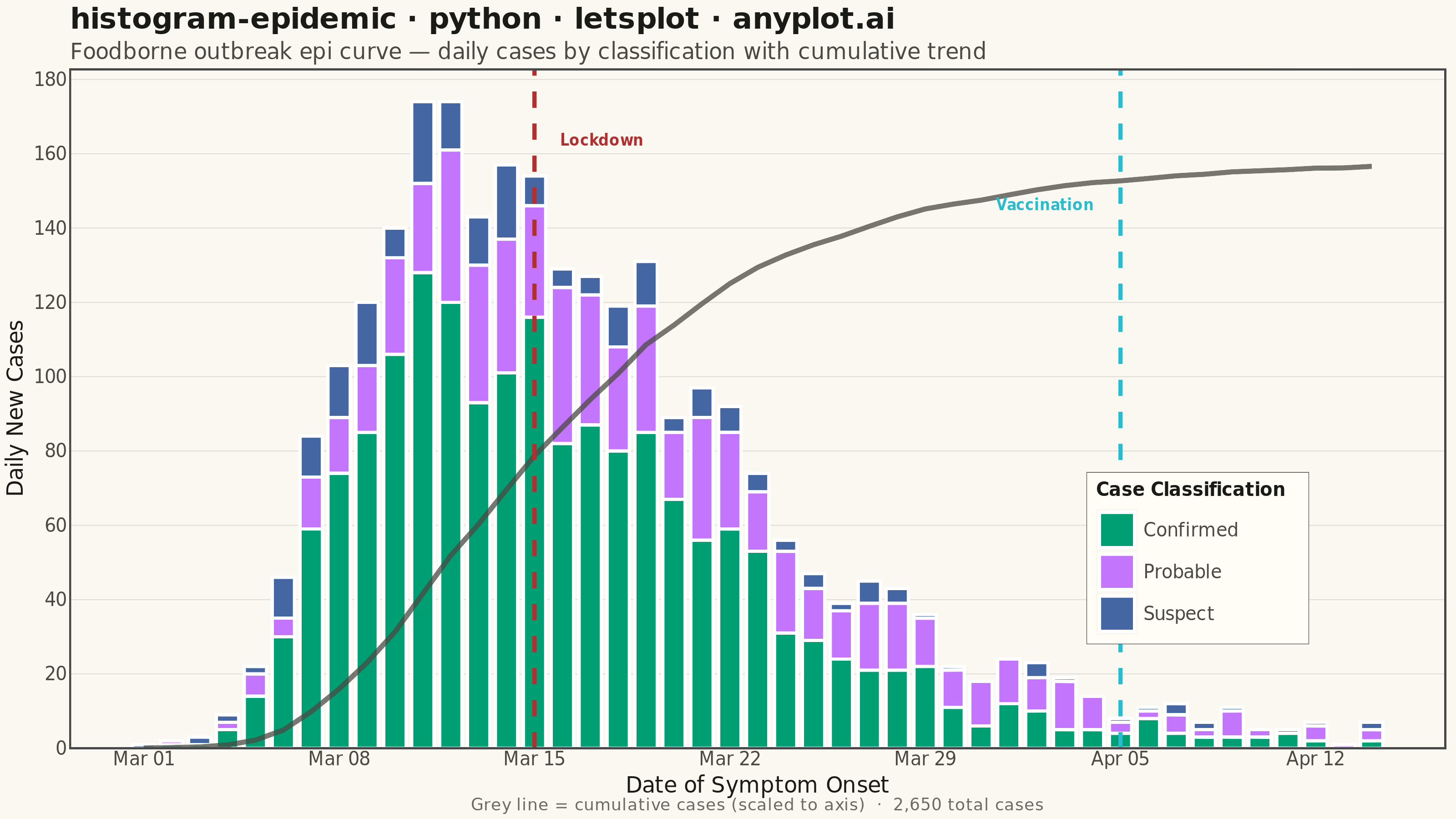
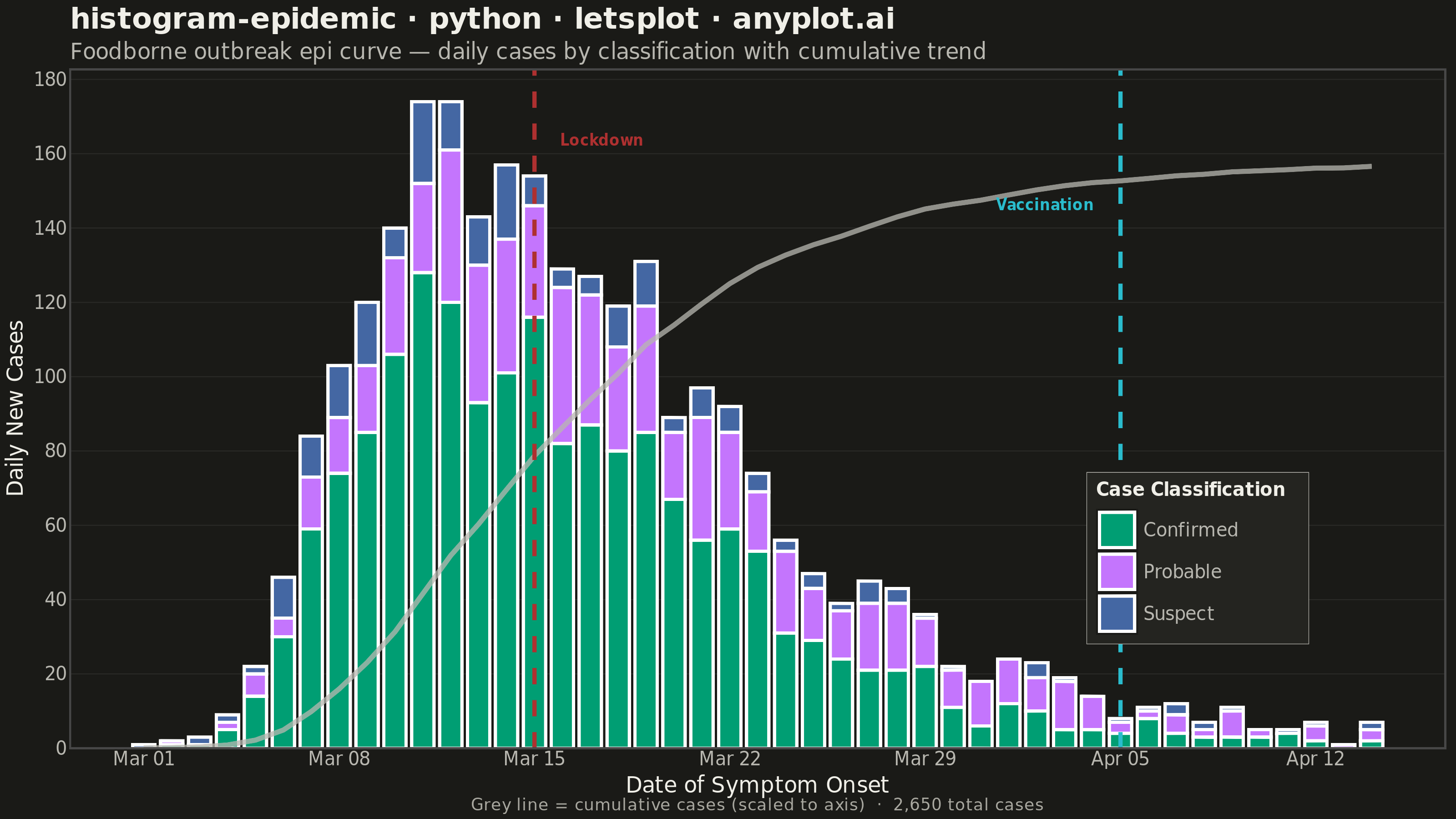
An epidemic curve (epi curve) is a histogram showing the number of new disease cases over time, plotted by date of symptom onset. The shape of the curve reveals the outbreak pattern: a sharp peak indicates a point source, successive waves suggest propagated transmission, and a plateau indicates continuous exposure. It is fundamental to epidemiological investigation and public health surveillance.
""" anyplot.ai
histogram-epidemic: Epidemic Curve (Epi Curve)
Library: letsplot 4.10.1 | Python 3.13.13
Quality: 89/100 | Updated: 2026-06-02
"""

import os

import numpy as np
import pandas as pd
from lets_plot import (
    LetsPlot,
    aes,
    element_blank,
    element_line,
    element_rect,
    element_text,
    geom_bar,
    geom_line,
    geom_text,
    geom_vline,
    ggplot,
    ggsize,
    labs,
    layer_tooltips,
    scale_fill_manual,
    scale_x_datetime,
    scale_y_continuous,
    theme,
    theme_minimal,
)
from lets_plot.export import ggsave


LetsPlot.setup_html()

# Theme tokens — Imprint palette, theme-adaptive chrome
THEME = os.getenv("ANYPLOT_THEME", "light")
PAGE_BG = "#FAF8F1" if THEME == "light" else "#1A1A17"
ELEVATED_BG = "#FFFDF6" if THEME == "light" else "#242420"
INK = "#1A1A17" if THEME == "light" else "#F0EFE8"
INK_SOFT = "#4A4A44" if THEME == "light" else "#B8B7B0"
INK_MUTED = "#6B6A63" if THEME == "light" else "#A8A79F"
GRID_COLOR = "#E0DED8" if THEME == "light" else "#2A2A27"

# Imprint categorical palette — first series always #009E73
IMPRINT_PALETTE = ["#009E73", "#C475FD", "#4467A3", "#BD8233", "#AE3030", "#2ABCCD", "#954477", "#99B314"]
COLOR_LOCKDOWN = IMPRINT_PALETTE[4]  # matte red — restriction / caution
COLOR_VACC = IMPRINT_PALETTE[5]  # cyan — health intervention

# Data — simulated foodborne outbreak with point-source shape
np.random.seed(42)

outbreak_start = pd.Timestamp("2024-03-01")
n_days = 45
dates = pd.date_range(outbreak_start, periods=n_days, freq="D")

days = np.arange(n_days)
confirmed_rate = 120 * np.exp(-0.5 * ((np.log(days + 1) - np.log(12)) / 0.45) ** 2)
probable_rate = 35 * np.exp(-0.5 * ((np.log(days + 1) - np.log(14)) / 0.5) ** 2)
suspect_rate = 15 * np.exp(-0.5 * ((np.log(days + 1) - np.log(10)) / 0.55) ** 2)

confirmed_counts = np.random.poisson(np.maximum(confirmed_rate, 0.1)).astype(int)
probable_counts = np.random.poisson(np.maximum(probable_rate, 0.1)).astype(int)
suspect_counts = np.random.poisson(np.maximum(suspect_rate, 0.1)).astype(int)

df = pd.DataFrame(
    {
        "onset_date": np.tile(dates, 3),
        "case_count": np.concatenate([confirmed_counts, probable_counts, suspect_counts]),
        "case_type": ["Confirmed"] * n_days + ["Probable"] * n_days + ["Suspect"] * n_days,
    }
)

# Cumulative overlay line (scaled to share primary y-axis)
daily_total = confirmed_counts + probable_counts + suspect_counts
cumulative = np.cumsum(daily_total)
max_daily = int(daily_total.max())
max_cumulative = int(cumulative[-1])
scale_factor = max_daily * 0.90 / max_cumulative

df_cumulative = pd.DataFrame({"onset_date": dates, "scaled_cumulative": cumulative * scale_factor})

# Intervention markers — ms timestamps required for lets-plot datetime axis
lockdown_date = pd.Timestamp("2024-03-15")
vaccination_date = pd.Timestamp("2024-04-05")
lockdown_ms = lockdown_date.timestamp() * 1000
vaccination_ms = vaccination_date.timestamp() * 1000

df_ann_lockdown = pd.DataFrame({"onset_date": [lockdown_date], "y_pos": [max_daily * 0.94], "label": ["Lockdown"]})
df_ann_vacc = pd.DataFrame({"onset_date": [vaccination_date], "y_pos": [max_daily * 0.84], "label": ["Vaccination"]})

# Weekly x-axis breaks
weekly_dates = pd.date_range(outbreak_start, periods=7, freq="7D")
weekly_ms = [d.timestamp() * 1000 for d in weekly_dates]

# Title fontsize scaled for length (floor 11px per lets-plot family)
title = "histogram-epidemic · python · letsplot · anyplot.ai"
n_chars = len(title)
ratio = 67 / n_chars if n_chars > 67 else 1.0
title_size = max(11, round(16 * ratio))

# Plot
plot = (
    ggplot(df, aes(x="onset_date", y="case_count", fill="case_type"))
    + geom_bar(
        stat="identity", position="stack", width=0.8, tooltips=layer_tooltips().line("@case_type|@case_count cases")
    )
    + geom_line(
        data=df_cumulative,
        mapping=aes(x="onset_date", y="scaled_cumulative"),
        color=INK_SOFT,
        size=1.2,
        alpha=0.75,
        inherit_aes=False,
    )
    + geom_vline(xintercept=lockdown_ms, color=COLOR_LOCKDOWN, size=1.0, linetype="dashed")
    + geom_vline(xintercept=vaccination_ms, color=COLOR_VACC, size=1.0, linetype="dashed")
    + geom_text(
        data=df_ann_lockdown,
        mapping=aes(x="onset_date", y="y_pos", label="label"),
        color=COLOR_LOCKDOWN,
        size=4,
        fontface="bold",
        hjust=0,
        nudge_x=80000000,
        inherit_aes=False,
    )
    + geom_text(
        data=df_ann_vacc,
        mapping=aes(x="onset_date", y="y_pos", label="label"),
        color=COLOR_VACC,
        size=4,
        fontface="bold",
        hjust=1,
        nudge_x=-80000000,
        inherit_aes=False,
    )
    + scale_fill_manual(
        values={"Confirmed": IMPRINT_PALETTE[0], "Probable": IMPRINT_PALETTE[1], "Suspect": IMPRINT_PALETTE[2]},
        name="Case Classification",
    )
    + scale_x_datetime(name="Date of Symptom Onset", format="%b %d", breaks=weekly_ms)
    + scale_y_continuous(name="Daily New Cases", format="d")
    + labs(
        title=title,
        subtitle="Foodborne outbreak epi curve — daily cases by classification with cumulative trend",
        caption=f"Grey line = cumulative cases (scaled to axis)  ·  {max_cumulative:,} total cases",
    )
    + theme_minimal()
    + theme(
        plot_background=element_rect(fill=PAGE_BG, color=PAGE_BG),
        panel_background=element_rect(fill=PAGE_BG),
        plot_title=element_text(size=title_size, color=INK, face="bold"),
        plot_subtitle=element_text(size=12, color=INK_SOFT),
        axis_title=element_text(size=12, color=INK),
        axis_text=element_text(size=10, color=INK_SOFT),
        legend_title=element_text(size=10, color=INK, face="bold"),
        legend_text=element_text(size=10, color=INK_SOFT),
        plot_caption=element_text(size=9, color=INK_MUTED, hjust=0.5),
        legend_position=[0.82, 0.28],
        legend_background=element_rect(fill=ELEVATED_BG, color=INK_SOFT, size=0.3),
        panel_grid_major_x=element_blank(),
        panel_grid_minor=element_blank(),
        panel_grid_major_y=element_line(color=GRID_COLOR, size=0.5),
    )
    + ggsize(800, 450)
)

# Save
ggsave(plot, f"plot-{THEME}.png", path=".", scale=4)
ggsave(plot, f"plot-{THEME}.html", path=".")
Runnable source as JSON, for any HTTP client: https://api.anyplot.ai/specs/histogram-epidemic/letsplot/code. Any spec id and library id listed in llms-full.txt fit the same URL shape; every URL below is complete and callable.
{
  "spec_id": "histogram-epidemic",
  "language": "python",
  "library": "letsplot",
  "page": "https://anyplot.ai/histogram-epidemic/python/letsplot",
  "hub": "https://anyplot.ai/histogram-epidemic",
  "code_json": "https://api.anyplot.ai/specs/histogram-epidemic/letsplot/code",
  "spec_json": "https://api.anyplot.ai/specs/histogram-epidemic",
  "render_light_png": "https://storage.googleapis.com/anyplot-images/plots/histogram-epidemic/python/letsplot/plot-light.png",
  "render_dark_png": "https://storage.googleapis.com/anyplot-images/plots/histogram-epidemic/python/letsplot/plot-dark.png",
  "interactive_light_html": "https://storage.googleapis.com/anyplot-images/plots/histogram-epidemic/python/letsplot/plot-light.html",
  "interactive_dark_html": "https://storage.googleapis.com/anyplot-images/plots/histogram-epidemic/python/letsplot/plot-dark.html",
  "quality_score": 89.0,
  "license": "MIT",
  "guide": "https://anyplot.ai/llms.txt"
}
Part of Epidemic Curve (Epi Curve) on anyplot.ai.