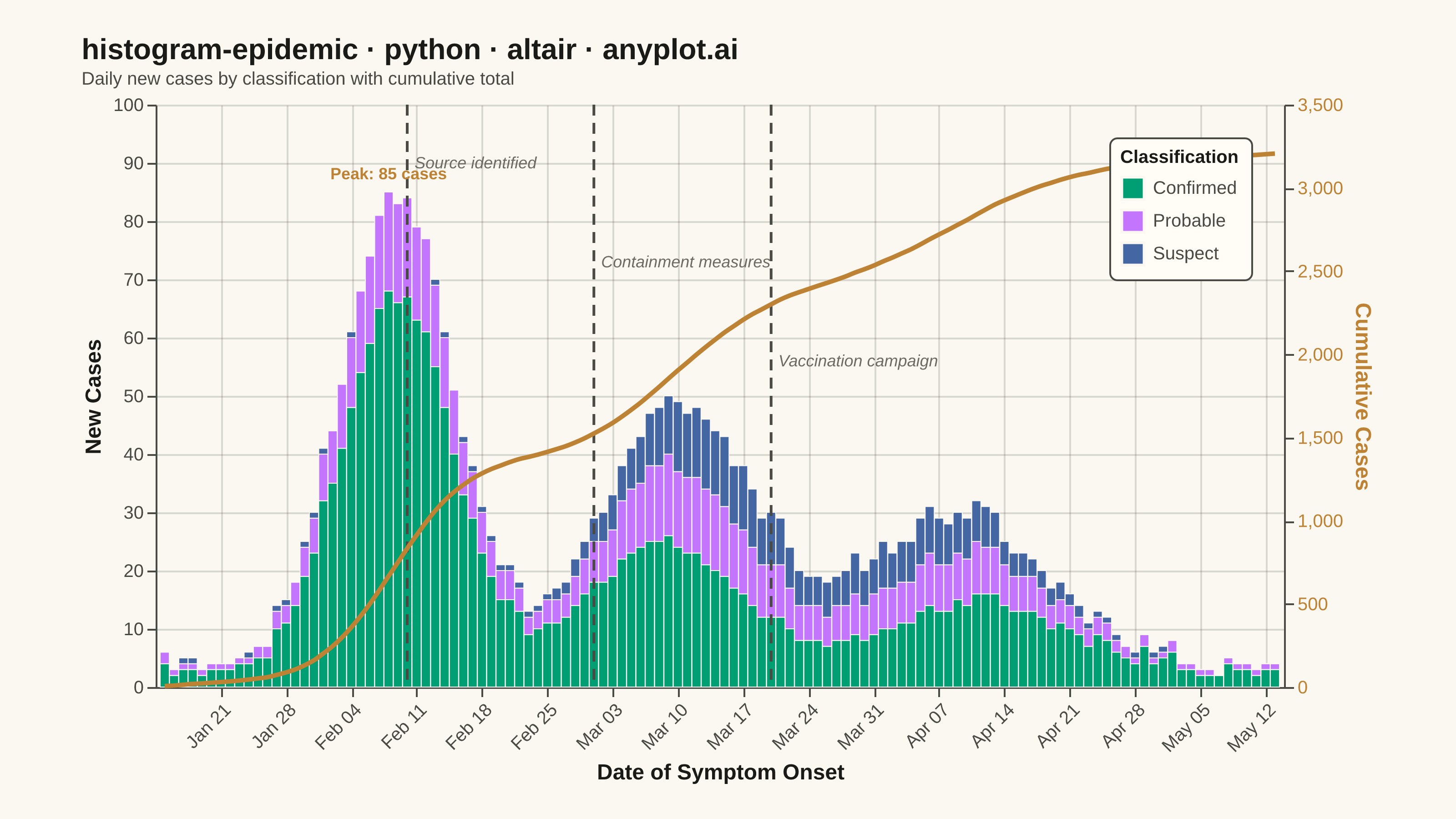
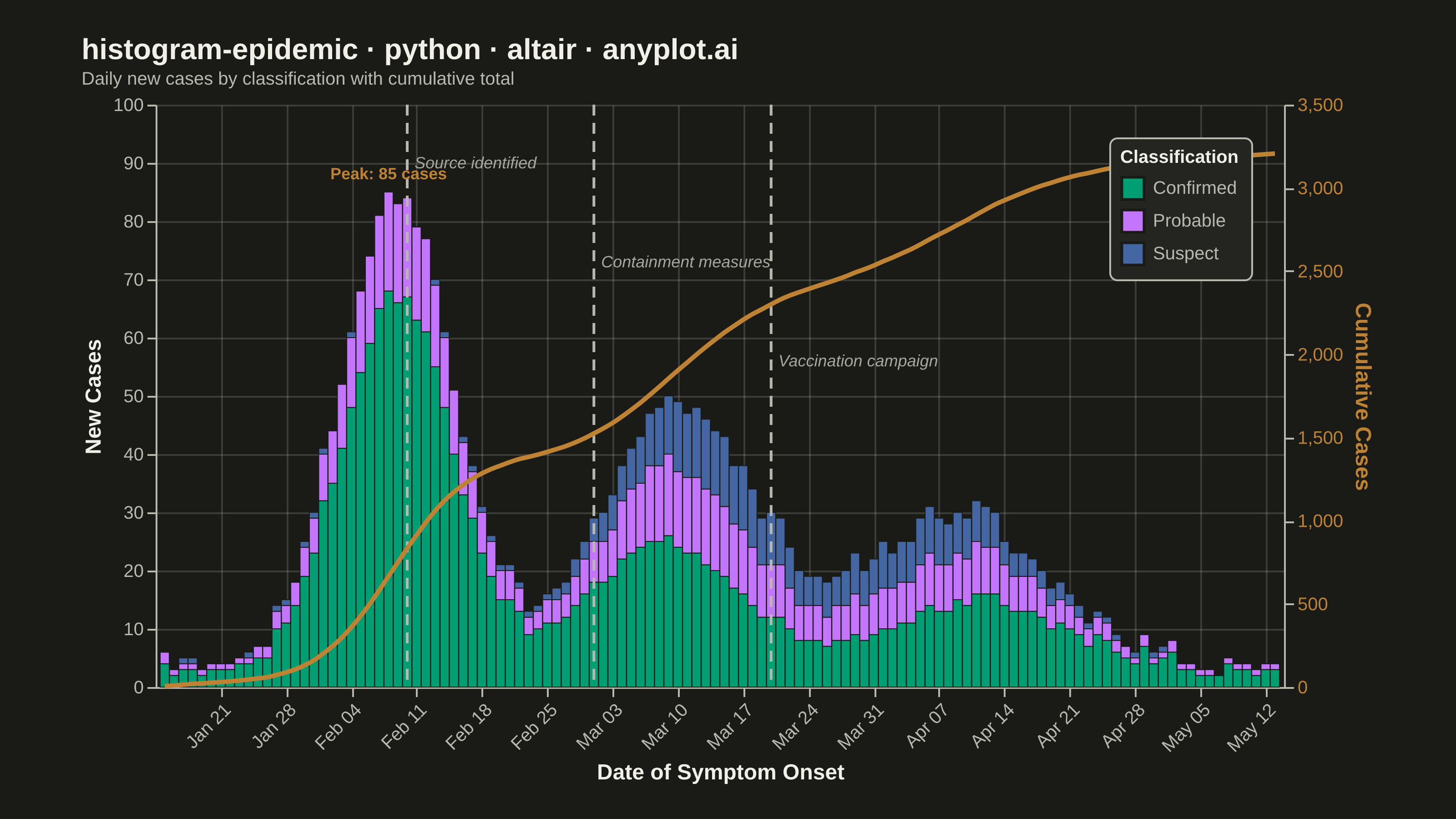
An epidemic curve (epi curve) is a histogram showing the number of new disease cases over time, plotted by date of symptom onset. The shape of the curve reveals the outbreak pattern: a sharp peak indicates a point source, successive waves suggest propagated transmission, and a plateau indicates continuous exposure. It is fundamental to epidemiological investigation and public health surveillance.
""" anyplot.ai
histogram-epidemic: Epidemic Curve (Epi Curve)
Library: altair 6.1.0 | Python 3.13.13
Quality: 93/100 | Updated: 2026-06-02
"""

import os

import altair as alt
import numpy as np
import pandas as pd
from PIL import Image


# Theme tokens (Imprint palette — see default-style-guide.md)
THEME = os.getenv("ANYPLOT_THEME", "light")
PAGE_BG = "#FAF8F1" if THEME == "light" else "#1A1A17"
ELEVATED_BG = "#FFFDF6" if THEME == "light" else "#242420"
INK = "#1A1A17" if THEME == "light" else "#F0EFE8"
INK_SOFT = "#4A4A44" if THEME == "light" else "#B8B7B0"
INK_MUTED = "#6B6A63" if THEME == "light" else "#A8A79F"

# Imprint palette — case classification + cumulative line
CONFIRMED_COLOR = "#009E73"  # Imprint position 1 — brand green
PROBABLE_COLOR = "#C475FD"  # Imprint position 2 — lavender
SUSPECT_COLOR = "#4467A3"  # Imprint position 3 — blue
CUMULATIVE_COLOR = "#BD8233"  # Imprint position 4 — ochre (cumulative line)

# Data
np.random.seed(42)

dates = pd.date_range("2024-01-15", periods=120, freq="D")

days = np.arange(120)
wave1 = 80 * np.exp(-0.5 * ((days - 25) / 6) ** 2)
wave2 = 45 * np.exp(-0.5 * ((days - 55) / 8) ** 2)
wave3 = 25 * np.exp(-0.5 * ((days - 85) / 10) ** 2)
base_rate = wave1 + wave2 + wave3 + 2

confirmed_frac = np.clip(0.6 + 0.2 * np.sin(days / 15), 0.4, 0.85)
probable_frac = np.clip(0.25 - 0.05 * np.sin(days / 15), 0.1, 0.35)

total_cases = np.round(base_rate + np.random.poisson(2, 120)).astype(int)
confirmed = np.round(total_cases * confirmed_frac).astype(int)
probable = np.round(total_cases * probable_frac).astype(int)
suspect = np.clip(total_cases - confirmed - probable, 0, None).astype(int)

df = pd.DataFrame(
    {
        "onset_date": np.tile(dates, 3),
        "case_count": np.concatenate([confirmed, probable, suspect]),
        "case_type": ["Confirmed"] * 120 + ["Probable"] * 120 + ["Suspect"] * 120,
    }
)

# Cumulative totals
daily_total = pd.DataFrame({"onset_date": dates, "daily_total": total_cases})
daily_total["cumulative"] = daily_total["daily_total"].cumsum()
max_daily = int(total_cases.max()) + 15

# Intervention events — staggered y positions to avoid bar interference
events = pd.DataFrame(
    {
        "date": pd.to_datetime(["2024-02-10", "2024-03-01", "2024-03-20"]),
        "event": ["Source identified", "Containment measures", "Vaccination campaign"],
        "y_pos": [max_daily * 0.90, max_daily * 0.73, max_daily * 0.56],
    }
)

# Stacked bars with Imprint palette
type_order = ["Confirmed", "Probable", "Suspect"]
color_scale = alt.Scale(domain=type_order, range=[CONFIRMED_COLOR, PROBABLE_COLOR, SUSPECT_COLOR])

bars = (
    alt.Chart(df)
    .mark_bar(stroke=PAGE_BG, strokeWidth=0.5)
    .encode(
        x=alt.X(
            "onset_date:T",
            title="Date of Symptom Onset",
            axis=alt.Axis(format="%b %d", labelAngle=-45, tickCount="week"),
        ),
        y=alt.Y("case_count:Q", title="New Cases", scale=alt.Scale(domain=[0, max_daily])),
        color=alt.Color("case_type:N", scale=color_scale, sort=type_order, title="Classification"),
        order=alt.Order("order:Q"),
        tooltip=[
            alt.Tooltip("onset_date:T", title="Date", format="%b %d, %Y"),
            alt.Tooltip("case_type:N", title="Type"),
            alt.Tooltip("case_count:Q", title="Cases"),
        ],
    )
    .transform_calculate(order="{'Confirmed': 0, 'Probable': 1, 'Suspect': 2}[datum.case_type]")
)

# Cumulative line with independent right y-axis
cumulative_line = (
    alt.Chart(daily_total)
    .mark_line(strokeWidth=2.5, interpolate="monotone", color=CUMULATIVE_COLOR)
    .encode(
        x="onset_date:T",
        y=alt.Y(
            "cumulative:Q",
            title="Cumulative Cases",
            axis=alt.Axis(titleColor=CUMULATIVE_COLOR, labelColor=CUMULATIVE_COLOR, format=",.0f"),
        ),
        tooltip=[
            alt.Tooltip("onset_date:T", title="Date", format="%b %d, %Y"),
            alt.Tooltip("cumulative:Q", title="Cumulative Cases", format=","),
        ],
    )
)

# Vertical intervention rules
rules = alt.Chart(events).mark_rule(strokeDash=[6, 4], strokeWidth=1.5, color=INK_SOFT).encode(x="date:T")

# Event labels — horizontal at staggered heights, avoiding bar interference
rule_labels = (
    alt.Chart(events)
    .mark_text(align="left", dx=4, fontSize=11, fontStyle="italic", color=INK_MUTED)
    .encode(x="date:T", y="y_pos:Q", text="event:N")
)

# Peak annotation
peak_day = int(np.argmax(total_cases))
peak_data = pd.DataFrame(
    {
        "onset_date": [dates[peak_day]],
        "peak_val": [int(total_cases[peak_day])],
        "label": [f"Peak: {int(total_cases[peak_day])} cases"],
    }
)

peak_label = (
    alt.Chart(peak_data)
    .mark_text(fontSize=11, fontWeight="bold", color=CUMULATIVE_COLOR, dy=-10, dx=30)
    .encode(x="onset_date:T", y="peak_val:Q", text="label:N")
)

# Title scaling (67-char baseline)
title_str = "histogram-epidemic · python · altair · anyplot.ai"
title_fontsize = round(16 * min(1.0, 67 / len(title_str)))

# Layer and compose
bar_layer = alt.layer(bars, rules, rule_labels, peak_label)

chart = (
    alt.layer(bar_layer, cumulative_line)
    .resolve_scale(y="independent")
    .properties(
        width=620,
        height=320,
        background=PAGE_BG,
        title=alt.Title(
            title_str,
            fontSize=title_fontsize,
            anchor="start",
            color=INK,
            subtitle="Daily new cases by classification with cumulative total",
            subtitleFontSize=10,
            subtitleColor=INK_SOFT,
        ),
    )
    .configure_view(fill=PAGE_BG, strokeWidth=0)
    .configure_axis(
        labelFontSize=10,
        titleFontSize=12,
        gridOpacity=0.15,
        gridColor=INK,
        domainColor=INK_SOFT,
        domainWidth=0,
        tickColor=INK_SOFT,
        labelColor=INK_SOFT,
        titleColor=INK,
    )
    .configure_legend(
        titleFontSize=10,
        labelFontSize=10,
        symbolSize=150,
        orient="top-right",
        fillColor=ELEVATED_BG,
        strokeColor=INK_SOFT,
        padding=6,
        cornerRadius=4,
        labelColor=INK_SOFT,
        titleColor=INK,
    )
    .configure_title(color=INK, anchor="start")
)

# Save PNG
chart.save(f"plot-{THEME}.png", scale_factor=4.0)

# Pad PNG to exact target 3200 × 1800 (altair.md canvas contract)
TW, TH = 3200, 1800
_img = Image.open(f"plot-{THEME}.png").convert("RGB")
_w, _h = _img.size
if _w > TW or _h > TH:
    raise SystemExit(
        f"altair vl-convert produced {_w}×{_h}, exceeds target {TW}×{TH}. "
        f"Shrink chart .properties(width=, height=) values and re-render."
    )
if _w < TW or _h < TH:
    _canvas = Image.new("RGB", (TW, TH), PAGE_BG)
    _canvas.paste(_img, ((TW - _w) // 2, (TH - _h) // 2))
    _canvas.save(f"plot-{THEME}.png")

chart.save(f"plot-{THEME}.html")
Runnable source as JSON, for any HTTP client: https://api.anyplot.ai/specs/histogram-epidemic/altair/code. Any spec id and library id listed in llms-full.txt fit the same URL shape; every URL below is complete and callable.
{
  "spec_id": "histogram-epidemic",
  "language": "python",
  "library": "altair",
  "page": "https://anyplot.ai/histogram-epidemic/python/altair",
  "hub": "https://anyplot.ai/histogram-epidemic",
  "code_json": "https://api.anyplot.ai/specs/histogram-epidemic/altair/code",
  "spec_json": "https://api.anyplot.ai/specs/histogram-epidemic",
  "render_light_png": "https://storage.googleapis.com/anyplot-images/plots/histogram-epidemic/python/altair/plot-light.png",
  "render_dark_png": "https://storage.googleapis.com/anyplot-images/plots/histogram-epidemic/python/altair/plot-dark.png",
  "interactive_light_html": "https://storage.googleapis.com/anyplot-images/plots/histogram-epidemic/python/altair/plot-light.html",
  "interactive_dark_html": "https://storage.googleapis.com/anyplot-images/plots/histogram-epidemic/python/altair/plot-dark.html",
  "quality_score": 93.0,
  "license": "MIT",
  "guide": "https://anyplot.ai/llms.txt"
}
Part of Epidemic Curve (Epi Curve) on anyplot.ai.