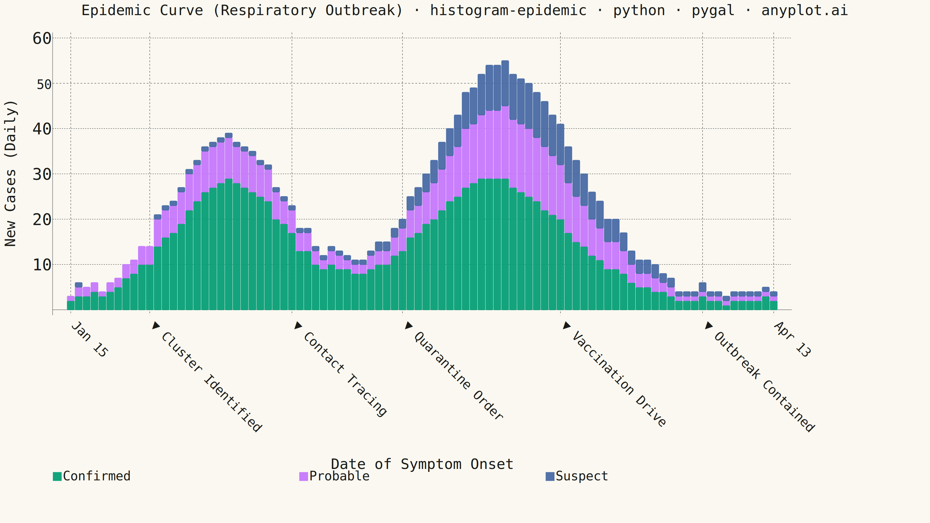
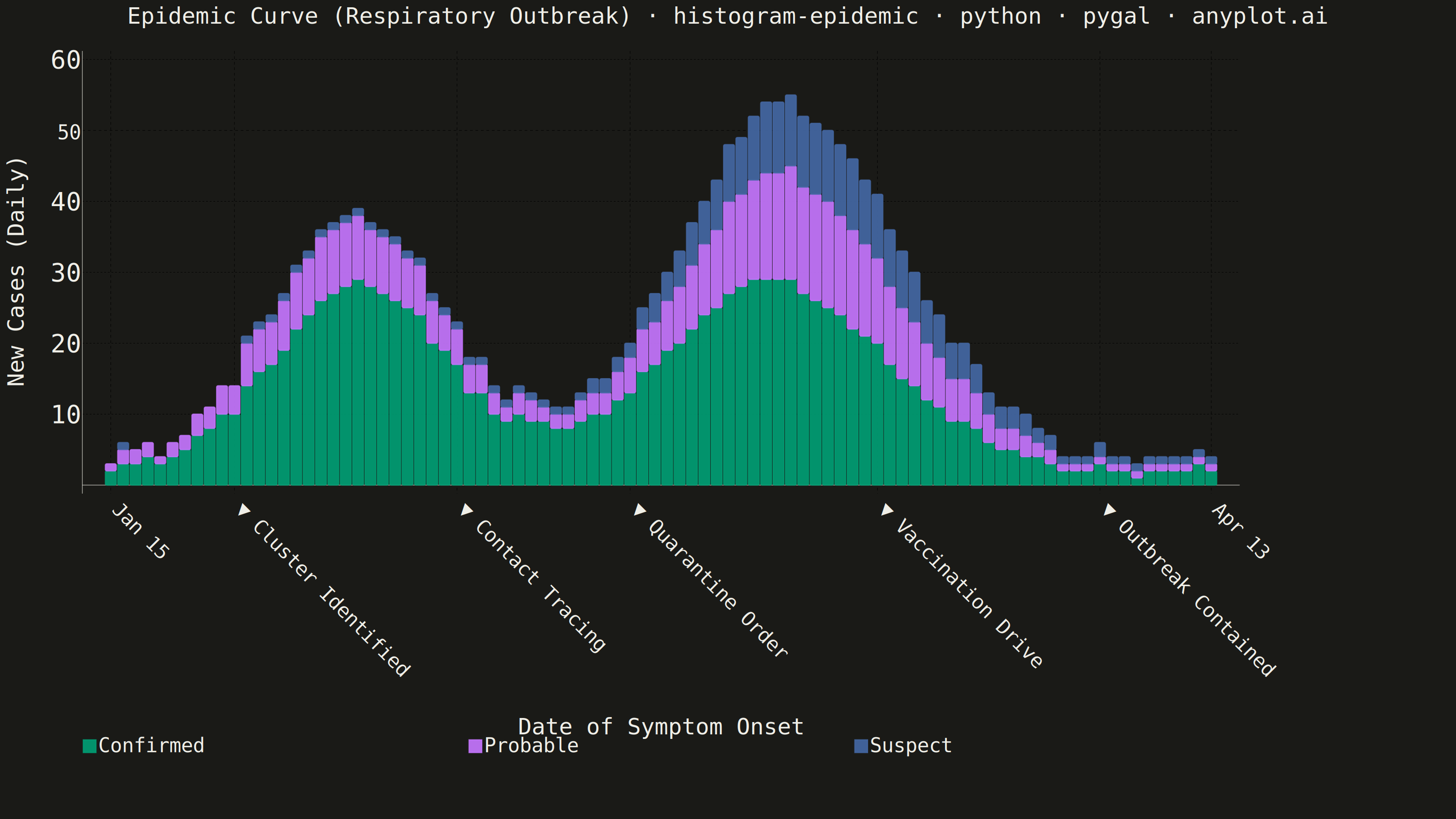
An epidemic curve (epi curve) is a histogram showing the number of new disease cases over time, plotted by date of symptom onset. The shape of the curve reveals the outbreak pattern: a sharp peak indicates a point source, successive waves suggest propagated transmission, and a plateau indicates continuous exposure. It is fundamental to epidemiological investigation and public health surveillance.
""" anyplot.ai
histogram-epidemic: Epidemic Curve (Epi Curve)
Library: pygal 3.1.0 | Python 3.13.13
Quality: 85/100 | Updated: 2026-06-02
"""

import os

import numpy as np
import pandas as pd
import pygal
from pygal.style import Style


THEME = os.getenv("ANYPLOT_THEME", "light")

# Theme-adaptive chrome tokens (Imprint palette reference)
PAGE_BG = "#FAF8F1" if THEME == "light" else "#1A1A17"
INK = "#1A1A17" if THEME == "light" else "#F0EFE8"
INK_SOFT = "#4A4A44" if THEME == "light" else "#B8B7B0"
INK_MUTED = "#6B6A63" if THEME == "light" else "#A8A79F"

# Imprint categorical palette — first series always #009E73
IMPRINT_PALETTE = ("#009E73", "#C475FD", "#4467A3", "#BD8233", "#AE3030", "#2ABCCD", "#954477", "#99B314")

# Data — simulated respiratory outbreak with two waves (propagated transmission)
np.random.seed(42)
dates = pd.date_range("2024-01-15", periods=90, freq="D")

days = np.arange(90)
wave1 = 35 * np.exp(-0.5 * ((days - 20) / 7) ** 2)
wave2 = 50 * np.exp(-0.5 * ((days - 55) / 9) ** 2)
baseline = 2 + 3 * np.random.rand(90)
total_signal = wave1 + wave2 + baseline

confirmed_frac = np.clip(0.6 + 0.15 * np.sin(days / 15), 0.45, 0.75)
probable_frac = np.clip(0.25 + 0.05 * np.cos(days / 10), 0.15, 0.35)
suspect_frac = 1.0 - confirmed_frac - probable_frac

confirmed = np.round(total_signal * confirmed_frac).astype(int)
probable = np.round(total_signal * probable_frac).astype(int)
suspect = np.round(total_signal * suspect_frac).astype(int)
daily_total = confirmed + probable + suspect

# Intervention events with spaced dates to avoid label crowding
interventions = {
    10: "Cluster Identified",
    28: "Contact Tracing",
    42: "Quarantine Order",
    62: "Vaccination Drive",
    80: "Outbreak Contained",
}

# X-axis labels — intervention dates get distinct triangle marker + event name
date_labels = []
for i, d in enumerate(dates):
    fmt = d.strftime("%b %d")
    if i in interventions:
        date_labels.append(f"▼ {interventions[i]}")
    else:
        date_labels.append(fmt)

# Major labels: monthly anchors + intervention dates, de-crowded
monthly_set = {0, 31, 59, 89}
intervention_set = set(interventions.keys())
major_indices = sorted(monthly_set | intervention_set)
filtered_indices = []
for idx in major_indices:
    if idx in intervention_set:
        filtered_indices.append(idx)
    elif all(abs(idx - iv) > 5 for iv in intervention_set):
        filtered_indices.append(idx)
major_labels = [date_labels[i] for i in filtered_indices]

# Build series with rich tooltip dicts for interactive HTML
confirmed_series = []
probable_series = []
suspect_series = []
for i in range(90):
    day_str = dates[i].strftime("%b %d, %Y")
    total_day = int(daily_total[i])
    event = interventions.get(i)
    tip = f"{day_str} — {total_day} total cases"
    if event:
        tip = f"⚠ {event}\n{tip}"
    confirmed_series.append({"value": int(confirmed[i]), "label": tip})
    probable_series.append({"value": int(probable[i]), "label": tip})
    suspect_series.append({"value": int(suspect[i]), "label": tip})

# Title font size scaled for length (formula: round(66 * 67 / len(title)))
title = "Epidemic Curve (Respiratory Outbreak) · histogram-epidemic · python · pygal · anyplot.ai"
title_font_size = round(66 * 67 / len(title))  # prevents overflow at 3200 px

custom_style = Style(
    background=PAGE_BG,
    plot_background=PAGE_BG,
    foreground=INK,
    foreground_strong=INK,
    foreground_subtle=INK_MUTED,
    colors=IMPRINT_PALETTE,
    title_font_size=title_font_size,
    label_font_size=56,
    major_label_font_size=44,
    legend_font_size=44,
    value_font_size=36,
    tooltip_font_size=36,
    stroke_width=2.5,
    opacity=0.92,
    opacity_hover=1.0,
)

chart = pygal.StackedBar(
    width=3200,
    height=1800,
    style=custom_style,
    title=title,
    x_title="Date of Symptom Onset",
    y_title="New Cases (Daily)",
    show_y_guides=True,
    show_x_guides=True,
    legend_at_bottom=True,
    legend_box_size=28,
    legend_at_bottom_columns=3,
    margin=60,
    margin_bottom=140,
    margin_right=80,
    spacing=2,
    rounded_bars=3,
    truncate_legend=-1,
    truncate_label=-1,
    x_label_rotation=45,
    show_minor_x_labels=False,
    print_values=False,
    range=(0, int(np.max(daily_total) * 1.1)),
    value_formatter=lambda x: f"{int(x):,}" if x else "",
)

chart.x_labels = date_labels
chart.x_labels_major = major_labels
# Vertical reference lines at intervention x-positions
chart.x_guides = list(interventions.keys())

chart.add("Confirmed", confirmed_series)
chart.add("Probable", probable_series)
chart.add("Suspect", suspect_series)

chart.render_to_png(f"plot-{THEME}.png")
with open(f"plot-{THEME}.html", "wb") as f:
    f.write(chart.render())
Runnable source as JSON, for any HTTP client: https://api.anyplot.ai/specs/histogram-epidemic/pygal/code. Any spec id and library id listed in llms-full.txt fit the same URL shape; every URL below is complete and callable.
{
  "spec_id": "histogram-epidemic",
  "language": "python",
  "library": "pygal",
  "page": "https://anyplot.ai/histogram-epidemic/python/pygal",
  "hub": "https://anyplot.ai/histogram-epidemic",
  "code_json": "https://api.anyplot.ai/specs/histogram-epidemic/pygal/code",
  "spec_json": "https://api.anyplot.ai/specs/histogram-epidemic",
  "render_light_png": "https://storage.googleapis.com/anyplot-images/plots/histogram-epidemic/python/pygal/plot-light.png",
  "render_dark_png": "https://storage.googleapis.com/anyplot-images/plots/histogram-epidemic/python/pygal/plot-dark.png",
  "interactive_light_html": "https://storage.googleapis.com/anyplot-images/plots/histogram-epidemic/python/pygal/plot-light.html",
  "interactive_dark_html": "https://storage.googleapis.com/anyplot-images/plots/histogram-epidemic/python/pygal/plot-dark.html",
  "quality_score": 85.0,
  "license": "MIT",
  "guide": "https://anyplot.ai/llms.txt"
}
Part of Epidemic Curve (Epi Curve) on anyplot.ai.