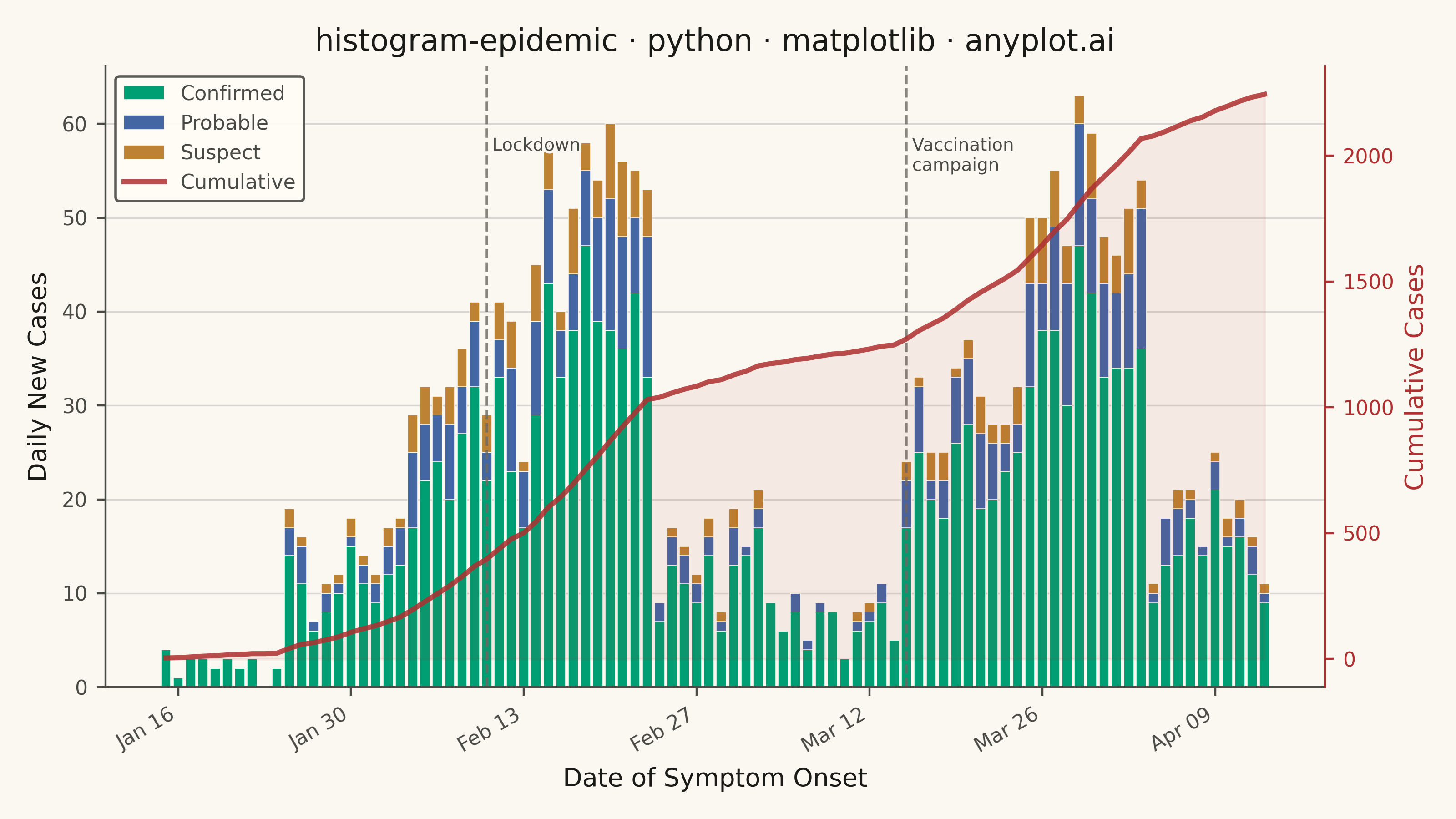
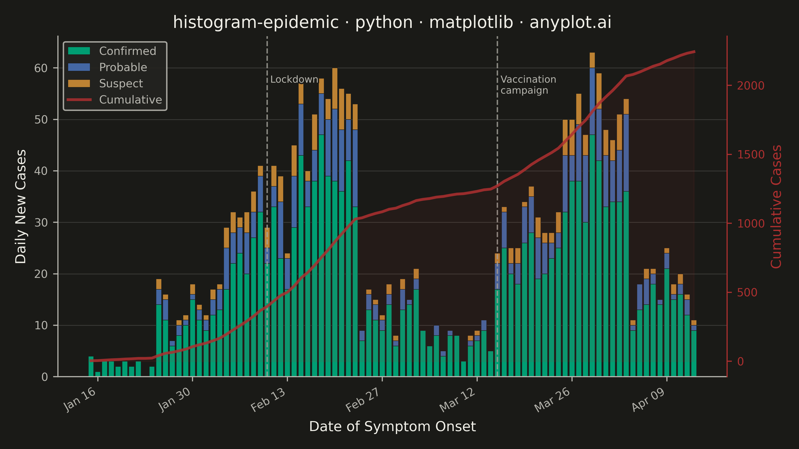
An epidemic curve (epi curve) is a histogram showing the number of new disease cases over time, plotted by date of symptom onset. The shape of the curve reveals the outbreak pattern: a sharp peak indicates a point source, successive waves suggest propagated transmission, and a plateau indicates continuous exposure. It is fundamental to epidemiological investigation and public health surveillance.
""" anyplot.ai
histogram-epidemic: Epidemic Curve (Epi Curve)
Library: matplotlib 3.10.9 | Python 3.13.13
Quality: 94/100 | Updated: 2026-06-02
"""

import os

import matplotlib.dates as mdates
import matplotlib.patheffects as pe
import matplotlib.pyplot as plt
import numpy as np
import pandas as pd


# Theme tokens — Imprint palette chrome
THEME = os.getenv("ANYPLOT_THEME", "light")
PAGE_BG = "#FAF8F1" if THEME == "light" else "#1A1A17"
ELEVATED_BG = "#FFFDF6" if THEME == "light" else "#242420"
INK = "#1A1A17" if THEME == "light" else "#F0EFE8"
INK_SOFT = "#4A4A44" if THEME == "light" else "#B8B7B0"
INK_MUTED = "#6B6A63" if THEME == "light" else "#A8A79F"

# Imprint categorical palette — positions 1→3 for the three case classifications
CONFIRMED_COLOR = "#009E73"  # brand green — always first series
PROBABLE_COLOR = "#4467A3"  # blue
SUSPECT_COLOR = "#BD8233"  # ochre
CUMULATIVE_COLOR = "#AE3030"  # matte red — total burden / severity semantic anchor

# Data — two-wave outbreak scenario, 90-day regional epidemic
np.random.seed(42)
dates = pd.date_range("2024-01-15", periods=90, freq="D")

confirmed_base = np.concatenate(
    [
        np.random.poisson(3, 10),
        np.random.poisson(12, 10),
        np.random.poisson(35, 10),
        np.random.poisson(55, 10),
        np.random.poisson(15, 10),
        np.random.poisson(8, 10),
        np.random.poisson(30, 10),
        np.random.poisson(50, 10),
        np.random.poisson(18, 10),
    ]
)
probable = np.maximum(0, (confirmed_base * np.random.uniform(0.1, 0.3, 90)).astype(int))
suspect = np.maximum(0, (confirmed_base * np.random.uniform(0.05, 0.15, 90)).astype(int))
confirmed = np.maximum(0, confirmed_base - probable - suspect)

df = pd.DataFrame({"date": dates, "Confirmed": confirmed, "Probable": probable, "Suspect": suspect})
cumulative = (df["Confirmed"] + df["Probable"] + df["Suspect"]).cumsum()
total_per_day = df["Confirmed"] + df["Probable"] + df["Suspect"]

# Plot — landscape canvas: figsize=(8, 4.5) × dpi=400 → 3200×1800 px
fig, ax = plt.subplots(figsize=(8, 4.5), dpi=400, facecolor=PAGE_BG)
ax.set_facecolor(PAGE_BG)

bar_width = 0.8
ax.bar(
    df["date"],
    df["Confirmed"],
    width=bar_width,
    label="Confirmed",
    color=CONFIRMED_COLOR,
    edgecolor=PAGE_BG,
    linewidth=0.3,
)
ax.bar(
    df["date"],
    df["Probable"],
    width=bar_width,
    bottom=df["Confirmed"],
    label="Probable",
    color=PROBABLE_COLOR,
    edgecolor=PAGE_BG,
    linewidth=0.3,
)
ax.bar(
    df["date"],
    df["Suspect"],
    width=bar_width,
    bottom=df["Confirmed"] + df["Probable"],
    label="Suspect",
    color=SUSPECT_COLOR,
    edgecolor=PAGE_BG,
    linewidth=0.3,
)

# Cumulative line on secondary axis
ax2 = ax.twinx()
ax2.plot(df["date"], cumulative, color=CUMULATIVE_COLOR, linewidth=2.0, alpha=0.85, label="Cumulative")
ax2.fill_between(df["date"], cumulative, alpha=0.07, color=CUMULATIVE_COLOR)
ax2.set_ylabel("Cumulative Cases", fontsize=10, color=CUMULATIVE_COLOR)
ax2.tick_params(axis="y", labelsize=8, colors=CUMULATIVE_COLOR, labelcolor=CUMULATIVE_COLOR)
ax2.spines["top"].set_visible(False)
ax2.spines["left"].set_visible(False)
ax2.spines["bottom"].set_visible(False)
ax2.spines["right"].set_color(CUMULATIVE_COLOR)

# Intervention annotation lines
lockdown_date = pd.Timestamp("2024-02-10")
vaccine_date = pd.Timestamp("2024-03-15")
text_stroke = [pe.withStroke(linewidth=2, foreground=PAGE_BG)]
y_label_pos = total_per_day.max() * 0.93

ax.axvline(lockdown_date, color=INK_MUTED, linestyle="--", linewidth=1.0, alpha=0.8)
ax.axvline(vaccine_date, color=INK_MUTED, linestyle="--", linewidth=1.0, alpha=0.8)
ax.text(
    lockdown_date, y_label_pos, " Lockdown", fontsize=7, color=INK_SOFT, va="top", ha="left", path_effects=text_stroke
)
ax.text(
    vaccine_date,
    y_label_pos,
    " Vaccination\n campaign",
    fontsize=7,
    color=INK_SOFT,
    va="top",
    ha="left",
    path_effects=text_stroke,
)

# Style
title = "histogram-epidemic · python · matplotlib · anyplot.ai"
n = len(title)
title_fontsize = max(8, round(12 * 67 / n)) if n > 67 else 12

ax.set_xlabel("Date of Symptom Onset", fontsize=10, color=INK)
ax.set_ylabel("Daily New Cases", fontsize=10, color=INK)
ax.set_title(title, fontsize=title_fontsize, fontweight="medium", color=INK)
ax.tick_params(axis="both", labelsize=8, colors=INK_SOFT, labelcolor=INK_SOFT)
ax.xaxis.set_major_locator(mdates.WeekdayLocator(interval=2))
ax.xaxis.set_major_formatter(mdates.DateFormatter("%b %d"))
plt.setp(ax.xaxis.get_majorticklabels(), rotation=30, ha="right")
ax.spines["top"].set_visible(False)
ax.spines["right"].set_visible(False)
ax.spines["left"].set_color(INK_SOFT)
ax.spines["bottom"].set_color(INK_SOFT)
ax.yaxis.grid(True, alpha=0.15, linewidth=0.6, color=INK)
ax.set_axisbelow(True)

# Combined legend from both axes
lines_bars, labels_bars = ax.get_legend_handles_labels()
lines_cum, labels_cum = ax2.get_legend_handles_labels()
leg = ax.legend(lines_bars + lines_cum, labels_bars + labels_cum, fontsize=8, loc="upper left", framealpha=0.9)
if leg:
    leg.get_frame().set_facecolor(ELEVATED_BG)
    leg.get_frame().set_edgecolor(INK_SOFT)
    plt.setp(leg.get_texts(), color=INK_SOFT)

# Save — bbox_inches must stay default (None) to preserve exact 3200×1800 canvas
plt.tight_layout()
plt.savefig(f"plot-{THEME}.png", dpi=400, facecolor=PAGE_BG)
Runnable source as JSON, for any HTTP client: https://api.anyplot.ai/specs/histogram-epidemic/matplotlib/code. Any spec id and library id listed in llms-full.txt fit the same URL shape; every URL below is complete and callable.
{
  "spec_id": "histogram-epidemic",
  "language": "python",
  "library": "matplotlib",
  "page": "https://anyplot.ai/histogram-epidemic/python/matplotlib",
  "hub": "https://anyplot.ai/histogram-epidemic",
  "code_json": "https://api.anyplot.ai/specs/histogram-epidemic/matplotlib/code",
  "spec_json": "https://api.anyplot.ai/specs/histogram-epidemic",
  "render_light_png": "https://storage.googleapis.com/anyplot-images/plots/histogram-epidemic/python/matplotlib/plot-light.png",
  "render_dark_png": "https://storage.googleapis.com/anyplot-images/plots/histogram-epidemic/python/matplotlib/plot-dark.png",
  "quality_score": 94.0,
  "license": "MIT",
  "guide": "https://anyplot.ai/llms.txt"
}
Part of Epidemic Curve (Epi Curve) on anyplot.ai.