The same plot in 14 other libraries — Python: Altair, Bokeh, lets-plot, Matplotlib, Plotly, plotnine, Pygal, Seaborn; Julia: Makie.jl; JavaScript: Chart.js, D3.js, Apache ECharts, Highcharts, MUI X Charts. Compare all 15 side by side: Epidemic Curve (Epi Curve) in Python, R, Julia and JavaScript.
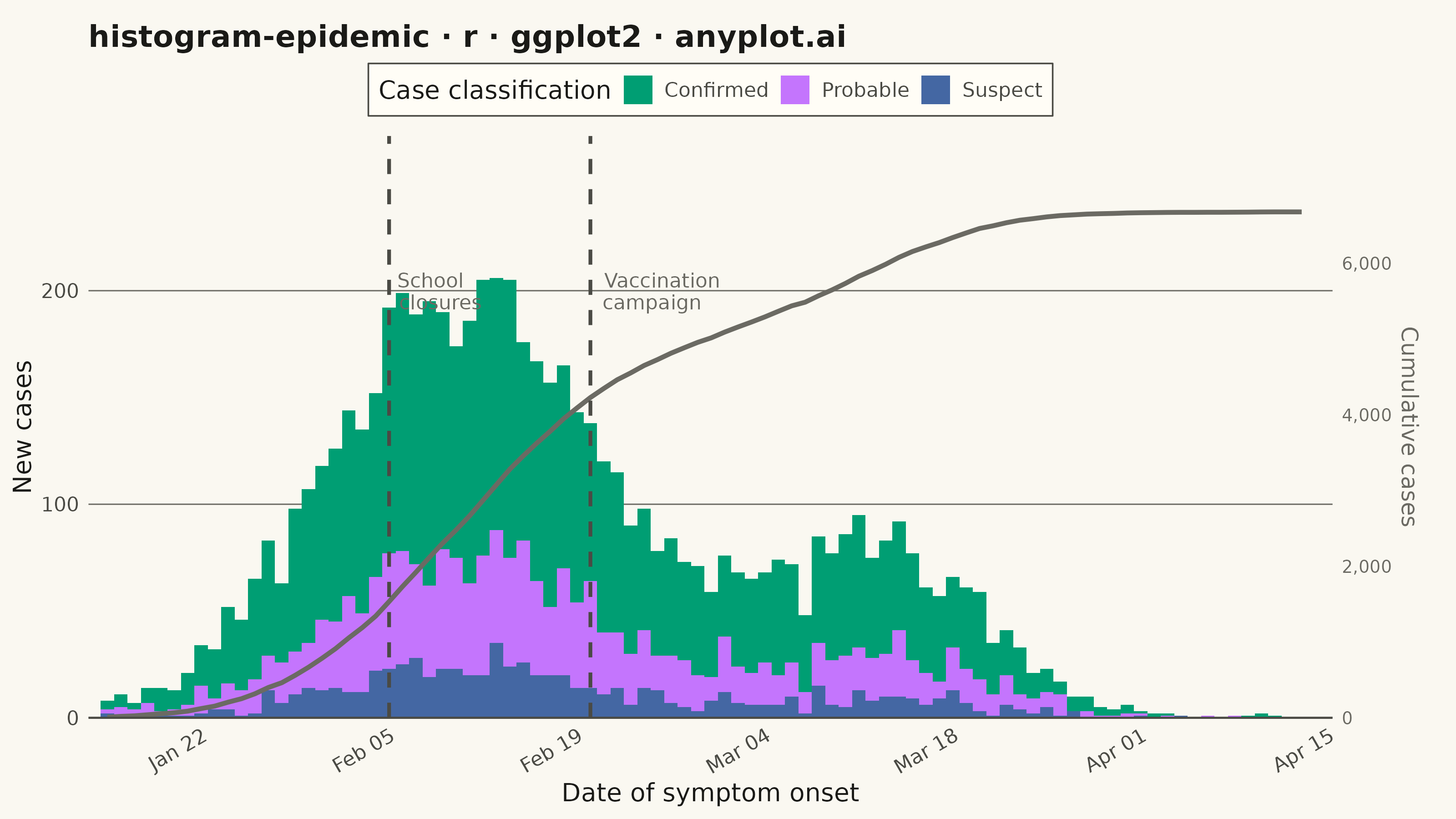
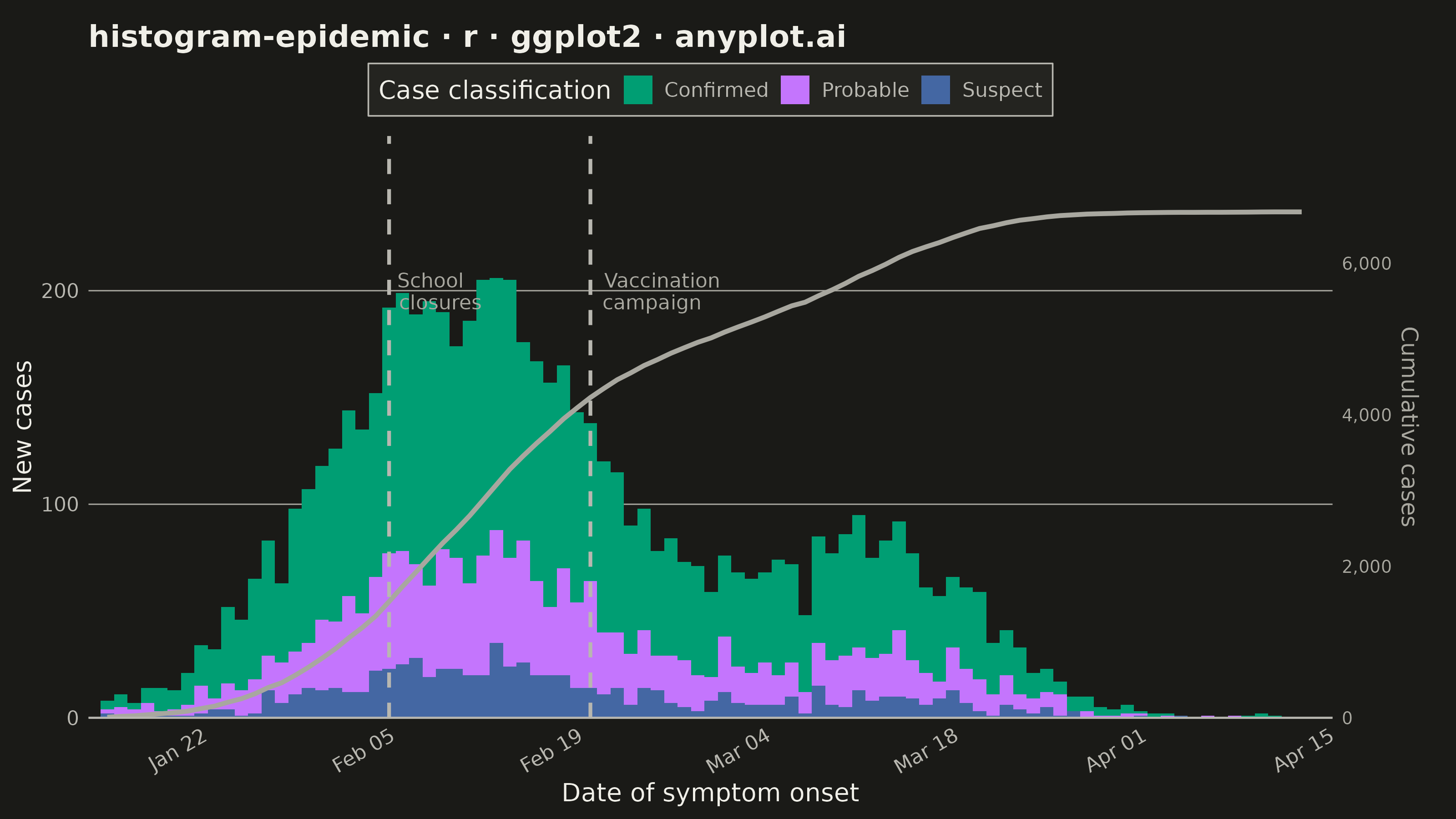
An epidemic curve (epi curve) is a histogram showing the number of new disease cases over time, plotted by date of symptom onset. The shape of the curve reveals the outbreak pattern: a sharp peak indicates a point source, successive waves suggest propagated transmission, and a plateau indicates continuous exposure. It is fundamental to epidemiological investigation and public health surveillance.
#' anyplot.ai
#' histogram-epidemic: Epidemic Curve (Epi Curve)
#' Library: ggplot2 3.5.1 | R 4.4.1
#' Quality: 89/100 | Created: 2026-06-02

library(ggplot2)
library(scales)
library(ragg)

set.seed(42)

# Theme tokens (Imprint palette, theme-adaptive chrome)
THEME       <- Sys.getenv("ANYPLOT_THEME", "light")
PAGE_BG     <- if (THEME == "light") "#FAF8F1" else "#1A1A17"
ELEVATED_BG <- if (THEME == "light") "#FFFDF6" else "#242420"
INK         <- if (THEME == "light") "#1A1A17" else "#F0EFE8"
INK_SOFT    <- if (THEME == "light") "#4A4A44" else "#B8B7B0"
INK_MUTED   <- if (THEME == "light") "#6B6A63" else "#A8A79F"

IMPRINT_PALETTE <- c(
    "#009E73",  # 1 - confirmed (brand green, always first)
    "#C475FD",  # 2 - probable (lavender)
    "#4467A3"   # 3 - suspect (blue)
)

# Data: simulated two-wave influenza outbreak (90 days, Jan-Apr 2024)
n_days     <- 90
start_date <- as.Date("2024-01-15")
dates      <- seq(start_date, by = "day", length.out = n_days)
days       <- seq_len(n_days)

# Two-wave epidemic curve (Gaussian mixture)
primary   <- 200 * exp(-((days - 28)^2) / (2 * 10^2))
secondary <-  80 * exp(-((days - 58)^2) / (2 *  8^2))
lambda    <- pmax(primary + secondary, 0.5)
total     <- rpois(n_days, lambda = lambda)

# Split into case classifications
confirmed <- rbinom(n_days, size = total, prob = 0.62)
remaining <- total - confirmed
probable  <- rbinom(n_days, size = remaining, prob = 0.70)
suspect   <- remaining - probable

df <- data.frame(
    date      = rep(dates, 3),
    cases     = c(confirmed, probable, suspect),
    case_type = factor(
        rep(c("Confirmed", "Probable", "Suspect"), each = n_days),
        levels = c("Confirmed", "Probable", "Suspect")
    )
)

# Public health intervention events
events <- data.frame(
    date  = as.Date(c("2024-02-05", "2024-02-20")),
    label = c("School\nclosures", "Vaccination\ncampaign")
)

y_max <- max(tapply(df$cases, df$date, sum), na.rm = TRUE)

# Cumulative case burden for secondary y-axis
total_by_date <- tapply(df$cases, df$date, sum)
cum_df <- data.frame(
    date  = as.Date(names(total_by_date)),
    daily = as.numeric(total_by_date)
)
cum_df        <- cum_df[order(cum_df$date), ]
cum_df$cumulative <- cumsum(cum_df$daily)
cum_max      <- max(cum_df$cumulative)
scale_factor <- (y_max * 1.15) / cum_max  # scale cumulative to primary axis range

# Plot
p <- ggplot(df, aes(x = date, y = cases, fill = case_type)) +
    geom_col(width = 1, position = "stack") +
    geom_line(
        data        = cum_df,
        aes(x = date, y = cumulative * scale_factor),
        color       = INK_MUTED,
        linewidth   = 0.9,
        linetype    = "solid",
        inherit.aes = FALSE
    ) +
    geom_vline(
        data     = events,
        aes(xintercept = date),
        color    = INK_SOFT,
        linewidth = 0.7,
        linetype = "dashed"
    ) +
    geom_text(
        data        = events,
        aes(x = date, y = y_max * 0.97, label = label),
        color       = INK_MUTED,
        size        = 2.8,
        hjust       = -0.12,
        lineheight  = 0.9,
        inherit.aes = FALSE
    ) +
    scale_fill_manual(
        values = IMPRINT_PALETTE,
        name   = "Case classification"
    ) +
    scale_x_date(
        date_breaks = "2 weeks",
        date_labels = "%b %d",
        expand      = expansion(mult = c(0.01, 0.02))
    ) +
    scale_y_continuous(
        expand   = expansion(mult = c(0, 0.15)),
        labels   = label_comma(),
        sec.axis = sec_axis(
            ~ . / scale_factor,
            name   = "Cumulative cases",
            labels = label_comma()
        )
    ) +
    labs(
        x     = "Date of symptom onset",
        y     = "New cases",
        title = "histogram-epidemic · r · ggplot2 · anyplot.ai"
    ) +
    theme_minimal(base_size = 8) +
    theme(
        plot.background    = element_rect(fill = PAGE_BG,     color = PAGE_BG),
        panel.background   = element_rect(fill = PAGE_BG,     color = NA),
        panel.grid.major.y = element_line(color = INK_MUTED,  linewidth = 0.25),
        panel.grid.major.x = element_blank(),
        panel.grid.minor   = element_blank(),
        axis.title         = element_text(color = INK,        size = 10),
        axis.title.y.right = element_text(color = INK_MUTED,  size = 9),
        axis.text          = element_text(color = INK_SOFT,   size = 8),
        axis.text.x        = element_text(angle = 30,         hjust = 1),
        axis.text.y.right  = element_text(color = INK_MUTED,  size = 7),
        axis.line.x        = element_line(color = INK_SOFT,   linewidth = 0.4),
        plot.title         = element_text(color = INK,        size = 12, face = "bold"),
        legend.background  = element_rect(fill = ELEVATED_BG, color = INK_SOFT, linewidth = 0.3),
        legend.text        = element_text(color = INK_SOFT,   size = 8),
        legend.title       = element_text(color = INK,        size = 10),
        legend.position    = "top",
        legend.key.size    = unit(0.45, "cm"),
        plot.margin        = margin(t = 10, r = 15, b = 5, l = 5, unit = "pt")
    )

# Save
ggsave(
    filename = sprintf("plot-%s.png", THEME),
    plot     = p,
    device   = ragg::agg_png,
    width    = 8,
    height   = 4.5,
    units    = "in",
    dpi      = 400
)
Runnable source as JSON, for any HTTP client: https://api.anyplot.ai/specs/histogram-epidemic/ggplot2/code. Any spec id and library id listed in llms-full.txt fit the same URL shape; every URL below is complete and callable.
{
  "spec_id": "histogram-epidemic",
  "language": "r",
  "library": "ggplot2",
  "page": "https://anyplot.ai/histogram-epidemic/r/ggplot2",
  "hub": "https://anyplot.ai/histogram-epidemic",
  "code_json": "https://api.anyplot.ai/specs/histogram-epidemic/ggplot2/code",
  "spec_json": "https://api.anyplot.ai/specs/histogram-epidemic",
  "render_light_png": "https://storage.googleapis.com/anyplot-images/plots/histogram-epidemic/r/ggplot2/plot-light.png",
  "render_dark_png": "https://storage.googleapis.com/anyplot-images/plots/histogram-epidemic/r/ggplot2/plot-dark.png",
  "quality_score": 89.0,
  "license": "MIT",
  "guide": "https://anyplot.ai/llms.txt"
}
Part of Epidemic Curve (Epi Curve) on anyplot.ai.