The same plot in 14 other libraries — Python: Altair, Bokeh, lets-plot, Matplotlib, Plotly, plotnine, Pygal, Seaborn; R: ggplot2; JavaScript: Chart.js, D3.js, Apache ECharts, Highcharts, MUI X Charts. Compare all 15 side by side: Epidemic Curve (Epi Curve) in Python, R, Julia and JavaScript.
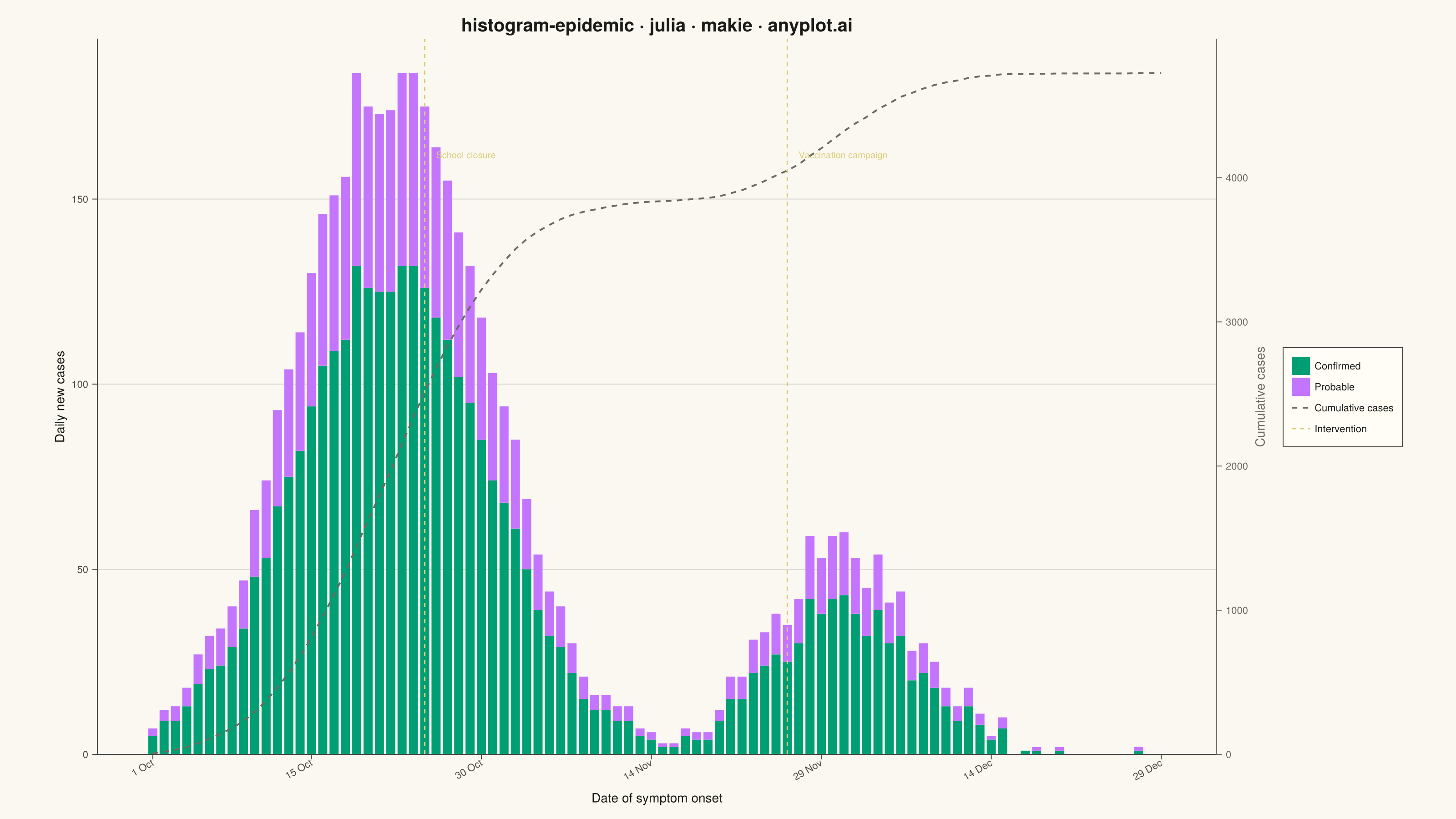
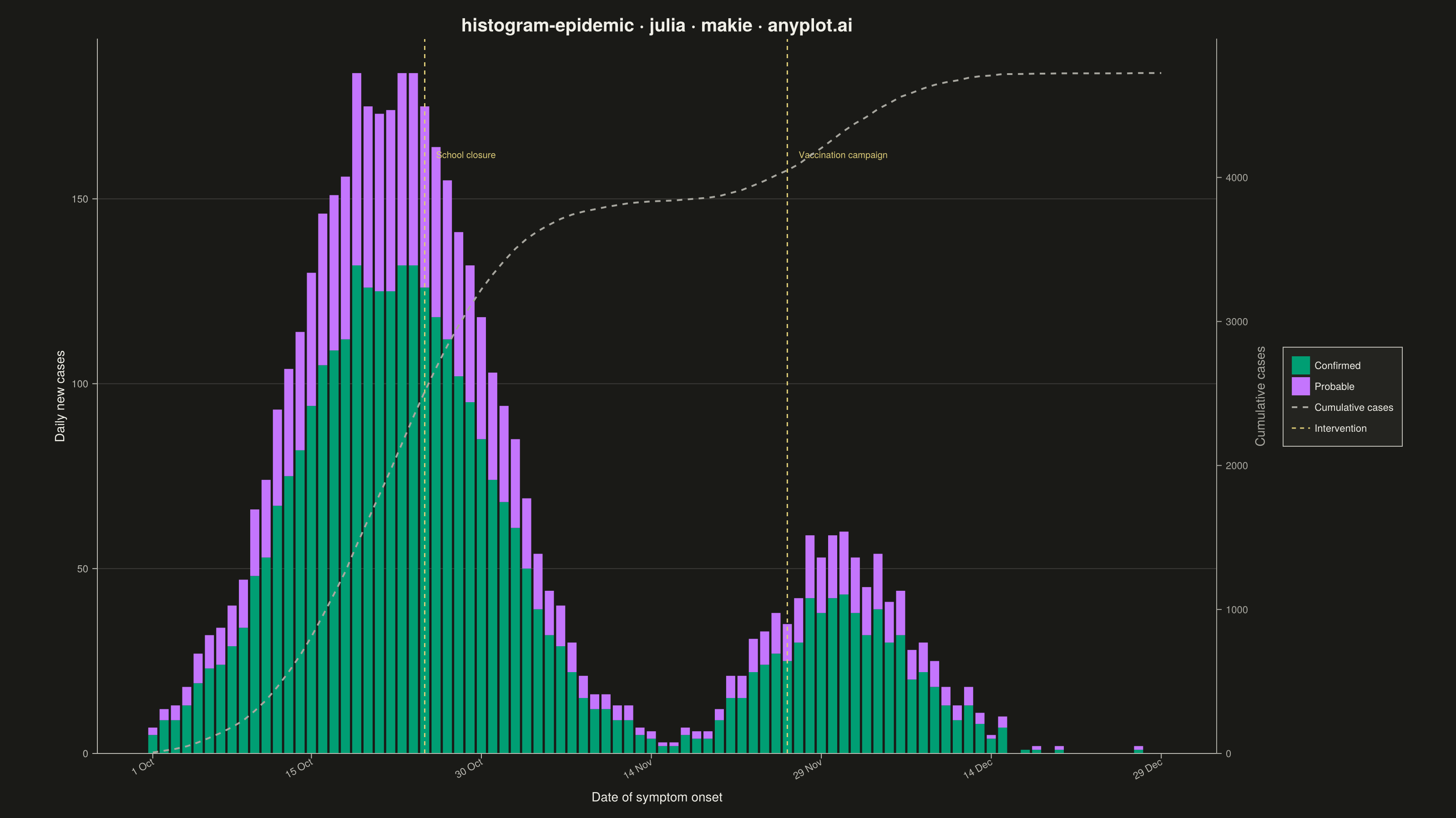
An epidemic curve (epi curve) is a histogram showing the number of new disease cases over time, plotted by date of symptom onset. The shape of the curve reveals the outbreak pattern: a sharp peak indicates a point source, successive waves suggest propagated transmission, and a plateau indicates continuous exposure. It is fundamental to epidemiological investigation and public health surveillance.
# anyplot.ai
# histogram-epidemic: Epidemic Curve (Epi Curve)
# Library: makie 0.22.10 | Julia 1.11.9
# Quality: 91/100 | Created: 2026-06-02

using CairoMakie
using Colors
using Random
using Dates

Random.seed!(42)

# Theme tokens
const THEME       = get(ENV, "ANYPLOT_THEME", "light")
const PAGE_BG     = THEME == "light" ? colorant"#FAF8F1" : colorant"#1A1A17"
const ELEVATED_BG = THEME == "light" ? colorant"#FFFDF6" : colorant"#242420"
const INK         = THEME == "light" ? colorant"#1A1A17" : colorant"#F0EFE8"
const INK_SOFT    = THEME == "light" ? colorant"#4A4A44" : colorant"#B8B7B0"
const INK_MUTED   = THEME == "light" ? colorant"#6B6A63" : colorant"#A8A79F"

# Imprint palette — confirmed: pos 1 (brand green), probable: pos 2 (lavender)
const BRAND    = colorant"#009E73"
const LAVENDER = colorant"#C475FD"
const AMBER    = colorant"#DDCC77"   # semantic anchor — intervention events

# Data — 90-day influenza-like outbreak, Oct–Dec 2023
n_days = 90
start_date = Date(2023, 10, 1)

wave1 = [180.0 * exp(-0.5 * ((d - 22)^2) / 72.0) for d in 1:n_days]
wave2 = [55.0 * exp(-0.5 * ((d - 62)^2) / 45.0) for d in 1:n_days]
noise = randn(n_days) .* 4.0
total_cases = max.(0, round.(Int, wave1 .+ wave2 .+ noise))

confirmed  = round.(Int, total_cases .* 0.72)
probable   = total_cases .- confirmed
cumulative = cumsum(total_cases)
max_daily  = maximum(total_cases)

# Stacked barplot vectors (confirmed = stack 1 bottom, probable = stack 2 top)
x_stacked    = vcat(1:n_days, 1:n_days)
y_stacked    = vcat(Float64.(confirmed), Float64.(probable))
stack_groups = vcat(fill(1, n_days), fill(2, n_days))
bar_colors   = vcat(fill(BRAND, n_days), fill(LAVENDER, n_days))

# X-axis ticks — fortnightly + endpoints
tick_positions = [1, 15, 30, 45, 60, 75, 90]
tick_labels    = [Dates.format(start_date + Day(d - 1), "d u") for d in tick_positions]

# Intervention events (day, label)
interventions = [(25, "School closure"), (57, "Vaccination campaign")]

# Figure
fig = Figure(
    size            = (1600, 900),
    fontsize        = 14,
    backgroundcolor = PAGE_BG,
)

# Primary axis: daily case counts (left y-axis)
ax = Axis(
    fig[1, 1];
    title              = "histogram-epidemic · julia · makie · anyplot.ai",
    titlesize          = 20,
    titlecolor         = INK,
    xlabel             = "Date of symptom onset",
    ylabel             = "Daily new cases",
    xlabelsize         = 14,
    ylabelsize         = 14,
    xlabelcolor        = INK,
    ylabelcolor        = INK,
    xticklabelsize     = 11,
    yticklabelsize     = 11,
    xticklabelcolor    = INK_SOFT,
    yticklabelcolor    = INK_SOFT,
    xtickcolor         = INK_SOFT,
    ytickcolor         = INK_SOFT,
    backgroundcolor    = PAGE_BG,
    topspinevisible    = false,
    rightspinevisible  = false,
    leftspinecolor     = INK_SOFT,
    bottomspinecolor   = INK_SOFT,
    xgridvisible       = false,
    ygridcolor         = RGBAf(INK.r, INK.g, INK.b, 0.15),
    xminorgridvisible  = false,
    yminorgridvisible  = false,
    xticks             = (tick_positions, tick_labels),
    xticklabelrotation = π / 6,
    xticklabelalign    = (:right, :center),
)

# Secondary axis: cumulative cases (right y-axis)
ax2 = Axis(
    fig[1, 1];
    yaxisposition      = :right,
    ylabel             = "Cumulative cases",
    ylabelsize         = 14,
    ylabelcolor        = INK_MUTED,
    yticklabelsize     = 11,
    yticklabelcolor    = INK_MUTED,
    ytickcolor         = INK_MUTED,
    rightspinecolor    = INK_MUTED,
    backgroundcolor    = :transparent,
    topspinevisible    = false,
    leftspinevisible   = false,
    bottomspinevisible = false,
    xgridvisible       = false,
    ygridvisible       = false,
    xminorgridvisible  = false,
    yminorgridvisible  = false,
)
hidexdecorations!(ax2)
linkxaxes!(ax, ax2)

# Stacked bars (epi curve histogram)
barplot!(ax, x_stacked, y_stacked;
    stack       = stack_groups,
    color       = bar_colors,
    strokewidth = 0,
    width       = 1.0,
)

# Cumulative line on secondary axis
lines!(ax2, 1:n_days, Float64.(cumulative);
    color     = INK_MUTED,
    linewidth = 2.0,
    linestyle = :dash,
)

# Intervention events — vertical lines with labels
for (day, label) in interventions
    vlines!(ax, [Float64(day)]; color = AMBER, linewidth = 1.5, linestyle = :dash)
    text!(ax, day + 1, max_daily * 0.88;
        text    = label,
        fontsize = 10,
        color   = AMBER,
        align   = (:left, :center),
    )
end

# Axis limits
ylims!(ax, 0, nothing)
ylims!(ax2, 0, nothing)
xlims!(ax, 0.5, n_days + 0.5)

# Legend
legend_entries = [
    PolyElement(color = BRAND, strokewidth = 0),
    PolyElement(color = LAVENDER, strokewidth = 0),
    LineElement(color = INK_MUTED, linewidth = 2.0, linestyle = :dash),
    LineElement(color = AMBER, linewidth = 1.5, linestyle = :dash),
]
legend_labels = ["Confirmed", "Probable", "Cumulative cases", "Intervention"]

Legend(
    fig[1, 2],
    legend_entries,
    legend_labels;
    framecolor      = INK_SOFT,
    framevisible    = true,
    backgroundcolor = ELEVATED_BG,
    labelsize       = 11,
    labelcolor      = INK,
    padding         = (10, 10, 10, 10),
)

colsize!(fig.layout, 1, Relative(0.85))

# Save
save("plot-$(THEME).png", fig; px_per_unit = 2)
Runnable source as JSON, for any HTTP client: https://api.anyplot.ai/specs/histogram-epidemic/makie/code. Any spec id and library id listed in llms-full.txt fit the same URL shape; every URL below is complete and callable.
{
  "spec_id": "histogram-epidemic",
  "language": "julia",
  "library": "makie",
  "page": "https://anyplot.ai/histogram-epidemic/julia/makie",
  "hub": "https://anyplot.ai/histogram-epidemic",
  "code_json": "https://api.anyplot.ai/specs/histogram-epidemic/makie/code",
  "spec_json": "https://api.anyplot.ai/specs/histogram-epidemic",
  "render_light_png": "https://storage.googleapis.com/anyplot-images/plots/histogram-epidemic/julia/makie/plot-light.png",
  "render_dark_png": "https://storage.googleapis.com/anyplot-images/plots/histogram-epidemic/julia/makie/plot-dark.png",
  "quality_score": 91.0,
  "license": "MIT",
  "guide": "https://anyplot.ai/llms.txt"
}
Part of Epidemic Curve (Epi Curve) on anyplot.ai.