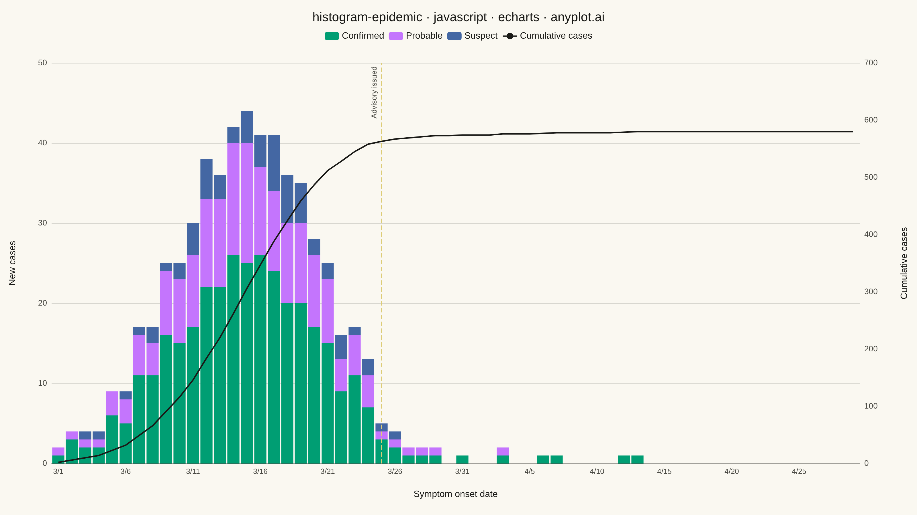
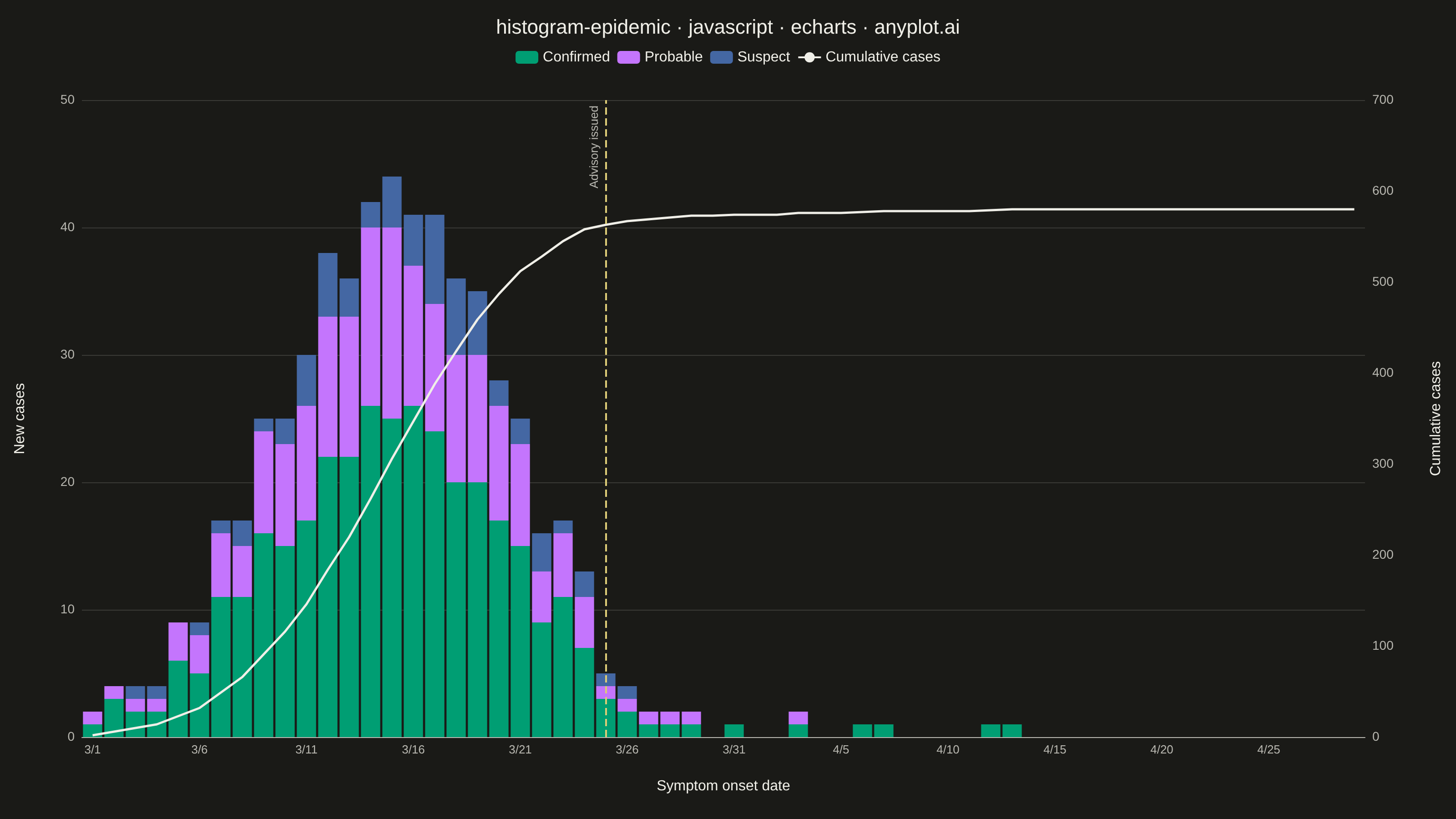
The same plot in 14 other libraries — JavaScript: Chart.js, D3.js, Highcharts, MUI X Charts; Python: Altair, Bokeh, lets-plot, Matplotlib, Plotly, plotnine, Pygal, Seaborn; R: ggplot2; Julia: Makie.jl. Compare all 15 side by side: Epidemic Curve (Epi Curve) in Python, R, Julia and JavaScript.
An epidemic curve (epi curve) is a histogram showing the number of new disease cases over time, plotted by date of symptom onset. The shape of the curve reveals the outbreak pattern: a sharp peak indicates a point source, successive waves suggest propagated transmission, and a plateau indicates continuous exposure. It is fundamental to epidemiological investigation and public health surveillance.
// anyplot.ai
// histogram-epidemic: Epidemic Curve (Epi Curve)
// Library: echarts 6.1.0 | JavaScript 22.23.2
// Quality: 89/100 | Created: 2026-08-26

const t = window.ANYPLOT_TOKENS;

// --- Data (in-memory, deterministic LCG) ------------------------------------
// Simulated foodborine-illness outbreak, daily symptom-onset counts over 60 days.
let seed = 42;
function lcg() {
  seed = (seed * 1103515245 + 12345) & 0x7fffffff;
  return seed / 0x7fffffff;
}

const DAYS = 60;
const LOCKDOWN_DAY = 24; // intervention: public health advisory issued

const dates = [];
const confirmed = [];
const probable = [];
const suspect = [];

for (let day = 0; day < DAYS; day++) {
  const d = new Date(2026, 2, 1 + day); // Mar 1 2026 start
  dates.push(`${d.getMonth() + 1}/${d.getDate()}`);

  // Point-source outbreak: sharp rise, peak, decay; intervention accelerates the decline.
  const peakDistance = day - 14;
  const preIntervention = 42 * Math.exp(-(peakDistance * peakDistance) / 60);
  const decayBoost = day > LOCKDOWN_DAY ? Math.exp(-(day - LOCKDOWN_DAY) / 6) : 1;
  const base = Math.max(0, preIntervention * decayBoost);

  // Taper the post-intervention noise to zero so the resolved outbreak's tail
  // reads as genuinely over, instead of a sporadic near-zero background rate.
  const noiseScale = day > LOCKDOWN_DAY ? Math.max(0, 1 - (day - LOCKDOWN_DAY) / 25) : 1;
  const total = Math.round(base + (lcg() - 0.5) * 6 * noiseScale);
  const c = Math.max(0, Math.round(total * (0.55 + lcg() * 0.1)));
  const p = Math.max(0, Math.round(total * (0.25 + lcg() * 0.1)));
  const s = Math.max(0, total - c - p);

  confirmed.push(c);
  probable.push(p);
  suspect.push(Math.max(0, s));
}

const cumulative = [];
let running = 0;
for (let day = 0; day < DAYS; day++) {
  running += confirmed[day] + probable[day] + suspect[day];
  cumulative.push(running);
}
// Headroom on the secondary axis keeps the intervention markLine label clear
// of the cumulative line's own inflection point near the top of the chart.
const cumulativeMax = Math.ceil((cumulative[cumulative.length - 1] * 1.2) / 50) * 50;

// --- Init ---------------------------------------------------------------
const chart = echarts.init(document.getElementById("container"));

// --- Option ---------------------------------------------------------------
chart.setOption({
  animation: false,
  color: [t.palette[0], t.palette[1], t.palette[2]],
  backgroundColor: "transparent",
  title: {
    text: "histogram-epidemic · javascript · echarts · anyplot.ai",
    left: "center",
    textStyle: { color: t.ink, fontSize: 22, fontWeight: 500 },
  },
  legend: {
    top: 50,
    data: ["Confirmed", "Probable", "Suspect", "Cumulative cases"],
    textStyle: { color: t.ink, fontSize: 16 },
  },
  grid: { left: 90, right: 100, top: 110, bottom: 90 },
  xAxis: {
    type: "category",
    data: dates,
    name: "Symptom onset date",
    nameLocation: "middle",
    nameGap: 46,
    nameTextStyle: { color: t.ink, fontSize: 16 },
    axisLabel: { color: t.inkSoft, fontSize: 13, interval: 4, rotate: 0 },
    axisLine: { lineStyle: { color: t.inkSoft } },
    axisTick: { show: false },
    splitLine: { show: false },
  },
  yAxis: [
    {
      type: "value",
      name: "New cases",
      nameLocation: "middle",
      nameGap: 60,
      nameTextStyle: { color: t.ink, fontSize: 16 },
      axisLabel: { color: t.inkSoft, fontSize: 14 },
      axisLine: { show: false },
      axisTick: { show: false },
      splitLine: { lineStyle: { color: t.grid } },
    },
    {
      type: "value",
      name: "Cumulative cases",
      nameLocation: "middle",
      nameGap: 70,
      max: cumulativeMax,
      nameTextStyle: { color: t.ink, fontSize: 16 },
      axisLabel: { color: t.inkSoft, fontSize: 14 },
      axisLine: { show: false },
      axisTick: { show: false },
      splitLine: { show: false },
    },
  ],
  series: [
    {
      name: "Confirmed",
      type: "bar",
      stack: "cases",
      barCategoryGap: "10%",
      data: confirmed,
      itemStyle: { color: t.palette[0] },
    },
    {
      name: "Probable",
      type: "bar",
      stack: "cases",
      data: probable,
      itemStyle: { color: t.palette[1] },
    },
    {
      name: "Suspect",
      type: "bar",
      stack: "cases",
      data: suspect,
      itemStyle: { color: t.palette[2] },
      markLine: {
        symbol: "none",
        silent: true,
        label: {
          formatter: "Advisory issued",
          color: t.inkSoft,
          fontSize: 13,
          position: "insideEndTop",
          distance: 6,
        },
        lineStyle: { color: t.amber, type: "dashed", width: 2 },
        data: [{ xAxis: LOCKDOWN_DAY }],
      },
    },
    {
      name: "Cumulative cases",
      type: "line",
      yAxisIndex: 1,
      data: cumulative,
      symbol: "none",
      lineStyle: { color: t.ink, width: 2.5, type: "solid" },
      itemStyle: { color: t.ink },
    },
  ],
});
Runnable source as JSON, for any HTTP client: https://api.anyplot.ai/specs/histogram-epidemic/echarts/code. Any spec id and library id listed in llms-full.txt fit the same URL shape; every URL below is complete and callable.
{
  "spec_id": "histogram-epidemic",
  "language": "javascript",
  "library": "echarts",
  "page": "https://anyplot.ai/histogram-epidemic/javascript/echarts",
  "hub": "https://anyplot.ai/histogram-epidemic",
  "code_json": "https://api.anyplot.ai/specs/histogram-epidemic/echarts/code",
  "spec_json": "https://api.anyplot.ai/specs/histogram-epidemic",
  "render_light_png": "https://storage.googleapis.com/anyplot-images/plots/histogram-epidemic/javascript/echarts/plot-light.png",
  "render_dark_png": "https://storage.googleapis.com/anyplot-images/plots/histogram-epidemic/javascript/echarts/plot-dark.png",
  "interactive_light_html": "https://storage.googleapis.com/anyplot-images/plots/histogram-epidemic/javascript/echarts/plot-light.html",
  "interactive_dark_html": "https://storage.googleapis.com/anyplot-images/plots/histogram-epidemic/javascript/echarts/plot-dark.html",
  "quality_score": 89.0,
  "license": "MIT",
  "guide": "https://anyplot.ai/llms.txt"
}
Part of Epidemic Curve (Epi Curve) on anyplot.ai.