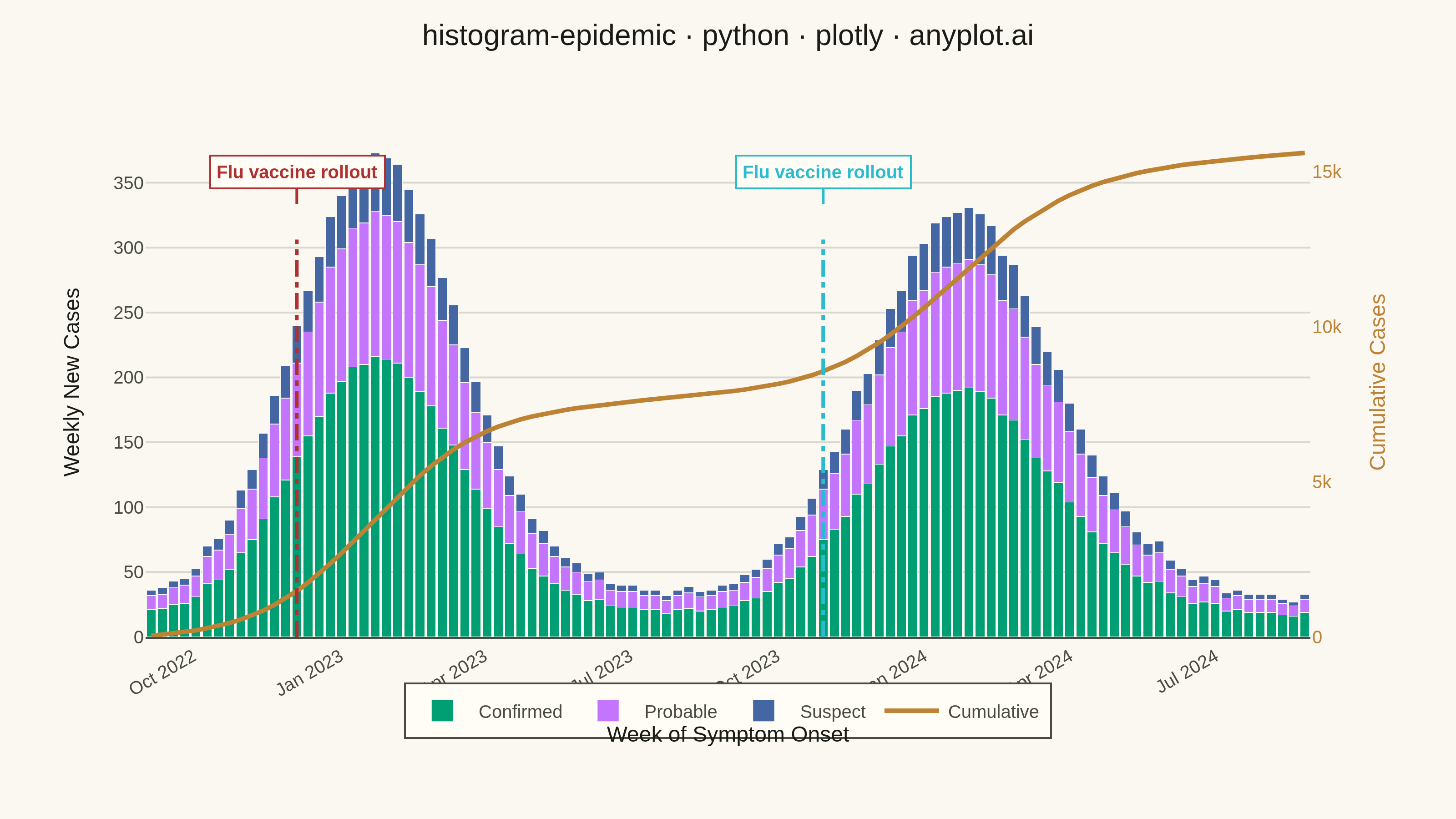
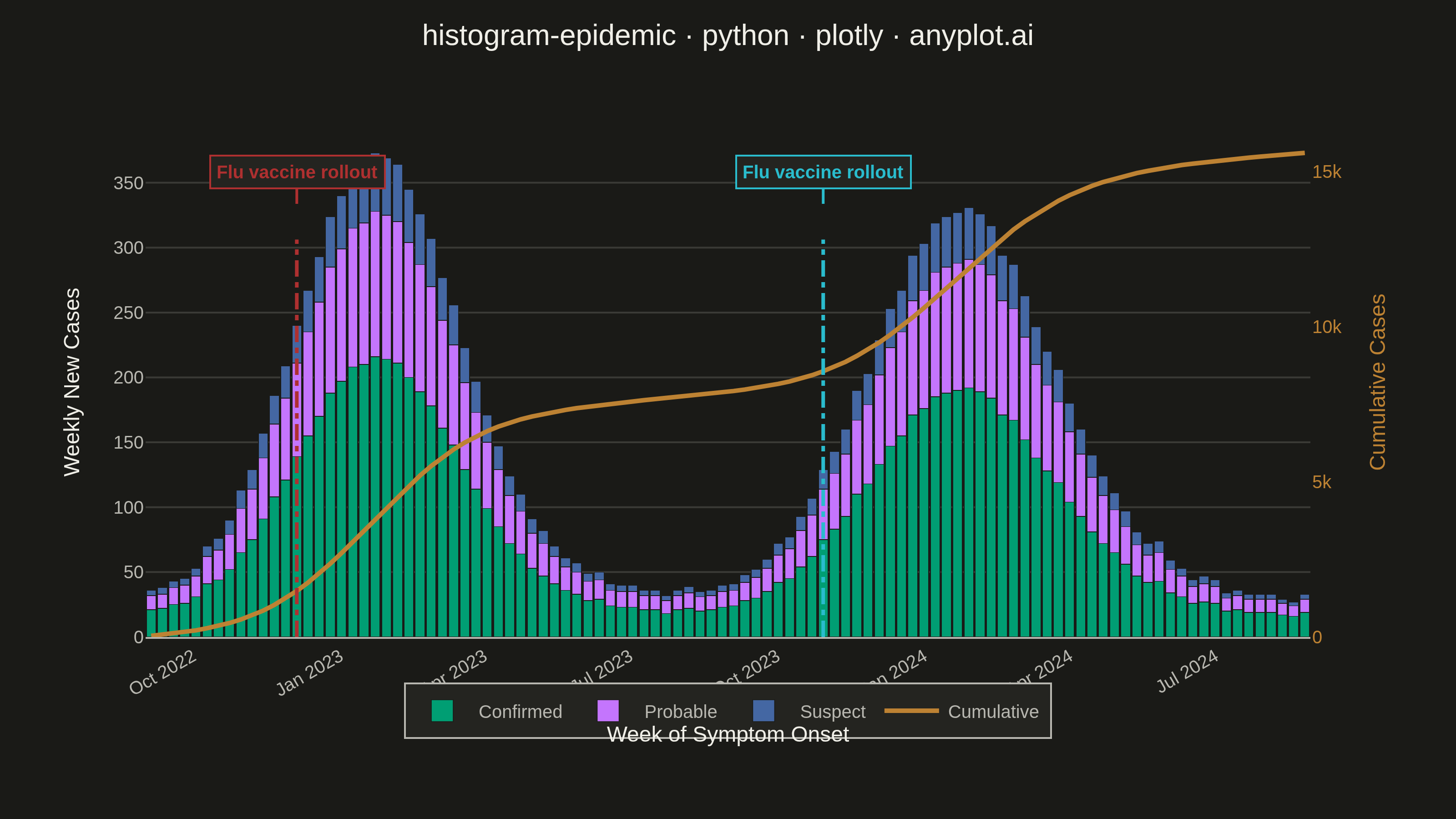
An epidemic curve (epi curve) is a histogram showing the number of new disease cases over time, plotted by date of symptom onset. The shape of the curve reveals the outbreak pattern: a sharp peak indicates a point source, successive waves suggest propagated transmission, and a plateau indicates continuous exposure. It is fundamental to epidemiological investigation and public health surveillance.
""" anyplot.ai
histogram-epidemic: Epidemic Curve (Epi Curve)
Library: plotly 6.7.0 | Python 3.13.13
Quality: 84/100 | Updated: 2026-06-02
"""

import os

import numpy as np
import pandas as pd
import plotly.graph_objects as go


THEME = os.getenv("ANYPLOT_THEME", "light")

# Imprint palette — theme-independent data colors
IMPRINT_PALETTE = ["#009E73", "#C475FD", "#4467A3", "#BD8233", "#AE3030", "#2ABCCD", "#954477", "#99B314"]

# Theme-adaptive chrome
PAGE_BG = "#FAF8F1" if THEME == "light" else "#1A1A17"
ELEVATED_BG = "#FFFDF6" if THEME == "light" else "#242420"
INK = "#1A1A17" if THEME == "light" else "#F0EFE8"
INK_SOFT = "#4A4A44" if THEME == "light" else "#B8B7B0"
GRID = "rgba(26,26,23,0.15)" if THEME == "light" else "rgba(240,239,232,0.15)"

# Data — two influenza-like illness seasons over 104 weeks (weekly bins)
# Seasonal cycling pattern: distinct winter peaks, low endemic summer baseline
np.random.seed(17)
weeks = pd.date_range("2022-09-05", periods=104, freq="W-MON")

t = np.arange(104)
# Season 1 peak: ~week 20 (mid-Jan 2023); Season 2 peak: ~week 72 (mid-Jan 2024)
season1 = 320 * np.exp(-0.5 * ((t - 20) / 7) ** 2)
season2 = 275 * np.exp(-0.5 * ((t - 72) / 8) ** 2)
endemic = 35 + 12 * np.sin(2 * np.pi * t / 52 - np.pi / 2)

base_cases = np.maximum(0, season1 + season2 + endemic + np.random.poisson(8, 104))

confirmed = np.round(base_cases * 0.58).astype(int)
probable = np.round(base_cases * 0.30).astype(int)
suspect = np.round(base_cases * 0.12).astype(int)
cumulative = np.cumsum(confirmed + probable + suspect)

# Convert to strings for kaleido JSON serialization
weeks_str = [d.strftime("%Y-%m-%d") for d in weeks]

fig = go.Figure()

fig.add_trace(
    go.Bar(
        x=weeks_str,
        y=confirmed,
        name="Confirmed",
        marker={"color": IMPRINT_PALETTE[0], "line": {"color": PAGE_BG, "width": 0.4}},
        hovertemplate="%{y} cases<extra></extra>",
    )
)

fig.add_trace(
    go.Bar(
        x=weeks_str,
        y=probable,
        name="Probable",
        marker={"color": IMPRINT_PALETTE[1], "line": {"color": PAGE_BG, "width": 0.4}},
        hovertemplate="%{y} cases<extra></extra>",
    )
)

fig.add_trace(
    go.Bar(
        x=weeks_str,
        y=suspect,
        name="Suspect",
        marker={"color": IMPRINT_PALETTE[2], "line": {"color": PAGE_BG, "width": 0.4}},
        hovertemplate="%{y} cases<extra></extra>",
    )
)

# Cumulative burden line on secondary y-axis
fig.add_trace(
    go.Scatter(
        x=weeks_str,
        y=cumulative,
        name="Cumulative",
        yaxis="y2",
        mode="lines",
        line={"color": IMPRINT_PALETTE[3], "width": 2.5},
        hovertemplate="%{y:,} total<extra></extra>",
    )
)

# Intervention annotation lines: vaccination campaign rollouts before each season peak
for evt_date, evt_label, evt_color in [
    (weeks_str[13], "Flu vaccine rollout", IMPRINT_PALETTE[4]),  # Dec 2022, before Season 1 peak
    (weeks_str[60], "Flu vaccine rollout", IMPRINT_PALETTE[5]),  # Oct 2023, before Season 2 peak
]:
    fig.add_shape(
        type="line",
        x0=evt_date,
        x1=evt_date,
        y0=0,
        y1=0.78,
        yref="paper",
        line={"color": evt_color, "width": 2, "dash": "dashdot"},
    )
    fig.add_annotation(
        x=evt_date,
        y=0.85,
        yref="paper",
        text=f"<b>{evt_label}</b>",
        showarrow=True,
        arrowhead=0,
        arrowwidth=1.5,
        arrowcolor=evt_color,
        ax=0,
        ay=-30,
        font={"size": 10, "color": evt_color, "family": "Arial"},
        align="center",
        bgcolor=ELEVATED_BG,
        bordercolor=evt_color,
        borderwidth=1,
        borderpad=3,
    )

fig.update_layout(
    autosize=False,
    title={
        "text": "histogram-epidemic · python · plotly · anyplot.ai",
        "font": {"size": 16, "color": INK, "family": "Arial"},
        "x": 0.5,
        "xanchor": "center",
        "y": 0.93,
        "yanchor": "top",
    },
    hovermode="x unified",
    xaxis={
        "title": {"text": "Week of Symptom Onset", "font": {"size": 12, "color": INK}},
        "tickfont": {"size": 10, "color": INK_SOFT},
        "tickformat": "%b %Y",
        "dtick": "M3",
        "tickangle": -30,
        "showgrid": False,
        "zeroline": False,
        "showline": False,
        "spikemode": "across",
        "spikethickness": 1,
        "spikecolor": INK_SOFT,
        "spikedash": "dot",
    },
    yaxis={
        "title": {"text": "Weekly New Cases", "font": {"size": 12, "color": INK}},
        "tickfont": {"size": 10, "color": INK_SOFT},
        "showgrid": True,
        "gridcolor": GRID,
        "gridwidth": 1,
        "zeroline": False,
        "showline": False,
        "rangemode": "tozero",
    },
    yaxis2={
        "title": {"text": "Cumulative Cases", "font": {"size": 12, "color": IMPRINT_PALETTE[3]}},
        "tickfont": {"size": 10, "color": IMPRINT_PALETTE[3]},
        "overlaying": "y",
        "side": "right",
        "showgrid": False,
        "zeroline": False,
        "rangemode": "tozero",
    },
    barmode="stack",
    bargap=0.15,
    paper_bgcolor=PAGE_BG,
    plot_bgcolor=PAGE_BG,
    font={"color": INK, "family": "Arial"},
    legend={
        "font": {"size": 10, "color": INK_SOFT},
        "orientation": "h",
        "traceorder": "normal",
        "yanchor": "bottom",
        "y": 1.02,
        "xanchor": "center",
        "x": 0.5,
        "bgcolor": ELEVATED_BG,
        "bordercolor": INK_SOFT,
        "borderwidth": 1,
    },
    margin={"l": 80, "r": 80, "t": 90, "b": 100},
)

fig.write_image(f"plot-{THEME}.png", width=800, height=450, scale=4)
fig.write_html(f"plot-{THEME}.html", include_plotlyjs="cdn")
Runnable source as JSON, for any HTTP client: https://api.anyplot.ai/specs/histogram-epidemic/plotly/code. Any spec id and library id listed in llms-full.txt fit the same URL shape; every URL below is complete and callable.
{
  "spec_id": "histogram-epidemic",
  "language": "python",
  "library": "plotly",
  "page": "https://anyplot.ai/histogram-epidemic/python/plotly",
  "hub": "https://anyplot.ai/histogram-epidemic",
  "code_json": "https://api.anyplot.ai/specs/histogram-epidemic/plotly/code",
  "spec_json": "https://api.anyplot.ai/specs/histogram-epidemic",
  "render_light_png": "https://storage.googleapis.com/anyplot-images/plots/histogram-epidemic/python/plotly/plot-light.png",
  "render_dark_png": "https://storage.googleapis.com/anyplot-images/plots/histogram-epidemic/python/plotly/plot-dark.png",
  "interactive_light_html": "https://storage.googleapis.com/anyplot-images/plots/histogram-epidemic/python/plotly/plot-light.html",
  "interactive_dark_html": "https://storage.googleapis.com/anyplot-images/plots/histogram-epidemic/python/plotly/plot-dark.html",
  "quality_score": 84.0,
  "license": "MIT",
  "guide": "https://anyplot.ai/llms.txt"
}
Part of Epidemic Curve (Epi Curve) on anyplot.ai.