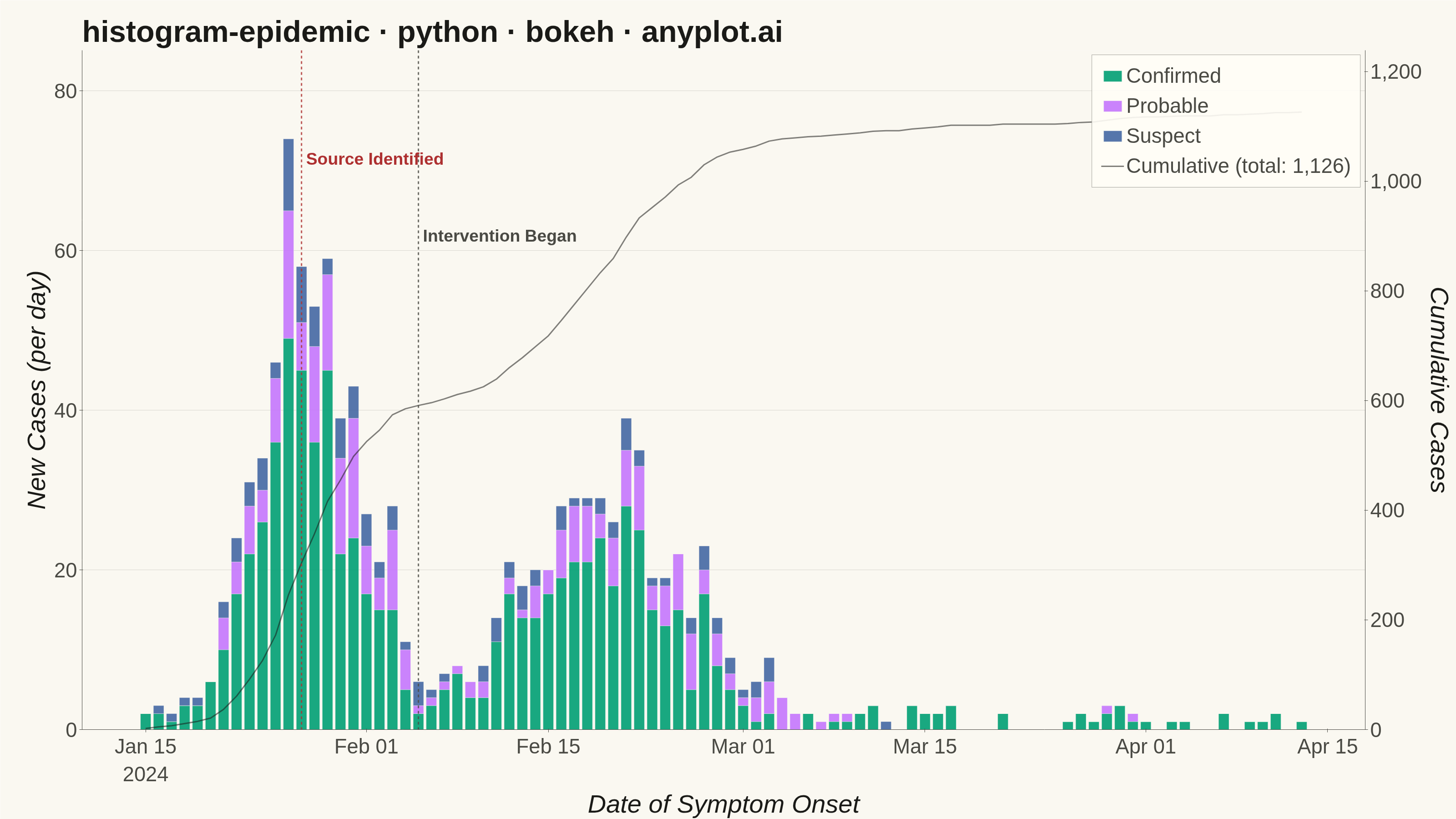
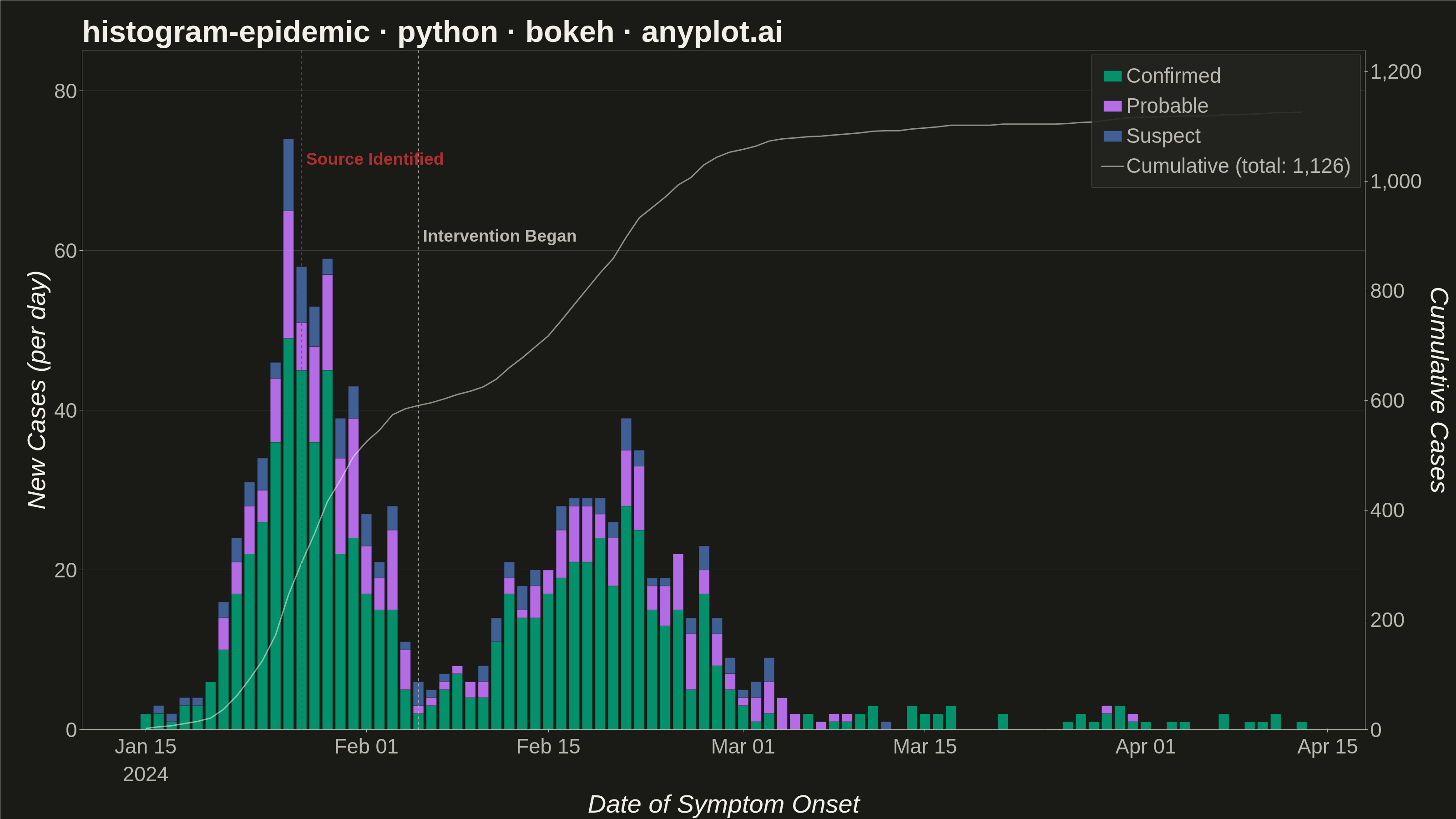
An epidemic curve (epi curve) is a histogram showing the number of new disease cases over time, plotted by date of symptom onset. The shape of the curve reveals the outbreak pattern: a sharp peak indicates a point source, successive waves suggest propagated transmission, and a plateau indicates continuous exposure. It is fundamental to epidemiological investigation and public health surveillance.
""" anyplot.ai
histogram-epidemic: Epidemic Curve (Epi Curve)
Library: bokeh 3.9.0 | Python 3.13.13
Quality: 93/100 | Updated: 2026-06-02
"""

import os
import sys


# Prevent this file (bokeh.py) from shadowing the installed bokeh package when
# Python prepends the script's directory to sys.path at startup.
_here = os.path.dirname(os.path.abspath(__file__))
sys.path = [p for p in sys.path if os.path.abspath(p) != _here]

import time
from pathlib import Path

import numpy as np
import pandas as pd
from bokeh.io import output_file, save
from bokeh.models import (
    ColumnDataSource,
    HoverTool,
    Label,
    Legend,
    LegendItem,
    LinearAxis,
    NumeralTickFormatter,
    Range1d,
    Span,
)
from bokeh.plotting import figure
from selenium import webdriver
from selenium.webdriver.chrome.options import Options


# Theme tokens (Imprint palette — default-style-guide.md "Theme-adaptive Chrome")
THEME = os.getenv("ANYPLOT_THEME", "light")
PAGE_BG = "#FAF8F1" if THEME == "light" else "#1A1A17"
ELEVATED_BG = "#FFFDF6" if THEME == "light" else "#242420"
INK = "#1A1A17" if THEME == "light" else "#F0EFE8"
INK_SOFT = "#4A4A44" if THEME == "light" else "#B8B7B0"

# Imprint categorical palette — position 1 is ALWAYS first series
IMPRINT_PALETTE = ["#009E73", "#C475FD", "#4467A3", "#BD8233", "#AE3030", "#2ABCCD", "#954477", "#99B314"]

# Data — simulated foodborne illness outbreak over 90 days
np.random.seed(42)

start_date = pd.Timestamp("2024-01-15")
dates = pd.date_range(start_date, periods=90, freq="D")
days = np.arange(90)

# Primary wave: sharp peak ~day 12 (point-source contaminated event)
confirmed_wave1 = np.random.poisson(lam=np.clip(45 * np.exp(-0.5 * ((days - 12) / 3.5) ** 2), 0.5, None))
# Secondary propagated wave ~day 35
confirmed_wave2 = np.random.poisson(lam=np.clip(20 * np.exp(-0.5 * ((days - 35) / 6) ** 2), 0.2, None))
# Low endemic tail
confirmed_tail = np.random.poisson(lam=np.clip(1.5 * np.exp(-0.03 * days), 0.1, None))
confirmed = confirmed_wave1 + confirmed_wave2 + confirmed_tail

probable = np.random.poisson(
    lam=np.clip(12 * np.exp(-0.5 * ((days - 14) / 4) ** 2) + 7 * np.exp(-0.5 * ((days - 37) / 7) ** 2), 0.1, None)
)
suspect = np.random.poisson(
    lam=np.clip(5 * np.exp(-0.5 * ((days - 13) / 5) ** 2) + 3 * np.exp(-0.5 * ((days - 36) / 8) ** 2), 0.05, None)
)

df = pd.DataFrame({"date": dates, "confirmed": confirmed, "probable": probable, "suspect": suspect})
df["total"] = df["confirmed"] + df["probable"] + df["suspect"]
df["cumulative"] = df["total"].cumsum()
df["date_str"] = df["date"].dt.strftime("%b %d")
bar_width = 0.8 * 24 * 60 * 60 * 1000  # 0.8 day in milliseconds

source = ColumnDataSource(
    data={
        "date": df["date"],
        "date_str": df["date_str"],
        "confirmed": df["confirmed"],
        "probable": df["probable"],
        "suspect": df["suspect"],
        "total": df["total"],
        "cumulative": df["cumulative"],
    }
)

stack_labels = ["confirmed", "probable", "suspect"]
display_labels = ["Confirmed", "Probable", "Suspect"]
colors = IMPRINT_PALETTE[:3]  # #009E73, #C475FD, #4467A3

title = "histogram-epidemic · python · bokeh · anyplot.ai"
# 49 chars < 67 baseline — no fontsize scaling needed

# Plot
p = figure(
    width=3200,
    height=1800,
    title=title,
    x_axis_label="Date of Symptom Onset",
    y_axis_label="New Cases (per day)",
    x_axis_type="datetime",
    toolbar_location=None,  # prevent ~30-50px toolbar bloat above canvas
    min_border_bottom=160,  # room for 34pt tick + 42pt axis label
    min_border_left=180,
    min_border_top=110,
    min_border_right=200,  # extra room for right secondary-axis label
)

# Stacked bars (idiomatic Bokeh)
renderers = p.vbar_stack(
    stack_labels, x="date", width=bar_width, color=colors, source=source, line_color=PAGE_BG, line_width=0.5, alpha=0.9
)

hover = HoverTool(
    renderers=list(renderers),
    tooltips=[
        ("Date", "@date_str"),
        ("Confirmed", "@confirmed"),
        ("Probable", "@probable"),
        ("Suspect", "@suspect"),
        ("Total", "@total"),
        ("Cumulative", "@cumulative{0,0}"),
    ],
    mode="vline",
)
p.add_tools(hover)

# Intervention lines — matte red (#AE3030) for source; INK_SOFT for response
contamination_date = pd.Timestamp("2024-01-27")
intervention_date = pd.Timestamp("2024-02-05")

p.add_layout(
    Span(
        location=contamination_date,
        dimension="height",
        line_color=IMPRINT_PALETTE[4],  # #AE3030 — source / error semantic
        line_width=3,
        line_dash="dashed",
        line_alpha=0.8,
    )
)
p.add_layout(
    Span(
        location=intervention_date,
        dimension="height",
        line_color=INK_SOFT,
        line_width=3,
        line_dash="dashed",
        line_alpha=0.8,
    )
)

max_cases = int(df["total"].max())

p.add_layout(
    Label(
        x=contamination_date,
        y=max_cases * 0.95,
        text="Source Identified",
        text_font_size="28pt",
        text_color=IMPRINT_PALETTE[4],
        text_font_style="bold",
        x_offset=10,
    )
)
p.add_layout(
    Label(
        x=intervention_date,
        y=max_cases * 0.82,
        text="Intervention Began",
        text_font_size="28pt",
        text_color=INK_SOFT,
        text_font_style="bold",
        x_offset=10,
    )
)

# Secondary y-axis — cumulative burden line
cumulative_max = int(df["cumulative"].max())
p.extra_y_ranges = {"cumulative": Range1d(start=0, end=cumulative_max * 1.1)}

cumulative_axis = LinearAxis(
    y_range_name="cumulative",
    axis_label="Cumulative Cases",
    axis_label_text_font_size="42pt",
    axis_label_text_color=INK,
    major_label_text_font_size="34pt",
    major_label_text_color=INK_SOFT,
    axis_line_color=INK_SOFT,
    minor_tick_line_color=None,
    major_tick_line_color=INK_SOFT,
    formatter=NumeralTickFormatter(format="0,0"),
)
p.add_layout(cumulative_axis, "right")

source_cumulative = ColumnDataSource(data={"date": df["date"], "cumulative": df["cumulative"]})
r_cumulative = p.line(
    x="date",
    y="cumulative",
    source=source_cumulative,
    line_color=INK,
    line_width=3,
    line_alpha=0.55,
    y_range_name="cumulative",
)

# Legend
legend_items = [LegendItem(label=lbl, renderers=[r]) for lbl, r in zip(display_labels, renderers, strict=False)]
legend_items.append(LegendItem(label=f"Cumulative (total: {cumulative_max:,})", renderers=[r_cumulative]))
legend = Legend(
    items=legend_items,
    location="top_right",
    label_text_font_size="34pt",
    label_text_color=INK_SOFT,
    glyph_width=50,
    glyph_height=30,
    spacing=14,
    padding=20,
    background_fill_alpha=0.9,
    background_fill_color=ELEVATED_BG,
    border_line_color=INK_SOFT,
    border_line_alpha=0.5,
)
p.add_layout(legend, "center")

# Typography (canonical bokeh.md sizing: title 50pt, labels 42pt, ticks 34pt)
p.title.text_font_size = "50pt"
p.title.text_color = INK
p.title.text_font_style = "bold"

p.xaxis.axis_label_text_font_size = "42pt"
p.yaxis[0].axis_label_text_font_size = "42pt"
p.xaxis.axis_label_text_color = INK
p.yaxis[0].axis_label_text_color = INK

p.xaxis.major_label_text_font_size = "34pt"
p.yaxis[0].major_label_text_font_size = "34pt"
p.xaxis.major_label_text_color = INK_SOFT
p.yaxis[0].major_label_text_color = INK_SOFT
p.yaxis[0].formatter = NumeralTickFormatter(format="0,0")

# Grid
p.xgrid.visible = False
p.ygrid.grid_line_alpha = 0.15
p.ygrid.grid_line_color = INK
p.ygrid.grid_line_width = 1

# Theme-adaptive chrome
p.background_fill_color = PAGE_BG
p.border_fill_color = PAGE_BG
p.outline_line_color = None

p.xaxis.axis_line_color = INK_SOFT
p.yaxis[0].axis_line_color = INK_SOFT
p.xaxis.minor_tick_line_color = None
p.yaxis[0].minor_tick_line_color = None
p.xaxis.major_tick_line_color = INK_SOFT
p.yaxis[0].major_tick_line_color = INK_SOFT

p.y_range.start = 0
p.y_range.end = max_cases * 1.15

# Save HTML (interactive catalog artifact)
output_file(f"plot-{THEME}.html", title=title)
save(p)

# Screenshot via headless Chrome — Selenium 4 auto-resolves the driver
W, H = 3200, 1800
opts = Options()
for arg in (
    "--headless=new",
    "--no-sandbox",
    "--disable-dev-shm-usage",
    "--disable-gpu",
    f"--window-size={W},{H}",
    "--hide-scrollbars",
):
    opts.add_argument(arg)
driver = webdriver.Chrome(options=opts)
# CDP override ensures exact viewport — window-size alone is eaten by browser chrome
driver.execute_cdp_cmd(
    "Emulation.setDeviceMetricsOverride", {"width": W, "height": H, "deviceScaleFactor": 1, "mobile": False}
)
driver.get(f"file://{Path(f'plot-{THEME}.html').resolve()}")
time.sleep(3)
driver.save_screenshot(f"plot-{THEME}.png")
driver.quit()

# Belt-and-braces: pin saved PNG to exact target dims so the post-render gate passes
from PIL import Image as _PILImage


_img = _PILImage.open(f"plot-{THEME}.png").convert("RGB")
if _img.size != (W, H):
    _norm = _PILImage.new("RGB", (W, H), PAGE_BG)
    _norm.paste(_img, ((W - _img.size[0]) // 2, (H - _img.size[1]) // 2))
    _norm.save(f"plot-{THEME}.png")
Runnable source as JSON, for any HTTP client: https://api.anyplot.ai/specs/histogram-epidemic/bokeh/code. Any spec id and library id listed in llms-full.txt fit the same URL shape; every URL below is complete and callable.
{
  "spec_id": "histogram-epidemic",
  "language": "python",
  "library": "bokeh",
  "page": "https://anyplot.ai/histogram-epidemic/python/bokeh",
  "hub": "https://anyplot.ai/histogram-epidemic",
  "code_json": "https://api.anyplot.ai/specs/histogram-epidemic/bokeh/code",
  "spec_json": "https://api.anyplot.ai/specs/histogram-epidemic",
  "render_light_png": "https://storage.googleapis.com/anyplot-images/plots/histogram-epidemic/python/bokeh/plot-light.png",
  "render_dark_png": "https://storage.googleapis.com/anyplot-images/plots/histogram-epidemic/python/bokeh/plot-dark.png",
  "interactive_light_html": "https://storage.googleapis.com/anyplot-images/plots/histogram-epidemic/python/bokeh/plot-light.html",
  "interactive_dark_html": "https://storage.googleapis.com/anyplot-images/plots/histogram-epidemic/python/bokeh/plot-dark.html",
  "quality_score": 93.0,
  "license": "MIT",
  "guide": "https://anyplot.ai/llms.txt"
}
Part of Epidemic Curve (Epi Curve) on anyplot.ai.