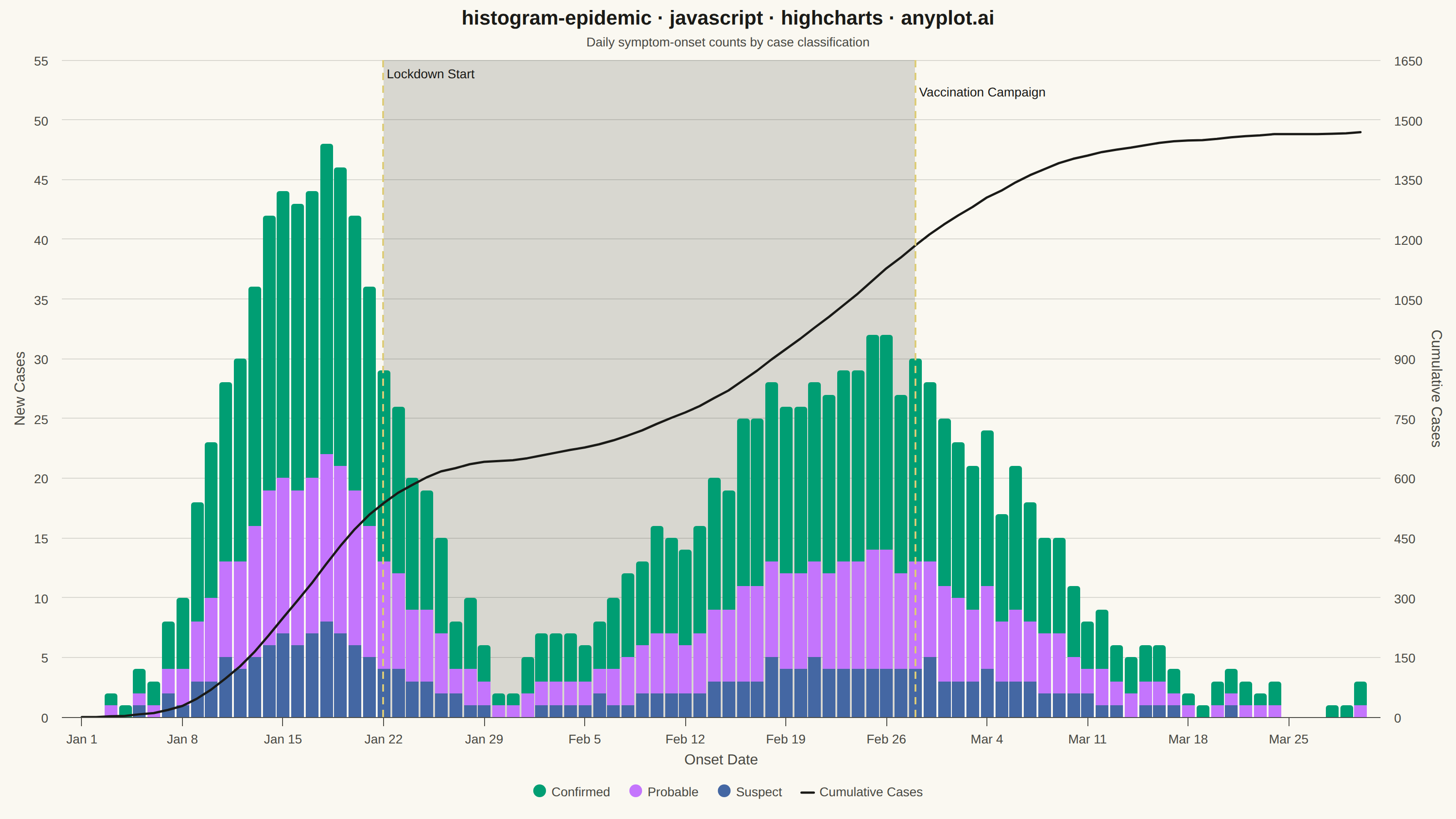
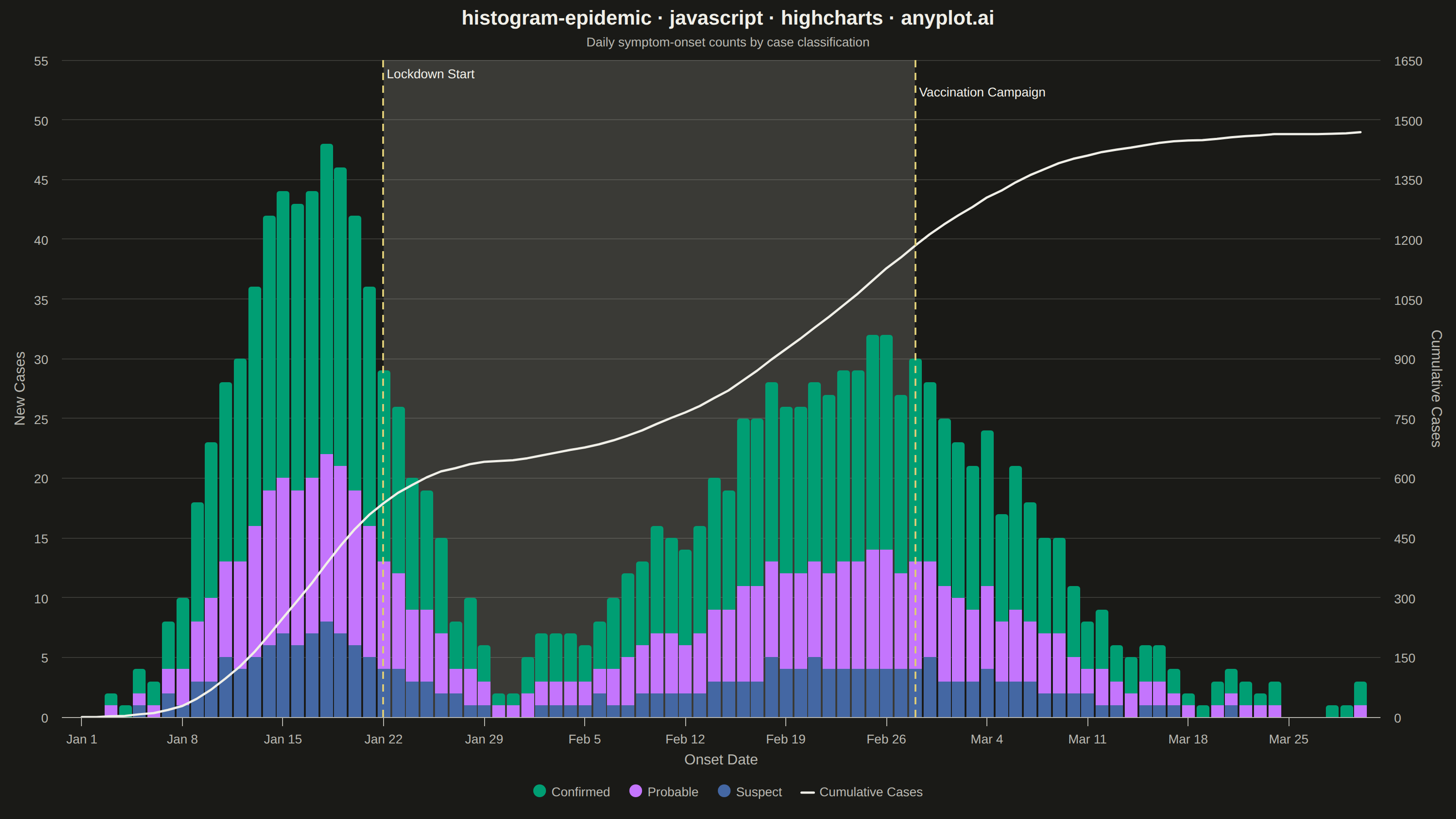
The same plot in 14 other libraries — JavaScript: Chart.js, D3.js, Apache ECharts, MUI X Charts; Python: Altair, Bokeh, lets-plot, Matplotlib, Plotly, plotnine, Pygal, Seaborn; R: ggplot2; Julia: Makie.jl. Compare all 15 side by side: Epidemic Curve (Epi Curve) in Python, R, Julia and JavaScript.
An epidemic curve (epi curve) is a histogram showing the number of new disease cases over time, plotted by date of symptom onset. The shape of the curve reveals the outbreak pattern: a sharp peak indicates a point source, successive waves suggest propagated transmission, and a plateau indicates continuous exposure. It is fundamental to epidemiological investigation and public health surveillance.
// anyplot.ai
// histogram-epidemic: Epidemic Curve (Epi Curve)
// Library: highcharts 12.6.0 | JavaScript 22.23.2
// Quality: 91/100 | Created: 2026-08-26

const t = window.ANYPLOT_TOKENS;

// --- Data (in-memory, deterministic LCG — no seeded Math.random in browser) ---
function makeLcg(seed) {
  let state = seed >>> 0;
  return function lcg() {
    state = (state * 1664525 + 1013904223) >>> 0;
    return state / 4294967296;
  };
}
const rand = makeLcg(42);

const DAY_MS = 24 * 3600 * 1000;
const outbreakStart = Date.UTC(2024, 0, 1);
const numDays = 90;

// Two overlapping gaussian bumps: a sharp point-source wave, followed by a
// broader propagated wave once mitigation measures loosen.
function gaussian(x, mu, sigma, amplitude) {
  return amplitude * Math.exp(-((x - mu) ** 2) / (2 * sigma * sigma));
}

const confirmedData = [];
const probableData = [];
const suspectData = [];
const cumulativeData = [];

let runningTotal = 0;
for (let day = 0; day < numDays; day++) {
  const wave1 = gaussian(day, 16, 5.5, 46);
  const wave2 = gaussian(day, 54, 11, 30);
  const noise = (rand() - 0.5) * 6;
  const total = Math.max(0, Math.round(wave1 + wave2 + noise));

  const confirmed = Math.round(total * 0.55);
  const probable = Math.round(total * 0.3);
  const suspect = Math.max(0, total - confirmed - probable);

  const date = outbreakStart + day * DAY_MS;
  confirmedData.push([date, confirmed]);
  probableData.push([date, probable]);
  suspectData.push([date, suspect]);

  runningTotal += confirmed + probable + suspect;
  cumulativeData.push([date, runningTotal]);
}

const lockdownDate = outbreakStart + 21 * DAY_MS;
const vaccinationDate = outbreakStart + 58 * DAY_MS;

// --- Chart -------------------------------------------------------------------
Highcharts.chart("container", {
  chart: {
    type: "column",
    backgroundColor: "transparent",
    animation: false,
    style: { fontFamily: "inherit" },
  },
  credits: { enabled: false },
  colors: t.palette,
  title: {
    text: "histogram-epidemic · javascript · highcharts · anyplot.ai",
    style: { color: t.ink, fontSize: "22px", fontWeight: "600" },
  },
  subtitle: {
    text: "Daily symptom-onset counts by case classification",
    style: { color: t.inkSoft, fontSize: "14px" },
  },
  xAxis: {
    type: "datetime",
    lineColor: t.inkSoft,
    tickColor: t.inkSoft,
    gridLineColor: t.grid,
    labels: { style: { color: t.inkSoft, fontSize: "14px" } },
    title: { text: "Onset Date", style: { color: t.inkSoft, fontSize: "16px" } },
    plotBands: [
      {
        from: lockdownDate,
        to: vaccinationDate,
        color: t.grid,
        zIndex: 0,
      },
    ],
    plotLines: [
      {
        value: lockdownDate,
        color: t.amber,
        width: 2,
        dashStyle: "Dash",
        zIndex: 5,
        label: {
          text: "Lockdown Start",
          rotation: 0,
          y: 20,
          x: 4,
          style: { color: t.ink, fontSize: "14px" },
        },
      },
      {
        value: vaccinationDate,
        color: t.amber,
        width: 2,
        dashStyle: "Dash",
        zIndex: 5,
        label: {
          text: "Vaccination Campaign",
          rotation: 0,
          y: 40,
          x: 4,
          style: { color: t.ink, fontSize: "14px" },
        },
      },
    ],
  },
  yAxis: [
    {
      title: { text: "New Cases", style: { color: t.inkSoft, fontSize: "16px" } },
      gridLineColor: t.grid,
      labels: { style: { color: t.inkSoft, fontSize: "14px" } },
      lineColor: t.inkSoft,
      tickColor: t.inkSoft,
    },
    {
      title: {
        text: "Cumulative Cases",
        style: { color: t.inkSoft, fontSize: "16px" },
      },
      labels: { style: { color: t.inkSoft, fontSize: "14px" } },
      lineColor: t.inkSoft,
      tickColor: t.inkSoft,
      gridLineWidth: 0,
      opposite: true,
    },
  ],
  legend: {
    itemStyle: { color: t.inkSoft, fontSize: "14px" },
    itemHoverStyle: { color: t.ink },
  },
  tooltip: {
    shared: true,
    xDateFormat: "%b %d, %Y",
  },
  plotOptions: {
    series: { animation: false },
    column: {
      stacking: "normal",
      borderWidth: 0,
      groupPadding: 0.06,
      pointPadding: 0.02,
    },
  },
  series: [
    { name: "Confirmed", type: "column", data: confirmedData, color: t.palette[0] },
    { name: "Probable", type: "column", data: probableData, color: t.palette[1] },
    { name: "Suspect", type: "column", data: suspectData, color: t.palette[2] },
    {
      name: "Cumulative Cases",
      type: "line",
      yAxis: 1,
      data: cumulativeData,
      color: t.ink,
      lineWidth: 2.5,
      marker: { enabled: false },
    },
  ],
});
Runnable source as JSON, for any HTTP client: https://api.anyplot.ai/specs/histogram-epidemic/highcharts/code. Any spec id and library id listed in llms-full.txt fit the same URL shape; every URL below is complete and callable.
{
  "spec_id": "histogram-epidemic",
  "language": "javascript",
  "library": "highcharts",
  "page": "https://anyplot.ai/histogram-epidemic/javascript/highcharts",
  "hub": "https://anyplot.ai/histogram-epidemic",
  "code_json": "https://api.anyplot.ai/specs/histogram-epidemic/highcharts/code",
  "spec_json": "https://api.anyplot.ai/specs/histogram-epidemic",
  "render_light_png": "https://storage.googleapis.com/anyplot-images/plots/histogram-epidemic/javascript/highcharts/plot-light.png",
  "render_dark_png": "https://storage.googleapis.com/anyplot-images/plots/histogram-epidemic/javascript/highcharts/plot-dark.png",
  "interactive_light_html": "https://storage.googleapis.com/anyplot-images/plots/histogram-epidemic/javascript/highcharts/plot-light.html",
  "interactive_dark_html": "https://storage.googleapis.com/anyplot-images/plots/histogram-epidemic/javascript/highcharts/plot-dark.html",
  "quality_score": 91.0,
  "license": "MIT",
  "guide": "https://anyplot.ai/llms.txt"
}
Part of Epidemic Curve (Epi Curve) on anyplot.ai.