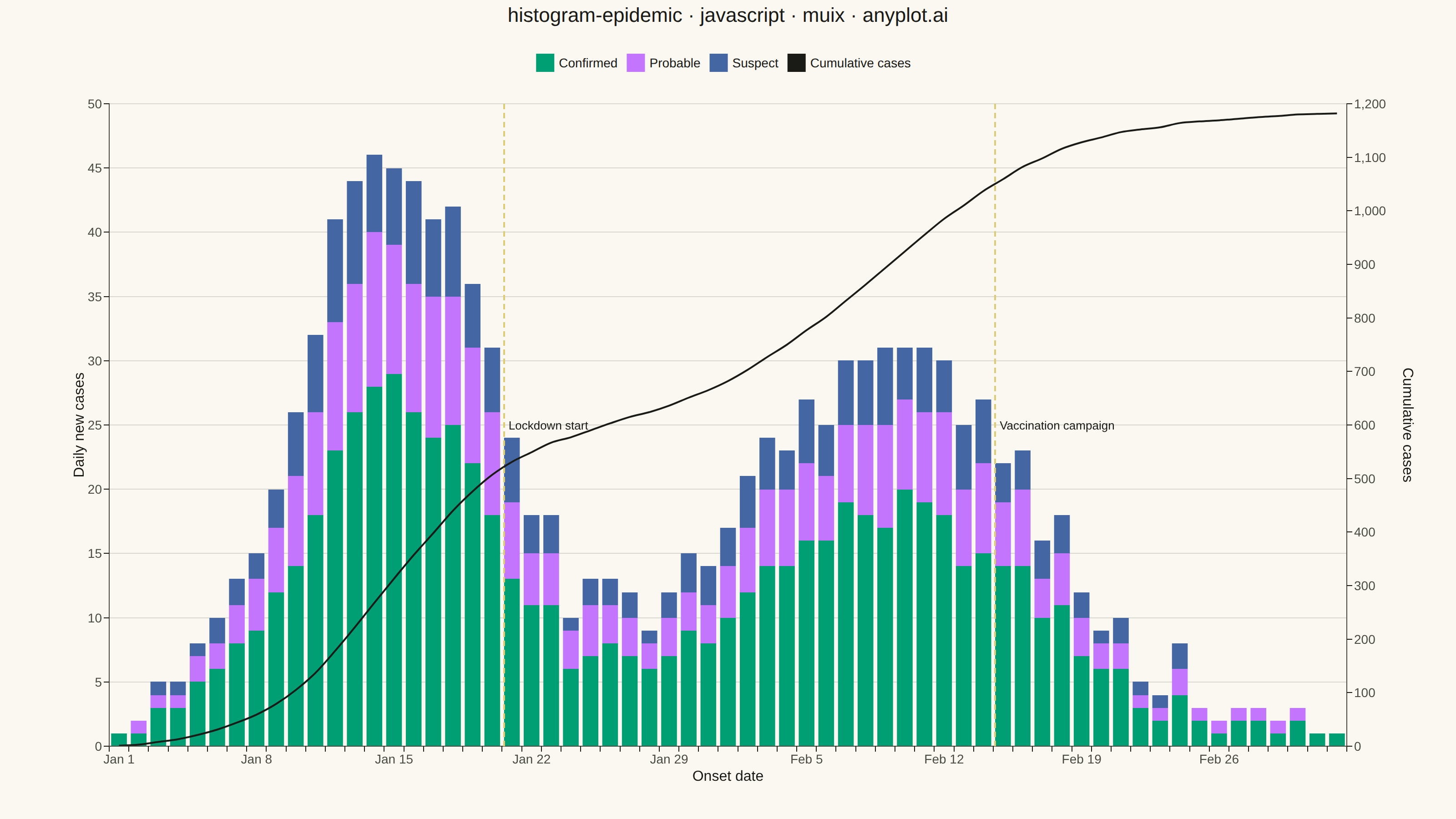
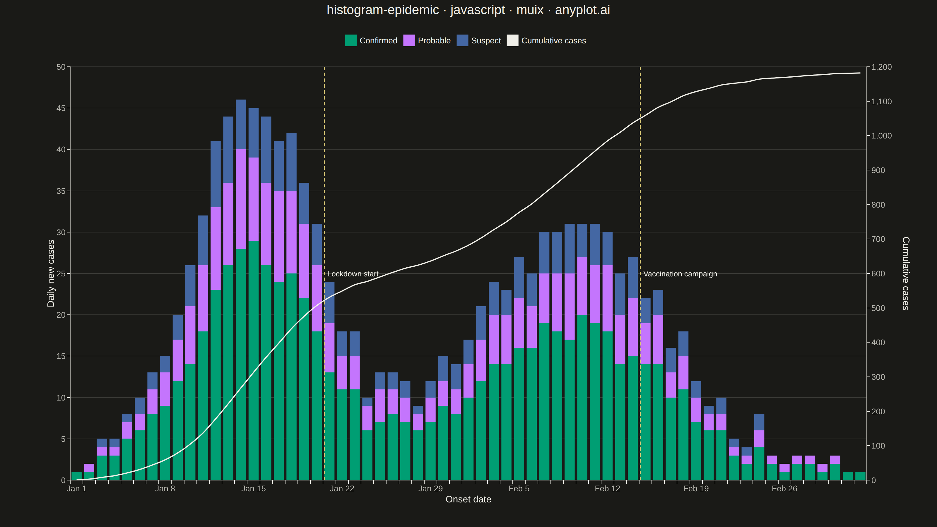
The same plot in 14 other libraries — JavaScript: Chart.js, D3.js, Apache ECharts, Highcharts; Python: Altair, Bokeh, lets-plot, Matplotlib, Plotly, plotnine, Pygal, Seaborn; R: ggplot2; Julia: Makie.jl. Compare all 15 side by side: Epidemic Curve (Epi Curve) in Python, R, Julia and JavaScript.
An epidemic curve (epi curve) is a histogram showing the number of new disease cases over time, plotted by date of symptom onset. The shape of the curve reveals the outbreak pattern: a sharp peak indicates a point source, successive waves suggest propagated transmission, and a plateau indicates continuous exposure. It is fundamental to epidemiological investigation and public health surveillance.
// anyplot.ai
// histogram-epidemic: Epidemic Curve (Epi Curve)
// Library: muix 7.29.1 | JavaScript 22.23.2
// Quality: 94/100 | Created: 2026-08-26
import { ChartContainer } from "@mui/x-charts/ChartContainer";
import { BarPlot } from "@mui/x-charts/BarChart";
import { LinePlot } from "@mui/x-charts/LineChart";
import { ChartsXAxis } from "@mui/x-charts/ChartsXAxis";
import { ChartsYAxis } from "@mui/x-charts/ChartsYAxis";
import { ChartsGrid } from "@mui/x-charts/ChartsGrid";
import { ChartsReferenceLine } from "@mui/x-charts/ChartsReferenceLine";
import { ChartsLegend } from "@mui/x-charts/ChartsLegend";
import { ChartsTooltip } from "@mui/x-charts/ChartsTooltip";
import Typography from "@mui/material/Typography";

const t = window.ANYPLOT_TOKENS;

// --- Data (in-memory, deterministic) ---------------------------------------
// A fixed-seed LCG keeps the daily noise and the case-type split identical
// across the light/dark renders.
let seed = 42;
const lcg = () => {
  seed = (seed * 1103515245 + 12345) % 2147483648;
  return seed / 2147483648;
};

const DAY_COUNT = 63; // short outbreak → daily bins per the spec's Notes
const START_DATE = new Date(2024, 0, 1);
const onsetDates = Array.from({ length: DAY_COUNT }, (_, i) => {
  const d = new Date(START_DATE);
  d.setDate(d.getDate() + i);
  return d.toLocaleDateString("en-US", { month: "short", day: "numeric" });
});

// Two overlapping bell-shaped waves — a propagated (secondary-transmission)
// outbreak pattern, the shape epi curves are drawn to reveal.
const gaussianBump = (day, center, width, peak) => {
  const z = (day - center) / width;
  return peak * Math.exp(-0.5 * z * z);
};

const dailyCaseCount = Array.from({ length: DAY_COUNT }, (_, day) => {
  const wave1 = gaussianBump(day, 14, 5, 46);
  const wave2 = gaussianBump(day, 39, 8, 30);
  const noise = (lcg() - 0.5) * 6;
  return Math.max(0, Math.round(wave1 + wave2 + noise));
});

// Split each day's total into confirmed / probable / suspect so the stack
// always sums back to `dailyCaseCount`.
const confirmedCases = dailyCaseCount.map((n) => Math.round(n * (0.55 + lcg() * 0.1)));
const probableCases = dailyCaseCount.map((n, i) =>
  Math.round((n - confirmedCases[i]) * (0.55 + lcg() * 0.1)),
);
const suspectCases = dailyCaseCount.map((n, i) =>
  Math.max(0, n - confirmedCases[i] - probableCases[i]),
);

const cumulativeCases = dailyCaseCount.reduce((acc, n) => {
  acc.push((acc.length ? acc[acc.length - 1] : 0) + n);
  return acc;
}, []);

const LOCKDOWN_DAY = 20;
const VACCINATION_DAY = 45;

const series = [
  {
    type: "bar",
    xAxisId: "onset",
    yAxisId: "daily",
    stack: "cases",
    data: confirmedCases,
    label: "Confirmed",
    color: t.palette[0],
  },
  {
    type: "bar",
    xAxisId: "onset",
    yAxisId: "daily",
    stack: "cases",
    data: probableCases,
    label: "Probable",
    color: t.palette[1],
  },
  {
    type: "bar",
    xAxisId: "onset",
    yAxisId: "daily",
    stack: "cases",
    data: suspectCases,
    label: "Suspect",
    color: t.palette[2],
  },
  {
    type: "line",
    xAxisId: "onset",
    yAxisId: "cumulative",
    data: cumulativeCases,
    label: "Cumulative cases",
    color: t.ink,
    curve: "monotoneX",
    showMark: false,
  },
];

const xAxis = [
  {
    id: "onset",
    scaleType: "band",
    data: onsetDates,
    label: "Onset date",
    tickLabelInterval: (_value, index) => index % 7 === 0,
  },
];

const yAxis = [
  { id: "daily", position: "left", label: "Daily new cases" },
  { id: "cumulative", position: "right", label: "Cumulative cases" },
];

const title = "histogram-epidemic · javascript · muix · anyplot.ai";
const TITLE_HEIGHT = 44;

// --- Chart (default-exported component — the harness mounts it) -------------
export default function Chart() {
  const chartHeight = window.ANYPLOT_SIZE.height - TITLE_HEIGHT;

  return (
    <div style={{ width: window.ANYPLOT_SIZE.width, height: window.ANYPLOT_SIZE.height }}>
      <Typography
        align="center"
        style={{ height: TITLE_HEIGHT, fontSize: 22, fontWeight: 500, color: t.ink }}
      >
        {title}
      </Typography>
      <ChartContainer
        width={window.ANYPLOT_SIZE.width}
        height={chartHeight}
        series={series}
        xAxis={xAxis}
        yAxis={yAxis}
        margin={{ top: 70, right: 120, bottom: 80, left: 120 }}
        skipAnimation
      >
        <ChartsGrid horizontal sx={{ "& .MuiChartsGrid-line": { stroke: t.grid, strokeWidth: 1 } }} />
        <BarPlot />
        <LinePlot />
        <ChartsXAxis
          axisId="onset"
          tickLabelStyle={{ fontSize: 14, fill: t.inkSoft }}
          labelStyle={{ fontSize: 16, fill: t.ink }}
          sx={{ "& .MuiChartsAxis-line": { stroke: t.inkSoft } }}
        />
        <ChartsYAxis
          axisId="daily"
          tickLabelStyle={{ fontSize: 14, fill: t.inkSoft }}
          labelStyle={{ fontSize: 16, fill: t.ink }}
          sx={{ "& .MuiChartsAxis-line": { stroke: t.inkSoft } }}
        />
        <ChartsYAxis
          axisId="cumulative"
          tickLabelStyle={{ fontSize: 14, fill: t.inkSoft }}
          labelStyle={{ fontSize: 16, fill: t.ink }}
          // Right-axis label sits well clear of the tick-number column: MUI X's
          // default label offset is a fixed heuristic based on `tickFontSize`
          // (12px default), not the actual rendered tick text width, so with our
          // larger 14px 3-digit ticks ("700") the stock offset lands the rotated
          // "Cumulative cases" label directly on top of them.
          slotProps={{ axisLabel: { x: 62 } }}
          sx={{ "& .MuiChartsAxis-line": { stroke: t.inkSoft } }}
        />
        <ChartsReferenceLine
          x={onsetDates[LOCKDOWN_DAY]}
          axisId="onset"
          label="Lockdown start"
          labelStyle={{ fontSize: 13, fill: t.ink }}
          lineStyle={{ stroke: t.amber, strokeDasharray: "6 4", strokeWidth: 2 }}
        />
        <ChartsReferenceLine
          x={onsetDates[VACCINATION_DAY]}
          axisId="onset"
          label="Vaccination campaign"
          labelStyle={{ fontSize: 13, fill: t.ink }}
          lineStyle={{ stroke: t.amber, strokeDasharray: "6 4", strokeWidth: 2 }}
        />
        <ChartsLegend
          position={{ vertical: "top", horizontal: "middle" }}
          direction="row"
          labelStyle={{ fontSize: 14, fill: t.ink }}
        />
        <ChartsTooltip trigger="item" />
      </ChartContainer>
    </div>
  );
}
Runnable source as JSON, for any HTTP client: https://api.anyplot.ai/specs/histogram-epidemic/muix/code. Any spec id and library id listed in llms-full.txt fit the same URL shape; every URL below is complete and callable.
{
  "spec_id": "histogram-epidemic",
  "language": "javascript",
  "library": "muix",
  "page": "https://anyplot.ai/histogram-epidemic/javascript/muix",
  "hub": "https://anyplot.ai/histogram-epidemic",
  "code_json": "https://api.anyplot.ai/specs/histogram-epidemic/muix/code",
  "spec_json": "https://api.anyplot.ai/specs/histogram-epidemic",
  "render_light_png": "https://storage.googleapis.com/anyplot-images/plots/histogram-epidemic/javascript/muix/plot-light.png",
  "render_dark_png": "https://storage.googleapis.com/anyplot-images/plots/histogram-epidemic/javascript/muix/plot-dark.png",
  "interactive_light_html": "https://storage.googleapis.com/anyplot-images/plots/histogram-epidemic/javascript/muix/plot-light.html",
  "interactive_dark_html": "https://storage.googleapis.com/anyplot-images/plots/histogram-epidemic/javascript/muix/plot-dark.html",
  "quality_score": 94.0,
  "license": "MIT",
  "guide": "https://anyplot.ai/llms.txt"
}
Part of Epidemic Curve (Epi Curve) on anyplot.ai.