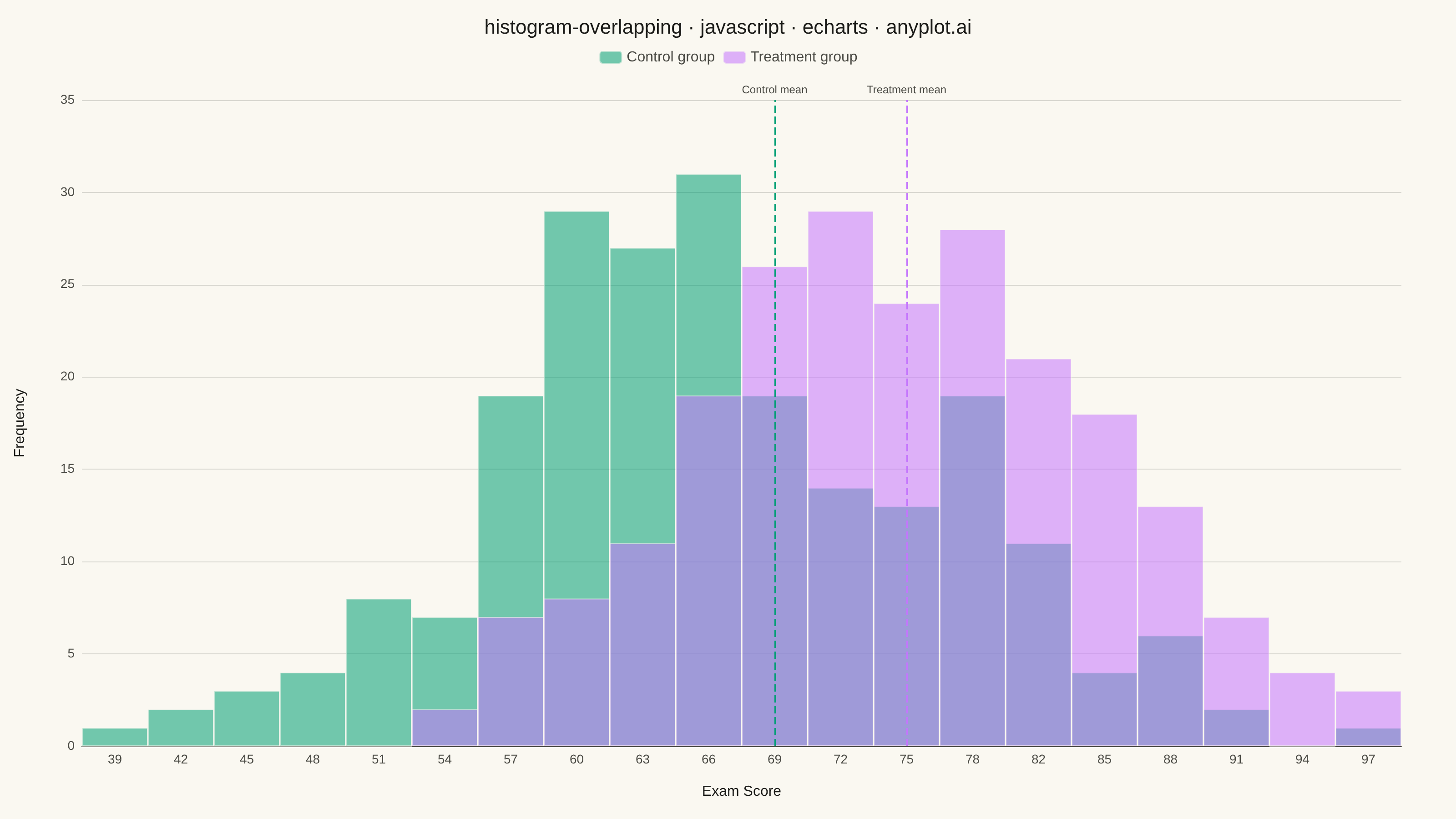
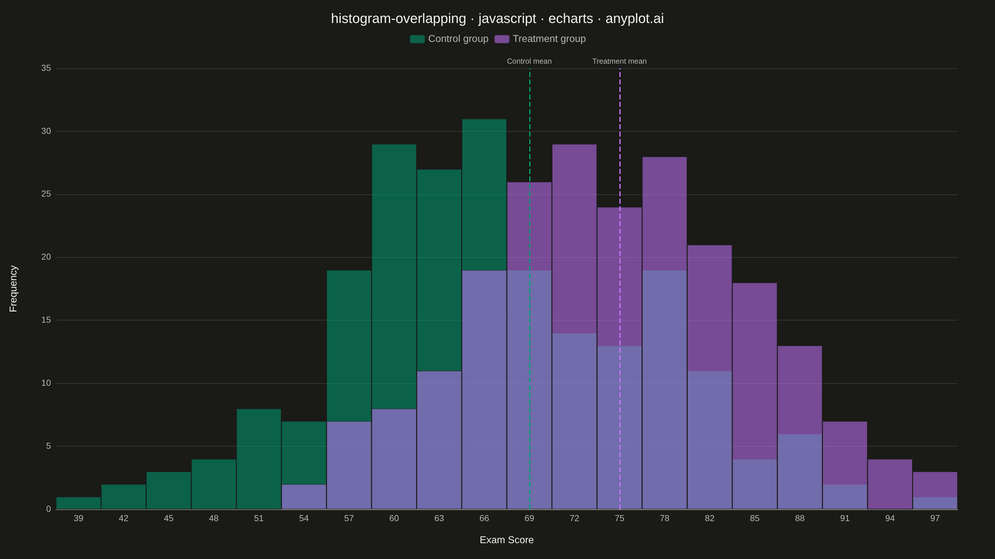
The same plot in 14 other libraries — JavaScript: Chart.js, D3.js, Highcharts, MUI X Charts; Python: Altair, Bokeh, lets-plot, Matplotlib, Plotly, plotnine, Pygal, Seaborn; R: ggplot2; Julia: Makie.jl. Compare all 15 side by side: Overlapping Histograms in Python, R, Julia and JavaScript.
Overlapping histograms display multiple distributions on the same axes using semi-transparent bars, enabling direct visual comparison between groups. This technique reveals differences in central tendency, spread, and shape across categories while maintaining the familiar histogram format. The transparency allows viewers to see where distributions overlap and diverge.
// anyplot.ai
// histogram-overlapping: Overlapping Histograms
// Library: echarts 6.1.0 | JavaScript 22.23.2
// Quality: 93/100 | Created: 2026-08-18

const t = window.ANYPLOT_TOKENS;

// --- Data (in-memory, deterministic LCG) ------------------------------------
function lcg(seed) {
  let state = seed;
  return function next() {
    state = (state * 1664525 + 1013904223) % 4294967296;
    return state / 4294967296;
  };
}

function normalSamples(rand, mean, stdDev, count) {
  const samples = [];
  for (let i = 0; i < count; i += 2) {
    const u1 = Math.max(rand(), 1e-9);
    const u2 = rand();
    const mag = Math.sqrt(-2.0 * Math.log(u1));
    samples.push(mean + stdDev * mag * Math.cos(2 * Math.PI * u2));
    samples.push(mean + stdDev * mag * Math.sin(2 * Math.PI * u2));
  }
  return samples.slice(0, count);
}

const randControl = lcg(42);
const randTreatment = lcg(1337);

const clampScore = (value) => Math.min(100, Math.max(0, value));

const controlScores = normalSamples(randControl, 68, 11, 220).map(clampScore);
const treatmentScores = normalSamples(randTreatment, 76, 10, 220).map(clampScore);

const meanOf = (samples) => samples.reduce((sum, v) => sum + v, 0) / samples.length;
const controlMean = meanOf(controlScores);
const treatmentMean = meanOf(treatmentScores);

// --- Shared bins across both groups ------------------------------------------
const allScores = controlScores.concat(treatmentScores);
const dataMin = Math.min(...allScores);
const dataMax = Math.max(...allScores);
const binCount = 20;
const binWidth = (dataMax - dataMin) / binCount;

function toHistogram(samples) {
  const counts = new Array(binCount).fill(0);
  for (const value of samples) {
    let index = Math.floor((value - dataMin) / binWidth);
    if (index >= binCount) index = binCount - 1;
    if (index < 0) index = 0;
    counts[index] += 1;
  }
  return counts;
}

const binLabels = [];
for (let i = 0; i < binCount; i += 1) {
  binLabels.push(Math.round(dataMin + i * binWidth));
}

const controlCounts = toHistogram(controlScores);
const treatmentCounts = toHistogram(treatmentScores);

const binIndexFor = (value) => {
  const idx = Math.round((value - dataMin) / binWidth);
  return Math.min(binCount - 1, Math.max(0, idx));
};
const controlMeanIndex = binIndexFor(controlMean);
const treatmentMeanIndex = binIndexFor(treatmentMean);

// --- Init ---------------------------------------------------------------------
const chart = echarts.init(document.getElementById("container"));

// --- Option ---------------------------------------------------------------------
chart.setOption({
  animation: false,
  color: t.palette,
  backgroundColor: "transparent",
  title: {
    text: "histogram-overlapping · javascript · echarts · anyplot.ai",
    left: "center",
    textStyle: { color: t.ink, fontSize: 22, fontWeight: 500 },
  },
  legend: {
    top: 50,
    textStyle: { color: t.inkSoft, fontSize: 16 },
  },
  grid: { left: 90, right: 60, top: 110, bottom: 80 },
  xAxis: {
    type: "category",
    data: binLabels,
    name: "Exam Score",
    nameLocation: "middle",
    nameGap: 42,
    nameTextStyle: { color: t.ink, fontSize: 16 },
    axisLabel: { color: t.inkSoft, fontSize: 14 },
    axisLine: { lineStyle: { color: t.inkSoft } },
    axisTick: { show: false },
    splitLine: { show: false },
  },
  yAxis: {
    type: "value",
    name: "Frequency",
    nameLocation: "middle",
    nameGap: 60,
    nameTextStyle: { color: t.ink, fontSize: 16 },
    axisLabel: { color: t.inkSoft, fontSize: 14 },
    axisLine: { show: false },
    axisTick: { show: false },
    splitLine: { lineStyle: { color: t.grid } },
  },
  series: [
    {
      name: "Control group",
      type: "bar",
      data: controlCounts,
      barGap: "-100%",
      barCategoryGap: "0%",
      itemStyle: {
        color: t.palette[0],
        opacity: 0.55,
        borderColor: t.pageBg,
        borderWidth: 1,
      },
      emphasis: { disabled: true },
      z: 2,
      markLine: {
        silent: true,
        symbol: "none",
        lineStyle: { color: t.palette[0], type: "dashed", width: 2 },
        label: { show: true, formatter: "Control mean", color: t.inkSoft, fontSize: 12 },
        data: [{ xAxis: controlMeanIndex }],
      },
    },
    {
      name: "Treatment group",
      type: "bar",
      data: treatmentCounts,
      barGap: "-100%",
      barCategoryGap: "0%",
      itemStyle: {
        color: t.palette[1],
        opacity: 0.55,
        borderColor: t.pageBg,
        borderWidth: 1,
      },
      emphasis: { disabled: true },
      z: 3,
      markLine: {
        silent: true,
        symbol: "none",
        lineStyle: { color: t.palette[1], type: "dashed", width: 2 },
        label: { show: true, formatter: "Treatment mean", color: t.inkSoft, fontSize: 12 },
        data: [{ xAxis: treatmentMeanIndex }],
      },
    },
  ],
});
Runnable source as JSON, for any HTTP client: https://api.anyplot.ai/specs/histogram-overlapping/echarts/code. Any spec id and library id listed in llms-full.txt fit the same URL shape; every URL below is complete and callable.
{
  "spec_id": "histogram-overlapping",
  "language": "javascript",
  "library": "echarts",
  "page": "https://anyplot.ai/histogram-overlapping/javascript/echarts",
  "hub": "https://anyplot.ai/histogram-overlapping",
  "code_json": "https://api.anyplot.ai/specs/histogram-overlapping/echarts/code",
  "spec_json": "https://api.anyplot.ai/specs/histogram-overlapping",
  "render_light_png": "https://storage.googleapis.com/anyplot-images/plots/histogram-overlapping/javascript/echarts/plot-light.png",
  "render_dark_png": "https://storage.googleapis.com/anyplot-images/plots/histogram-overlapping/javascript/echarts/plot-dark.png",
  "interactive_light_html": "https://storage.googleapis.com/anyplot-images/plots/histogram-overlapping/javascript/echarts/plot-light.html",
  "interactive_dark_html": "https://storage.googleapis.com/anyplot-images/plots/histogram-overlapping/javascript/echarts/plot-dark.html",
  "quality_score": 93.0,
  "license": "MIT",
  "guide": "https://anyplot.ai/llms.txt"
}
Part of Overlapping Histograms on anyplot.ai.