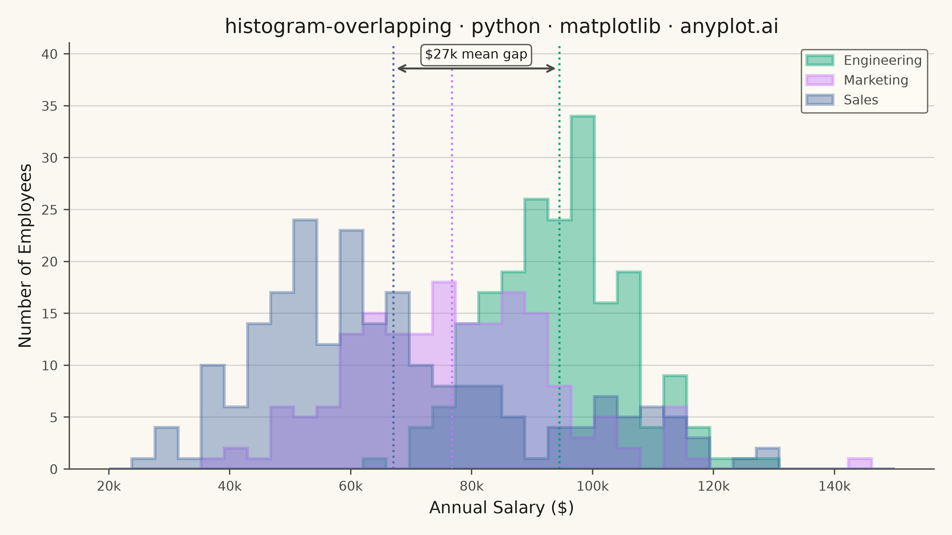
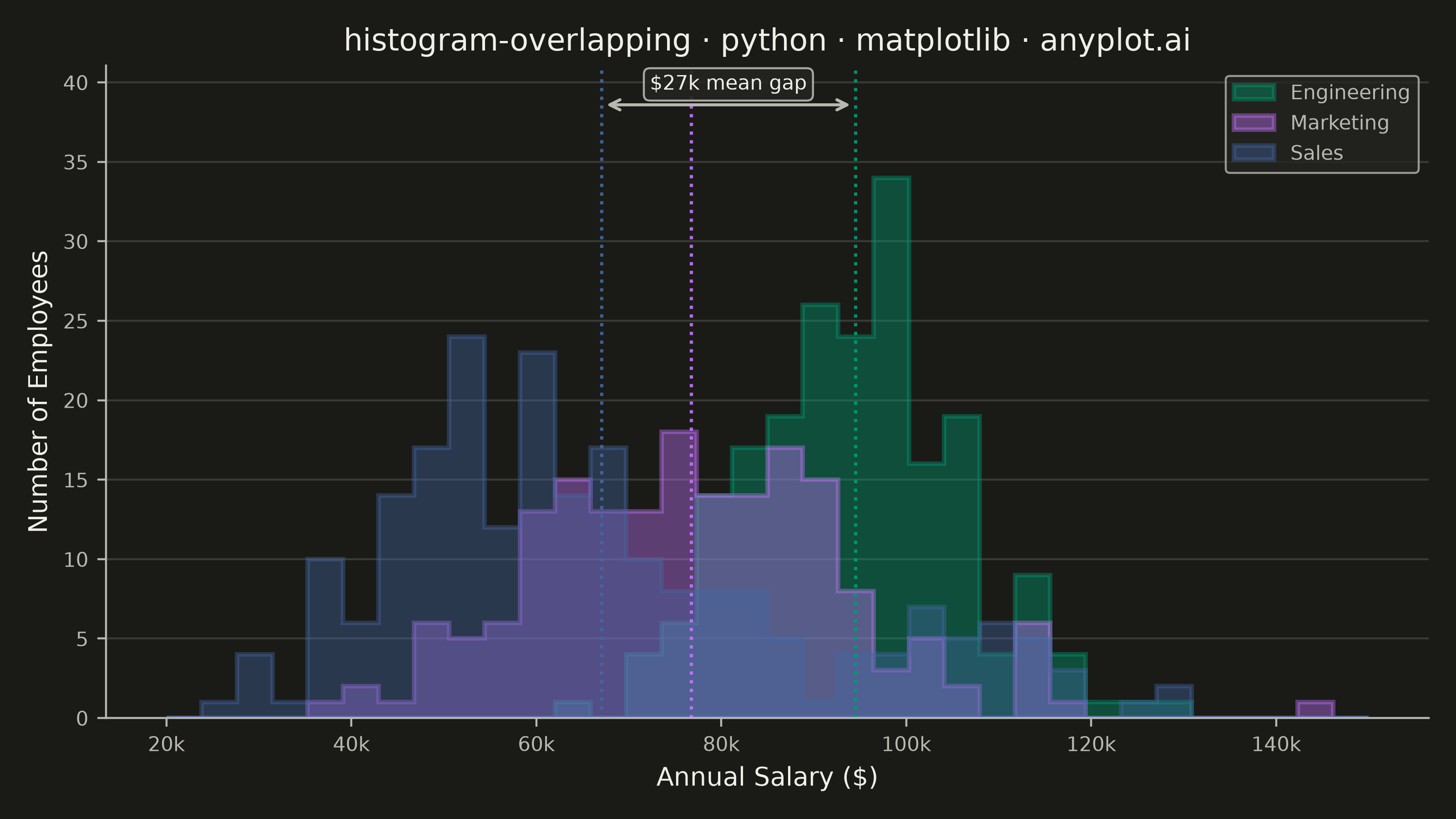
Overlapping histograms display multiple distributions on the same axes using semi-transparent bars, enabling direct visual comparison between groups. This technique reveals differences in central tendency, spread, and shape across categories while maintaining the familiar histogram format. The transparency allows viewers to see where distributions overlap and diverge.
""" anyplot.ai
histogram-overlapping: Overlapping Histograms
Library: matplotlib 3.11.1 | Python 3.13.15
Quality: 91/100 | Updated: 2026-08-18
"""

import os

import matplotlib.pyplot as plt
import numpy as np


# Theme tokens
THEME = os.getenv("ANYPLOT_THEME", "light")
PAGE_BG = "#FAF8F1" if THEME == "light" else "#1A1A17"
ELEVATED_BG = "#FFFDF6" if THEME == "light" else "#242420"
INK = "#1A1A17" if THEME == "light" else "#F0EFE8"
INK_SOFT = "#4A4A44" if THEME == "light" else "#B8B7B0"

# Imprint palette (first series is always #009E73)
IMPRINT = ["#009E73", "#C475FD", "#4467A3"]

# Data - Comparing salary distributions across three departments
np.random.seed(42)

# Engineering: higher salaries, tighter distribution
engineering = np.random.normal(95000, 12000, 200)

# Marketing: moderate salaries, wider spread
marketing = np.random.normal(75000, 18000, 180)

# Sales: lower base pay plus a smaller high-commission cohort, giving the
# distribution a light second mode - unlike the two unimodal groups above.
sales = np.concatenate([np.random.normal(60000, 14000, 180), np.random.normal(105000, 11000, 40)])

groups = [("Engineering", engineering, IMPRINT[0]), ("Marketing", marketing, IMPRINT[1]), ("Sales", sales, IMPRINT[2])]

# Create plot
fig, ax = plt.subplots(figsize=(8, 4.5), dpi=400, facecolor=PAGE_BG)
ax.set_facecolor(PAGE_BG)

# Define consistent bins for all groups
bins = np.linspace(20000, 150000, 35)

# Overlapping histograms as filled steps - a single continuous outline per
# group reads more clearly than per-bar edges once fills stack on top of
# each other, and keeps the silhouette of each distribution legible.
for name, data, color in groups:
    ax.hist(data, bins=bins, alpha=0.4, label=name, color=color, histtype="stepfilled", edgecolor=color, linewidth=1.8)
    ax.axvline(data.mean(), color=color, linestyle=":", linewidth=1.3, alpha=0.9)

# Labels and styling
title = "histogram-overlapping · python · matplotlib · anyplot.ai"
ax.set_xlabel("Annual Salary ($)", fontsize=10, color=INK)
ax.set_ylabel("Number of Employees", fontsize=10, color=INK)
ax.set_title(title, fontsize=12, fontweight="medium", color=INK)
ax.tick_params(axis="both", labelsize=8, colors=INK_SOFT)

# Grid - y-axis only, subtle
ax.yaxis.grid(True, alpha=0.15, linewidth=0.8, color=INK)
ax.set_axisbelow(True)

# Remove top and right spines
ax.spines["top"].set_visible(False)
ax.spines["right"].set_visible(False)
for s in ("left", "bottom"):
    ax.spines[s].set_color(INK_SOFT)

# Format x-axis with thousands separator
ax.xaxis.set_major_formatter(plt.FuncFormatter(lambda x, p: f"{x / 1000:.0f}k"))

# Callout: highlight the largest mean gap (Engineering vs. Sales)
eng_mean, sales_mean = engineering.mean(), sales.mean()
headroom = ax.get_ylim()[1] * 1.15
ax.set_ylim(top=headroom)
callout_y = headroom * 0.94
ax.annotate(
    "",
    xy=(eng_mean, callout_y),
    xytext=(sales_mean, callout_y),
    arrowprops={"arrowstyle": "<->", "color": INK_SOFT, "linewidth": 1.2},
)
ax.annotate(
    f"${(eng_mean - sales_mean) / 1000:.0f}k mean gap",
    xy=((eng_mean + sales_mean) / 2, callout_y),
    xytext=(0, 6),
    textcoords="offset points",
    ha="center",
    fontsize=8,
    color=INK,
    bbox={"facecolor": ELEVATED_BG, "edgecolor": INK_SOFT, "linewidth": 0.8, "alpha": 0.9, "boxstyle": "round,pad=0.3"},
)

# Legend styling
leg = ax.legend(fontsize=8, loc="upper right")
if leg:
    leg.get_frame().set_facecolor(ELEVATED_BG)
    leg.get_frame().set_edgecolor(INK_SOFT)
    leg.get_frame().set_linewidth(0.8)
    plt.setp(leg.get_texts(), color=INK_SOFT)

plt.tight_layout()
plt.savefig(f"plot-{THEME}.png", dpi=400, facecolor=PAGE_BG)
Runnable source as JSON, for any HTTP client: https://api.anyplot.ai/specs/histogram-overlapping/matplotlib/code. Any spec id and library id listed in llms-full.txt fit the same URL shape; every URL below is complete and callable.
{
  "spec_id": "histogram-overlapping",
  "language": "python",
  "library": "matplotlib",
  "page": "https://anyplot.ai/histogram-overlapping/python/matplotlib",
  "hub": "https://anyplot.ai/histogram-overlapping",
  "code_json": "https://api.anyplot.ai/specs/histogram-overlapping/matplotlib/code",
  "spec_json": "https://api.anyplot.ai/specs/histogram-overlapping",
  "render_light_png": "https://storage.googleapis.com/anyplot-images/plots/histogram-overlapping/python/matplotlib/plot-light.png",
  "render_dark_png": "https://storage.googleapis.com/anyplot-images/plots/histogram-overlapping/python/matplotlib/plot-dark.png",
  "quality_score": 91.0,
  "license": "MIT",
  "guide": "https://anyplot.ai/llms.txt"
}
Part of Overlapping Histograms on anyplot.ai.