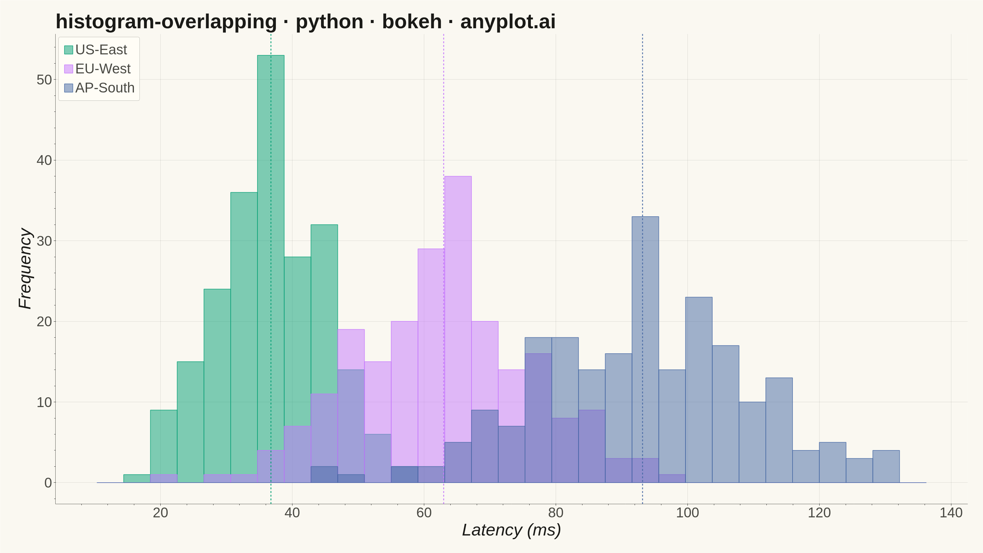
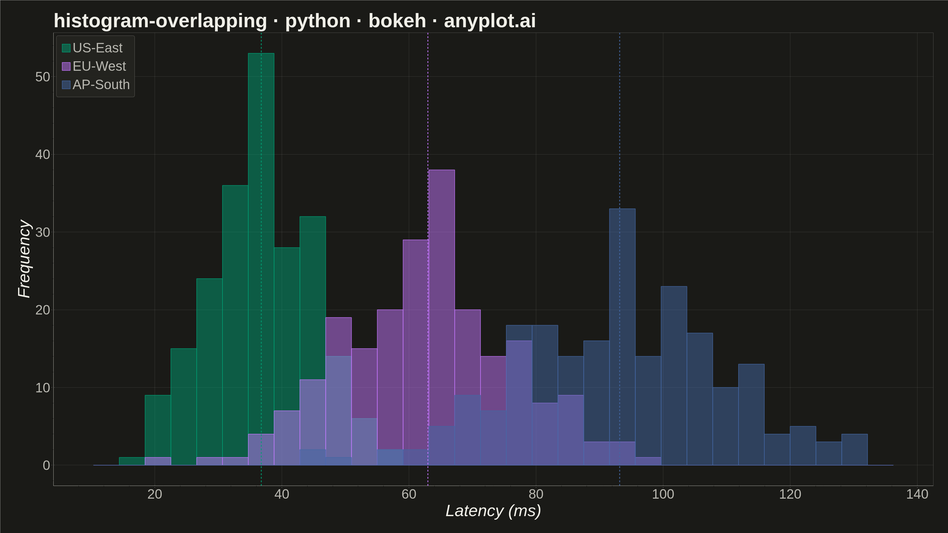
Overlapping histograms display multiple distributions on the same axes using semi-transparent bars, enabling direct visual comparison between groups. This technique reveals differences in central tendency, spread, and shape across categories while maintaining the familiar histogram format. The transparency allows viewers to see where distributions overlap and diverge.
""" anyplot.ai
histogram-overlapping: Overlapping Histograms
Library: bokeh 3.9.2 | Python 3.13.15
Quality: 93/100 | Updated: 2026-08-18
"""

import os
import sys


# Prevent local bokeh.py from being treated as bokeh module
sys.path = [p for p in sys.path if p not in ("", ".", os.getcwd())]

import time
from pathlib import Path

import numpy as np
from bokeh.io import output_file, save
from bokeh.models import ColumnDataSource, HoverTool, Span
from bokeh.plotting import figure
from selenium import webdriver
from selenium.webdriver.chrome.options import Options


# Theme tokens
THEME = os.getenv("ANYPLOT_THEME", "light")
PAGE_BG = "#FAF8F1" if THEME == "light" else "#1A1A17"
ELEVATED_BG = "#FFFDF6" if THEME == "light" else "#242420"
INK = "#1A1A17" if THEME == "light" else "#F0EFE8"
INK_SOFT = "#4A4A44" if THEME == "light" else "#B8B7B0"

# Imprint palette (canonical order)
BRAND = "#009E73"  # Position 1 - first series
COLOR_2 = "#C475FD"  # Position 2
COLOR_3 = "#4467A3"  # Position 3

# Data - network latency (ms) across cloud regions
rng = np.random.default_rng(7)
us_east = rng.normal(38, 9, 220)
eu_west = rng.normal(64, 14, 220)
ap_south = rng.normal(96, 18, 220)

# Compute histogram bins (aligned across all groups)
all_data = np.concatenate([us_east, eu_west, ap_south])
bins = np.linspace(all_data.min() - 5, all_data.max() + 5, 32)

# Compute histogram values
us_hist, edges = np.histogram(us_east, bins=bins)
eu_hist, _ = np.histogram(eu_west, bins=bins)
ap_hist, _ = np.histogram(ap_south, bins=bins)

# Prepare data for ColumnDataSource
bin_centers = (edges[:-1] + edges[1:]) / 2

# Per-group means, used for the dashed focal-point markers below
us_mean = float(us_east.mean())
eu_mean = float(eu_west.mean())
ap_mean = float(ap_south.mean())

data = {
    "bin_left": edges[:-1],
    "bin_right": edges[1:],
    "bin_center": bin_centers,
    "us_count": us_hist,
    "eu_count": eu_hist,
    "ap_count": ap_hist,
}

source = ColumnDataSource(data)

# Create figure (3200 x 1800 px, canonical landscape canvas)
p = figure(
    width=3200,
    height=1800,
    title="histogram-overlapping · python · bokeh · anyplot.ai",
    x_axis_label="Latency (ms)",
    y_axis_label="Frequency",
    tools="pan,wheel_zoom,box_zoom,reset,hover",
    toolbar_location=None,  # default toolbar adds ~30-50px above the plot,
    # shrinking the saved PNG below the canonical height
    min_border_bottom=160,
    min_border_left=180,
    min_border_top=110,
    min_border_right=50,
)

# Plot overlapping histograms
us_render = p.quad(
    top="us_count",
    bottom=0,
    left="bin_left",
    right="bin_right",
    source=source,
    fill_color=BRAND,
    fill_alpha=0.5,
    line_color=BRAND,
    line_width=2,
    line_alpha=0.8,
    legend_label="US-East",
    muted_alpha=0.05,
)

eu_render = p.quad(
    top="eu_count",
    bottom=0,
    left="bin_left",
    right="bin_right",
    source=source,
    fill_color=COLOR_2,
    fill_alpha=0.5,
    line_color=COLOR_2,
    line_width=2,
    line_alpha=0.8,
    legend_label="EU-West",
    muted_alpha=0.05,
)

ap_render = p.quad(
    top="ap_count",
    bottom=0,
    left="bin_left",
    right="bin_right",
    source=source,
    fill_color=COLOR_3,
    fill_alpha=0.5,
    line_color=COLOR_3,
    line_width=2,
    line_alpha=0.8,
    legend_label="AP-South",
    muted_alpha=0.05,
)

# Dashed mean markers - a subtle focal point per region, distinguishing the
# central tendency of each distribution beyond the raw overlapping bars
for mean_val, color in ((us_mean, BRAND), (eu_mean, COLOR_2), (ap_mean, COLOR_3)):
    p.add_layout(
        Span(location=mean_val, dimension="height", line_color=color, line_dash="dashed", line_width=3, line_alpha=0.9)
    )

# Configure hover tool
hover = p.select_one(HoverTool)
hover.tooltips = [
    ("Range", "@bin_left ms - @bin_right ms"),
    ("US-East", "@us_count"),
    ("EU-West", "@eu_count"),
    ("AP-South", "@ap_count"),
]

# Configure text sizes for the 3200x1800 canvas
p.title.text_font_size = "50pt"
p.xaxis.axis_label_text_font_size = "42pt"
p.yaxis.axis_label_text_font_size = "42pt"
p.xaxis.major_label_text_font_size = "34pt"
p.yaxis.major_label_text_font_size = "34pt"

# Theme-adaptive chrome
p.background_fill_color = PAGE_BG
p.border_fill_color = PAGE_BG
# Drop the full rectangular frame - the bottom/left axis lines already form
# an L-shaped frame, which reads cleaner than a boxed-in plot area
p.outline_line_color = None

p.title.text_color = INK
p.xaxis.axis_label_text_color = INK
p.yaxis.axis_label_text_color = INK
p.xaxis.major_label_text_color = INK_SOFT
p.yaxis.major_label_text_color = INK_SOFT
p.xaxis.axis_line_color = INK_SOFT
p.yaxis.axis_line_color = INK_SOFT
p.xaxis.major_tick_line_color = INK_SOFT
p.yaxis.major_tick_line_color = INK_SOFT

p.xgrid.grid_line_color = INK
p.ygrid.grid_line_color = INK
p.xgrid.grid_line_alpha = 0.15
p.ygrid.grid_line_alpha = 0.15

# Configure legend - click a label to mute that region's histogram, a
# genuine bokeh-native interaction beyond the static HoverTool tooltips
p.legend.location = "top_left"
p.legend.label_text_font_size = "34pt"
p.legend.spacing = 10
p.legend.padding = 15
p.legend.background_fill_color = ELEVATED_BG
p.legend.border_line_color = INK_SOFT
p.legend.border_line_alpha = 0.4
p.legend.border_radius = 6
p.legend.label_text_color = INK_SOFT
p.legend.glyph_height = 34
p.legend.glyph_width = 34
p.legend.click_policy = "mute"

# Save HTML
output_file(f"plot-{THEME}.html")
save(p)

# Screenshot with headless Chrome via Selenium
W, H = 3200, 1800
opts = Options()
for arg in (
    "--headless=new",
    "--no-sandbox",
    "--disable-dev-shm-usage",
    "--disable-gpu",
    f"--window-size={W},{H}",
    "--hide-scrollbars",
):
    opts.add_argument(arg)

driver = webdriver.Chrome(options=opts)
driver.set_window_size(W, H)
driver.get(f"file://{Path(f'plot-{THEME}.html').resolve()}")
# headless Chrome's --window-size sets the OUTER window, which still reserves
# a phantom title-bar height even headless; pin the viewport exactly via CDP.
driver.execute_cdp_cmd(
    "Emulation.setDeviceMetricsOverride", {"width": W, "height": H, "deviceScaleFactor": 1, "mobile": False}
)
time.sleep(3)
driver.save_screenshot(f"plot-{THEME}.png")
driver.quit()
Runnable source as JSON, for any HTTP client: https://api.anyplot.ai/specs/histogram-overlapping/bokeh/code. Any spec id and library id listed in llms-full.txt fit the same URL shape; every URL below is complete and callable.
{
  "spec_id": "histogram-overlapping",
  "language": "python",
  "library": "bokeh",
  "page": "https://anyplot.ai/histogram-overlapping/python/bokeh",
  "hub": "https://anyplot.ai/histogram-overlapping",
  "code_json": "https://api.anyplot.ai/specs/histogram-overlapping/bokeh/code",
  "spec_json": "https://api.anyplot.ai/specs/histogram-overlapping",
  "render_light_png": "https://storage.googleapis.com/anyplot-images/plots/histogram-overlapping/python/bokeh/plot-light.png",
  "render_dark_png": "https://storage.googleapis.com/anyplot-images/plots/histogram-overlapping/python/bokeh/plot-dark.png",
  "interactive_light_html": "https://storage.googleapis.com/anyplot-images/plots/histogram-overlapping/python/bokeh/plot-light.html",
  "interactive_dark_html": "https://storage.googleapis.com/anyplot-images/plots/histogram-overlapping/python/bokeh/plot-dark.html",
  "quality_score": 93.0,
  "license": "MIT",
  "guide": "https://anyplot.ai/llms.txt"
}
Part of Overlapping Histograms on anyplot.ai.