The same plot in 14 other libraries — JavaScript: Chart.js, D3.js, Apache ECharts, Highcharts; Python: Altair, Bokeh, lets-plot, Matplotlib, Plotly, plotnine, Pygal, Seaborn; R: ggplot2; Julia: Makie.jl. Compare all 15 side by side: Overlapping Histograms in Python, R, Julia and JavaScript.
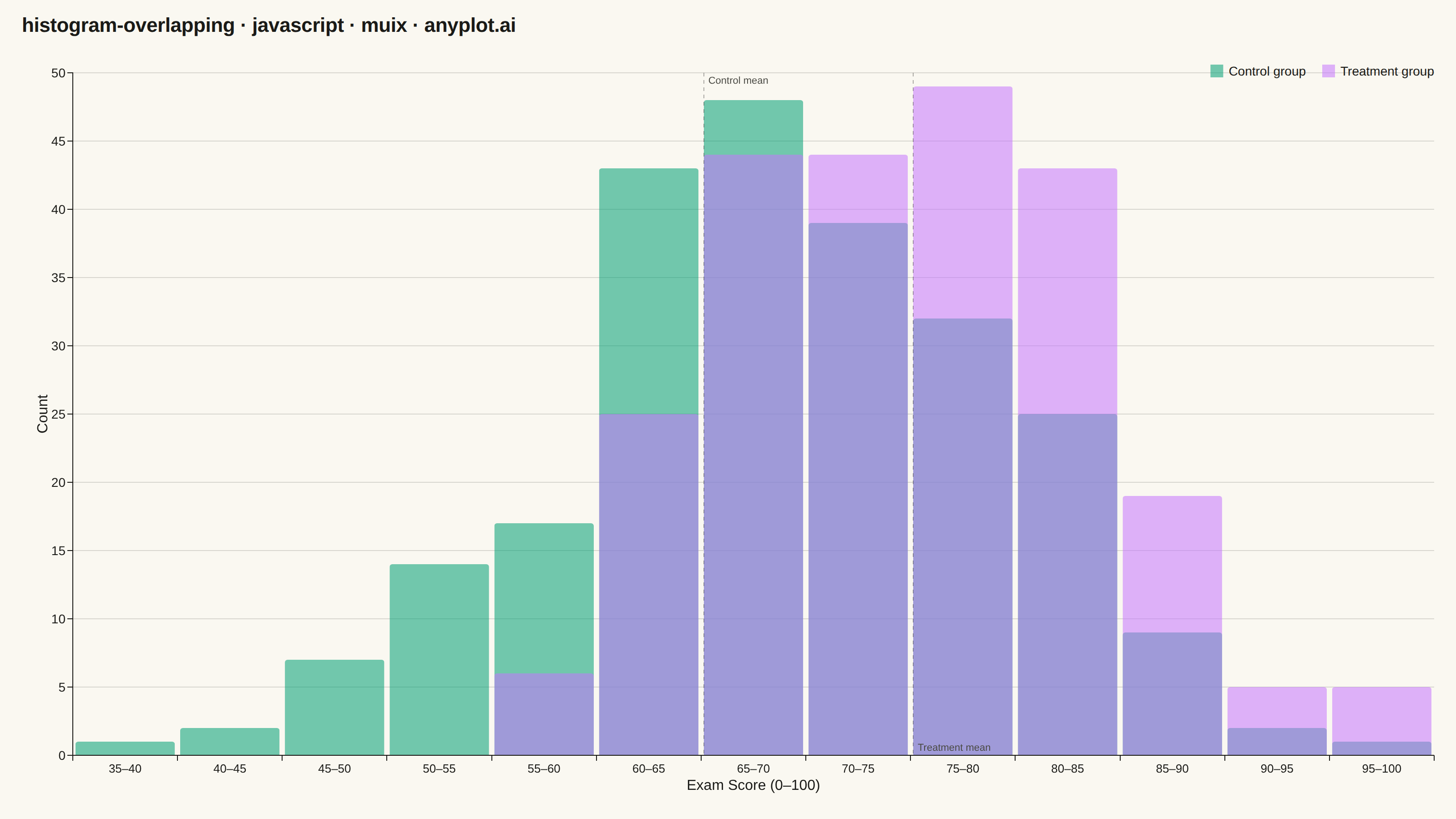
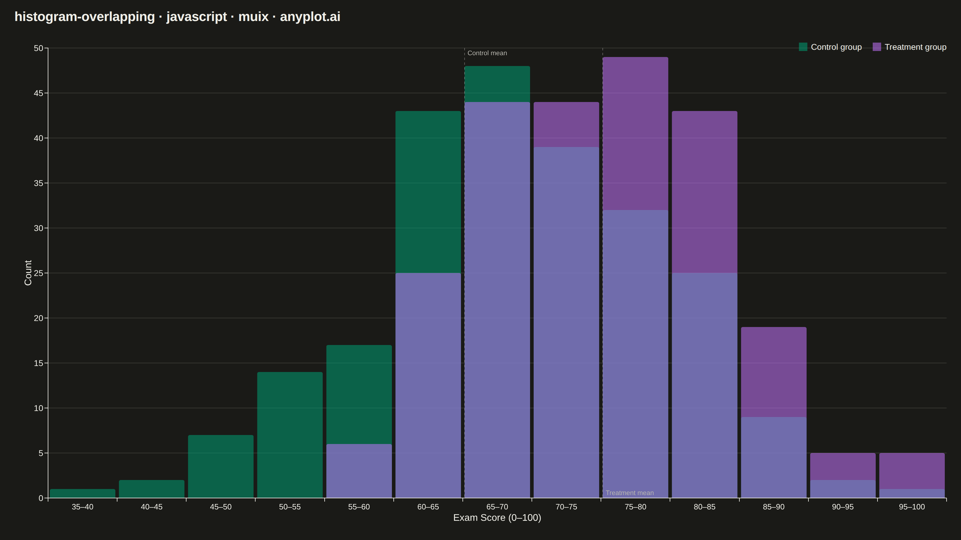
Overlapping histograms display multiple distributions on the same axes using semi-transparent bars, enabling direct visual comparison between groups. This technique reveals differences in central tendency, spread, and shape across categories while maintaining the familiar histogram format. The transparency allows viewers to see where distributions overlap and diverge.
// anyplot.ai
// histogram-overlapping: Overlapping Histograms
// Library: muix 7.29.1 | JavaScript 22.23.2
// Quality: 93/100 | Created: 2026-08-18
import { BarChart } from "@mui/x-charts/BarChart";
import { ChartsReferenceLine } from "@mui/x-charts/ChartsReferenceLine";

const t = window.ANYPLOT_TOKENS;
const TITLE = "histogram-overlapping · javascript · muix · anyplot.ai";
const TITLE_HEIGHT = 56;

// --- Data (in-memory, deterministic): exam scores, control vs treatment -----
// Deterministic LCG so the sampled distributions are stable across renders —
// the browser has no seeded Math.random().
function makeLcg(seed) {
  let state = seed >>> 0;
  return function next() {
    state = (state * 1664525 + 1013904223) >>> 0;
    return state / 4294967296;
  };
}
const rand = makeLcg(42);
function gaussianSample() {
  const u1 = Math.max(rand(), 1e-9);
  const u2 = rand();
  return Math.sqrt(-2 * Math.log(u1)) * Math.cos(2 * Math.PI * u2);
}

const SAMPLE_COUNT = 240;
const controlScores = Array.from({ length: SAMPLE_COUNT }, () =>
  Math.min(100, Math.max(0, 68 + 11 * gaussianSample())),
);
const treatmentScores = Array.from({ length: SAMPLE_COUNT }, () =>
  Math.min(100, Math.max(0, 76 + 9 * gaussianSample())),
);

// Shared bin edges across both groups so the comparison is apples-to-apples.
const BIN_WIDTH = 5;
const allScores = controlScores.concat(treatmentScores);
const binStart = Math.floor(Math.min(...allScores) / BIN_WIDTH) * BIN_WIDTH;
const binEnd = Math.ceil(Math.max(...allScores) / BIN_WIDTH) * BIN_WIDTH;
const binCount = (binEnd - binStart) / BIN_WIDTH;
const binLabels = Array.from(
  { length: binCount },
  (_, i) => `${binStart + i * BIN_WIDTH}–${binStart + (i + 1) * BIN_WIDTH}`,
);

function countPerBin(samples) {
  const counts = new Array(binCount).fill(0);
  samples.forEach((value) => {
    const idx = Math.min(binCount - 1, Math.floor((value - binStart) / BIN_WIDTH));
    counts[idx] += 1;
  });
  return counts;
}
const controlCounts = countPerBin(controlScores);
const treatmentCounts = countPerBin(treatmentScores);

// Bake 55% opacity into the fill so overlapping regions stay legible.
function withAlpha(hex, alpha) {
  return hex + Math.round(alpha * 255).toString(16).padStart(2, "0");
}

// Storytelling touch: a reference line at each group's mean, snapped to its
// containing bin label (the x axis is a band scale, so ChartsReferenceLine's
// `x` must match one of `binLabels` exactly rather than a raw numeric mean).
function meanBinLabel(samples) {
  const mean = samples.reduce((sum, v) => sum + v, 0) / samples.length;
  const idx = Math.min(binCount - 1, Math.max(0, Math.floor((mean - binStart) / BIN_WIDTH)));
  return binLabels[idx];
}
const controlMeanBin = meanBinLabel(controlScores);
const treatmentMeanBin = meanBinLabel(treatmentScores);

// --- Chart (default-exported component — the harness mounts it) -------------
export default function Chart() {
  const chartHeight = window.ANYPLOT_SIZE.height - TITLE_HEIGHT;

  return (
    <div
      style={{
        width: window.ANYPLOT_SIZE.width,
        height: window.ANYPLOT_SIZE.height,
      }}
    >
      <div
        style={{
          height: TITLE_HEIGHT,
          lineHeight: `${TITLE_HEIGHT}px`,
          paddingLeft: 24,
          fontSize: 22,
          fontWeight: 600,
          letterSpacing: -0.2,
          color: t.ink,
        }}
      >
        {TITLE}
      </div>
      <BarChart
        width={window.ANYPLOT_SIZE.width}
        height={chartHeight}
        skipAnimation
        borderRadius={3}
        series={[
          {
            data: controlCounts,
            label: "Control group",
            color: withAlpha(t.palette[0], 0.55),
            valueFormatter: (v) => `${v} students`,
            highlightScope: { highlight: "series", fade: "global" },
          },
          {
            data: treatmentCounts,
            label: "Treatment group",
            color: withAlpha(t.palette[1], 0.55),
            valueFormatter: (v) => `${v} students`,
            highlightScope: { highlight: "series", fade: "global" },
          },
        ]}
        xAxis={[
          {
            scaleType: "band",
            data: binLabels,
            label: "Exam Score (0–100)",
            labelStyle: { fontSize: 16, fontWeight: 500 },
            tickLabelStyle: { fontSize: 13 },
            categoryGapRatio: 0.05,
            // Overlap the two series' bars instead of placing them side by
            // side: barGapRatio=-1 solves barWidth=bandWidth, offset=0 for
            // every series (see getBandSize in @mui/x-charts/BarChart/BarPlot),
            // so both groups' bars share the same position and width.
            barGapRatio: -1,
          },
        ]}
        yAxis={[
          {
            label: "Count",
            labelStyle: { fontSize: 16, fontWeight: 500 },
            tickLabelStyle: { fontSize: 14 },
          },
        ]}
        grid={{ horizontal: true }}
        margin={{ left: 80, right: 24, top: 24, bottom: 70 }}
        slotProps={{
          legend: {
            direction: "row",
            position: { vertical: "top", horizontal: "right" },
            labelStyle: { fontSize: 14 },
            itemMarkWidth: 14,
            itemMarkHeight: 14,
            markGap: 6,
            itemGap: 18,
            padding: 6,
          },
        }}
      >
        {/* Storytelling touch: a light dashed reference line at each group's
            mean, in the theme-adaptive ink color so it reads as structure
            rather than a third data series. */}
        <ChartsReferenceLine
          x={controlMeanBin}
          label="Control mean"
          labelAlign="start"
          lineStyle={{ stroke: withAlpha(t.ink, 0.35), strokeDasharray: "4 4" }}
          labelStyle={{ fontSize: 11, fill: t.inkSoft }}
        />
        <ChartsReferenceLine
          x={treatmentMeanBin}
          label="Treatment mean"
          labelAlign="end"
          lineStyle={{ stroke: withAlpha(t.ink, 0.35), strokeDasharray: "4 4" }}
          labelStyle={{ fontSize: 11, fill: t.inkSoft }}
        />
      </BarChart>
    </div>
  );
}
Runnable source as JSON, for any HTTP client: https://api.anyplot.ai/specs/histogram-overlapping/muix/code. Any spec id and library id listed in llms-full.txt fit the same URL shape; every URL below is complete and callable.
{
  "spec_id": "histogram-overlapping",
  "language": "javascript",
  "library": "muix",
  "page": "https://anyplot.ai/histogram-overlapping/javascript/muix",
  "hub": "https://anyplot.ai/histogram-overlapping",
  "code_json": "https://api.anyplot.ai/specs/histogram-overlapping/muix/code",
  "spec_json": "https://api.anyplot.ai/specs/histogram-overlapping",
  "render_light_png": "https://storage.googleapis.com/anyplot-images/plots/histogram-overlapping/javascript/muix/plot-light.png",
  "render_dark_png": "https://storage.googleapis.com/anyplot-images/plots/histogram-overlapping/javascript/muix/plot-dark.png",
  "interactive_light_html": "https://storage.googleapis.com/anyplot-images/plots/histogram-overlapping/javascript/muix/plot-light.html",
  "interactive_dark_html": "https://storage.googleapis.com/anyplot-images/plots/histogram-overlapping/javascript/muix/plot-dark.html",
  "quality_score": 93.0,
  "license": "MIT",
  "guide": "https://anyplot.ai/llms.txt"
}
Part of Overlapping Histograms on anyplot.ai.