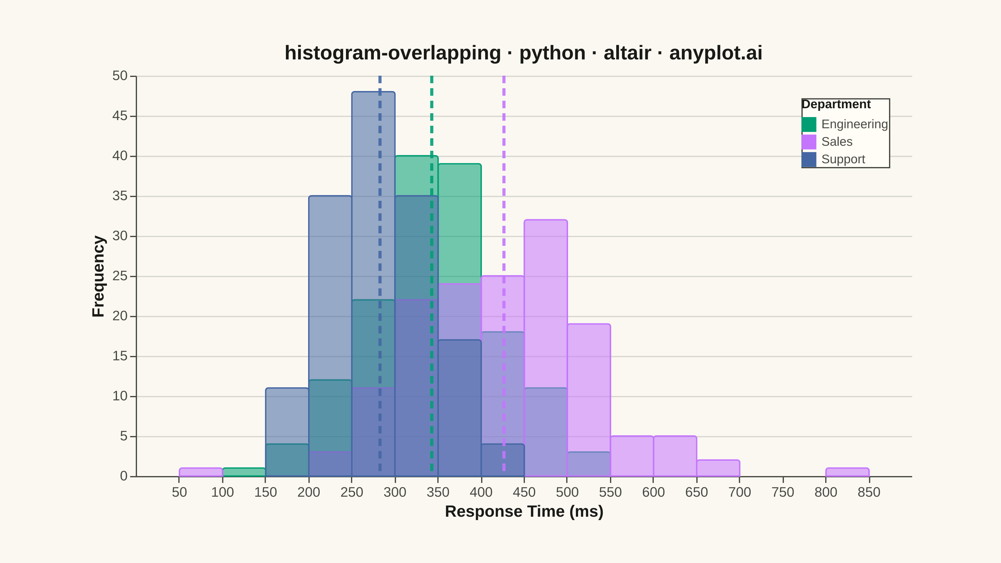
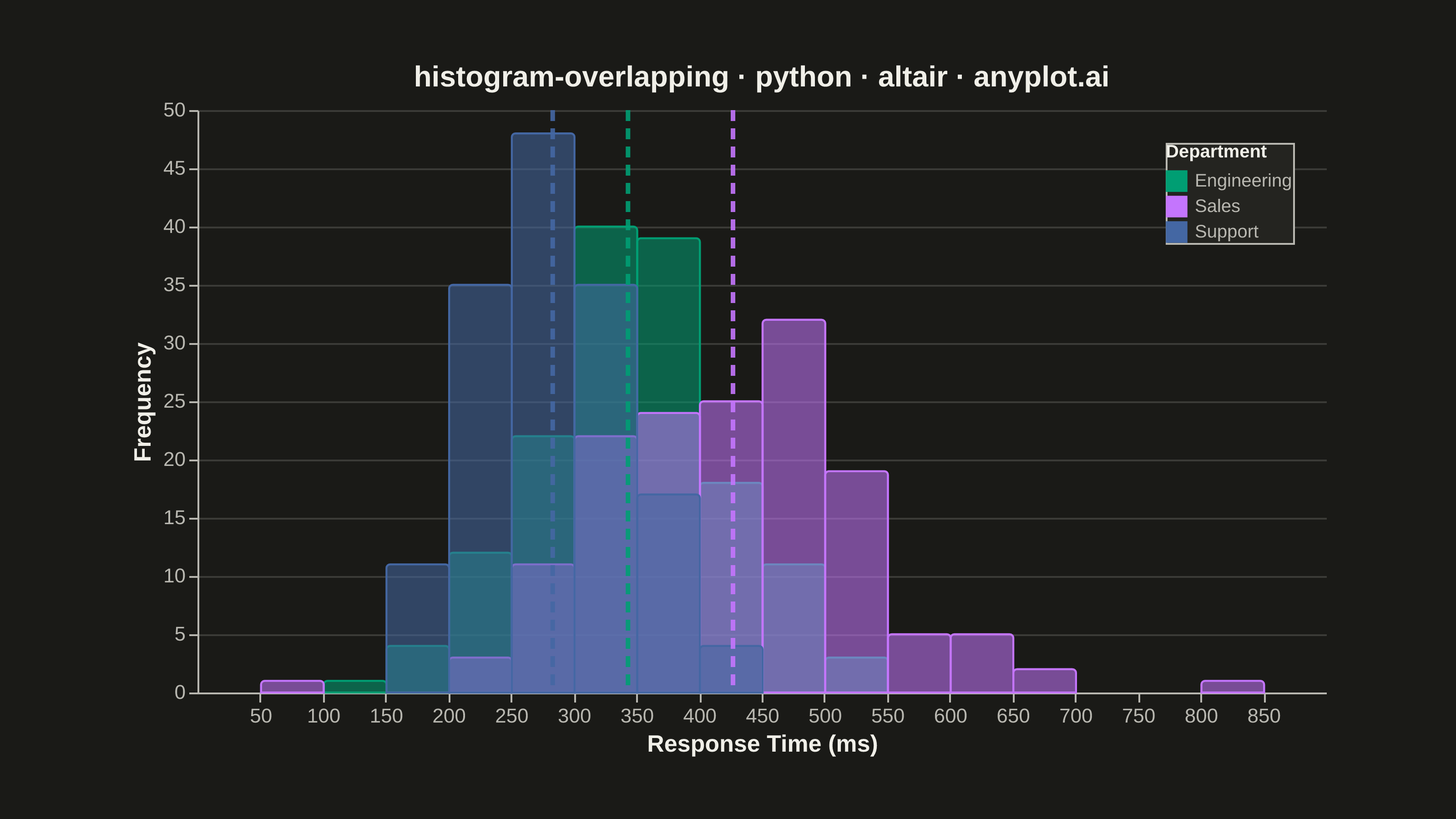
Overlapping histograms display multiple distributions on the same axes using semi-transparent bars, enabling direct visual comparison between groups. This technique reveals differences in central tendency, spread, and shape across categories while maintaining the familiar histogram format. The transparency allows viewers to see where distributions overlap and diverge.
""" anyplot.ai
histogram-overlapping: Overlapping Histograms
Library: altair 6.2.2 | Python 3.13.15
Quality: 86/100 | Updated: 2026-08-18
"""

import os

import altair as alt
import numpy as np
import pandas as pd
from PIL import Image


# Theme tokens (see prompts/default-style-guide.md "Background" + "Theme-adaptive Chrome")
THEME = os.getenv("ANYPLOT_THEME", "light")
PAGE_BG = "#FAF8F1" if THEME == "light" else "#1A1A17"
ELEVATED_BG = "#FFFDF6" if THEME == "light" else "#242420"
INK = "#1A1A17" if THEME == "light" else "#F0EFE8"
INK_SOFT = "#4A4A44" if THEME == "light" else "#B8B7B0"

# Imprint palette (position 1 is ALWAYS #009E73 — see default-style-guide.md)
IMPRINT_PALETTE = ["#009E73", "#C475FD", "#4467A3", "#BD8233", "#AE3030", "#2ABCCD", "#954477", "#99B314"]
DEPARTMENTS = ["Engineering", "Sales", "Support"]
COLOR_SCALE = alt.Scale(domain=DEPARTMENTS, range=IMPRINT_PALETTE[:3])

# Data: support-ticket response times (ms) by department
np.random.seed(42)
engineering = np.random.normal(loc=350, scale=80, size=150)
sales = np.random.normal(loc=420, scale=100, size=150)
support = np.random.normal(loc=280, scale=60, size=150)

df = pd.DataFrame(
    {
        "Response Time (ms)": np.concatenate([engineering, sales, support]),
        "Department": ["Engineering"] * 150 + ["Sales"] * 150 + ["Support"] * 150,
    }
)

# Legend-bound selection — click a swatch to isolate that department's bars/rule
# (Altair-distinctive declarative interaction; empty selection == everything selected,
# so the static PNG render is unaffected and matches the un-highlighted default state)
legend_highlight = alt.selection_point(fields=["Department"], bind="legend", empty=True)

# Plot — overlapping semi-transparent histograms; one shared x encoding keeps bin edges aligned.
# Fill stays semi-transparent so overlaps blend, but each bar's own-color stroke (full opacity)
# traces its boundary through the blended region for pairwise disambiguation without the legend.
histograms = (
    alt.Chart(df)
    .mark_bar(binSpacing=0, cornerRadiusTopLeft=2, cornerRadiusTopRight=2, strokeWidth=1.1)
    .encode(
        x=alt.X(
            "Response Time (ms):Q",
            bin=alt.Bin(maxbins=24),
            title="Response Time (ms)",
            axis=alt.Axis(labelFontSize=11, titleFontSize=13, grid=False),
        ),
        y=alt.Y(
            "count():Q",
            title="Frequency",
            stack=None,
            axis=alt.Axis(labelFontSize=11, titleFontSize=13, gridColor=INK, gridOpacity=0.15),
        ),
        color=alt.Color(
            "Department:N",
            scale=COLOR_SCALE,
            legend=alt.Legend(
                title="Department",
                titleFontSize=10,
                labelFontSize=10,
                orient="top-right",
                symbolSize=140,
                symbolStrokeWidth=0,
            ),
        ),
        stroke=alt.Stroke("Department:N", scale=COLOR_SCALE, legend=None),
        fillOpacity=alt.condition(legend_highlight, alt.value(0.55), alt.value(0.08)),
        tooltip=[alt.Tooltip("Department:N"), alt.Tooltip("count():Q", title="Count")],
    )
    .add_params(legend_highlight)
)

# Layer — dashed mean-rule per department, using Altair's inline aggregate encoding shorthand
mean_rules = (
    alt.Chart(df)
    .mark_rule(strokeDash=[6, 4], strokeWidth=2.5)
    .encode(
        x=alt.X("mean(Response Time (ms)):Q"),
        color=alt.Color("Department:N", scale=COLOR_SCALE, legend=None),
        opacity=alt.condition(legend_highlight, alt.value(0.9), alt.value(0.08)),
    )
)

title = "histogram-overlapping · python · altair · anyplot.ai"
chart = (
    alt.layer(histograms, mean_rules)
    .properties(
        width=620, height=320, background=PAGE_BG, title=alt.Title(title, fontSize=16, anchor="middle", color=INK)
    )
    .configure_view(fill=PAGE_BG, stroke=None)
    .configure_axis(domainColor=INK_SOFT, tickColor=INK_SOFT, labelColor=INK_SOFT, titleColor=INK)
    .configure_legend(fillColor=ELEVATED_BG, strokeColor=INK_SOFT, labelColor=INK_SOFT, titleColor=INK)
)

# Save — PNG padded to the canonical 3200×1800 canvas (see prompts/library/altair.md "Canvas")
chart.save(f"plot-{THEME}.png", scale_factor=4.0)

TARGET_W, TARGET_H = 3200, 1800
_img = Image.open(f"plot-{THEME}.png").convert("RGB")
_w, _h = _img.size
if _w > TARGET_W or _h > TARGET_H:
    raise SystemExit(
        f"altair vl-convert produced {_w}x{_h}, exceeds target {TARGET_W}x{TARGET_H}. "
        f"Shrink chart .properties(width=, height=) values and re-render."
    )
if _w < TARGET_W or _h < TARGET_H:
    _canvas = Image.new("RGB", (TARGET_W, TARGET_H), PAGE_BG)
    _canvas.paste(_img, ((TARGET_W - _w) // 2, (TARGET_H - _h) // 2))
    _canvas.save(f"plot-{THEME}.png")

chart.save(f"plot-{THEME}.html")
Runnable source as JSON, for any HTTP client: https://api.anyplot.ai/specs/histogram-overlapping/altair/code. Any spec id and library id listed in llms-full.txt fit the same URL shape; every URL below is complete and callable.
{
  "spec_id": "histogram-overlapping",
  "language": "python",
  "library": "altair",
  "page": "https://anyplot.ai/histogram-overlapping/python/altair",
  "hub": "https://anyplot.ai/histogram-overlapping",
  "code_json": "https://api.anyplot.ai/specs/histogram-overlapping/altair/code",
  "spec_json": "https://api.anyplot.ai/specs/histogram-overlapping",
  "render_light_png": "https://storage.googleapis.com/anyplot-images/plots/histogram-overlapping/python/altair/plot-light.png",
  "render_dark_png": "https://storage.googleapis.com/anyplot-images/plots/histogram-overlapping/python/altair/plot-dark.png",
  "interactive_light_html": "https://storage.googleapis.com/anyplot-images/plots/histogram-overlapping/python/altair/plot-light.html",
  "interactive_dark_html": "https://storage.googleapis.com/anyplot-images/plots/histogram-overlapping/python/altair/plot-dark.html",
  "quality_score": 86.0,
  "license": "MIT",
  "guide": "https://anyplot.ai/llms.txt"
}
Part of Overlapping Histograms on anyplot.ai.