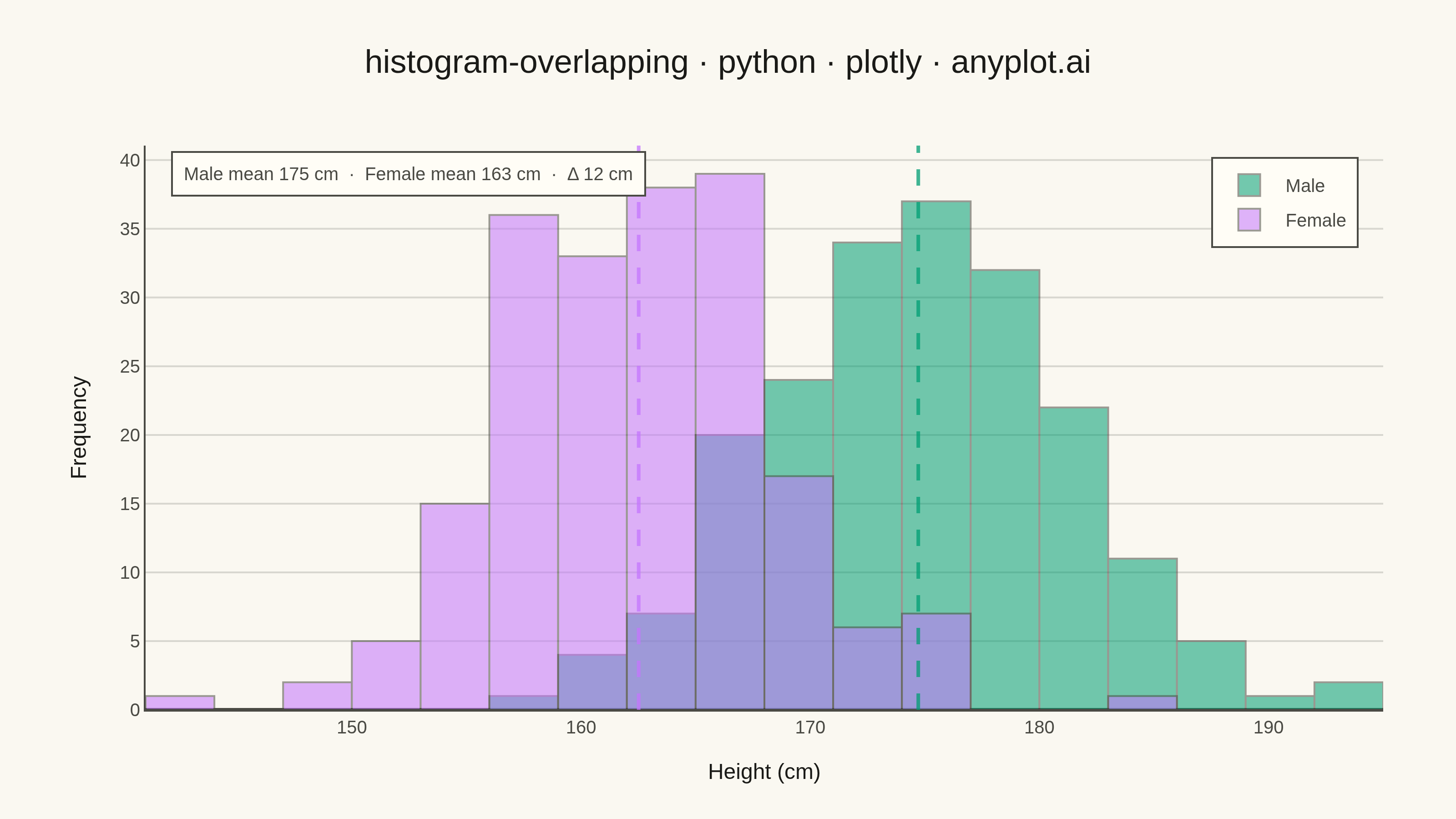
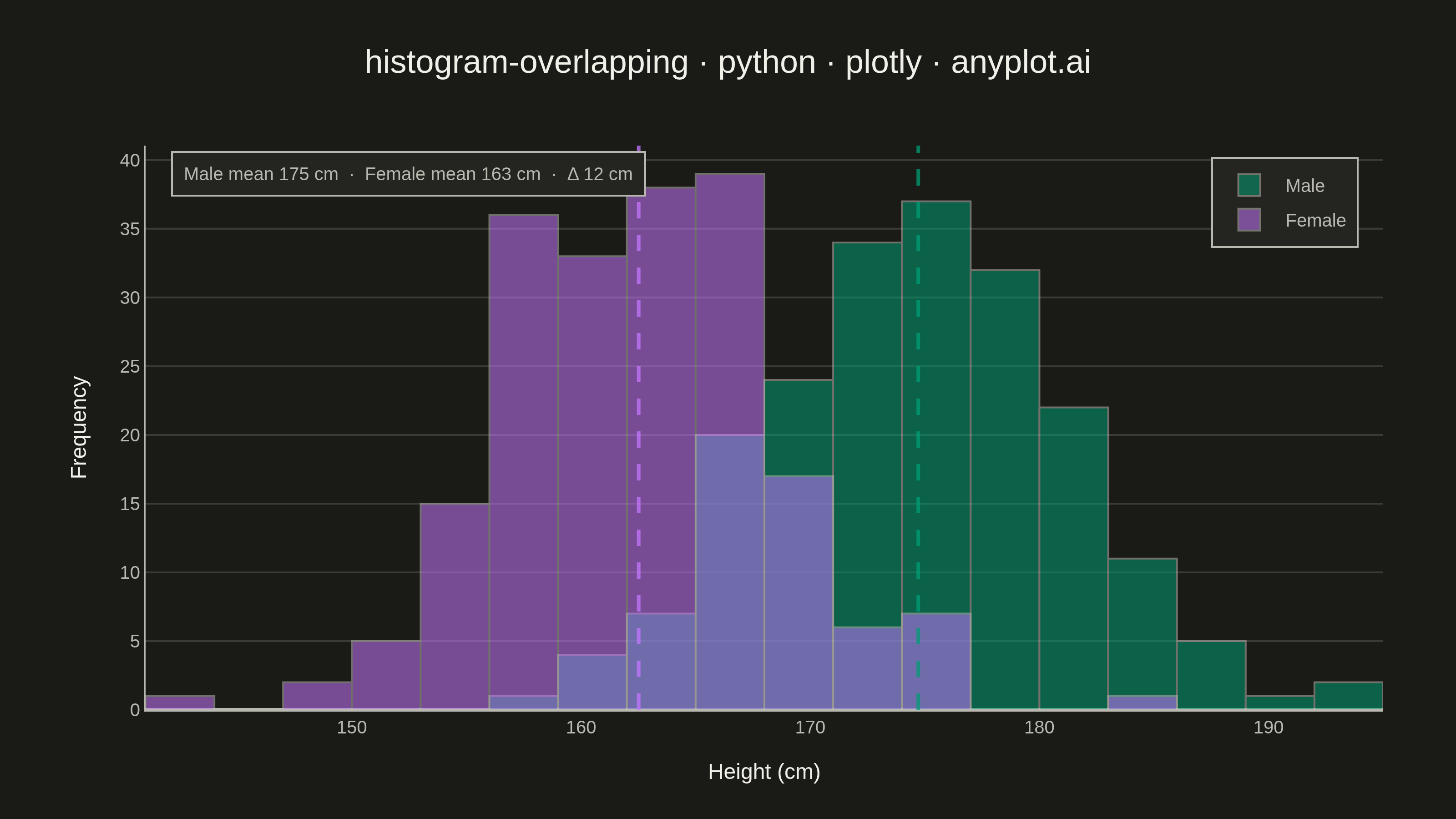
Overlapping histograms display multiple distributions on the same axes using semi-transparent bars, enabling direct visual comparison between groups. This technique reveals differences in central tendency, spread, and shape across categories while maintaining the familiar histogram format. The transparency allows viewers to see where distributions overlap and diverge.
""" anyplot.ai
histogram-overlapping: Overlapping Histograms
Library: plotly 6.9.0 | Python 3.13.15
Quality: 90/100 | Updated: 2026-08-18
"""

import os

import numpy as np
import plotly.graph_objects as go


THEME = os.getenv("ANYPLOT_THEME", "light")
PAGE_BG = "#FAF8F1" if THEME == "light" else "#1A1A17"
ELEVATED_BG = "#FFFDF6" if THEME == "light" else "#242420"
INK = "#1A1A17" if THEME == "light" else "#F0EFE8"
INK_SOFT = "#4A4A44" if THEME == "light" else "#B8B7B0"
GRID = "rgba(26,26,23,0.15)" if THEME == "light" else "rgba(240,239,232,0.15)"

# Imprint palette (positions 1-2)
IMPRINT = ["#009E73", "#C475FD"]
IMPRINT_LINE = ["rgba(0,158,115,0.75)", "rgba(196,117,253,0.75)"]

# Shared bin edges so both traces align regardless of the underlying data
BINS = dict(start=141, end=197, size=3)

# Data - heights by gender (realistic scenario showing overlapping distributions)
np.random.seed(42)
male_heights = np.random.normal(175, 7, 200)
female_heights = np.random.normal(162, 6, 200)
mean_male = male_heights.mean()
mean_female = female_heights.mean()

# Create figure
fig = go.Figure()

# Add histograms with semi-transparent fills for overlap visibility
fig.add_trace(
    go.Histogram(
        x=male_heights,
        name="Male",
        marker=dict(color=IMPRINT[0], line=dict(color=INK_SOFT, width=1)),
        opacity=0.55,
        xbins=BINS,
    )
)

fig.add_trace(
    go.Histogram(
        x=female_heights,
        name="Female",
        marker=dict(color=IMPRINT[1], line=dict(color=INK_SOFT, width=1)),
        opacity=0.55,
        xbins=BINS,
    )
)

# Use overlay mode for true overlapping histograms
fig.update_layout(barmode="overlay")

# Mean reference lines - visual hierarchy calling out the central-tendency gap
fig.add_vline(x=mean_male, line=dict(color=IMPRINT_LINE[0], dash="dash", width=2))
fig.add_vline(x=mean_female, line=dict(color=IMPRINT_LINE[1], dash="dash", width=2))

fig.add_annotation(
    xref="paper",
    yref="paper",
    x=0.02,
    y=0.99,
    xanchor="left",
    yanchor="top",
    align="left",
    showarrow=False,
    text=f"Male mean {mean_male:.0f} cm  ·  Female mean {mean_female:.0f} cm  ·  Δ {mean_male - mean_female:.0f} cm",
    font=dict(size=10, color=INK_SOFT),
    bgcolor=ELEVATED_BG,
    bordercolor=INK_SOFT,
    borderwidth=1,
    borderpad=6,
)

# Layout styling for 3200x1800 px output (width=800, height=450, scale=4)
fig.update_layout(
    autosize=False,
    title=dict(
        text="histogram-overlapping · python · plotly · anyplot.ai",
        font=dict(size=18, color=INK),
        x=0.5,
        xanchor="center",
    ),
    xaxis=dict(
        title=dict(text="Height (cm)", font=dict(size=12, color=INK)),
        tickfont=dict(size=10, color=INK_SOFT),
        showgrid=False,
        linecolor=INK_SOFT,
        zerolinecolor=INK_SOFT,
    ),
    yaxis=dict(
        title=dict(text="Frequency", font=dict(size=12, color=INK)),
        tickfont=dict(size=10, color=INK_SOFT),
        showgrid=True,
        gridcolor=GRID,
        linecolor=INK_SOFT,
        zerolinecolor=INK_SOFT,
    ),
    legend=dict(
        font=dict(size=10, color=INK_SOFT),
        x=0.98,
        y=0.98,
        xanchor="right",
        yanchor="top",
        bgcolor=ELEVATED_BG,
        bordercolor=INK_SOFT,
        borderwidth=1,
    ),
    paper_bgcolor=PAGE_BG,
    plot_bgcolor=PAGE_BG,
    margin=dict(l=80, r=40, t=80, b=60),
)

# Save as PNG (3200 x 1800 px)
fig.write_image(f"plot-{THEME}.png", width=800, height=450, scale=4)

# Save interactive HTML version
fig.write_html(f"plot-{THEME}.html", include_plotlyjs="cdn")
Runnable source as JSON, for any HTTP client: https://api.anyplot.ai/specs/histogram-overlapping/plotly/code. Any spec id and library id listed in llms-full.txt fit the same URL shape; every URL below is complete and callable.
{
  "spec_id": "histogram-overlapping",
  "language": "python",
  "library": "plotly",
  "page": "https://anyplot.ai/histogram-overlapping/python/plotly",
  "hub": "https://anyplot.ai/histogram-overlapping",
  "code_json": "https://api.anyplot.ai/specs/histogram-overlapping/plotly/code",
  "spec_json": "https://api.anyplot.ai/specs/histogram-overlapping",
  "render_light_png": "https://storage.googleapis.com/anyplot-images/plots/histogram-overlapping/python/plotly/plot-light.png",
  "render_dark_png": "https://storage.googleapis.com/anyplot-images/plots/histogram-overlapping/python/plotly/plot-dark.png",
  "interactive_light_html": "https://storage.googleapis.com/anyplot-images/plots/histogram-overlapping/python/plotly/plot-light.html",
  "interactive_dark_html": "https://storage.googleapis.com/anyplot-images/plots/histogram-overlapping/python/plotly/plot-dark.html",
  "quality_score": 90.0,
  "license": "MIT",
  "guide": "https://anyplot.ai/llms.txt"
}
Part of Overlapping Histograms on anyplot.ai.