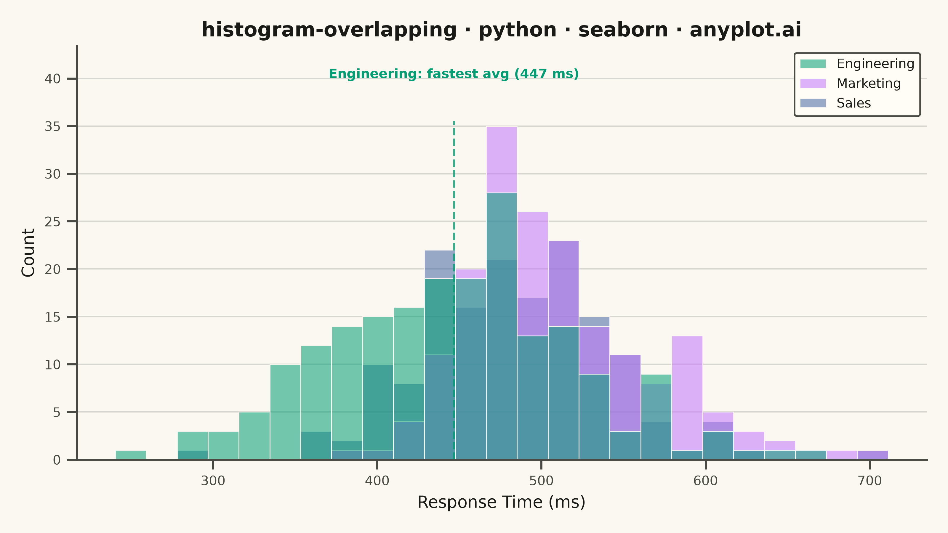
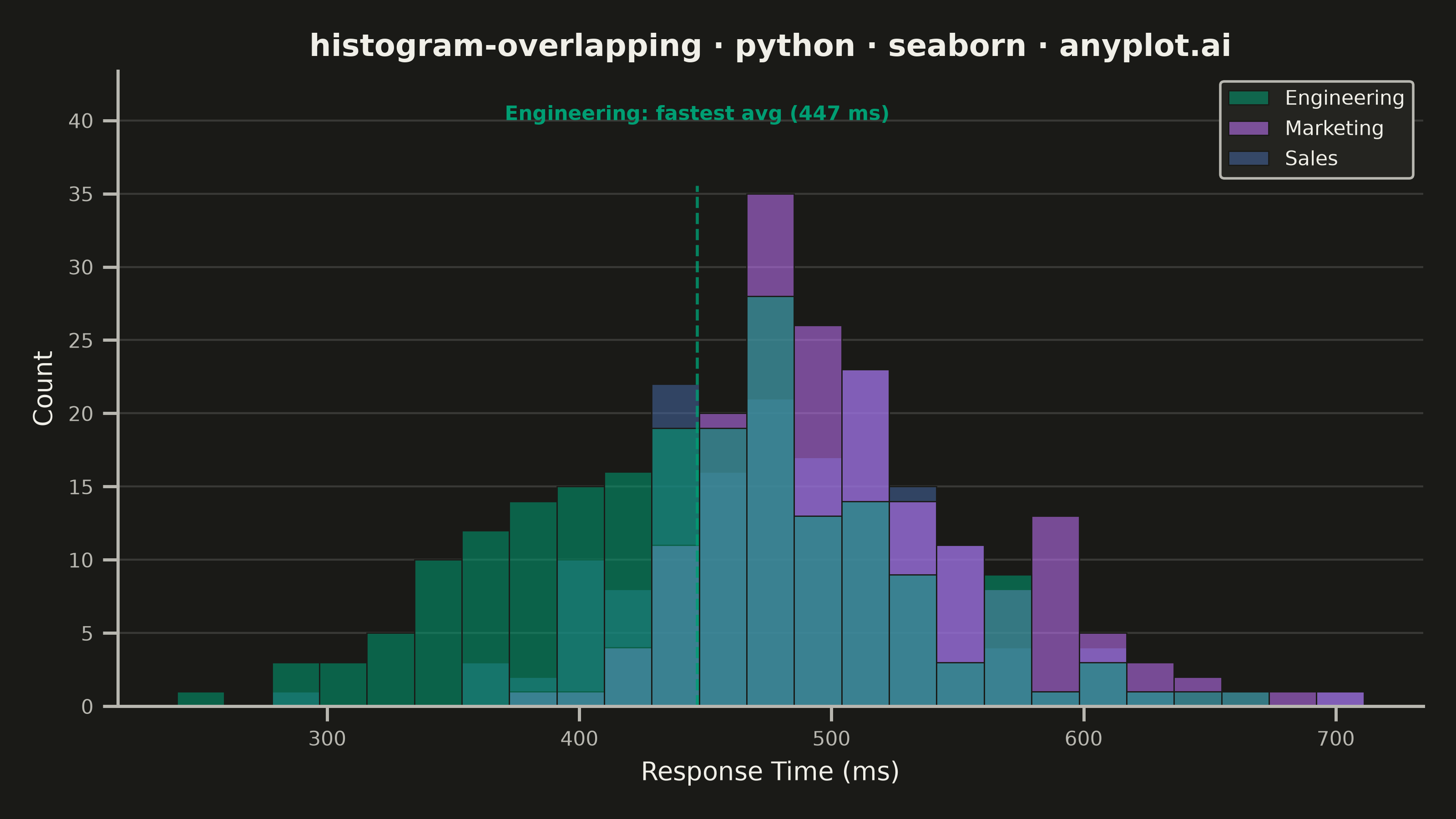
Overlapping histograms display multiple distributions on the same axes using semi-transparent bars, enabling direct visual comparison between groups. This technique reveals differences in central tendency, spread, and shape across categories while maintaining the familiar histogram format. The transparency allows viewers to see where distributions overlap and diverge.
""" anyplot.ai
histogram-overlapping: Overlapping Histograms
Library: seaborn 0.13.2 | Python 3.13.15
Quality: 92/100 | Updated: 2026-08-18
"""

import os

import matplotlib.pyplot as plt
import numpy as np
import pandas as pd
import seaborn as sns
from scipy.stats import skewnorm


# Theme tokens
THEME = os.getenv("ANYPLOT_THEME", "light")
PAGE_BG = "#FAF8F1" if THEME == "light" else "#1A1A17"
ELEVATED_BG = "#FFFDF6" if THEME == "light" else "#242420"
INK = "#1A1A17" if THEME == "light" else "#F0EFE8"
INK_SOFT = "#4A4A44" if THEME == "light" else "#B8B7B0"

# Imprint palette — canonical order, first series always #009E73
IMPRINT = ["#009E73", "#C475FD", "#4467A3"]

sns.set_theme(
    style="ticks",
    rc={
        "figure.facecolor": PAGE_BG,
        "axes.facecolor": PAGE_BG,
        "axes.edgecolor": INK_SOFT,
        "axes.labelcolor": INK,
        "text.color": INK,
        "xtick.color": INK_SOFT,
        "ytick.color": INK_SOFT,
        "grid.color": INK,
        "grid.alpha": 0.15,
        "legend.facecolor": ELEVATED_BG,
        "legend.edgecolor": INK_SOFT,
    },
)

# Data - employee response times (ms) by department
# Marketing carries a mild right skew (occasional slow tickets) so the overlap
# also demonstrates a shape difference, not just a shift in mean/spread.
np.random.seed(42)
group_order = ["Engineering", "Marketing", "Sales"]
engineering = np.random.normal(450, 80, 200)
marketing = skewnorm.rvs(a=4, loc=445, scale=90, size=180, random_state=42)
sales = np.random.normal(480, 60, 160)

df = pd.DataFrame(
    {
        "values": np.concatenate([engineering, marketing, sales]),
        "group": ["Engineering"] * len(engineering) + ["Marketing"] * len(marketing) + ["Sales"] * len(sales),
    }
)

# Shared bin edges so all three distributions compare on the same grid
bin_edges = np.histogram_bin_edges(df["values"], bins=25)

# Create plot
fig, ax = plt.subplots(figsize=(8, 4.5), dpi=400)

# Idiomatic long-form overlapping histogram: one call, seaborn's hue/multiple machinery
sns.histplot(
    data=df,
    x="values",
    hue="group",
    hue_order=group_order,
    multiple="layer",
    bins=bin_edges,
    palette=IMPRINT[:3],
    alpha=0.55,
    edgecolor=PAGE_BG,
    linewidth=0.5,
    ax=ax,
)

# Labels and styling
ax.set_xlabel("Response Time (ms)", fontsize=10)
ax.set_ylabel("Count", fontsize=10)
ax.set_title("histogram-overlapping · python · seaborn · anyplot.ai", fontsize=12, fontweight="bold")
ax.tick_params(axis="both", labelsize=8)

# Spines
sns.despine(ax=ax)

# Grid
ax.set_axisbelow(True)
ax.yaxis.grid(True, linewidth=0.8)

# Legend (seaborn auto-builds it from hue; drop the "group" title, restyle to match theme)
sns.move_legend(ax, "upper right", title=None, fontsize=8, frameon=True)
legend = ax.get_legend()
legend.get_frame().set_alpha(1)
for text in legend.get_texts():
    text.set_color(INK)

# Storytelling: call out the fastest department's average response time
group_means = df.groupby("group")["values"].mean()
fastest_group = group_means.idxmin()
fastest_mean = group_means[fastest_group]
fastest_color = IMPRINT[group_order.index(fastest_group)]

bar_top = ax.get_ylim()[1]
ax.set_ylim(top=bar_top * 1.18)
ax.axvline(fastest_mean, color=fastest_color, linestyle="--", linewidth=1.2, alpha=0.8, ymax=0.82)
ax.annotate(
    f"{fastest_group}: fastest avg ({fastest_mean:.0f} ms)",
    xy=(fastest_mean, bar_top),
    xytext=(fastest_mean, bar_top * 1.08),
    fontsize=8,
    fontweight="bold",
    color=fastest_color,
    ha="center",
    va="bottom",
)

plt.tight_layout()
plt.savefig(f"plot-{THEME}.png", dpi=400, facecolor=PAGE_BG)
Runnable source as JSON, for any HTTP client: https://api.anyplot.ai/specs/histogram-overlapping/seaborn/code. Any spec id and library id listed in llms-full.txt fit the same URL shape; every URL below is complete and callable.
{
  "spec_id": "histogram-overlapping",
  "language": "python",
  "library": "seaborn",
  "page": "https://anyplot.ai/histogram-overlapping/python/seaborn",
  "hub": "https://anyplot.ai/histogram-overlapping",
  "code_json": "https://api.anyplot.ai/specs/histogram-overlapping/seaborn/code",
  "spec_json": "https://api.anyplot.ai/specs/histogram-overlapping",
  "render_light_png": "https://storage.googleapis.com/anyplot-images/plots/histogram-overlapping/python/seaborn/plot-light.png",
  "render_dark_png": "https://storage.googleapis.com/anyplot-images/plots/histogram-overlapping/python/seaborn/plot-dark.png",
  "quality_score": 92.0,
  "license": "MIT",
  "guide": "https://anyplot.ai/llms.txt"
}
Part of Overlapping Histograms on anyplot.ai.