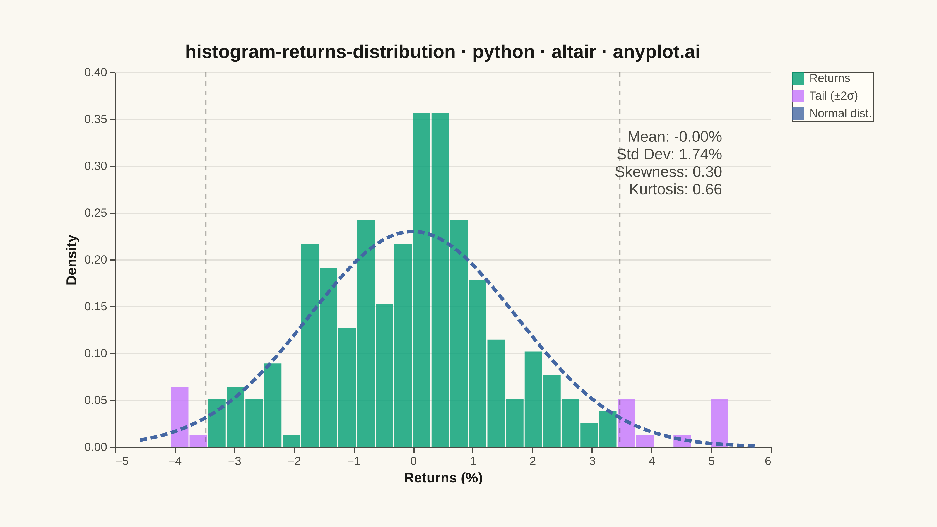
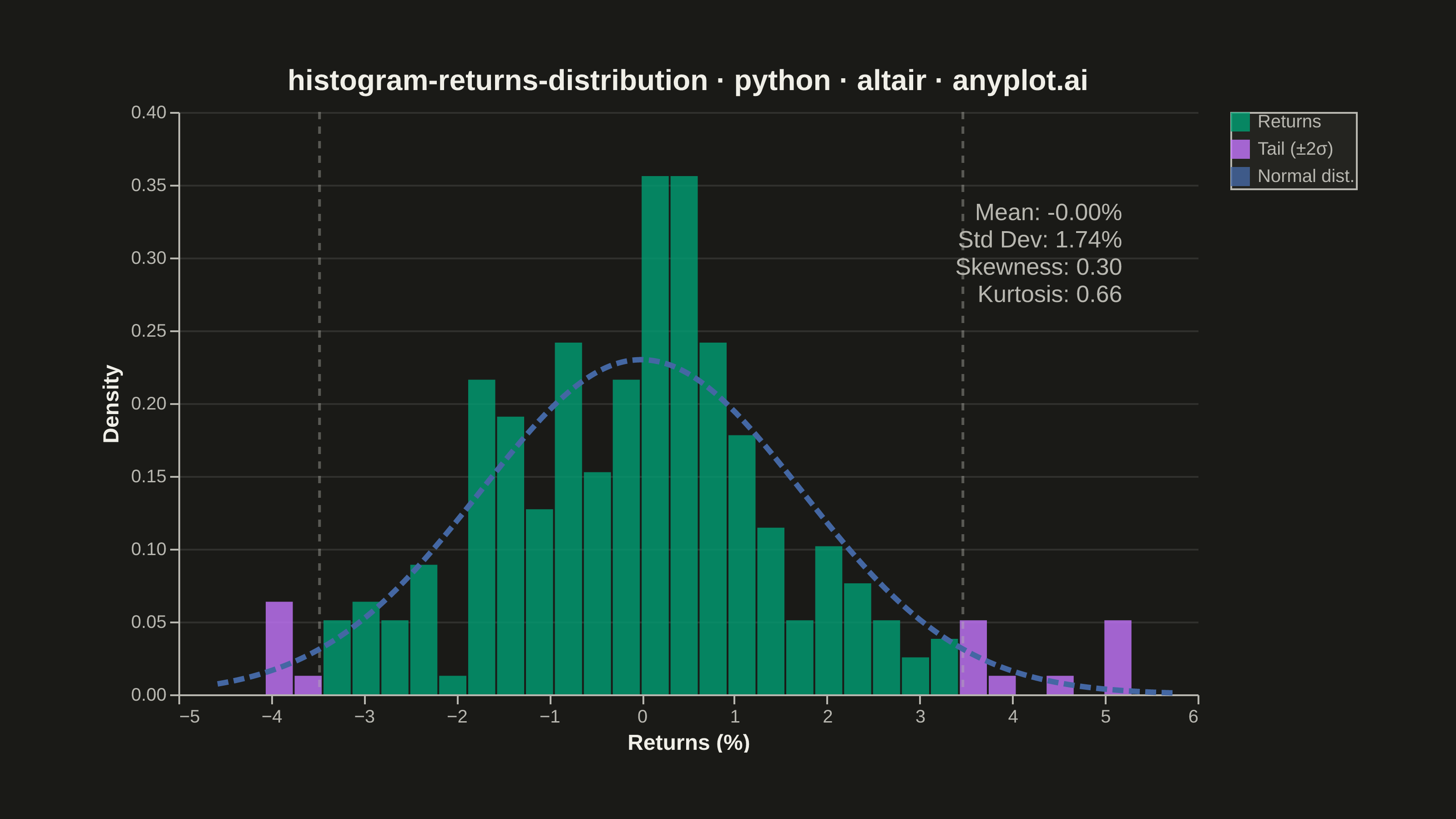
A histogram showing the distribution of financial returns (daily, weekly, or monthly) with a normal distribution overlay for comparison. This visualization is essential for risk analysis, allowing analysts to assess whether returns follow a normal distribution, identify fat tails indicating higher-than-expected extreme events, and measure asymmetry through skewness. Key statistics are displayed directly on the plot for quick interpretation.
""" anyplot.ai
histogram-returns-distribution: Returns Distribution Histogram
Library: altair 6.1.0 | Python 3.13.13
Quality: 91/100 | Updated: 2026-05-20
"""

import os
import sys


# Prevent altair.py (this file) from shadowing the installed altair package:
# Python puts the script's directory as sys.path[0], so we drop it.
_script_dir = os.path.dirname(os.path.abspath(__file__))
sys.path = [p for p in sys.path if p and os.path.abspath(p) != _script_dir]

import altair as alt
import numpy as np
import pandas as pd
from PIL import Image
from scipy import stats


THEME = os.getenv("ANYPLOT_THEME", "light")
PAGE_BG = "#FAF8F1" if THEME == "light" else "#1A1A17"
ELEVATED_BG = "#FFFDF6" if THEME == "light" else "#242420"
INK = "#1A1A17" if THEME == "light" else "#F0EFE8"
INK_SOFT = "#4A4A44" if THEME == "light" else "#B8B7B0"

BRAND = "#009E73"  # Okabe-Ito 1 — main distribution bars
TAIL_COLOR = "#C475FD"  # Okabe-Ito 2 — tail bars beyond ±2σ
CURVE_COLOR = "#4467A3"  # Okabe-Ito 3 — fitted normal distribution overlay

# Data
np.random.seed(42)
n_days = 252
raw_returns = np.random.standard_t(df=5, size=n_days) * 0.015 + 0.0003
# Clip at 1st–99th percentile to remove extreme outliers that compress the main distribution
returns = np.clip(raw_returns, np.percentile(raw_returns, 1), np.percentile(raw_returns, 99))

mean_ret = np.mean(returns) * 100
std_ret = np.std(returns) * 100
skewness = stats.skew(returns)
kurtosis = stats.kurtosis(returns)

df_ret = pd.DataFrame({"returns": returns * 100})

bin_count = 30
hist_values, bin_edges = np.histogram(df_ret["returns"], bins=bin_count, density=True)
bin_centers = (bin_edges[:-1] + bin_edges[1:]) / 2

hist_df = pd.DataFrame(
    {"bin_center": bin_centers, "density": hist_values, "bin_start": bin_edges[:-1], "bin_end": bin_edges[1:]}
)

lower_tail = mean_ret - 2 * std_ret
upper_tail = mean_ret + 2 * std_ret
hist_df["is_tail"] = (hist_df["bin_center"] < lower_tail) | (hist_df["bin_center"] > upper_tail)
hist_df["category"] = np.where(hist_df["is_tail"], "Tail (±2σ)", "Returns")

x_range = np.linspace(df_ret["returns"].min() - 0.5, df_ret["returns"].max() + 0.5, 300)
normal_pdf = stats.norm.pdf(x_range, mean_ret, std_ret)
normal_df = pd.DataFrame({"x": x_range, "density": normal_pdf, "category": "Normal dist."})

# ±2σ reference lines
sigma_df = pd.DataFrame({"x": [lower_tail, upper_tail]})

stats_text = f"Mean: {mean_ret:.2f}%\nStd Dev: {std_ret:.2f}%\nSkewness: {skewness:.2f}\nKurtosis: {kurtosis:.2f}"
stats_df = pd.DataFrame({"x": [df_ret["returns"].max() - 0.1], "y": [max(hist_values) * 0.95], "text": [stats_text]})

title = "histogram-returns-distribution · python · altair · anyplot.ai"

# Shared color scale — explicit domain shows all 3 entries in the legend even
# though the histogram data only contains "Returns" and "Tail (±2σ)"
COLOR_DOMAIN = ["Returns", "Tail (±2σ)", "Normal dist."]
COLOR_RANGE = [BRAND, TAIL_COLOR, CURVE_COLOR]
color_scale = alt.Scale(domain=COLOR_DOMAIN, range=COLOR_RANGE)

# Plot
histogram = (
    alt.Chart(hist_df)
    .mark_bar(opacity=0.8)
    .encode(
        x=alt.X("bin_start:Q", bin="binned", title="Returns (%)"),
        x2="bin_end:Q",
        y=alt.Y("density:Q", title="Density"),
        color=alt.Color(
            "category:N",
            scale=color_scale,
            legend=alt.Legend(title=None, orient="right", labelFontSize=10, symbolSize=80),
        ),
        tooltip=[
            alt.Tooltip("bin_center:Q", title="Return (%)", format=".2f"),
            alt.Tooltip("density:Q", title="Density", format=".4f"),
        ],
    )
)

normal_curve = (
    alt.Chart(normal_df)
    .mark_line(strokeWidth=3, strokeDash=[6, 3])
    .encode(x=alt.X("x:Q"), y=alt.Y("density:Q"), color=alt.Color("category:N", scale=color_scale, legend=None))
)

# Subtle ±2σ reference lines to mark tail cutoffs
sigma_lines = (
    alt.Chart(sigma_df)
    .mark_rule(strokeDash=[4, 4], opacity=0.4, strokeWidth=1.5, color=INK_SOFT)
    .encode(x=alt.X("x:Q"))
)

stats_annotation = (
    alt.Chart(stats_df)
    .mark_text(align="right", baseline="top", fontSize=13, color=INK_SOFT, lineBreak="\n")
    .encode(x=alt.X("x:Q"), y=alt.Y("y:Q"), text="text:N")
)

chart = (
    alt.layer(histogram, sigma_lines, normal_curve, stats_annotation)
    .properties(
        width=560,
        height=320,
        background=PAGE_BG,
        padding={"left": 0, "right": 0, "top": 0, "bottom": 0},
        title=alt.Title(title, fontSize=16, anchor="middle"),
    )
    .configure_view(fill=PAGE_BG, strokeWidth=0, continuousWidth=560, continuousHeight=320)
    .configure_axis(
        labelFontSize=10,
        titleFontSize=12,
        domainColor=INK_SOFT,
        tickColor=INK_SOFT,
        gridColor=INK,
        gridOpacity=0.10,
        labelColor=INK_SOFT,
        titleColor=INK,
    )
    .configure_title(color=INK)
    .configure_legend(
        fillColor=ELEVATED_BG,
        strokeColor=INK_SOFT,
        labelColor=INK_SOFT,
        titleColor=INK,
        labelFontSize=10,
        titleFontSize=10,
    )
)

# Save
chart.save(f"plot-{THEME}.png", scale_factor=4.0)

TW, TH = 3200, 1800
_img = Image.open(f"plot-{THEME}.png").convert("RGB")
_w, _h = _img.size
if _w > TW or _h > TH:
    raise SystemExit(
        f"altair vl-convert produced {_w}×{_h}, exceeds target {TW}×{TH}. "
        f"Shrink chart .properties(width=, height=) values and re-render."
    )
if _w < TW or _h < TH:
    _bg_rgb = (250, 248, 241) if THEME == "light" else (26, 26, 23)
    _canvas = Image.new("RGB", (TW, TH), _bg_rgb)
    _canvas.paste(_img, ((TW - _w) // 2, (TH - _h) // 2))
    _canvas.save(f"plot-{THEME}.png")

chart.save(f"plot-{THEME}.html")
Runnable source as JSON, for any HTTP client: https://api.anyplot.ai/specs/histogram-returns-distribution/altair/code. Any spec id and library id listed in llms-full.txt fit the same URL shape; every URL below is complete and callable.
{
  "spec_id": "histogram-returns-distribution",
  "language": "python",
  "library": "altair",
  "page": "https://anyplot.ai/histogram-returns-distribution/python/altair",
  "hub": "https://anyplot.ai/histogram-returns-distribution",
  "code_json": "https://api.anyplot.ai/specs/histogram-returns-distribution/altair/code",
  "spec_json": "https://api.anyplot.ai/specs/histogram-returns-distribution",
  "render_light_png": "https://storage.googleapis.com/anyplot-images/plots/histogram-returns-distribution/python/altair/plot-light.png",
  "render_dark_png": "https://storage.googleapis.com/anyplot-images/plots/histogram-returns-distribution/python/altair/plot-dark.png",
  "interactive_light_html": "https://storage.googleapis.com/anyplot-images/plots/histogram-returns-distribution/python/altair/plot-light.html",
  "interactive_dark_html": "https://storage.googleapis.com/anyplot-images/plots/histogram-returns-distribution/python/altair/plot-dark.html",
  "quality_score": 91.0,
  "license": "MIT",
  "guide": "https://anyplot.ai/llms.txt"
}
Part of Returns Distribution Histogram on anyplot.ai.