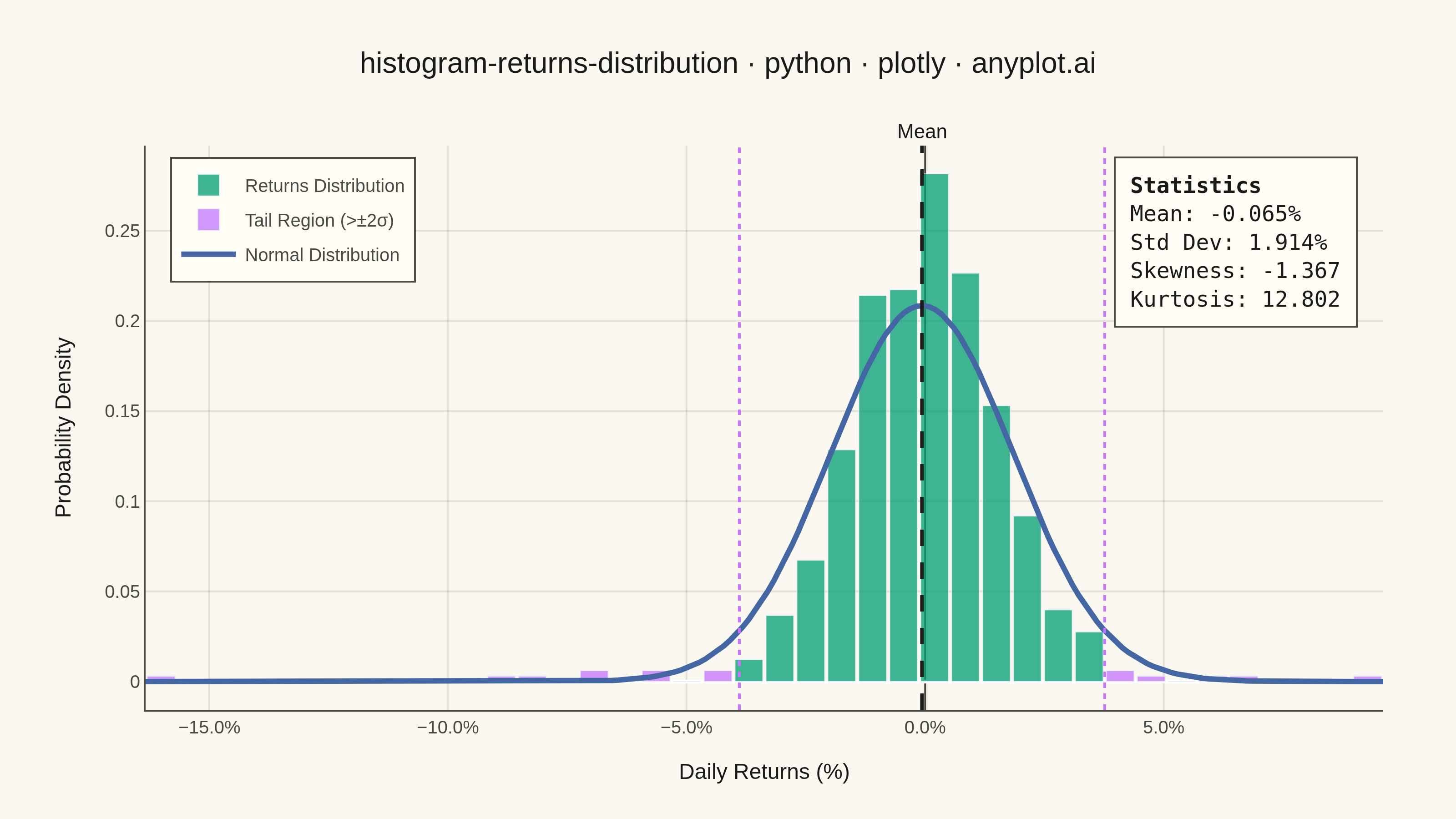
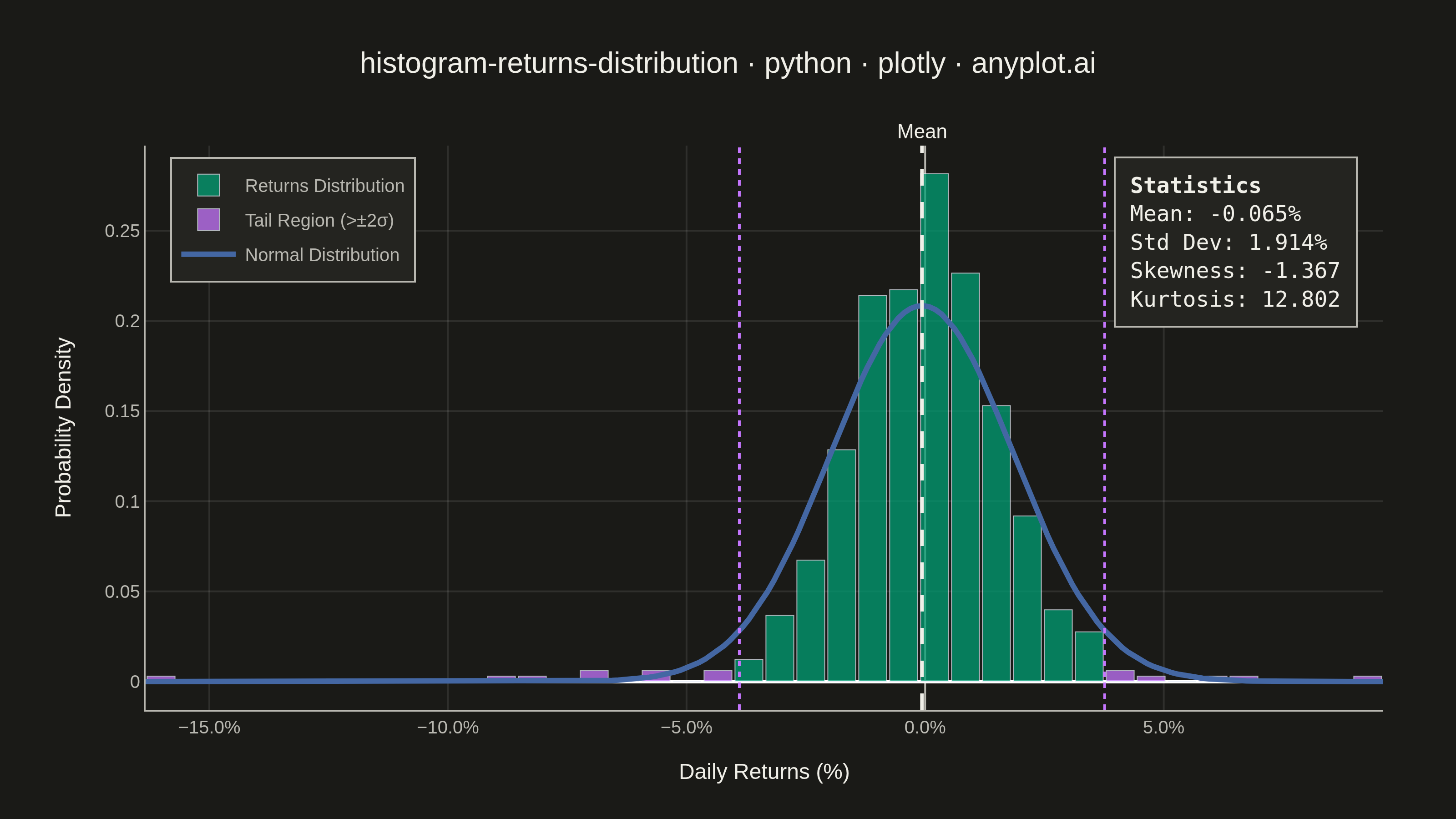
A histogram showing the distribution of financial returns (daily, weekly, or monthly) with a normal distribution overlay for comparison. This visualization is essential for risk analysis, allowing analysts to assess whether returns follow a normal distribution, identify fat tails indicating higher-than-expected extreme events, and measure asymmetry through skewness. Key statistics are displayed directly on the plot for quick interpretation.
""" anyplot.ai
histogram-returns-distribution: Returns Distribution Histogram
Library: plotly 6.7.0 | Python 3.13.13
Quality: 89/100 | Updated: 2026-05-20
"""

import os

import numpy as np
import plotly.graph_objects as go
from scipy import stats


# Theme tokens
THEME = os.getenv("ANYPLOT_THEME", "light")
PAGE_BG = "#FAF8F1" if THEME == "light" else "#1A1A17"
ELEVATED_BG = "#FFFDF6" if THEME == "light" else "#242420"
INK = "#1A1A17" if THEME == "light" else "#F0EFE8"
INK_SOFT = "#4A4A44" if THEME == "light" else "#B8B7B0"
GRID = "rgba(26,26,23,0.10)" if THEME == "light" else "rgba(240,239,232,0.10)"

# Okabe-Ito palette
BRAND = "#009E73"  # position 1 — normal return bars
VERMILLION = "#C475FD"  # position 2 — tail region bars
BLUE = "#4467A3"  # position 3 — normal distribution curve

# Data - Simulated daily stock returns (504 trading days / 2 years)
np.random.seed(42)
n_days = 504
daily_returns = np.random.normal(loc=0.0005, scale=0.015, size=n_days)

# Add fat tails (realistic financial returns)
outliers = np.random.choice(n_days, size=20, replace=False)
daily_returns[outliers] *= np.random.uniform(2, 4, size=20) * np.random.choice([-1, 1], size=20)

returns_pct = daily_returns * 100

# Statistics
mean_ret = np.mean(returns_pct)
std_ret = np.std(returns_pct)
skewness = stats.skew(returns_pct)
kurtosis = stats.kurtosis(returns_pct)

# Histogram bins
n_bins = 40
hist_values, bin_edges = np.histogram(returns_pct, bins=n_bins, density=True)
bin_centers = (bin_edges[:-1] + bin_edges[1:]) / 2
bin_width = bin_edges[1] - bin_edges[0]

# Normal distribution overlay
x_norm = np.linspace(returns_pct.min(), returns_pct.max(), 200)
y_norm = stats.norm.pdf(x_norm, mean_ret, std_ret)

# Tail region thresholds (±2 std dev)
lower_tail = mean_ret - 2 * std_ret
upper_tail = mean_ret + 2 * std_ret

# Split bins into normal-range and tail for correct legend swatches
normal_mask = (bin_centers >= lower_tail) & (bin_centers <= upper_tail)
tail_mask = ~normal_mask

normal_x = bin_centers[normal_mask]
normal_y = hist_values[normal_mask]
tail_x = bin_centers[tail_mask]
tail_y = hist_values[tail_mask]

# Figure
fig = go.Figure()

# Normal-range bars (green, primary legend entry)
fig.add_trace(
    go.Bar(
        x=normal_x,
        y=normal_y,
        width=bin_width * 0.9,
        marker_color=BRAND,
        name="Returns Distribution",
        opacity=0.75,
        hovertemplate="Return: %{x:.2f}%<br>Density: %{y:.4f}<br>Range: Normal<extra></extra>",
    )
)

# Tail bins (vermillion, separate legend entry)
fig.add_trace(
    go.Bar(
        x=tail_x,
        y=tail_y,
        width=bin_width * 0.9,
        marker_color=VERMILLION,
        name="Tail Region (>±2σ)",
        opacity=0.75,
        hovertemplate="Return: %{x:.2f}%<br>Density: %{y:.4f}<br>Range: Tail<extra></extra>",
    )
)

fig.add_trace(
    go.Scatter(x=x_norm, y=y_norm, mode="lines", line={"color": BLUE, "width": 3}, name="Normal Distribution")
)

fig.add_vline(
    x=mean_ret,
    line={"color": INK, "width": 2, "dash": "dash"},
    annotation_text="Mean",
    annotation_position="top",
    annotation_font={"color": INK, "size": 11},
)
fig.add_vline(x=lower_tail, line={"color": VERMILLION, "width": 1.5, "dash": "dot"})
fig.add_vline(x=upper_tail, line={"color": VERMILLION, "width": 1.5, "dash": "dot"})

stats_text = (
    f"<b>Statistics</b><br>"
    f"Mean: {mean_ret:.3f}%<br>"
    f"Std Dev: {std_ret:.3f}%<br>"
    f"Skewness: {skewness:.3f}<br>"
    f"Kurtosis: {kurtosis:.3f}"
)

fig.add_annotation(
    x=0.98,
    y=0.98,
    xref="paper",
    yref="paper",
    text=stats_text,
    showarrow=False,
    font={"size": 12, "family": "monospace", "color": INK},
    align="left",
    bgcolor=ELEVATED_BG,
    bordercolor=INK_SOFT,
    borderwidth=1,
    borderpad=8,
)

fig.update_layout(
    autosize=False,
    margin={"l": 80, "r": 40, "t": 80, "b": 60},
    paper_bgcolor=PAGE_BG,
    plot_bgcolor=PAGE_BG,
    font={"color": INK},
    title={
        "text": "histogram-returns-distribution · python · plotly · anyplot.ai",
        "font": {"size": 16, "color": INK},
        "x": 0.5,
        "xanchor": "center",
    },
    xaxis={
        "title": {"text": "Daily Returns (%)", "font": {"size": 12, "color": INK}},
        "tickfont": {"size": 10, "color": INK_SOFT},
        "tickformat": ".1f",
        "ticksuffix": "%",
        "zeroline": True,
        "zerolinewidth": 1,
        "zerolinecolor": INK_SOFT,
        "gridcolor": GRID,
        "showline": True,
        "linecolor": INK_SOFT,
        "mirror": False,
    },
    yaxis={
        "title": {"text": "Probability Density", "font": {"size": 12, "color": INK}},
        "tickfont": {"size": 10, "color": INK_SOFT},
        "gridcolor": GRID,
        "showline": True,
        "linecolor": INK_SOFT,
        "mirror": False,
    },
    legend={
        "x": 0.02,
        "y": 0.98,
        "bgcolor": ELEVATED_BG,
        "bordercolor": INK_SOFT,
        "borderwidth": 1,
        "font": {"size": 10, "color": INK_SOFT},
    },
    bargap=0.05,
    barmode="overlay",
    showlegend=True,
)

fig.write_image(f"plot-{THEME}.png", width=800, height=450, scale=4)
fig.write_html(f"plot-{THEME}.html", include_plotlyjs="cdn")
Runnable source as JSON, for any HTTP client: https://api.anyplot.ai/specs/histogram-returns-distribution/plotly/code. Any spec id and library id listed in llms-full.txt fit the same URL shape; every URL below is complete and callable.
{
  "spec_id": "histogram-returns-distribution",
  "language": "python",
  "library": "plotly",
  "page": "https://anyplot.ai/histogram-returns-distribution/python/plotly",
  "hub": "https://anyplot.ai/histogram-returns-distribution",
  "code_json": "https://api.anyplot.ai/specs/histogram-returns-distribution/plotly/code",
  "spec_json": "https://api.anyplot.ai/specs/histogram-returns-distribution",
  "render_light_png": "https://storage.googleapis.com/anyplot-images/plots/histogram-returns-distribution/python/plotly/plot-light.png",
  "render_dark_png": "https://storage.googleapis.com/anyplot-images/plots/histogram-returns-distribution/python/plotly/plot-dark.png",
  "interactive_light_html": "https://storage.googleapis.com/anyplot-images/plots/histogram-returns-distribution/python/plotly/plot-light.html",
  "interactive_dark_html": "https://storage.googleapis.com/anyplot-images/plots/histogram-returns-distribution/python/plotly/plot-dark.html",
  "quality_score": 89.0,
  "license": "MIT",
  "guide": "https://anyplot.ai/llms.txt"
}
Part of Returns Distribution Histogram on anyplot.ai.