The same plot in 14 other libraries — Python: Altair, Bokeh, lets-plot, Matplotlib, Plotly, plotnine, Pygal, Seaborn; Julia: Makie.jl; JavaScript: Chart.js, D3.js, Apache ECharts, Highcharts, MUI X Charts. Compare all 15 side by side: Returns Distribution Histogram in Python, R, Julia and JavaScript.
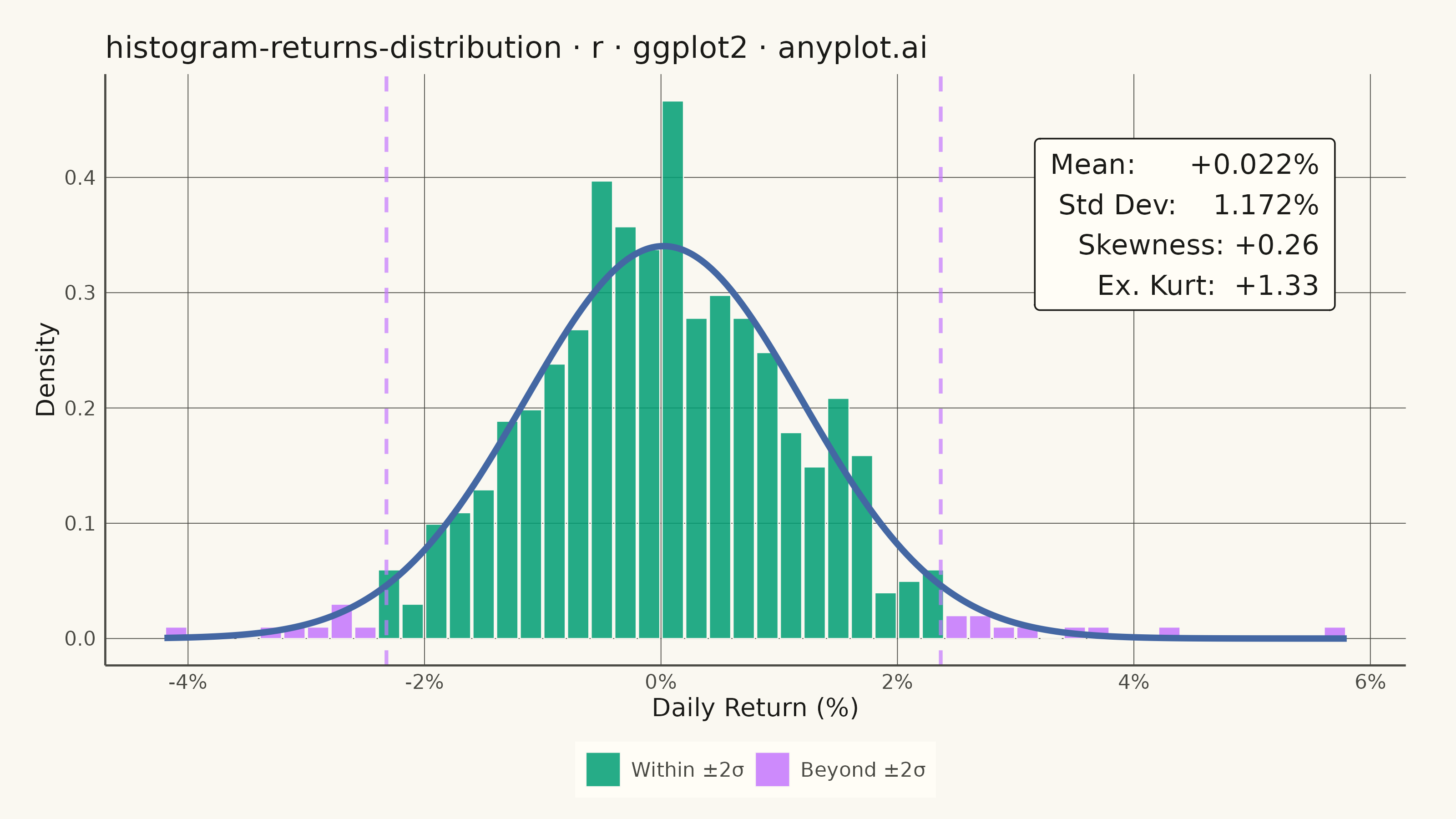
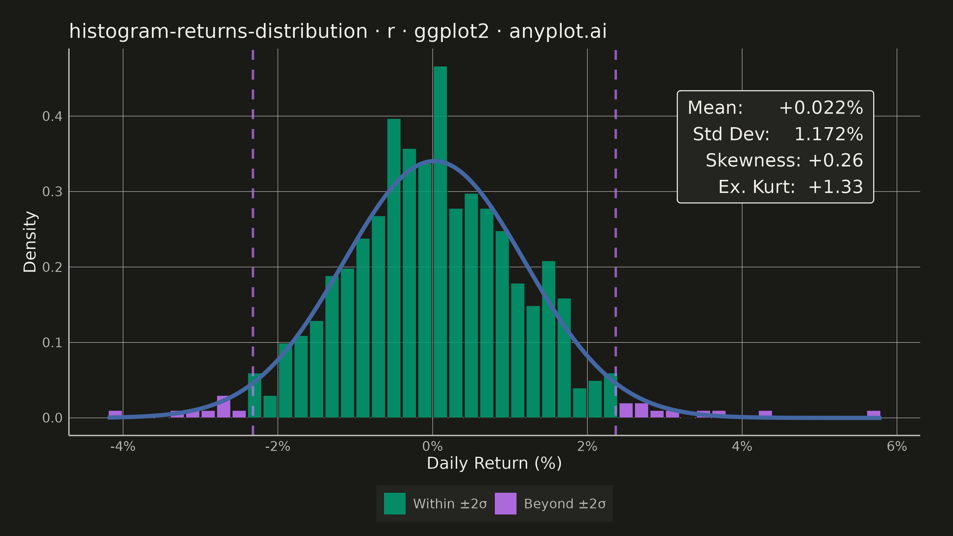
A histogram showing the distribution of financial returns (daily, weekly, or monthly) with a normal distribution overlay for comparison. This visualization is essential for risk analysis, allowing analysts to assess whether returns follow a normal distribution, identify fat tails indicating higher-than-expected extreme events, and measure asymmetry through skewness. Key statistics are displayed directly on the plot for quick interpretation.
#' anyplot.ai
#' histogram-returns-distribution: Returns Distribution Histogram
#' Library: ggplot2 3.5.1 | R 4.4.1
#' Quality: 92/100 | Created: 2026-05-20

library(ggplot2)
library(ragg)

set.seed(42)

# Theme tokens
THEME       <- Sys.getenv("ANYPLOT_THEME", "light")
PAGE_BG     <- if (THEME == "light") "#FAF8F1" else "#1A1A17"
ELEVATED_BG <- if (THEME == "light") "#FFFDF6" else "#242420"
INK         <- if (THEME == "light") "#1A1A17" else "#F0EFE8"
INK_SOFT    <- if (THEME == "light") "#4A4A44" else "#B8B7B0"
IMPRINT   <- c("#009E73", "#C475FD", "#4467A3", "#BD8233",
                 "#AE3030", "#2ABCCD", "#954477")

# Data - 2 years of daily returns for a diversified equity portfolio
n     <- 504
mu    <- 0.10 / 252        # 10% annual return (daily)
sigma <- 0.18 / sqrt(252)  # 18% annual volatility (daily)

base_returns          <- rnorm(n, mean = mu, sd = sigma)
fat_idx               <- sample(n, 14)
base_returns[fat_idx] <- base_returns[fat_idx] * 2.6
returns_pct           <- base_returns * 100

# Summary statistics
mean_ret <- mean(returns_pct)
sd_ret   <- sd(returns_pct)
skew_ret <- mean((returns_pct - mean_ret)^3) / sd_ret^3
kurt_ret <- mean((returns_pct - mean_ret)^4) / sd_ret^4 - 3

# Pre-compute histogram for per-bin tail coloring
h       <- hist(returns_pct, breaks = 40, plot = FALSE)
bin_w   <- diff(h$breaks)[1]
df_hist <- data.frame(
  mid     = h$mids,
  density = h$density,
  tail    = abs(h$mids - mean_ret) > 2 * sd_ret
)

# Normal distribution overlay
x_seq   <- seq(min(h$breaks), max(h$breaks), length.out = 500)
df_norm <- data.frame(x = x_seq, y = dnorm(x_seq, mean = mean_ret, sd = sd_ret))

# Statistics annotation (top-right, above the tail region)
stats_txt <- sprintf(
  "Mean:      %+.3f%%\nStd Dev:    %.3f%%\nSkewness: %+.2f\nEx. Kurt:  %+.2f",
  mean_ret, sd_ret, skew_ret, kurt_ret
)
ann_x <- max(h$mids)
ann_y <- max(h$density) * 0.93

# Plot
p <- ggplot(df_hist, aes(x = mid, y = density, fill = tail)) +
  geom_col(width = bin_w * 0.90, color = PAGE_BG, linewidth = 0.2, alpha = 0.85) +
  scale_fill_manual(
    values = c("FALSE" = IMPRINT[1], "TRUE" = IMPRINT[2]),
    labels = c("FALSE" = "Within ±2σ", "TRUE" = "Beyond ±2σ"),
    name   = NULL
  ) +
  geom_line(
    data = df_norm, aes(x = x, y = y), inherit.aes = FALSE,
    color = IMPRINT[3], linewidth = 1.2
  ) +
  geom_vline(
    xintercept = c(mean_ret - 2 * sd_ret, mean_ret + 2 * sd_ret),
    color      = IMPRINT[2], linewidth = 0.7, linetype = "dashed", alpha = 0.7
  ) +
  annotate("label",
    x = ann_x, y = ann_y,
    label         = stats_txt,
    hjust         = 1, vjust = 1,
    color         = INK,
    fill          = ELEVATED_BG,
    label.padding = unit(0.45, "lines"),
    label.size    = 0.3,
    size          = 3.9
  ) +
  scale_x_continuous(labels = function(x) paste0(x, "%")) +
  labs(
    title = "histogram-returns-distribution · r · ggplot2 · anyplot.ai",
    x     = "Daily Return (%)",
    y     = "Density"
  ) +
  theme_minimal(base_size = 8) +
  theme(
    plot.background   = element_rect(fill = PAGE_BG, color = PAGE_BG),
    panel.background  = element_rect(fill = PAGE_BG, color = NA),
    panel.grid.major  = element_line(color = INK_SOFT, linewidth = 0.15),
    panel.grid.minor  = element_blank(),
    panel.border      = element_blank(),
    axis.line         = element_line(color = INK_SOFT, linewidth = 0.4),
    axis.ticks        = element_blank(),
    axis.title        = element_text(color = INK,      size = 10),
    axis.text         = element_text(color = INK_SOFT, size = 8),
    plot.title        = element_text(color = INK,      size = 12, hjust = 0),
    legend.background = element_rect(fill = ELEVATED_BG, color = NA, linewidth = 0),
    legend.text       = element_text(color = INK_SOFT, size = 8),
    legend.position   = "bottom",
    legend.key.size   = unit(0.5, "cm"),
    plot.margin       = margin(0.5, 0.7, 0.3, 0.5, "cm")
  )

# Save
ggsave(
  filename = sprintf("plot-%s.png", THEME),
  plot     = p,
  device   = ragg::agg_png,
  width    = 8,
  height   = 4.5,
  units    = "in",
  dpi      = 400
)
Runnable source as JSON, for any HTTP client: https://api.anyplot.ai/specs/histogram-returns-distribution/ggplot2/code. Any spec id and library id listed in llms-full.txt fit the same URL shape; every URL below is complete and callable.
{
  "spec_id": "histogram-returns-distribution",
  "language": "r",
  "library": "ggplot2",
  "page": "https://anyplot.ai/histogram-returns-distribution/r/ggplot2",
  "hub": "https://anyplot.ai/histogram-returns-distribution",
  "code_json": "https://api.anyplot.ai/specs/histogram-returns-distribution/ggplot2/code",
  "spec_json": "https://api.anyplot.ai/specs/histogram-returns-distribution",
  "render_light_png": "https://storage.googleapis.com/anyplot-images/plots/histogram-returns-distribution/r/ggplot2/plot-light.png",
  "render_dark_png": "https://storage.googleapis.com/anyplot-images/plots/histogram-returns-distribution/r/ggplot2/plot-dark.png",
  "quality_score": 92.0,
  "license": "MIT",
  "guide": "https://anyplot.ai/llms.txt"
}
Part of Returns Distribution Histogram on anyplot.ai.