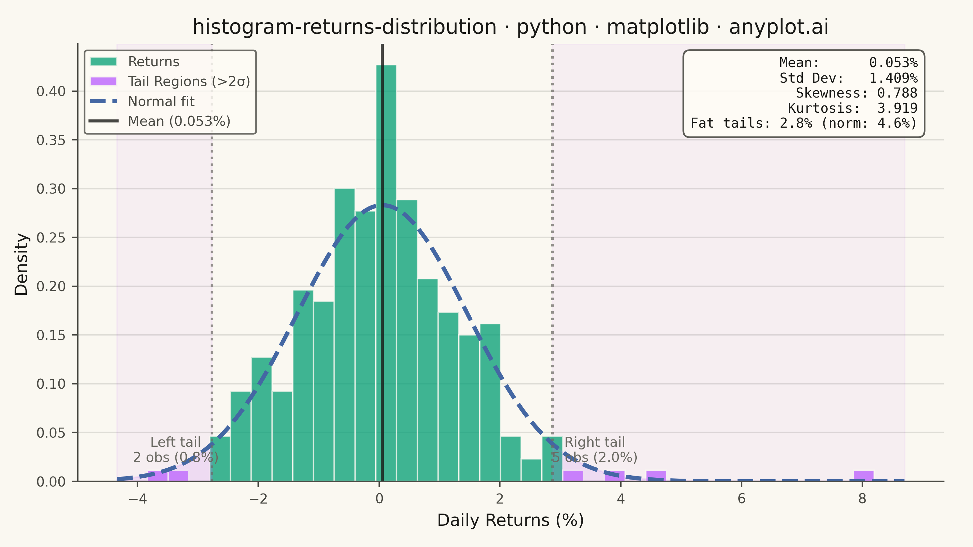
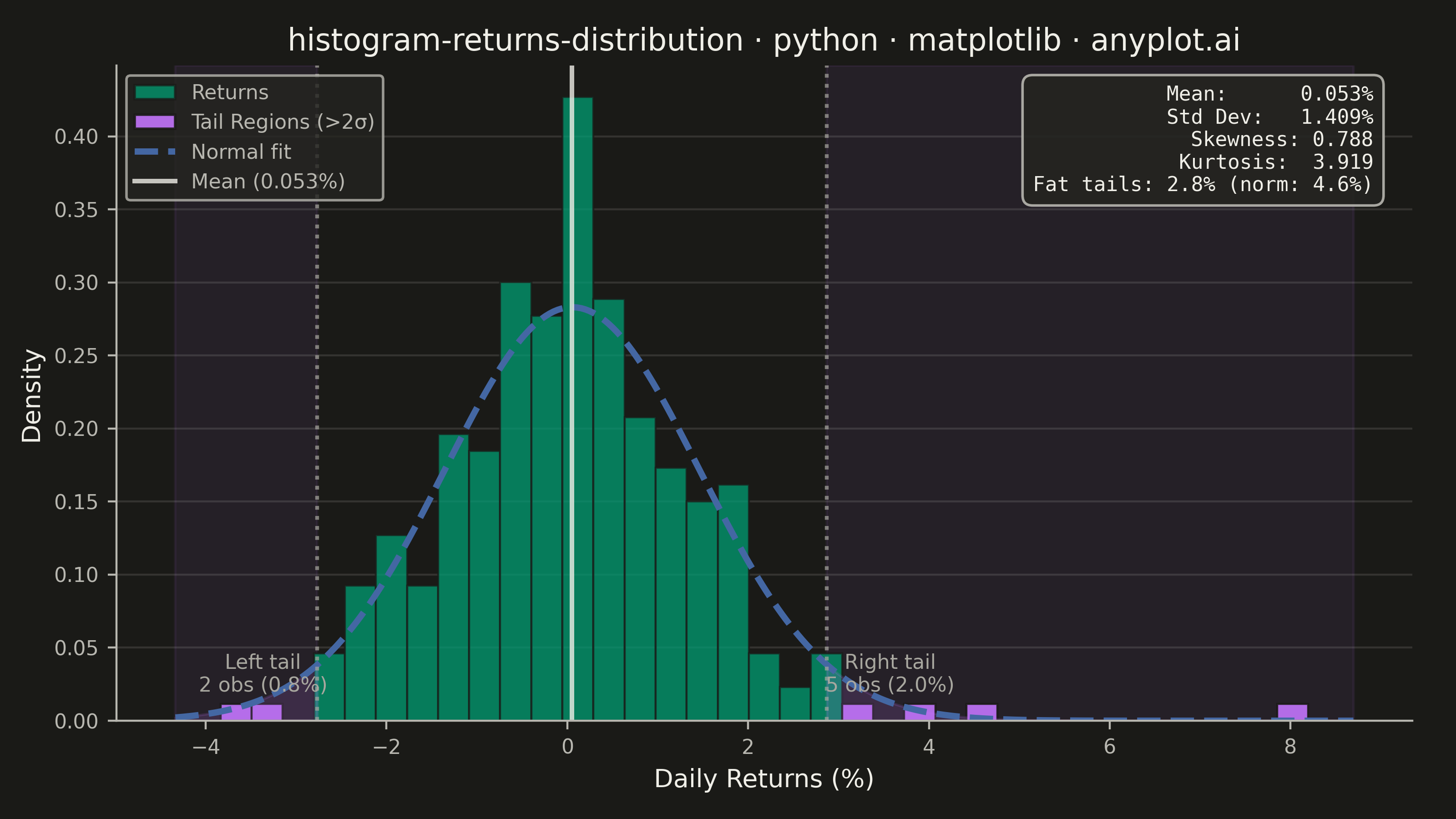
A histogram showing the distribution of financial returns (daily, weekly, or monthly) with a normal distribution overlay for comparison. This visualization is essential for risk analysis, allowing analysts to assess whether returns follow a normal distribution, identify fat tails indicating higher-than-expected extreme events, and measure asymmetry through skewness. Key statistics are displayed directly on the plot for quick interpretation.
""" anyplot.ai
histogram-returns-distribution: Returns Distribution Histogram
Library: matplotlib 3.10.9 | Python 3.13.13
Quality: 90/100 | Updated: 2026-05-20
"""

import os

import matplotlib.pyplot as plt
import numpy as np
from matplotlib.patches import Patch
from scipy import stats


# Theme tokens
THEME = os.getenv("ANYPLOT_THEME", "light")
PAGE_BG = "#FAF8F1" if THEME == "light" else "#1A1A17"
ELEVATED_BG = "#FFFDF6" if THEME == "light" else "#242420"
INK = "#1A1A17" if THEME == "light" else "#F0EFE8"
INK_SOFT = "#4A4A44" if THEME == "light" else "#B8B7B0"
INK_MUTED = "#6B6A63" if THEME == "light" else "#A8A79F"

BRAND = "#009E73"  # Okabe-Ito pos 1 — main histogram bars
TAIL_COLOR = "#C475FD"  # Okabe-Ito pos 2 — tail regions
CURVE_COLOR = "#4467A3"  # Okabe-Ito pos 3 — normal distribution curve

# Data — simulate daily stock returns with slight fat tails (t-distribution df=8)
np.random.seed(42)
n_days = 252
returns = np.random.standard_t(df=8, size=n_days) * 0.012 + 0.0004  # ~1.2% daily vol

# Key statistics
mean_ret = np.mean(returns) * 100
std_ret = np.std(returns) * 100
skewness = stats.skew(returns)
kurtosis = stats.kurtosis(returns)
returns_pct = returns * 100

# Tail thresholds (±2σ) and observation counts
lower_tail = mean_ret - 2 * std_ret
upper_tail = mean_ret + 2 * std_ret
n_left = int(np.sum(returns_pct < lower_tail))
n_right = int(np.sum(returns_pct > upper_tail))
n_tail = n_left + n_right
tail_pct = n_tail / n_days * 100
expected_tail_pct = (1 - stats.norm.cdf(2)) * 2 * 100  # ≈ 4.55% beyond ±2σ under normality

# Normal distribution overlay range
x_lo = returns_pct.min() - 0.5
x_hi = returns_pct.max() + 0.5
x_range = np.linspace(x_lo, x_hi, 300)
normal_pdf = stats.norm.pdf(x_range, mean_ret, std_ret)

# Plot
fig, ax = plt.subplots(figsize=(8, 4.5), dpi=400, facecolor=PAGE_BG)
ax.set_facecolor(PAGE_BG)

# Histogram with density normalization
n, bins, patches = ax.hist(
    returns_pct, bins=35, density=True, color=BRAND, alpha=0.75, edgecolor=PAGE_BG, linewidth=0.8
)

# Color tail bins with distinct Okabe-Ito highlight
for i, patch in enumerate(patches):
    bin_center = (bins[i] + bins[i + 1]) / 2
    if bin_center < lower_tail or bin_center > upper_tail:
        patch.set_facecolor(TAIL_COLOR)
        patch.set_alpha(0.90)

# Subtle axvspan background tinting for tail risk zones (below histogram bars)
ax.axvspan(x_lo, lower_tail, alpha=0.07, color=TAIL_COLOR, zorder=0)
ax.axvspan(upper_tail, x_hi, alpha=0.07, color=TAIL_COLOR, zorder=0)

# Shade theoretical tail areas under the normal curve (fill_between)
x_left = np.linspace(x_lo, lower_tail, 150)
x_right = np.linspace(upper_tail, x_hi, 150)
ax.fill_between(x_left, stats.norm.pdf(x_left, mean_ret, std_ret), color=TAIL_COLOR, alpha=0.15)
ax.fill_between(x_right, stats.norm.pdf(x_right, mean_ret, std_ret), color=TAIL_COLOR, alpha=0.15)

# Normal distribution overlay curve
(normal_line,) = ax.plot(x_range, normal_pdf, color=CURVE_COLOR, linewidth=2.5, linestyle="--", label="Normal fit")

# Vertical reference lines
ax.axvline(mean_ret, color=INK, linewidth=1.8, linestyle="-", alpha=0.8, label=f"Mean ({mean_ret:.3f}%)")
ax.axvline(lower_tail, color=INK_MUTED, linewidth=1.5, linestyle=":", alpha=0.7)
ax.axvline(upper_tail, color=INK_MUTED, linewidth=1.5, linestyle=":", alpha=0.7)

# Tail annotations with observation counts — fontsize=8 for mobile legibility
ax.annotate(
    f"Left tail\n{n_left} obs ({n_left / n_days * 100:.1f}%)",
    xy=(lower_tail - 0.6, 0.02),
    fontsize=8,
    ha="center",
    color=INK_MUTED,
)
ax.annotate(
    f"Right tail\n{n_right} obs ({n_right / n_days * 100:.1f}%)",
    xy=(upper_tail + 0.7, 0.02),
    fontsize=8,
    ha="center",
    color=INK_MUTED,
)

# Statistics text box — includes actual vs expected tail % for fat-tail emphasis
stats_text = (
    f"Mean:      {mean_ret:.3f}%\n"
    f"Std Dev:   {std_ret:.3f}%\n"
    f"Skewness: {skewness:.3f}\n"
    f"Kurtosis:  {kurtosis:.3f}\n"
    f"Fat tails: {tail_pct:.1f}% (norm: {expected_tail_pct:.1f}%)"
)
ax.text(
    0.97,
    0.97,
    stats_text,
    transform=ax.transAxes,
    fontsize=8,
    verticalalignment="top",
    horizontalalignment="right",
    family="monospace",
    color=INK,
    bbox={"boxstyle": "round,pad=0.5", "facecolor": ELEVATED_BG, "edgecolor": INK_SOFT, "alpha": 0.9},
)

# Style
ax.set_xlabel("Daily Returns (%)", fontsize=10, color=INK)
ax.set_ylabel("Density", fontsize=10, color=INK)
ax.set_title(
    "histogram-returns-distribution · python · matplotlib · anyplot.ai", fontsize=12, fontweight="medium", color=INK
)
ax.tick_params(axis="both", labelsize=8, colors=INK_SOFT, labelcolor=INK_SOFT)

# Spines
ax.spines["top"].set_visible(False)
ax.spines["right"].set_visible(False)
for spine in ("left", "bottom"):
    ax.spines[spine].set_color(INK_SOFT)

# Grid (subtle, solid, y-axis only)
ax.set_axisbelow(True)
ax.yaxis.grid(True, alpha=0.12, linewidth=0.8, color=INK)

# Legend with correct patch colors
hist_patch = Patch(facecolor=BRAND, edgecolor=PAGE_BG, alpha=0.75, label="Returns")
tail_patch = Patch(facecolor=TAIL_COLOR, edgecolor=PAGE_BG, alpha=0.90, label="Tail Regions (>2σ)")
handles, _ = ax.get_legend_handles_labels()
leg = ax.legend(handles=[hist_patch, tail_patch] + handles, fontsize=8, loc="upper left")
leg.get_frame().set_facecolor(ELEVATED_BG)
leg.get_frame().set_edgecolor(INK_SOFT)
plt.setp(leg.get_texts(), color=INK_SOFT)

# Layout — no bbox_inches='tight' on savefig per prompts/library/matplotlib.md
fig.subplots_adjust(left=0.08, right=0.97, top=0.92, bottom=0.12)

# Save
plt.savefig(f"plot-{THEME}.png", dpi=400, facecolor=PAGE_BG)
plt.close()
Runnable source as JSON, for any HTTP client: https://api.anyplot.ai/specs/histogram-returns-distribution/matplotlib/code. Any spec id and library id listed in llms-full.txt fit the same URL shape; every URL below is complete and callable.
{
  "spec_id": "histogram-returns-distribution",
  "language": "python",
  "library": "matplotlib",
  "page": "https://anyplot.ai/histogram-returns-distribution/python/matplotlib",
  "hub": "https://anyplot.ai/histogram-returns-distribution",
  "code_json": "https://api.anyplot.ai/specs/histogram-returns-distribution/matplotlib/code",
  "spec_json": "https://api.anyplot.ai/specs/histogram-returns-distribution",
  "render_light_png": "https://storage.googleapis.com/anyplot-images/plots/histogram-returns-distribution/python/matplotlib/plot-light.png",
  "render_dark_png": "https://storage.googleapis.com/anyplot-images/plots/histogram-returns-distribution/python/matplotlib/plot-dark.png",
  "quality_score": 90.0,
  "license": "MIT",
  "guide": "https://anyplot.ai/llms.txt"
}
Part of Returns Distribution Histogram on anyplot.ai.