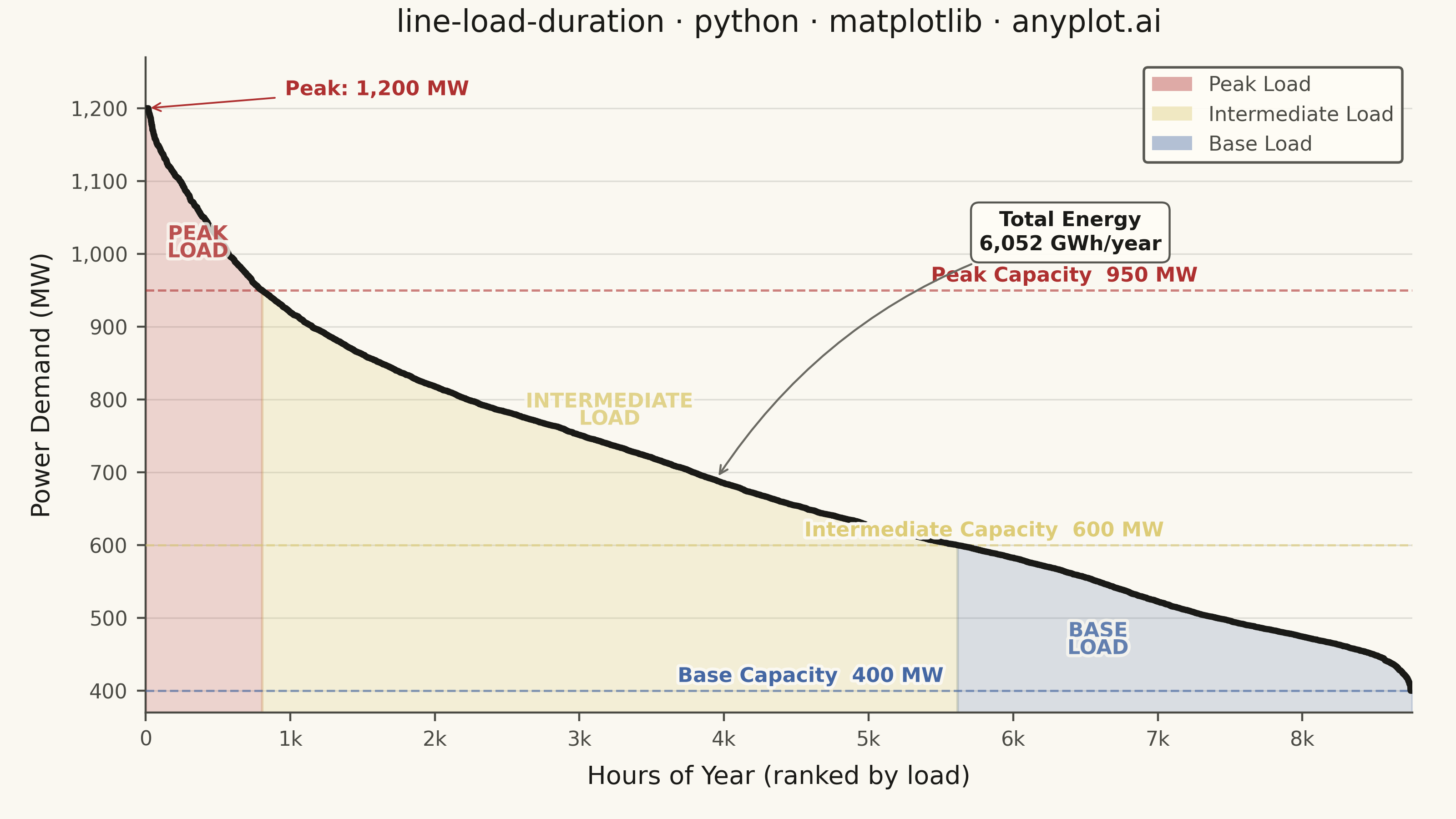
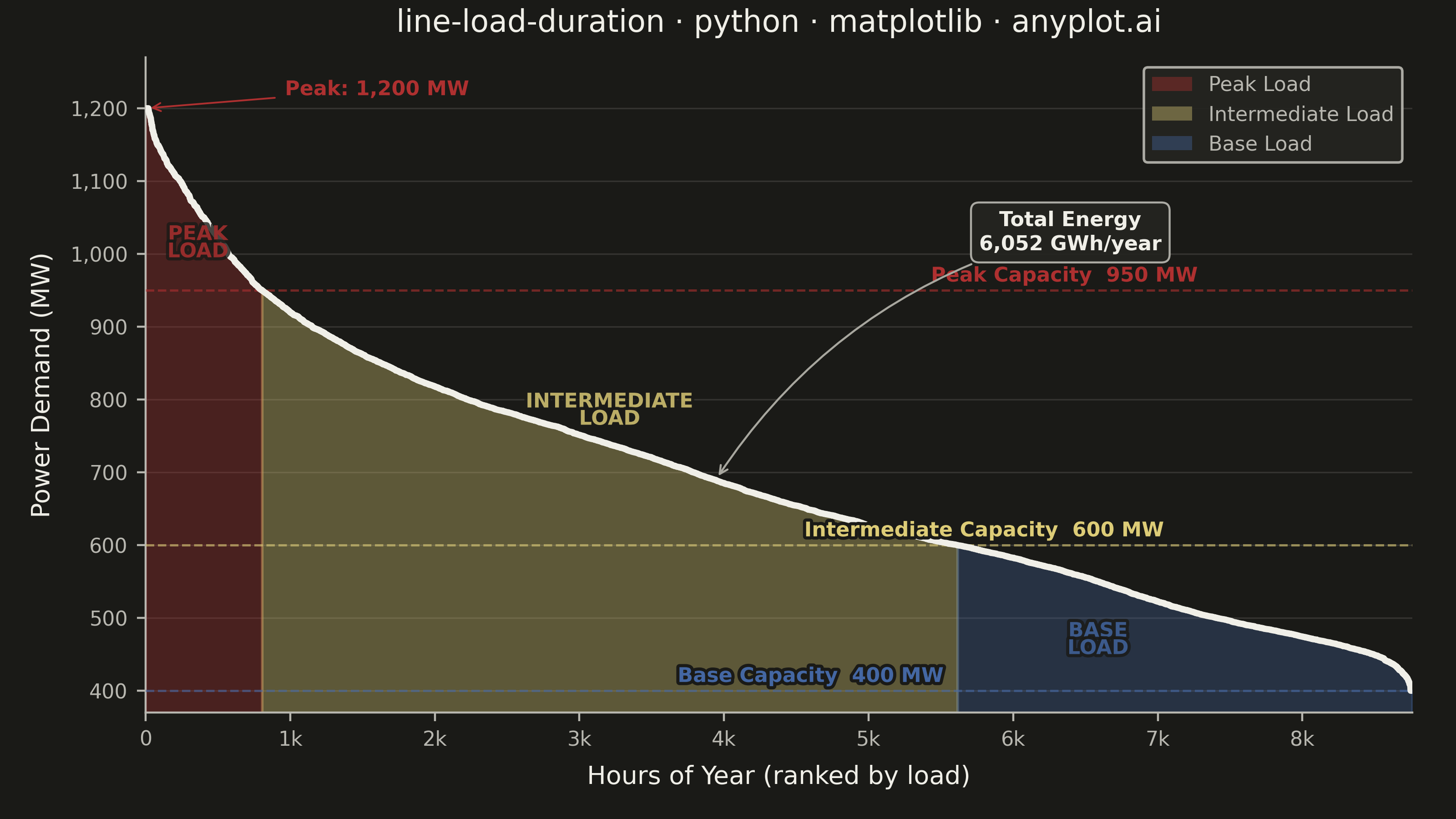
A load duration curve displays electrical power demand (MW) sorted from highest to lowest across all hours of a year (8,760 hours), forming a monotonically decreasing curve. It is a fundamental tool in power system planning, revealing the proportion of time that load exceeds a given level. The curve naturally segments into peak, intermediate, and base load regions, helping utilities determine the optimal generation capacity mix. The area under the curve represents total annual energy consumption.
""" anyplot.ai
line-load-duration: Load Duration Curve for Energy Systems
Library: matplotlib 3.10.9 | Python 3.13.13
Quality: 90/100 | Updated: 2026-06-10
"""

import os

import matplotlib.patheffects as pe
import matplotlib.pyplot as plt
import matplotlib.ticker as ticker
import numpy as np
from matplotlib.patches import Patch


# Theme
THEME = os.getenv("ANYPLOT_THEME", "light")
PAGE_BG = "#FAF8F1" if THEME == "light" else "#1A1A17"
ELEVATED_BG = "#FFFDF6" if THEME == "light" else "#242420"
INK = "#1A1A17" if THEME == "light" else "#F0EFE8"
INK_SOFT = "#4A4A44" if THEME == "light" else "#B8B7B0"
INK_MUTED = "#6B6A63" if THEME == "light" else "#A8A79F"

# Imprint palette — semantic assignments for load regions
COLOR_PEAK = "#AE3030"  # Imprint matte red — peak / critical load
COLOR_INTER = "#DDCC77"  # Imprint amber anchor — intermediate / caution
COLOR_BASE = "#4467A3"  # Imprint blue — base load

# Data
np.random.seed(42)
hours = 8760
base_load = 400
peak_load = 1200

hourly_load = np.concatenate(
    [
        np.random.normal(1100, 60, int(hours * 0.05)),
        np.random.normal(900, 80, int(hours * 0.15)),
        np.random.normal(750, 70, int(hours * 0.30)),
        np.random.normal(600, 50, int(hours * 0.30)),
        np.random.normal(480, 30, int(hours * 0.20)),
    ]
)
hourly_load = np.clip(hourly_load, base_load, peak_load)
extra = hours - len(hourly_load)
if extra > 0:
    hourly_load = np.concatenate([hourly_load, np.random.normal(500, 40, extra)])
hourly_load = hourly_load[:hours]
load_mw = np.sort(hourly_load)[::-1]
hour = np.arange(hours)

peak_threshold = 950
intermediate_threshold = 600

peak_end = np.searchsorted(-load_mw, -peak_threshold)
base_start = np.searchsorted(-load_mw, -intermediate_threshold)
total_energy_gwh = np.trapezoid(load_mw, hour) / 1000

# Plot
title = "line-load-duration · python · matplotlib · anyplot.ai"
title_n = len(title)
title_fontsize = max(8, round(12 * 67 / title_n)) if title_n > 67 else 12

fig, ax = plt.subplots(figsize=(8, 4.5), dpi=400, facecolor=PAGE_BG)
ax.set_facecolor(PAGE_BG)

# Region fills using Imprint semantic palette — alpha boosted in dark theme for visual impact
fill_alpha = 0.18 if THEME == "light" else 0.32
fill_alpha_inter = 0.22 if THEME == "light" else 0.35
ax.fill_between(
    hour[: peak_end + 1], load_mw[: peak_end + 1], base_load - 30, color=COLOR_PEAK, alpha=fill_alpha, zorder=2
)
ax.fill_between(
    hour[peak_end : base_start + 1],
    load_mw[peak_end : base_start + 1],
    base_load - 30,
    color=COLOR_INTER,
    alpha=fill_alpha_inter,
    zorder=2,
)
ax.fill_between(hour[base_start:], load_mw[base_start:], base_load - 30, color=COLOR_BASE, alpha=fill_alpha, zorder=2)

# Main load duration curve
ax.plot(hour, load_mw, color=INK, linewidth=2.5, zorder=5)

# Capacity tier dashed lines — staggered x-positions to prevent label crowding
tier_props = [
    (peak_threshold, COLOR_PEAK, "Peak Capacity", 0.62),
    (intermediate_threshold, COLOR_INTER, "Intermediate Capacity", 0.52),
    (base_load, COLOR_BASE, "Base Capacity", 0.42),
]
for y_val, color, label, x_frac in tier_props:
    ax.axhline(y=y_val, color=color, linestyle="--", linewidth=0.9, alpha=0.6, zorder=3)
    ax.text(
        hours * x_frac,
        y_val + 12,
        f"{label}  {y_val:,} MW",
        fontsize=8,
        color=color,
        fontweight="semibold",
        path_effects=[pe.withStroke(linewidth=2.5, foreground=PAGE_BG)],
        zorder=6,
    )

# Region labels
region_labels = [
    (peak_end * 0.45, peak_threshold + 65, "PEAK\nLOAD", COLOR_PEAK),
    (
        (peak_end + base_start) / 2,
        (peak_threshold + intermediate_threshold) / 2 + 10,
        "INTERMEDIATE\nLOAD",
        COLOR_INTER,
    ),
    ((base_start + hours) / 2 - 600, (intermediate_threshold + base_load) / 2 - 30, "BASE\nLOAD", COLOR_BASE),
]
for x, y, text, color in region_labels:
    ax.text(
        x,
        y,
        text,
        fontsize=8,
        fontweight="bold",
        color=color,
        ha="center",
        va="center",
        alpha=0.8,
        linespacing=0.85,
        path_effects=[pe.withStroke(linewidth=2.5, foreground=PAGE_BG)],
        zorder=6,
    )

# Total energy annotation
ax.annotate(
    f"Total Energy\n{total_energy_gwh:,.0f} GWh/year",
    xy=(hours * 0.45, load_mw[int(hours * 0.45)]),
    xytext=(hours * 0.73, peak_threshold + 55),
    fontsize=8,
    fontweight="bold",
    color=INK,
    ha="center",
    linespacing=1.3,
    bbox={
        "boxstyle": "round,pad=0.4",
        "facecolor": ELEVATED_BG,
        "edgecolor": INK_SOFT,
        "linewidth": 0.8,
        "alpha": 0.92,
    },
    arrowprops={"arrowstyle": "->", "color": INK_MUTED, "connectionstyle": "arc3,rad=0.2", "linewidth": 0.8},
    zorder=7,
)

# Peak demand callout
ax.annotate(
    f"Peak: {load_mw[0]:,.0f} MW",
    xy=(0, load_mw[0]),
    xytext=(hours * 0.11, load_mw[0] + 18),
    fontsize=8,
    fontweight="semibold",
    color=COLOR_PEAK,
    arrowprops={"arrowstyle": "->", "color": COLOR_PEAK, "linewidth": 0.7},
    path_effects=[pe.withStroke(linewidth=2, foreground=PAGE_BG)],
    zorder=7,
)

# Style
ax.set_xlabel("Hours of Year (ranked by load)", fontsize=10, color=INK, labelpad=6)
ax.set_ylabel("Power Demand (MW)", fontsize=10, color=INK, labelpad=6)
ax.set_title(title, fontsize=title_fontsize, fontweight="medium", color=INK, pad=10)
ax.tick_params(axis="both", labelsize=8, colors=INK_SOFT)
ax.set_xlim(0, hours)
ax.set_ylim(base_load - 30, peak_load + 70)

ax.spines["top"].set_visible(False)
ax.spines["right"].set_visible(False)
ax.spines["left"].set_color(INK_SOFT)
ax.spines["bottom"].set_color(INK_SOFT)

ax.xaxis.set_major_formatter(ticker.FuncFormatter(lambda x, _: f"{x / 1000:.0f}k" if x >= 1000 else f"{x:.0f}"))
ax.yaxis.set_major_formatter(ticker.FuncFormatter(lambda y, _: f"{y:,.0f}"))
ax.yaxis.grid(True, alpha=0.12, linewidth=0.6, color=INK)

# Legend
legend_elements = [
    Patch(facecolor=COLOR_PEAK, alpha=0.4, label="Peak Load"),
    Patch(facecolor=COLOR_INTER, alpha=0.4, label="Intermediate Load"),
    Patch(facecolor=COLOR_BASE, alpha=0.4, label="Base Load"),
]
leg = ax.legend(
    handles=legend_elements, fontsize=8, loc="upper right", framealpha=0.92, edgecolor=INK_SOFT, fancybox=True
)
leg.get_frame().set_facecolor(ELEVATED_BG)
plt.setp(leg.get_texts(), color=INK_SOFT)

fig.subplots_adjust(left=0.10, right=0.97, top=0.93, bottom=0.13)
fig.savefig(f"plot-{THEME}.png", dpi=400, facecolor=PAGE_BG)
Runnable source as JSON, for any HTTP client: https://api.anyplot.ai/specs/line-load-duration/matplotlib/code. Any spec id and library id listed in llms-full.txt fit the same URL shape; every URL below is complete and callable.
{
  "spec_id": "line-load-duration",
  "language": "python",
  "library": "matplotlib",
  "page": "https://anyplot.ai/line-load-duration/python/matplotlib",
  "hub": "https://anyplot.ai/line-load-duration",
  "code_json": "https://api.anyplot.ai/specs/line-load-duration/matplotlib/code",
  "spec_json": "https://api.anyplot.ai/specs/line-load-duration",
  "render_light_png": "https://storage.googleapis.com/anyplot-images/plots/line-load-duration/python/matplotlib/plot-light.png",
  "render_dark_png": "https://storage.googleapis.com/anyplot-images/plots/line-load-duration/python/matplotlib/plot-dark.png",
  "quality_score": 90.0,
  "license": "MIT",
  "guide": "https://anyplot.ai/llms.txt"
}
Part of Load Duration Curve for Energy Systems on anyplot.ai.