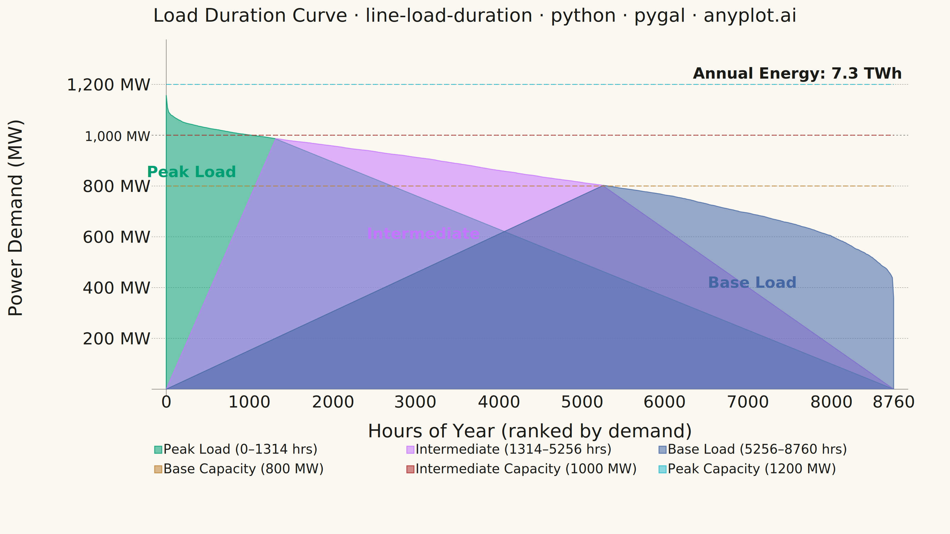
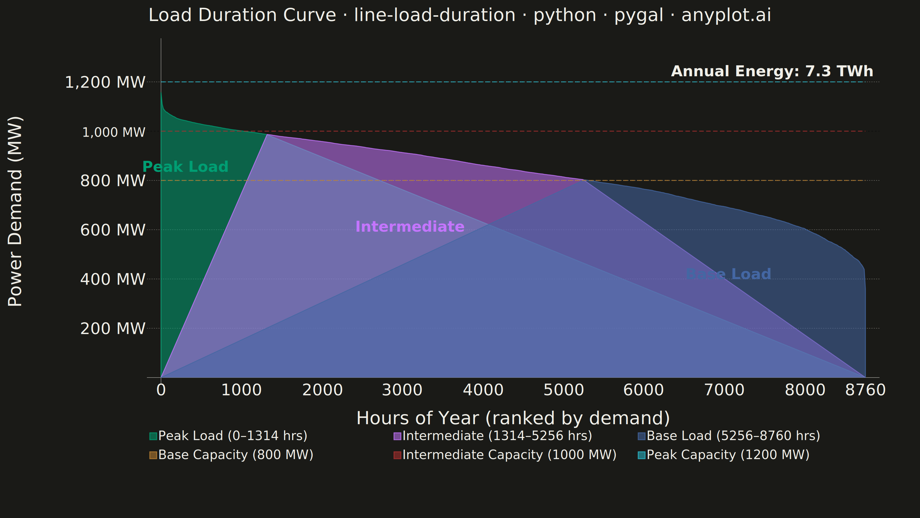
A load duration curve displays electrical power demand (MW) sorted from highest to lowest across all hours of a year (8,760 hours), forming a monotonically decreasing curve. It is a fundamental tool in power system planning, revealing the proportion of time that load exceeds a given level. The curve naturally segments into peak, intermediate, and base load regions, helping utilities determine the optimal generation capacity mix. The area under the curve represents total annual energy consumption.
""" anyplot.ai
line-load-duration: Load Duration Curve for Energy Systems
Library: pygal 3.1.0 | Python 3.13.13
Quality: 86/100 | Updated: 2026-06-10
"""

import os

import cairosvg
import numpy as np
import pygal
from pygal.style import Style


# Theme tokens
THEME = os.getenv("ANYPLOT_THEME", "light")
PAGE_BG = "#FAF8F1" if THEME == "light" else "#1A1A17"
INK = "#1A1A17" if THEME == "light" else "#F0EFE8"
INK_MUTED = "#6B6A63" if THEME == "light" else "#A8A79F"

IMPRINT_PALETTE = (
    "#009E73",  # brand green — peak load region
    "#C475FD",  # lavender — intermediate load region
    "#4467A3",  # blue — base load region
    "#BD8233",  # ochre — base capacity line
    "#AE3030",  # matte red — intermediate capacity line
    "#2ABCCD",  # cyan — peak capacity line
)

# Data — synthetic annual hourly load profile for a mid-sized utility
np.random.seed(42)
hours = 8760

base_load = 400
peak_load = 1200
mid_load = (base_load + peak_load) / 2

hour_of_year = np.arange(hours)
day_of_year = hour_of_year / 24.0
hour_of_day = hour_of_year % 24

# Seasonal component (summer peak, winter secondary peak)
seasonal = 150 * np.sin(2 * np.pi * (day_of_year - 45) / 365)
seasonal += 80 * np.sin(4 * np.pi * day_of_year / 365)

# Daily component (daytime peak)
daily = 120 * np.sin(np.pi * (hour_of_day - 6) / 16)
daily[hour_of_day < 6] = -80
daily[hour_of_day > 22] = -60

# Random noise
noise = np.random.normal(0, 40, hours)

# Combine and sort descending for load duration curve
raw_load = mid_load + seasonal + daily + noise
raw_load = np.clip(raw_load, base_load * 0.9, peak_load * 1.05)
load_mw = np.sort(raw_load)[::-1]

# Capacity tiers — defined by load percentiles for visually balanced regions
# Peak: top 15% of hours; Base: bottom 40% of hours; Intermediate: the rest
peak_end = int(0.15 * hours)  # ~1314 hours
base_start = int(0.60 * hours)  # ~5256 hours

# Round capacity MW to nearest 50 for clean engineering annotations
intermediate_capacity = int(round(float(load_mw[peak_end]) / 50) * 50)
base_capacity = int(round(float(load_mw[base_start]) / 50) * 50)

# Total energy consumption (area under curve)
total_energy_twh = np.trapezoid(load_mw) / 1e6

# Downsample for SVG performance (8760 points too heavy)
step = 15
indices = list(range(0, hours, step))
if indices[-1] != hours - 1:
    indices.append(hours - 1)
n_pts = len(indices)

load_sampled = [float(load_mw[i]) for i in indices]

# Build three filled region series (None outside each region)
peak_series = [None] * n_pts
inter_series = [None] * n_pts
base_series = [None] * n_pts

for i, idx in enumerate(indices):
    val = load_sampled[i]
    if idx <= peak_end:
        peak_series[i] = val
    elif idx <= base_start:
        inter_series[i] = val
    else:
        base_series[i] = val

# Overlap one point at each boundary for visual continuity
for i, idx in enumerate(indices):
    if idx >= peak_end and inter_series[i] is None and peak_series[i] is not None:
        inter_series[i] = load_sampled[i]
        break
for i, idx in enumerate(indices):
    if idx >= base_start and base_series[i] is None and inter_series[i] is not None:
        base_series[i] = load_sampled[i]
        break

# Title — total energy moved to in-chart annotation per spec requirement
title_str = "Load Duration Curve · line-load-duration · python · pygal · anyplot.ai"
n_chars = len(title_str)
ratio = 67 / n_chars if n_chars > 67 else 1.0
title_font_size = max(44, round(66 * ratio))

# Style
custom_style = Style(
    background=PAGE_BG,
    plot_background=PAGE_BG,
    foreground=INK,
    foreground_strong=INK,
    foreground_subtle=INK_MUTED,
    colors=IMPRINT_PALETTE,
    font_family="DejaVu Sans, Helvetica, Arial, sans-serif",
    title_font_family="DejaVu Sans, Helvetica, Arial, sans-serif",
    title_font_size=title_font_size,
    label_font_size=56,
    major_label_font_size=44,
    legend_font_size=44,
    value_font_size=36,
    legend_font_family="DejaVu Sans, Helvetica, Arial, sans-serif",
    label_font_family="DejaVu Sans, Helvetica, Arial, sans-serif",
    major_label_font_family="DejaVu Sans, Helvetica, Arial, sans-serif",
    value_font_family="DejaVu Sans, Helvetica, Arial, sans-serif",
    stroke_width=3,
    opacity=0.55,
    opacity_hover=0.75,
    guide_stroke_color=INK_MUTED,
    guide_stroke_dasharray="4,4",
)

# Chart
chart = pygal.Line(
    width=3200,
    height=1800,
    title=title_str,
    x_title="Hours of Year (ranked by demand)",
    y_title="Power Demand (MW)",
    style=custom_style,
    fill=True,
    show_dots=False,
    stroke_style={"width": 3},
    show_y_guides=True,
    show_x_guides=False,
    show_legend=True,
    legend_at_bottom=True,
    legend_box_size=24,
    value_formatter=lambda x: f"{x:,.0f} MW" if x else "",
    min_scale=4,
    max_scale=8,
    margin_bottom=140,
    margin_left=160,
    margin_right=140,
    margin_top=60,
    range=(0, 1350),
    truncate_label=10,
)

# Load region series (filled)
chart.add(f"Peak Load (0–{peak_end} hrs)", peak_series, fill=True, stroke_style={"width": 3})
chart.add(f"Intermediate ({peak_end}–{base_start} hrs)", inter_series, fill=True, stroke_style={"width": 3})
chart.add(f"Base Load ({base_start}–{hours} hrs)", base_series, fill=True, stroke_style={"width": 3})

# Capacity reference lines — wider stroke for prominence against filled regions
chart.add(
    f"Base Capacity ({base_capacity} MW)",
    [base_capacity] * n_pts,
    fill=False,
    show_dots=False,
    stroke_style={"width": 4, "dasharray": "16, 8"},
)
chart.add(
    f"Intermediate Capacity ({intermediate_capacity} MW)",
    [intermediate_capacity] * n_pts,
    fill=False,
    show_dots=False,
    stroke_style={"width": 4, "dasharray": "16, 8"},
)
chart.add(
    "Peak Capacity (1200 MW)",
    [1200] * n_pts,
    fill=False,
    show_dots=False,
    stroke_style={"width": 4, "dasharray": "16, 8"},
)

# X-axis labels at key milestones
x_labels = []
for idx in indices:
    if idx == 0:
        x_labels.append("0")
    elif idx % 1000 < step:
        x_labels.append(str((idx // 1000) * 1000))
    elif idx == indices[-1]:
        x_labels.append("8760")
    else:
        x_labels.append("")
chart.x_labels = x_labels

# === SVG post-processing: inject region labels and total energy annotation ===
# Pygal has no native text-annotation API; add SVG <text> nodes before </svg>.
# Approximate chart data area (3200×1800 canvas, based on margins and axis space):
#   X: margin_left(160) + y_title(~60) + y_tick_labels(~180) ≈ 450 left, 3200-145 right
#   Y: title(~120) + margin_top(60) ≈ 190 top;
#      1800 - margin_bottom(140) - x_tick(~80) - x_title(~60) - legend(~150) ≈ 1370 bottom
_XL, _XR = 450, 3055
_YT, _YB = 190, 1360
_XW, _YH = _XR - _XL, _YB - _YT
_MW_MAX = 1350.0


def _sx(hour_frac):
    """Hour fraction [0,1] → SVG x coordinate."""
    return _XL + hour_frac * _XW


def _sy(mw):
    """MW value → SVG y coordinate (y increases downward)."""
    return _YT + (1.0 - mw / _MW_MAX) * _YH


def _ann(x, y, text, color, anchor="middle"):
    """SVG <text> element with a PAGE_BG halo stroke for readability on fills."""
    return (
        f'<text x="{x:.0f}" y="{y:.0f}" '
        f'font-family="DejaVu Sans,Helvetica,Arial,sans-serif" '
        f'font-size="52" font-weight="bold" '
        f'fill="{color}" stroke="{PAGE_BG}" stroke-width="6" paint-order="stroke fill" '
        f'text-anchor="{anchor}">{text}</text>'
    )


svg_bytes = chart.render()
svg_str = svg_bytes.decode("utf-8")

# Label x = midpoint of each region; y = representative load height inside the fill
peak_mid_frac = (peak_end / 2) / hours
inter_mid_frac = ((peak_end + base_start) / 2) / hours
base_mid_frac = ((base_start + hours) / 2) / hours

annotations = "\n".join(
    [
        _ann(_sx(peak_mid_frac), _sy(880), "Peak Load", IMPRINT_PALETTE[0]),
        _ann(_sx(inter_mid_frac), _sy(640), "Intermediate", IMPRINT_PALETTE[1]),
        _ann(_sx(base_mid_frac), _sy(450), "Base Load", IMPRINT_PALETTE[2]),
        # Total energy annotation: right-aligned in the upper-right of the data area
        _ann(_XR - 20, _YT + 75, f"Annual Energy: {total_energy_twh:.1f} TWh", INK, "end"),
    ]
)

# Insert annotation block just before the closing </svg> tag
idx = svg_str.rfind("</svg>")
svg_modified = svg_str[:idx] + annotations + "\n</svg>"

# Write PNG from modified SVG (cairosvg, same engine used by render_to_png)
cairosvg.svg2png(bytestring=svg_modified.encode("utf-8"), write_to=f"plot-{THEME}.png")

# HTML interactive output uses the original (unmodified) SVG
with open(f"plot-{THEME}.html", "wb") as f:
    f.write(svg_bytes)
Runnable source as JSON, for any HTTP client: https://api.anyplot.ai/specs/line-load-duration/pygal/code. Any spec id and library id listed in llms-full.txt fit the same URL shape; every URL below is complete and callable.
{
  "spec_id": "line-load-duration",
  "language": "python",
  "library": "pygal",
  "page": "https://anyplot.ai/line-load-duration/python/pygal",
  "hub": "https://anyplot.ai/line-load-duration",
  "code_json": "https://api.anyplot.ai/specs/line-load-duration/pygal/code",
  "spec_json": "https://api.anyplot.ai/specs/line-load-duration",
  "render_light_png": "https://storage.googleapis.com/anyplot-images/plots/line-load-duration/python/pygal/plot-light.png",
  "render_dark_png": "https://storage.googleapis.com/anyplot-images/plots/line-load-duration/python/pygal/plot-dark.png",
  "interactive_light_html": "https://storage.googleapis.com/anyplot-images/plots/line-load-duration/python/pygal/plot-light.html",
  "interactive_dark_html": "https://storage.googleapis.com/anyplot-images/plots/line-load-duration/python/pygal/plot-dark.html",
  "quality_score": 86.0,
  "license": "MIT",
  "guide": "https://anyplot.ai/llms.txt"
}
Part of Load Duration Curve for Energy Systems on anyplot.ai.