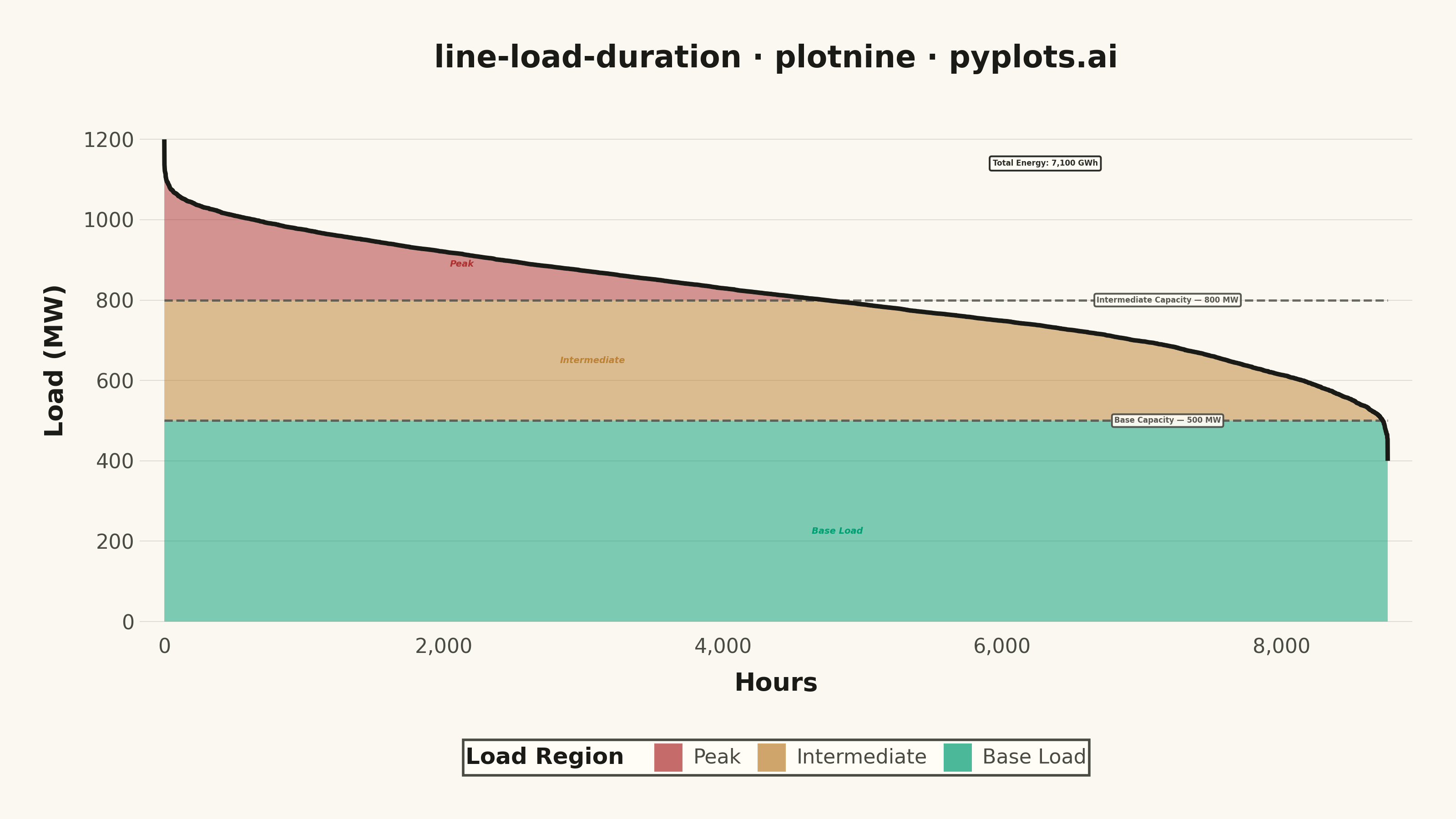
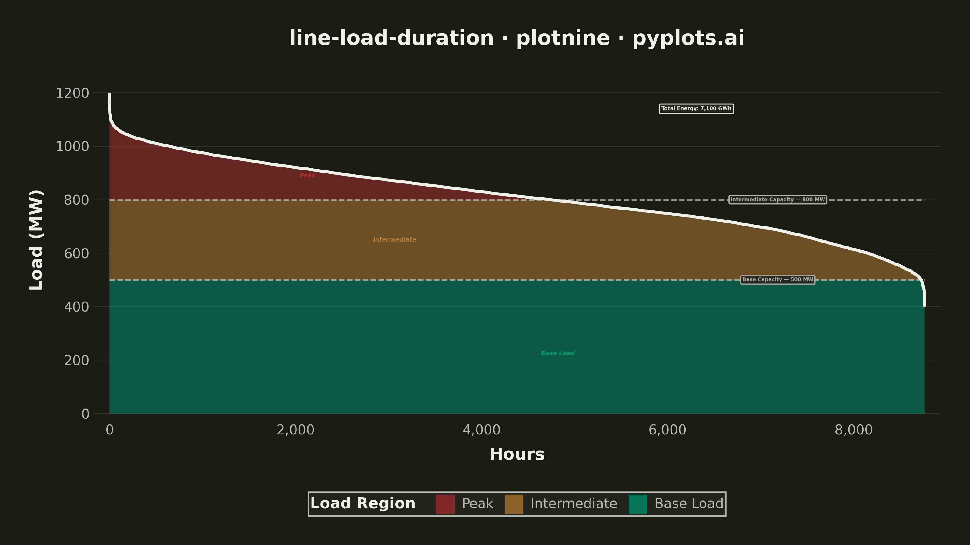
A load duration curve displays electrical power demand (MW) sorted from highest to lowest across all hours of a year (8,760 hours), forming a monotonically decreasing curve. It is a fundamental tool in power system planning, revealing the proportion of time that load exceeds a given level. The curve naturally segments into peak, intermediate, and base load regions, helping utilities determine the optimal generation capacity mix. The area under the curve represents total annual energy consumption.
""" anyplot.ai
line-load-duration: Load Duration Curve for Energy Systems
Library: plotnine 0.15.5 | Python 3.13.13
Quality: 88/100 | Updated: 2026-06-10
"""

import os

import numpy as np
import pandas as pd
from plotnine import (
    aes,
    annotate,
    coord_cartesian,
    element_blank,
    element_line,
    element_rect,
    element_text,
    geom_line,
    geom_ribbon,
    geom_segment,
    ggplot,
    guide_legend,
    labs,
    scale_fill_manual,
    scale_x_continuous,
    scale_y_continuous,
    theme,
    theme_minimal,
)


# ── Theme tokens ──────────────────────────────────────────────────────────────
THEME = os.getenv("ANYPLOT_THEME", "light")
PAGE_BG = "#FAF8F1" if THEME == "light" else "#1A1A17"
ELEVATED_BG = "#FFFDF6" if THEME == "light" else "#242420"
INK = "#1A1A17" if THEME == "light" else "#F0EFE8"
INK_SOFT = "#4A4A44" if THEME == "light" else "#B8B7B0"
INK_MUTED = "#6B6A63" if THEME == "light" else "#A8A79F"

# Imprint palette — semantic assignment for energy load regions
# Base Load (always-on, sustainable): position 1 — #009E73 (brand green)
# Intermediate (mid-merit, earth/energy): position 4 — #BD8233 (ochre)
# Peak (urgent demand): position 5 — #AE3030 (matte red, semantic for critical)
REGION_COLORS = {"Base Load": "#009E73", "Intermediate": "#BD8233", "Peak": "#AE3030"}

# ── Data ──────────────────────────────────────────────────────────────────────
np.random.seed(42)
HOURS_IN_YEAR = 8760
BASE_LOAD = 400
PEAK_LOAD = 1200

raw_load = np.zeros(HOURS_IN_YEAR)
for i in range(HOURS_IN_YEAR):
    hour_of_day = i % 24
    day_of_year = i // 24
    seasonal = 80 * np.sin(2 * np.pi * (day_of_year - 30) / 365)
    daily = 120 * np.sin(np.pi * (hour_of_day - 6) / 18) if 6 <= hour_of_day <= 24 else -60
    noise = np.random.normal(0, 30)
    raw_load[i] = 700 + seasonal + daily + noise

# Scale to the declared range so peak reaches exactly 1200 MW
raw_load = BASE_LOAD + (raw_load - raw_load.min()) / (raw_load.max() - raw_load.min()) * (PEAK_LOAD - BASE_LOAD)
load_sorted = np.sort(raw_load)[::-1]

BASE_CAPACITY = 500
INTER_CAPACITY = 800

total_energy_gwh = np.trapezoid(load_sorted) / 1000
peak_hours = int((load_sorted > INTER_CAPACITY).sum())

hours = np.arange(HOURS_IN_YEAR)

df_regions = pd.concat(
    [
        pd.DataFrame(
            {"hour": hours, "ymin": 0.0, "ymax": np.minimum(load_sorted, BASE_CAPACITY), "region": "Base Load"}
        ),
        pd.DataFrame(
            {
                "hour": hours,
                "ymin": float(BASE_CAPACITY),
                "ymax": np.clip(load_sorted, BASE_CAPACITY, INTER_CAPACITY),
                "region": "Intermediate",
            }
        ),
        pd.DataFrame(
            {
                "hour": hours,
                "ymin": float(INTER_CAPACITY),
                "ymax": np.where(load_sorted > INTER_CAPACITY, load_sorted, float(INTER_CAPACITY)),
                "region": "Peak",
            }
        ),
    ],
    ignore_index=True,
)
df_regions["region"] = pd.Categorical(
    df_regions["region"], categories=["Peak", "Intermediate", "Base Load"], ordered=True
)

df_line = pd.DataFrame({"hour": hours, "load_mw": load_sorted})

df_segments = pd.DataFrame(
    {
        "x": [0, 0],
        "xend": [HOURS_IN_YEAR, HOURS_IN_YEAR],
        "y": [BASE_CAPACITY, INTER_CAPACITY],
        "yend": [BASE_CAPACITY, INTER_CAPACITY],
    }
)

# ── Plot ──────────────────────────────────────────────────────────────────────
plot = (
    ggplot()
    + geom_ribbon(data=df_regions, mapping=aes(x="hour", ymin="ymin", ymax="ymax", fill="region"), alpha=0.5)
    + geom_segment(
        data=df_segments,
        mapping=aes(x="x", xend="xend", y="y", yend="yend"),
        linetype="dashed",
        color=INK_SOFT,
        size=0.5,
        alpha=0.8,
    )
    + geom_line(data=df_line, mapping=aes(x="hour", y="load_mw"), color=INK, size=1.0)
    + annotate(
        "label",
        x=HOURS_IN_YEAR * 0.82,
        y=BASE_CAPACITY,
        label=f"Base Capacity — {BASE_CAPACITY} MW",
        size=3.0,
        ha="center",
        color=INK_SOFT,
        fill=ELEVATED_BG,
        alpha=0.92,
        fontweight="bold",
        label_padding=0.3,
    )
    + annotate(
        "label",
        x=HOURS_IN_YEAR * 0.82,
        y=INTER_CAPACITY,
        label=f"Intermediate Capacity — {INTER_CAPACITY} MW",
        size=3.0,
        ha="center",
        color=INK_SOFT,
        fill=ELEVATED_BG,
        alpha=0.92,
        fontweight="bold",
        label_padding=0.3,
    )
    + annotate(
        "text",
        x=peak_hours * 0.45,
        y=INTER_CAPACITY + 90,
        label="Peak",
        size=3.5,
        ha="center",
        color="#AE3030",
        fontweight="bold",
        fontstyle="italic",
    )
    + annotate(
        "text",
        x=HOURS_IN_YEAR * 0.35,
        y=(BASE_CAPACITY + INTER_CAPACITY) / 2,
        label="Intermediate",
        size=3.5,
        ha="center",
        color="#BD8233",
        fontweight="bold",
        fontstyle="italic",
    )
    + annotate(
        "text",
        x=HOURS_IN_YEAR * 0.55,
        y=BASE_CAPACITY * 0.45,
        label="Base Load",
        size=3.5,
        ha="center",
        color="#009E73",
        fontweight="bold",
        fontstyle="italic",
    )
    + annotate(
        "label",
        x=HOURS_IN_YEAR * 0.72,
        y=PEAK_LOAD - 60,
        label=f"Total Energy: {total_energy_gwh:,.0f} GWh",
        size=3.0,
        ha="center",
        color=INK,
        fill=ELEVATED_BG,
        alpha=0.92,
        fontweight="bold",
        label_padding=0.4,
    )
    + scale_fill_manual(
        values=REGION_COLORS, guide=guide_legend(title="Load Region", override_aes={"alpha": 0.7}, nrow=1)
    )
    + scale_x_continuous(
        breaks=[0, 2000, 4000, 6000, 8000], labels=["0", "2,000", "4,000", "6,000", "8,000"], expand=(0.02, 0)
    )
    + scale_y_continuous(breaks=[0, 200, 400, 600, 800, 1000, 1200], expand=(0.02, 0))
    + coord_cartesian(ylim=(0, PEAK_LOAD + 100))
    + labs(x="Hours", y="Load (MW)", title="line-load-duration · python · plotnine · anyplot.ai")
    + theme_minimal()
    + theme(
        figure_size=(8, 4.5),
        text=element_text(size=7, color=INK),
        axis_title=element_text(size=10, weight="bold", color=INK),
        axis_text=element_text(size=8, color=INK_SOFT),
        plot_title=element_text(size=12, weight="bold", color=INK),
        panel_grid_major_x=element_blank(),
        panel_grid_minor=element_blank(),
        panel_grid_major_y=element_line(color=INK, size=0.3, alpha=0.15),
        panel_background=element_rect(fill=PAGE_BG),
        plot_background=element_rect(fill=PAGE_BG, color=PAGE_BG),
        legend_position="bottom",
        legend_title=element_text(size=9, weight="bold", color=INK),
        legend_text=element_text(size=8, color=INK_SOFT),
        legend_background=element_rect(fill=ELEVATED_BG, color=INK_SOFT),
        legend_key_size=12,
        plot_margin=0.03,
    )
)

# ── Save ──────────────────────────────────────────────────────────────────────
plot.save(f"plot-{THEME}.png", dpi=400, width=8, height=4.5, units="in", verbose=False)
Runnable source as JSON, for any HTTP client: https://api.anyplot.ai/specs/line-load-duration/plotnine/code. Any spec id and library id listed in llms-full.txt fit the same URL shape; every URL below is complete and callable.
{
  "spec_id": "line-load-duration",
  "language": "python",
  "library": "plotnine",
  "page": "https://anyplot.ai/line-load-duration/python/plotnine",
  "hub": "https://anyplot.ai/line-load-duration",
  "code_json": "https://api.anyplot.ai/specs/line-load-duration/plotnine/code",
  "spec_json": "https://api.anyplot.ai/specs/line-load-duration",
  "render_light_png": "https://storage.googleapis.com/anyplot-images/plots/line-load-duration/python/plotnine/plot-light.png",
  "render_dark_png": "https://storage.googleapis.com/anyplot-images/plots/line-load-duration/python/plotnine/plot-dark.png",
  "quality_score": 88.0,
  "license": "MIT",
  "guide": "https://anyplot.ai/llms.txt"
}
Part of Load Duration Curve for Energy Systems on anyplot.ai.