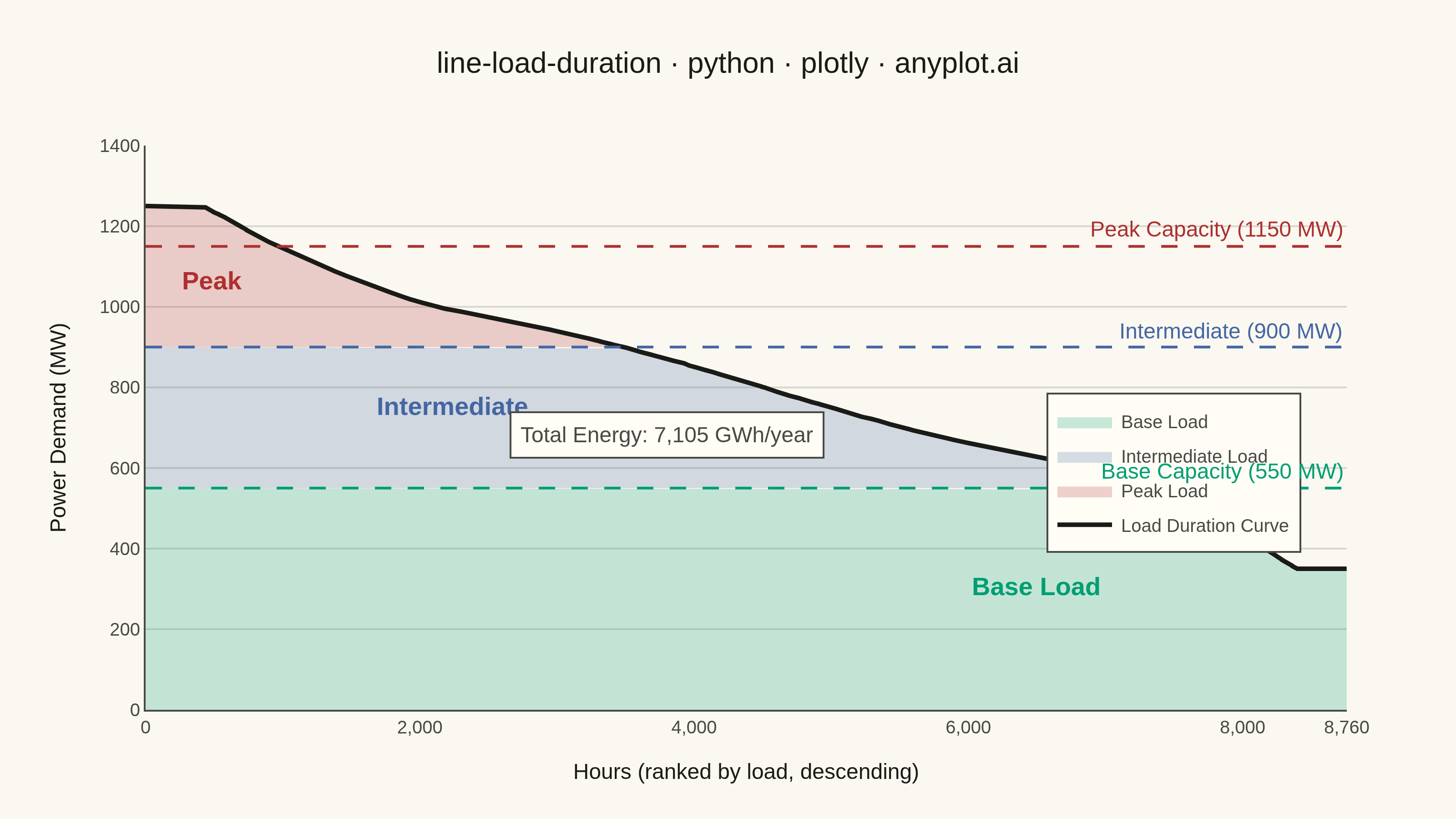
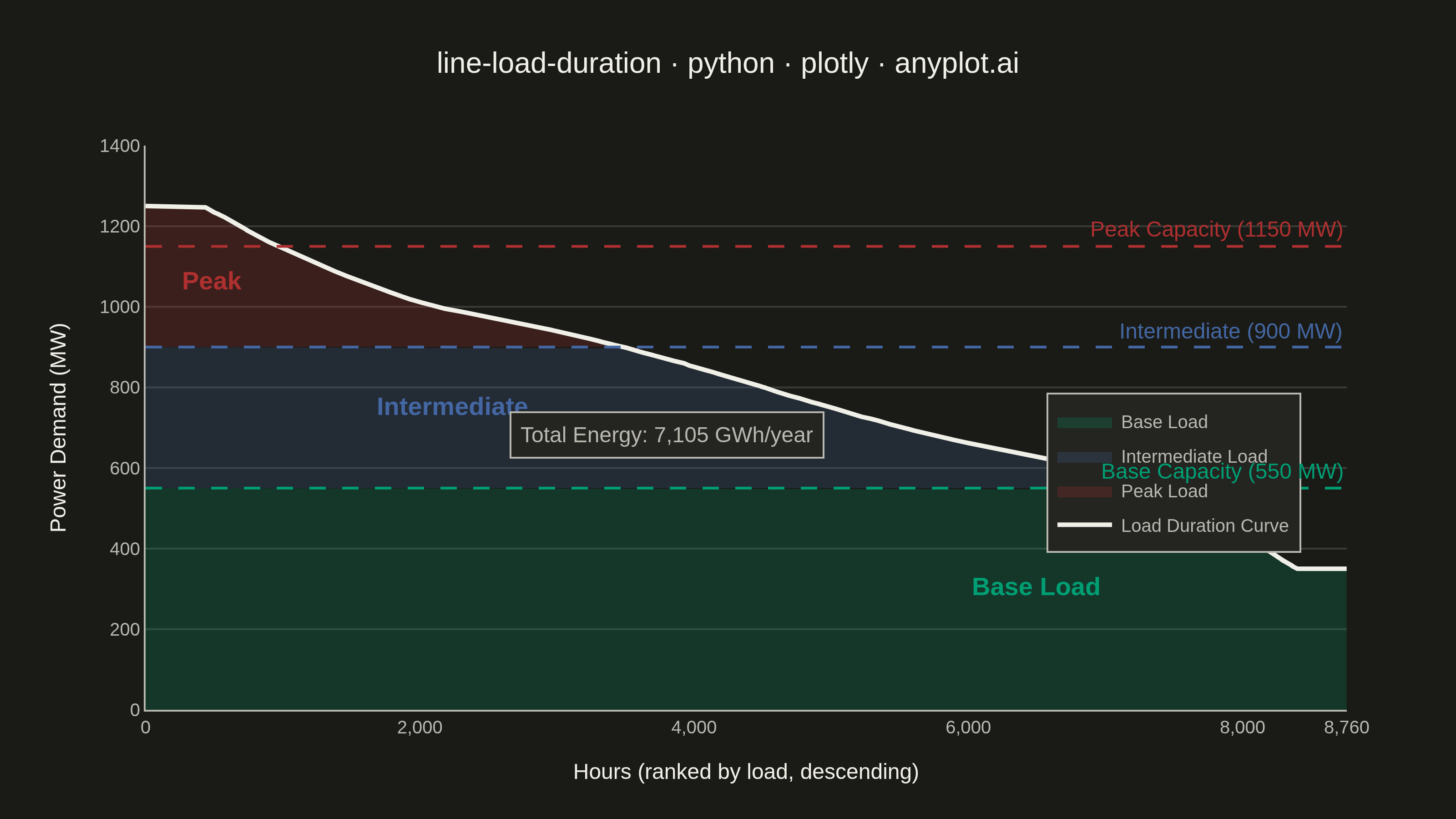
A load duration curve displays electrical power demand (MW) sorted from highest to lowest across all hours of a year (8,760 hours), forming a monotonically decreasing curve. It is a fundamental tool in power system planning, revealing the proportion of time that load exceeds a given level. The curve naturally segments into peak, intermediate, and base load regions, helping utilities determine the optimal generation capacity mix. The area under the curve represents total annual energy consumption.
""" anyplot.ai
line-load-duration: Load Duration Curve for Energy Systems
Library: plotly 6.8.0 | Python 3.13.13
Quality: 86/100 | Updated: 2026-06-10
"""

import os

import numpy as np
import plotly.graph_objects as go


# Theme tokens (Imprint palette — see prompts/default-style-guide.md)
THEME = os.getenv("ANYPLOT_THEME", "light")
PAGE_BG = "#FAF8F1" if THEME == "light" else "#1A1A17"
ELEVATED_BG = "#FFFDF6" if THEME == "light" else "#242420"
INK = "#1A1A17" if THEME == "light" else "#F0EFE8"
INK_SOFT = "#4A4A44" if THEME == "light" else "#B8B7B0"
INK_MUTED = "#6B6A63" if THEME == "light" else "#A8A79F"
GRID = "rgba(26,26,23,0.15)" if THEME == "light" else "rgba(240,239,232,0.15)"

# Imprint palette — semantic assignment: green=base (always-on), blue=intermediate, red=peak
COLOR_BASE = "#009E73"  # Imprint pos 1 — stable, always-on base load
COLOR_INTERMEDIATE = "#4467A3"  # Imprint pos 3 — intermediate cycling load
COLOR_PEAK = "#AE3030"  # Imprint pos 5 — high-cost peak demand spikes

# Data — synthetic annual hourly load profile for a mid-sized utility
np.random.seed(42)
hours = np.arange(8760)

hour_of_day = hours % 24
day_of_year = hours // 24

base_load = 400
seasonal = 200 * np.sin(2 * np.pi * (day_of_year - 30) / 365)
daily_cycle = 250 * np.sin(2 * np.pi * (hour_of_day - 6) / 24) + 150 * np.sin(4 * np.pi * (hour_of_day - 6) / 24)
peak_factor = np.where(
    (day_of_year > 150) & (day_of_year < 250) & (hour_of_day > 12) & (hour_of_day < 18),
    np.random.uniform(100, 300, 8760),
    0,
)
noise = np.random.normal(0, 30, 8760)

load_raw = base_load + seasonal + daily_cycle + peak_factor + noise + 400
load_mw = np.sort(load_raw)[::-1]
load_mw = np.clip(load_mw, 350, 1250)

# Capacity tier thresholds
base_capacity = 550
intermediate_capacity = 900
peak_capacity = 1150

# Hour indices where load crosses each threshold
peak_hours = np.searchsorted(-load_mw, -peak_capacity)
intermediate_hours = np.searchsorted(-load_mw, -intermediate_capacity)

# Total energy (area under curve) in GWh
total_energy_gwh = np.trapezoid(load_mw) / 1000

# Plot
fig = go.Figure()

# Base load region (rightmost — always-on generation)
fig.add_trace(
    go.Scatter(
        x=np.concatenate([hours, hours[::-1]]),
        y=np.concatenate([np.minimum(load_mw, base_capacity), np.zeros(8760)]),
        fill="toself",
        fillcolor="rgba(0,158,115,0.22)",
        line={"width": 0},
        name="Base Load",
        hoverinfo="skip",
    )
)

# Intermediate load region (between base and intermediate capacity)
intermediate_top = np.clip(load_mw, base_capacity, intermediate_capacity)
fig.add_trace(
    go.Scatter(
        x=np.concatenate([hours, hours[::-1]]),
        y=np.concatenate([intermediate_top, np.full(8760, base_capacity)]),
        fill="toself",
        fillcolor="rgba(68,103,163,0.30)",
        line={"width": 0},
        name="Intermediate Load",
        hoverinfo="skip",
    )
)

# Peak load region (leftmost — brief high-demand spikes)
peak_top = np.maximum(load_mw, intermediate_capacity)
fig.add_trace(
    go.Scatter(
        x=np.concatenate([hours, hours[::-1]]),
        y=np.concatenate([peak_top, np.full(8760, intermediate_capacity)]),
        fill="toself",
        fillcolor="rgba(174,48,48,0.32)",
        line={"width": 0},
        name="Peak Load",
        hoverinfo="skip",
    )
)

# Main load duration curve
fig.add_trace(
    go.Scatter(
        x=hours,
        y=load_mw,
        mode="lines",
        line={"color": INK, "width": 2.5},
        name="Load Duration Curve",
        hovertemplate="<b>Hour %{x:,}</b><br>Load: %{y:.0f} MW<extra></extra>",
    )
)

# Horizontal dashed capacity tier lines — annotations on right to avoid y-axis crowding
for capacity, label, color in [
    (peak_capacity, f"Peak Capacity ({peak_capacity} MW)", COLOR_PEAK),
    (intermediate_capacity, f"Intermediate ({intermediate_capacity} MW)", COLOR_INTERMEDIATE),
    (base_capacity, f"Base Capacity ({base_capacity} MW)", COLOR_BASE),
]:
    fig.add_hline(
        y=capacity,
        line_dash="dash",
        line_color=color,
        line_width=1.5,
        annotation_text=label,
        annotation_position="top right",
        annotation_font={"size": 12, "color": color},
    )

# Region labels placed within each zone
fig.add_annotation(
    x=peak_hours // 2,
    y=(peak_capacity + intermediate_capacity) // 2 + 40,
    text="<b>Peak</b>",
    showarrow=False,
    font={"size": 14, "color": COLOR_PEAK},
)

fig.add_annotation(
    x=(peak_hours + intermediate_hours) // 2,
    y=(intermediate_capacity + base_capacity) // 2 + 30,
    text="<b>Intermediate</b>",
    showarrow=False,
    font={"size": 14, "color": COLOR_INTERMEDIATE},
)

fig.add_annotation(
    x=6500, y=base_capacity // 2 + 30, text="<b>Base Load</b>", showarrow=False, font={"size": 14, "color": COLOR_BASE}
)

# Total energy annotation (mid-left area, clear of legend and capacity lines)
fig.add_annotation(
    x=3800,
    y=680,
    text=f"Total Energy: {total_energy_gwh:,.0f} GWh/year",
    showarrow=False,
    font={"size": 12, "color": INK_SOFT},
    bordercolor=INK_SOFT,
    borderwidth=1,
    borderpad=5,
    bgcolor=ELEVATED_BG,
)

# Layout
title = "line-load-duration · python · plotly · anyplot.ai"
fig.update_layout(
    autosize=False,
    paper_bgcolor=PAGE_BG,
    plot_bgcolor=PAGE_BG,
    font={"color": INK},
    title={"text": title, "font": {"size": 16, "color": INK}, "x": 0.5, "xanchor": "center"},
    xaxis={
        "title": {"text": "Hours (ranked by load, descending)", "font": {"size": 12, "color": INK}},
        "tickfont": {"size": 10, "color": INK_SOFT},
        "showgrid": False,
        "range": [0, 8760],
        "tickvals": [0, 2000, 4000, 6000, 8000, 8760],
        "ticktext": ["0", "2,000", "4,000", "6,000", "8,000", "8,760"],
        "linecolor": INK_SOFT,
        "zerolinecolor": INK_SOFT,
    },
    yaxis={
        "title": {"text": "Power Demand (MW)", "font": {"size": 12, "color": INK}},
        "tickfont": {"size": 10, "color": INK_SOFT},
        "showgrid": True,
        "gridwidth": 1,
        "gridcolor": GRID,
        "linecolor": INK_SOFT,
        "zerolinecolor": INK_SOFT,
        "range": [0, 1400],
    },
    legend={
        "x": 0.75,
        "y": 0.15,
        "font": {"size": 10, "color": INK_SOFT},
        "bgcolor": ELEVATED_BG,
        "bordercolor": INK_SOFT,
        "borderwidth": 1,
    },
    margin={"l": 80, "r": 60, "t": 80, "b": 60},
    hovermode="x",
)

# Save
fig.write_image(f"plot-{THEME}.png", width=800, height=450, scale=4)
fig.write_html(f"plot-{THEME}.html", include_plotlyjs="cdn")
Runnable source as JSON, for any HTTP client: https://api.anyplot.ai/specs/line-load-duration/plotly/code. Any spec id and library id listed in llms-full.txt fit the same URL shape; every URL below is complete and callable.
{
  "spec_id": "line-load-duration",
  "language": "python",
  "library": "plotly",
  "page": "https://anyplot.ai/line-load-duration/python/plotly",
  "hub": "https://anyplot.ai/line-load-duration",
  "code_json": "https://api.anyplot.ai/specs/line-load-duration/plotly/code",
  "spec_json": "https://api.anyplot.ai/specs/line-load-duration",
  "render_light_png": "https://storage.googleapis.com/anyplot-images/plots/line-load-duration/python/plotly/plot-light.png",
  "render_dark_png": "https://storage.googleapis.com/anyplot-images/plots/line-load-duration/python/plotly/plot-dark.png",
  "interactive_light_html": "https://storage.googleapis.com/anyplot-images/plots/line-load-duration/python/plotly/plot-light.html",
  "interactive_dark_html": "https://storage.googleapis.com/anyplot-images/plots/line-load-duration/python/plotly/plot-dark.html",
  "quality_score": 86.0,
  "license": "MIT",
  "guide": "https://anyplot.ai/llms.txt"
}
Part of Load Duration Curve for Energy Systems on anyplot.ai.