The same plot in 14 other libraries — Python: Altair, Bokeh, lets-plot, Matplotlib, Plotly, plotnine, Pygal, Seaborn; Julia: Makie.jl; JavaScript: Chart.js, D3.js, Apache ECharts, Highcharts, MUI X Charts. Compare all 15 side by side: Load Duration Curve for Energy Systems in Python, R, Julia and JavaScript.
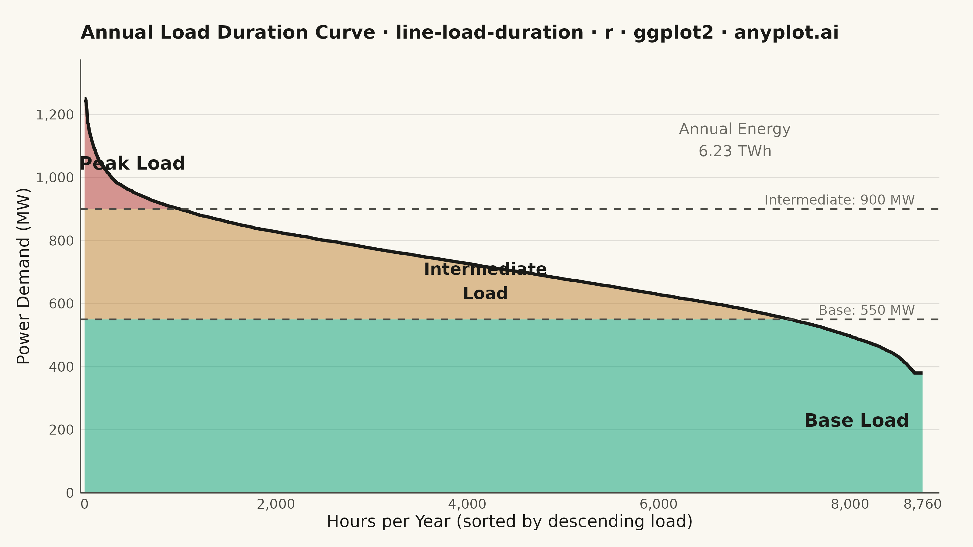
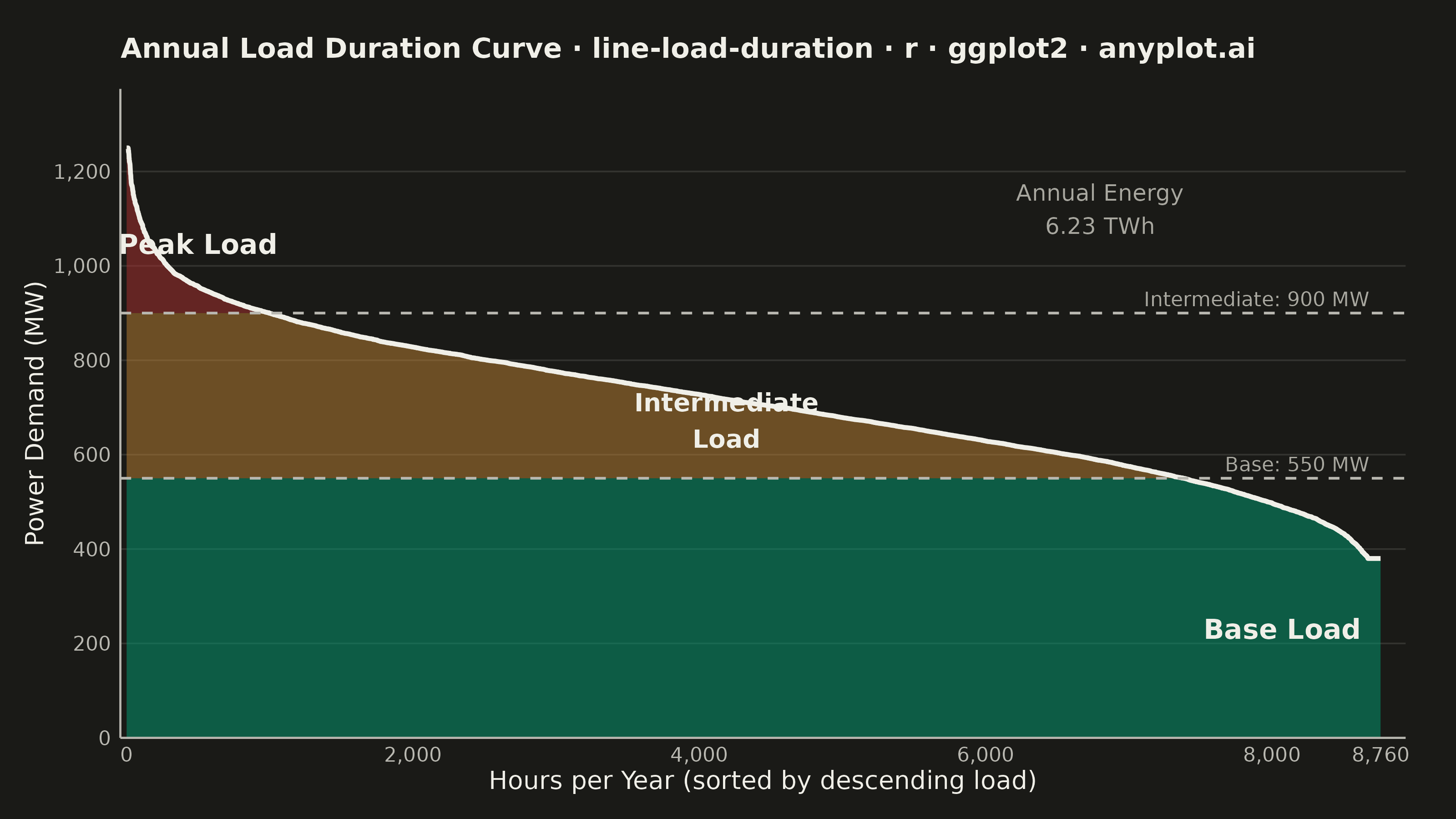
A load duration curve displays electrical power demand (MW) sorted from highest to lowest across all hours of a year (8,760 hours), forming a monotonically decreasing curve. It is a fundamental tool in power system planning, revealing the proportion of time that load exceeds a given level. The curve naturally segments into peak, intermediate, and base load regions, helping utilities determine the optimal generation capacity mix. The area under the curve represents total annual energy consumption.
#' anyplot.ai
#' line-load-duration: Load Duration Curve for Energy Systems
#' Library: ggplot2 3.5.1 | R 4.4.1
#' Quality: 93/100 | Created: 2026-06-10

library(ggplot2)
library(scales)
library(ragg)

set.seed(42)

# --- Theme tokens -----------------------------------------------------------
THEME       <- Sys.getenv("ANYPLOT_THEME", "light")
PAGE_BG     <- if (THEME == "light") "#FAF8F1" else "#1A1A17"
ELEVATED_BG <- if (THEME == "light") "#FFFDF6" else "#242420"
INK         <- if (THEME == "light") "#1A1A17" else "#F0EFE8"
INK_SOFT    <- if (THEME == "light") "#4A4A44" else "#B8B7B0"
INK_MUTED   <- if (THEME == "light") "#6B6A63" else "#A8A79F"

# Imprint palette (hybrid-v3 canonical order)
IMPRINT_PALETTE <- c(
  "#009E73", "#C475FD", "#4467A3", "#BD8233",
  "#AE3030", "#2ABCCD", "#954477", "#99B314"
)

# Region colors: semantic mapping (stable base=green, moderate=ochre, high peak=red)
COL_BASE <- IMPRINT_PALETTE[1]  # #009E73 — green, stable base load (first series)
COL_INT  <- IMPRINT_PALETTE[4]  # #BD8233 — ochre, intermediate load
COL_PEAK <- IMPRINT_PALETTE[5]  # #AE3030 — matte red, peak demand

GRID_COLOR <- adjustcolor(INK, alpha.f = 0.12)

# Capacity thresholds (MW)
BASE_CAP <- 550
INT_CAP  <- 900

# --- Data -------------------------------------------------------------------
n_hours <- 8760
t       <- seq(0, 2 * pi, length.out = n_hours)

# Synthetic annual load: base demand + seasonal cycle + random variation
base_demand  <- 700
seasonal_var <- 150 * cos(t + 0.3)
random_var   <- rnorm(n_hours, 0, 100)
load_raw     <- base_demand + seasonal_var + random_var

# Add extreme peak events (heat waves, cold snaps)
spike_idx           <- sample(seq_len(n_hours), 450)
load_raw[spike_idx] <- load_raw[spike_idx] + runif(450, 80, 380)

# Sort descending — this defines the load duration curve
load_sorted <- sort(pmin(pmax(load_raw, 380), 1250), decreasing = TRUE)

df <- data.frame(
  hour    = 0:(n_hours - 1),
  load_mw = load_sorted
)

# Summary statistics
total_energy_twh <- round(sum(df$load_mw) / 1e6, 2)

peak_mask  <- df$load_mw > INT_CAP
int_mask   <- df$load_mw > BASE_CAP & df$load_mw <= INT_CAP
base_mask  <- df$load_mw <= BASE_CAP

peak_hours <- sum(peak_mask)
int_hours  <- sum(int_mask)
base_hours <- sum(base_mask)

# X-midpoints for region labels (centered inside each region)
peak_x_mid <- max(peak_hours / 2, 300)
int_x_mid  <- peak_hours + int_hours / 2
base_x_mid <- peak_hours + int_hours + base_hours / 2

# --- Plot -------------------------------------------------------------------
title_str  <- "Annual Load Duration Curve · line-load-duration · r · ggplot2 · anyplot.ai"
title_size <- max(7, round(12 * 67 / nchar(title_str)))

p <- ggplot(df, aes(x = hour)) +
  # Fill regions stacked from bottom upward
  geom_ribbon(
    aes(ymin = 0, ymax = pmin(load_mw, BASE_CAP)),
    fill = COL_BASE, alpha = 0.5
  ) +
  geom_ribbon(
    aes(ymin = pmin(load_mw, BASE_CAP), ymax = pmin(load_mw, INT_CAP)),
    fill = COL_INT, alpha = 0.5
  ) +
  geom_ribbon(
    aes(ymin = pmin(load_mw, INT_CAP), ymax = load_mw),
    fill = COL_PEAK, alpha = 0.5
  ) +
  # Load duration curve
  geom_line(aes(y = load_mw), color = INK, linewidth = 0.9) +
  # Capacity threshold lines
  geom_hline(yintercept = BASE_CAP, linetype = "dashed",
             color = INK_SOFT, linewidth = 0.5) +
  geom_hline(yintercept = INT_CAP, linetype = "dashed",
             color = INK_SOFT, linewidth = 0.5) +
  # Region labels — centered inside each colored zone
  annotate("text", x = peak_x_mid,
           y = INT_CAP + (max(df$load_mw) - INT_CAP) * 0.42,
           label = "Peak Load",
           color = INK, size = 3.8, hjust = 0.5, fontface = "bold") +
  annotate("text", x = int_x_mid,
           y = BASE_CAP + (INT_CAP - BASE_CAP) * 0.35,
           label = "Intermediate\nLoad",
           color = INK, size = 3.5, hjust = 0.5, fontface = "bold") +
  annotate("text", x = base_x_mid,
           y = BASE_CAP * 0.42,
           label = "Base Load",
           color = INK, size = 3.8, hjust = 0.5, fontface = "bold") +
  # Capacity tier labels (right-aligned near right edge, above each dashed line)
  annotate("text", x = 8680, y = BASE_CAP + 30,
           label = sprintf("Base: %d MW", BASE_CAP),
           color = INK_MUTED, size = 2.8, hjust = 1) +
  annotate("text", x = 8680, y = INT_CAP + 30,
           label = sprintf("Intermediate: %d MW", INT_CAP),
           color = INK_MUTED, size = 2.8, hjust = 1) +
  # Total annual energy — upper-right empty space (above the curve at high x)
  annotate("text", x = 6800, y = 1120,
           label = sprintf("Annual Energy\n%.2f TWh", total_energy_twh),
           color = INK_MUTED, size = 3.2, hjust = 0.5) +
  # Scales
  scale_x_continuous(
    name   = "Hours per Year (sorted by descending load)",
    breaks = c(0, 2000, 4000, 6000, 8000, 8760),
    labels = c("0", "2,000", "4,000", "6,000", "8,000", "8,760"),
    expand = expansion(mult = c(0.005, 0.02))
  ) +
  scale_y_continuous(
    name   = "Power Demand (MW)",
    breaks = seq(0, 1200, by = 200),
    labels = scales::comma,
    expand = expansion(mult = c(0, 0.1))
  ) +
  labs(title = title_str) +
  # Theme
  theme_minimal(base_size = 8) +
  theme(
    plot.background    = element_rect(fill = PAGE_BG, color = PAGE_BG),
    panel.background   = element_rect(fill = PAGE_BG, color = NA),
    panel.grid.major.y = element_line(color = GRID_COLOR, linewidth = 0.3),
    panel.grid.major.x = element_blank(),
    panel.grid.minor   = element_blank(),
    panel.border       = element_blank(),
    axis.line          = element_line(color = INK_SOFT, linewidth = 0.4),
    axis.title         = element_text(color = INK,      size = 10),
    axis.text          = element_text(color = INK_SOFT, size = 8),
    plot.title         = element_text(color = INK,      size = title_size,
                                      face = "bold",
                                      margin = margin(b = 10)),
    plot.margin        = margin(t = 15, r = 20, b = 10, l = 10, unit = "pt"),
    legend.position    = "none"
  )

# --- Save -------------------------------------------------------------------
ggsave(
  filename = sprintf("plot-%s.png", THEME),
  plot     = p,
  device   = ragg::agg_png,
  width    = 8,
  height   = 4.5,
  units    = "in",
  dpi      = 400
)
Runnable source as JSON, for any HTTP client: https://api.anyplot.ai/specs/line-load-duration/ggplot2/code. Any spec id and library id listed in llms-full.txt fit the same URL shape; every URL below is complete and callable.
{
  "spec_id": "line-load-duration",
  "language": "r",
  "library": "ggplot2",
  "page": "https://anyplot.ai/line-load-duration/r/ggplot2",
  "hub": "https://anyplot.ai/line-load-duration",
  "code_json": "https://api.anyplot.ai/specs/line-load-duration/ggplot2/code",
  "spec_json": "https://api.anyplot.ai/specs/line-load-duration",
  "render_light_png": "https://storage.googleapis.com/anyplot-images/plots/line-load-duration/r/ggplot2/plot-light.png",
  "render_dark_png": "https://storage.googleapis.com/anyplot-images/plots/line-load-duration/r/ggplot2/plot-dark.png",
  "quality_score": 93.0,
  "license": "MIT",
  "guide": "https://anyplot.ai/llms.txt"
}
Part of Load Duration Curve for Energy Systems on anyplot.ai.