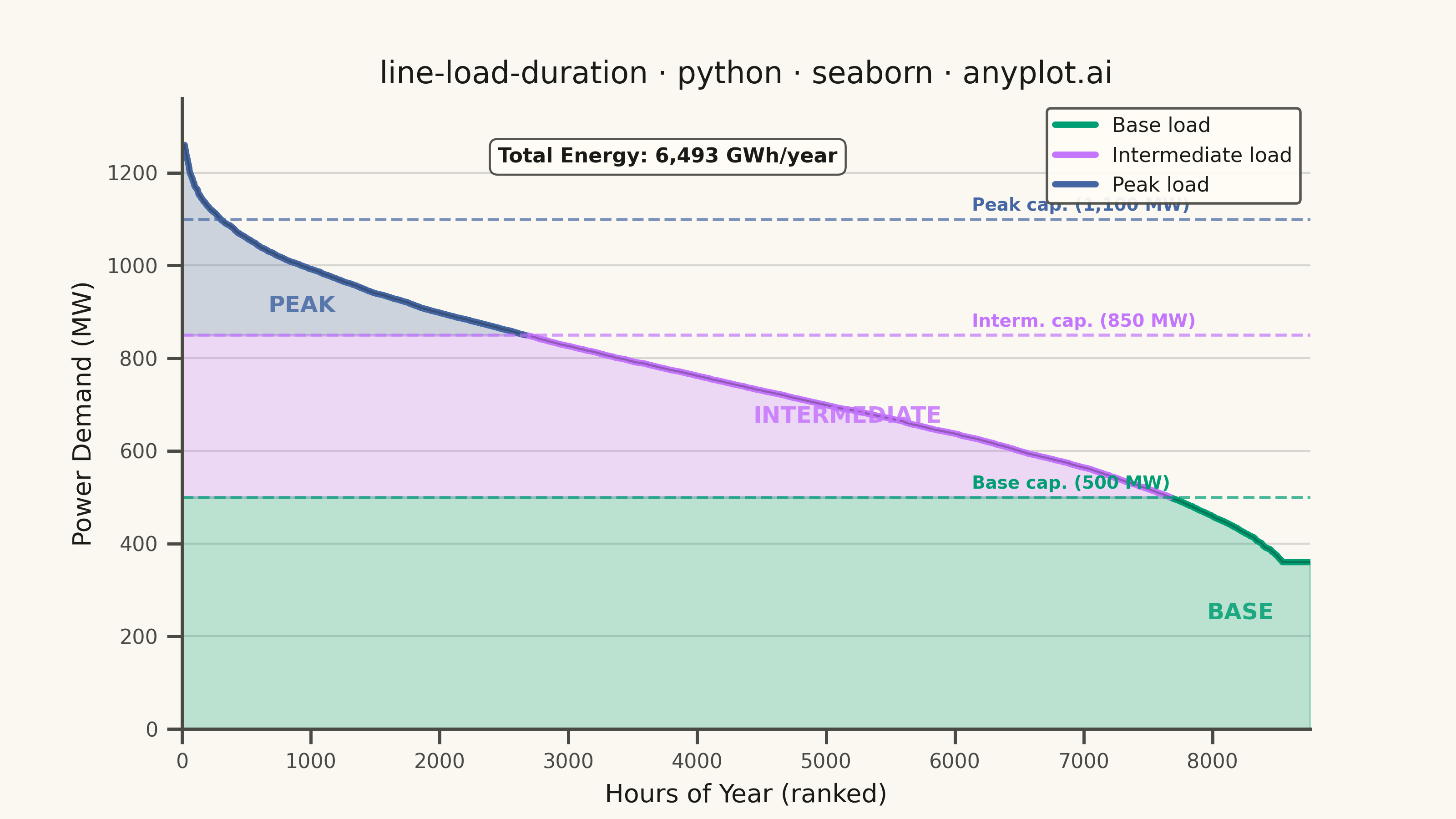
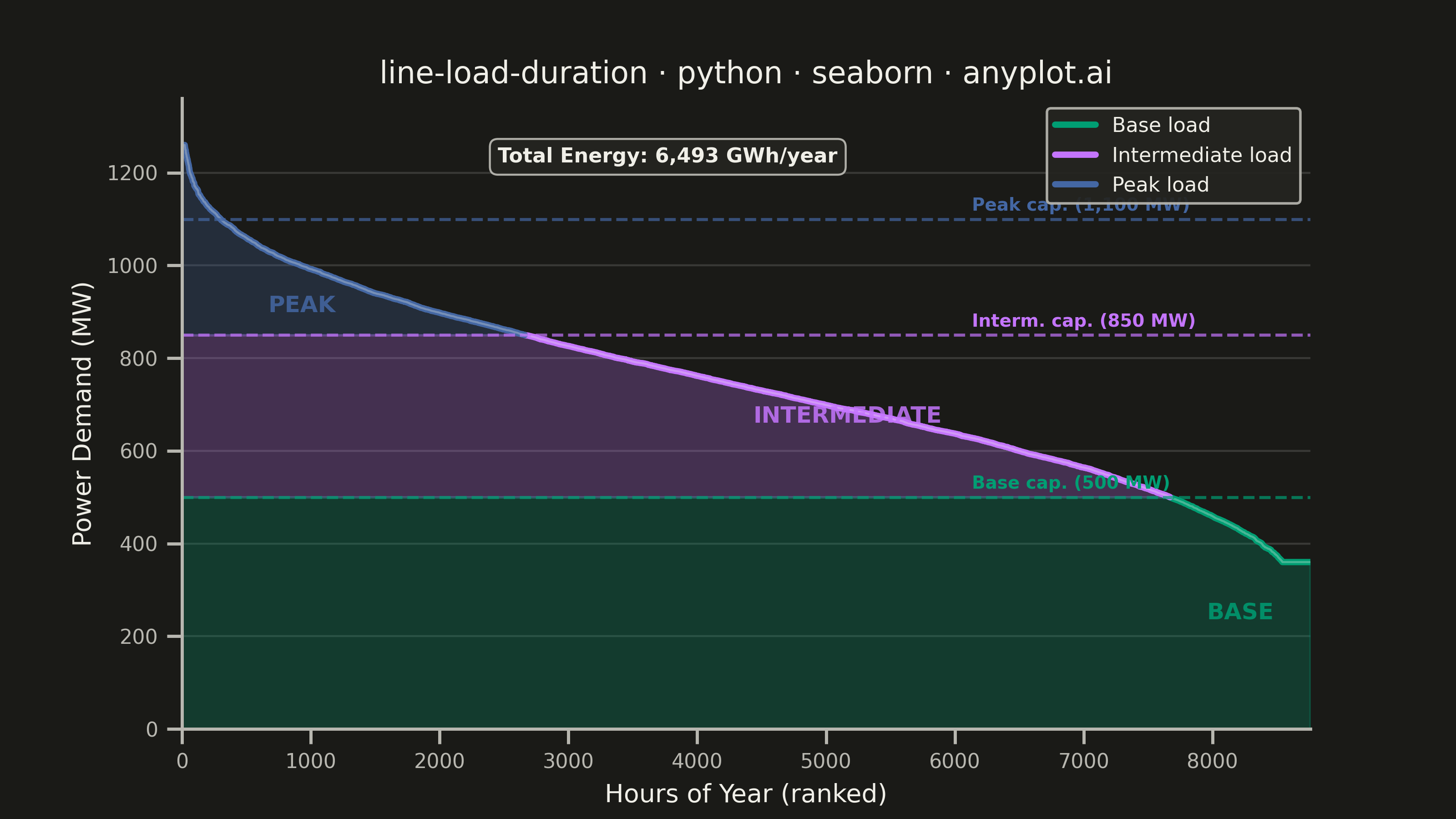
A load duration curve displays electrical power demand (MW) sorted from highest to lowest across all hours of a year (8,760 hours), forming a monotonically decreasing curve. It is a fundamental tool in power system planning, revealing the proportion of time that load exceeds a given level. The curve naturally segments into peak, intermediate, and base load regions, helping utilities determine the optimal generation capacity mix. The area under the curve represents total annual energy consumption.
""" anyplot.ai
line-load-duration: Load Duration Curve for Energy Systems
Library: seaborn 0.13.2 | Python 3.13.13
Quality: 90/100 | Updated: 2026-06-10
"""

import os

import matplotlib.pyplot as plt
import numpy as np
import pandas as pd
import seaborn as sns


# Theme tokens
THEME = os.getenv("ANYPLOT_THEME", "light")
PAGE_BG = "#FAF8F1" if THEME == "light" else "#1A1A17"
ELEVATED_BG = "#FFFDF6" if THEME == "light" else "#242420"
INK = "#1A1A17" if THEME == "light" else "#F0EFE8"
INK_SOFT = "#4A4A44" if THEME == "light" else "#B8B7B0"

# Imprint palette — canonical positions 1→3 for three load regions
IMPRINT_PALETTE = ["#009E73", "#C475FD", "#4467A3", "#BD8233", "#AE3030", "#2ABCCD", "#954477", "#99B314"]
REGION_COLORS = {
    "Base load": IMPRINT_PALETTE[0],  # #009E73 — steady, always-on
    "Intermediate load": IMPRINT_PALETTE[1],  # #C475FD — cycling
    "Peak load": IMPRINT_PALETTE[2],  # #4467A3 — brief demand spikes
}

# Seaborn theme with full theme-adaptive RC
sns.set_theme(
    style="ticks",
    rc={
        "figure.facecolor": PAGE_BG,
        "axes.facecolor": PAGE_BG,
        "axes.edgecolor": INK_SOFT,
        "axes.labelcolor": INK,
        "text.color": INK,
        "xtick.color": INK_SOFT,
        "ytick.color": INK_SOFT,
        "grid.color": INK,
        "grid.alpha": 0.15,
        "legend.facecolor": ELEVATED_BG,
        "legend.edgecolor": INK_SOFT,
    },
)

# Data
np.random.seed(42)
hours_in_year = 8760
base_load = 400
peak_load_max = 1200
t = np.linspace(0, 1, hours_in_year)
load_profile = base_load + (peak_load_max - base_load) * (
    0.5 * np.sin(2 * np.pi * t) ** 2
    + 0.25 * np.sin(2 * np.pi * t * 365 / 7) ** 2
    + 0.15 * np.random.normal(0, 1, hours_in_year)
    + 0.1 * np.sin(2 * np.pi * t * 365) ** 2
)
load_profile = np.clip(load_profile, base_load * 0.9, peak_load_max * 1.05)
load_sorted = np.sort(load_profile)[::-1]
hours = np.arange(hours_in_year)

base_capacity = 500
intermediate_capacity = 850
peak_capacity = 1100

total_energy_gwh = np.trapezoid(load_sorted, hours) / 1000

region = np.where(
    load_sorted > intermediate_capacity,
    "Peak load",
    np.where(load_sorted > base_capacity, "Intermediate load", "Base load"),
)
df = pd.DataFrame({"hour": hours, "load_mw": load_sorted, "region": region})

# Plot
fig, ax = plt.subplots(figsize=(8, 4.5), dpi=400)

# Filled regions under the load duration curve
ax.fill_between(
    hours,
    load_sorted,
    intermediate_capacity,
    where=(load_sorted > intermediate_capacity),
    color=REGION_COLORS["Peak load"],
    alpha=0.25,
)
ax.fill_between(
    hours,
    np.minimum(load_sorted, intermediate_capacity),
    base_capacity,
    where=(load_sorted > base_capacity),
    color=REGION_COLORS["Intermediate load"],
    alpha=0.25,
)
ax.fill_between(hours, np.minimum(load_sorted, base_capacity), 0, color=REGION_COLORS["Base load"], alpha=0.25)

# Load duration curve — seaborn hue mapping colors each segment by load region
# hue_order starts with Base load so the legend's first entry is #009E73 (Imprint brand green)
sns.lineplot(
    data=df,
    x="hour",
    y="load_mw",
    hue="region",
    hue_order=["Base load", "Intermediate load", "Peak load"],
    palette=REGION_COLORS,
    linewidth=2.5,
    legend=True,
    ax=ax,
)
# Thin silhouette overlay to unify hue-segment transitions
sns.lineplot(x=hours, y=load_sorted, color=INK, linewidth=0.8, alpha=0.3, legend=False, ax=ax)

# Style the seaborn auto-legend via move_legend (removes default "region" title)
sns.move_legend(ax, "upper right", fontsize=8, framealpha=0.92, title="")
ax.get_legend().get_title().set_visible(False)

# Capacity tier horizontal markers — labels at x=70% to separate from zone text labels
cap_x = hours_in_year * 0.70
for capacity, label, color in [
    (peak_capacity, "Peak cap. (1,100 MW)", REGION_COLORS["Peak load"]),
    (intermediate_capacity, "Interm. cap. (850 MW)", REGION_COLORS["Intermediate load"]),
    (base_capacity, "Base cap. (500 MW)", REGION_COLORS["Base load"]),
]:
    ax.axhline(y=capacity, color=color, linestyle="--", linewidth=1.2, alpha=0.7)
    ax.text(cap_x, capacity + 18, label, fontsize=7, color=color, fontweight="semibold")

# Zone labels — centered within each load region
peak_hours = int(np.sum(load_sorted > intermediate_capacity))
base_hours = int(np.sum(load_sorted > base_capacity))

ax.text(
    peak_hours * 0.35,
    (float(load_sorted[:peak_hours].mean()) + intermediate_capacity) / 2,
    "PEAK",
    fontsize=9,
    fontweight="bold",
    color=REGION_COLORS["Peak load"],
    ha="center",
    va="center",
    alpha=0.85,
)
ax.text(
    (peak_hours + base_hours) / 2,
    (intermediate_capacity + base_capacity) / 2,
    "INTERMEDIATE",
    fontsize=9,
    fontweight="bold",
    color=REGION_COLORS["Intermediate load"],
    ha="center",
    va="center",
    alpha=0.85,
)
ax.text(
    (base_hours + hours_in_year) / 2,
    base_capacity / 2,
    "BASE",
    fontsize=9,
    fontweight="bold",
    color=REGION_COLORS["Base load"],
    ha="center",
    va="center",
    alpha=0.85,
)

# Total energy annotation — top-center of plot with Imprint-compliant callout box
ax.text(
    hours_in_year * 0.28,
    load_sorted.max() * 0.97,
    f"Total Energy: {total_energy_gwh:,.0f} GWh/year",
    fontsize=8,
    fontweight="semibold",
    color=INK,
    bbox={
        "boxstyle": "round,pad=0.4",
        "facecolor": ELEVATED_BG,
        "edgecolor": INK_SOFT,
        "alpha": 0.95,
        "linewidth": 0.8,
    },
)

# Style
sns.despine(ax=ax)
ax.yaxis.grid(True, alpha=0.15, linewidth=0.8, color=INK)
ax.set_xlim(0, hours_in_year)
ax.set_ylim(0, load_sorted.max() * 1.08)
ax.set_title("line-load-duration · python · seaborn · anyplot.ai", fontsize=12, fontweight="medium", color=INK)
ax.set_xlabel("Hours of Year (ranked)", fontsize=10, color=INK)
ax.set_ylabel("Power Demand (MW)", fontsize=10, color=INK)
ax.tick_params(axis="both", labelsize=8, colors=INK_SOFT)

# Save — no bbox_inches so figsize × dpi lands exactly at 3200 × 1800 px
plt.savefig(f"plot-{THEME}.png", dpi=400, facecolor=PAGE_BG)
Runnable source as JSON, for any HTTP client: https://api.anyplot.ai/specs/line-load-duration/seaborn/code. Any spec id and library id listed in llms-full.txt fit the same URL shape; every URL below is complete and callable.
{
  "spec_id": "line-load-duration",
  "language": "python",
  "library": "seaborn",
  "page": "https://anyplot.ai/line-load-duration/python/seaborn",
  "hub": "https://anyplot.ai/line-load-duration",
  "code_json": "https://api.anyplot.ai/specs/line-load-duration/seaborn/code",
  "spec_json": "https://api.anyplot.ai/specs/line-load-duration",
  "render_light_png": "https://storage.googleapis.com/anyplot-images/plots/line-load-duration/python/seaborn/plot-light.png",
  "render_dark_png": "https://storage.googleapis.com/anyplot-images/plots/line-load-duration/python/seaborn/plot-dark.png",
  "quality_score": 90.0,
  "license": "MIT",
  "guide": "https://anyplot.ai/llms.txt"
}
Part of Load Duration Curve for Energy Systems on anyplot.ai.