The same plot in 14 other libraries — JavaScript: D3.js, Apache ECharts, Highcharts, MUI X Charts; Python: Altair, Bokeh, lets-plot, Matplotlib, Plotly, plotnine, Pygal, Seaborn; R: ggplot2; Julia: Makie.jl. Compare all 15 side by side: Multi-Line Comparison Plot in Python, R, Julia and JavaScript.
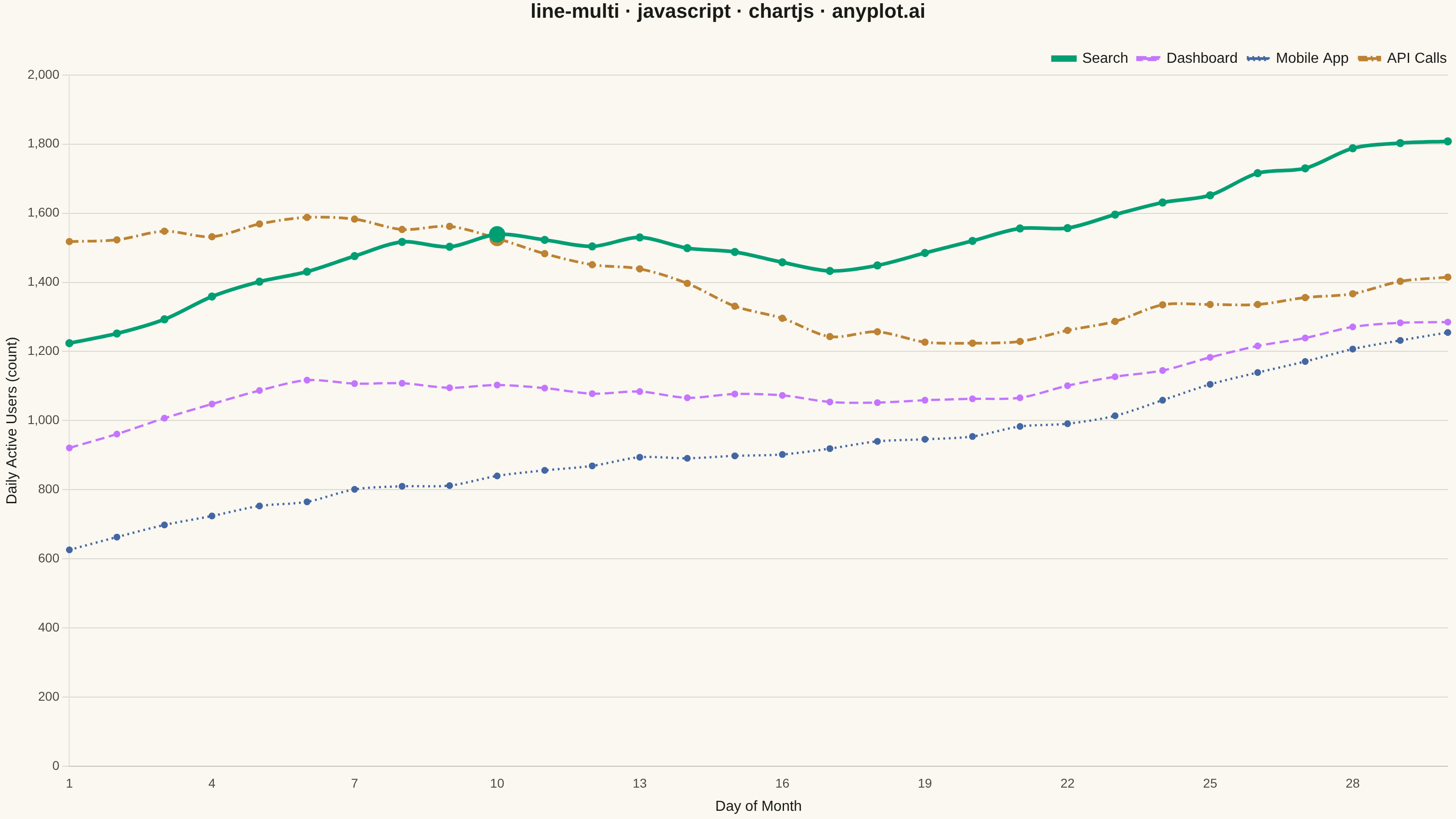
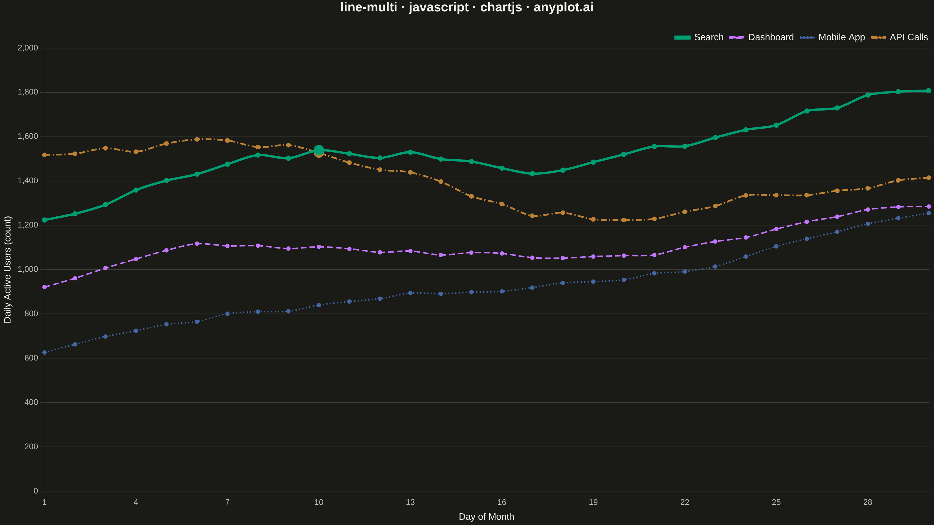
A multi-line plot displays multiple data series on the same axes for direct comparison. Each series is represented by a distinct line with its own color and optional style, making it easy to identify trends, correlations, and divergences between variables. This visualization is essential for comparing related metrics over a common sequence or time period.
// anyplot.ai
// line-multi: Multi-Line Comparison Plot
// Library: chartjs 4.4.7 | JavaScript 22.23.1
// Quality: 92/100 | Created: 2026-08-05

const t = window.ANYPLOT_TOKENS;

// --- Data (in-memory, deterministic) ----------------------------------------
// Daily active users for 4 product features over a 30-day month.
const days = Array.from({ length: 30 }, (_, i) => i + 1);

let seed = 7;
function lcg() {
  seed = (seed * 1103515245 + 12345) % 2147483648;
  return seed / 2147483648;
}

function trendSeries(base, drift, wiggle) {
  let value = base;
  return days.map((_, i) => {
    value += drift + (lcg() - 0.5) * wiggle;
    return Math.max(0, Math.round(value + Math.sin(i / 4) * wiggle * 1.5));
  });
}

const search = trendSeries(1200, 18, 60);
const dashboard = trendSeries(900, 10, 50);
const mobileApp = trendSeries(600, 22, 40);
const apiCalls = trendSeries(1500, -6, 70);

// Find where the primary series (Search) and its closest rival (API Calls)
// swap order, so the crossover can be called out with a marker.
function crossoverIndex(a, b) {
  for (let i = 1; i < a.length; i++) {
    if ((a[i - 1] - b[i - 1]) * (a[i] - b[i]) < 0) return i;
  }
  return -1;
}
const crossIdx = crossoverIndex(search, apiCalls);

function markerRadii(length, highlightIdx) {
  return Array.from({ length }, (_, i) => (i === highlightIdx ? 7 : 2.5));
}

// Search is the primary series (thickest, solid); the rest use distinct
// dash patterns so the four trends stay distinguishable without color alone.
const series = [
  { label: "Search", data: search, borderWidth: 4, borderDash: [], pointRadius: markerRadii(days.length, crossIdx) },
  { label: "Dashboard", data: dashboard, borderWidth: 2.5, borderDash: [10, 5], pointRadius: 2.5 },
  { label: "Mobile App", data: mobileApp, borderWidth: 2.5, borderDash: [2, 4], pointRadius: 2.5 },
  { label: "API Calls", data: apiCalls, borderWidth: 3, borderDash: [10, 4, 2, 4], pointRadius: markerRadii(days.length, crossIdx) },
];

// --- Mount -------------------------------------------------------------------
const canvas = document.createElement("canvas");
document.getElementById("container").appendChild(canvas);

// --- Chart ---------------------------------------------------------------
new Chart(canvas, {
  type: "line",
  data: {
    labels: days,
    datasets: series.map((s, i) => ({
      label: s.label,
      data: s.data,
      borderColor: t.palette[i % t.palette.length],
      backgroundColor: t.palette[i % t.palette.length],
      borderWidth: s.borderWidth,
      borderDash: s.borderDash,
      pointRadius: s.pointRadius,
      pointHoverRadius: 5,
      tension: 0.3,
      fill: false,
    })),
  },
  options: {
    responsive: true,
    maintainAspectRatio: false,
    animation: false,
    plugins: {
      title: {
        display: true,
        text: "line-multi · javascript · chartjs · anyplot.ai",
        color: t.ink,
        font: { size: 22 },
        padding: { bottom: 20 },
      },
      legend: {
        position: "top",
        align: "end",
        labels: { color: t.ink, font: { size: 16 }, boxWidth: 24, boxHeight: 3, usePointStyle: false },
      },
    },
    scales: {
      x: {
        ticks: { color: t.inkSoft, font: { size: 14 }, maxTicksLimit: 10 },
        grid: { display: false },
        title: { display: true, text: "Day of Month", color: t.ink, font: { size: 16 } },
      },
      y: {
        ticks: { color: t.inkSoft, font: { size: 14 } },
        grid: { color: t.grid },
        title: { display: true, text: "Daily Active Users (count)", color: t.ink, font: { size: 16 } },
        beginAtZero: true,
      },
    },
  },
});
Runnable source as JSON, for any HTTP client: https://api.anyplot.ai/specs/line-multi/chartjs/code. Any spec id and library id listed in llms-full.txt fit the same URL shape; every URL below is complete and callable.
{
  "spec_id": "line-multi",
  "language": "javascript",
  "library": "chartjs",
  "page": "https://anyplot.ai/line-multi/javascript/chartjs",
  "hub": "https://anyplot.ai/line-multi",
  "code_json": "https://api.anyplot.ai/specs/line-multi/chartjs/code",
  "spec_json": "https://api.anyplot.ai/specs/line-multi",
  "render_light_png": "https://storage.googleapis.com/anyplot-images/plots/line-multi/javascript/chartjs/plot-light.png",
  "render_dark_png": "https://storage.googleapis.com/anyplot-images/plots/line-multi/javascript/chartjs/plot-dark.png",
  "interactive_light_html": "https://storage.googleapis.com/anyplot-images/plots/line-multi/javascript/chartjs/plot-light.html",
  "interactive_dark_html": "https://storage.googleapis.com/anyplot-images/plots/line-multi/javascript/chartjs/plot-dark.html",
  "quality_score": 92.0,
  "license": "MIT",
  "guide": "https://anyplot.ai/llms.txt"
}
Part of Multi-Line Comparison Plot on anyplot.ai.