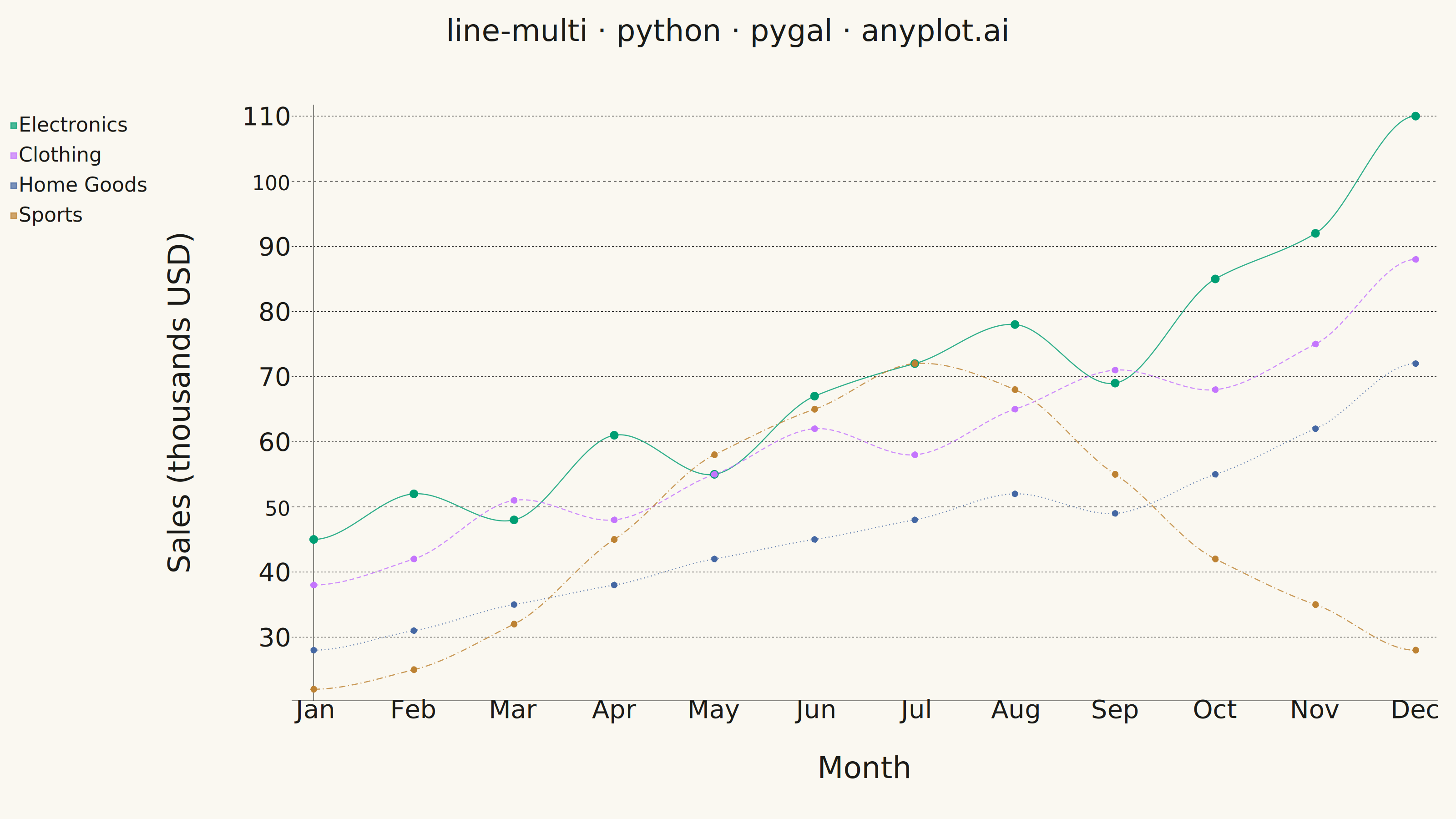
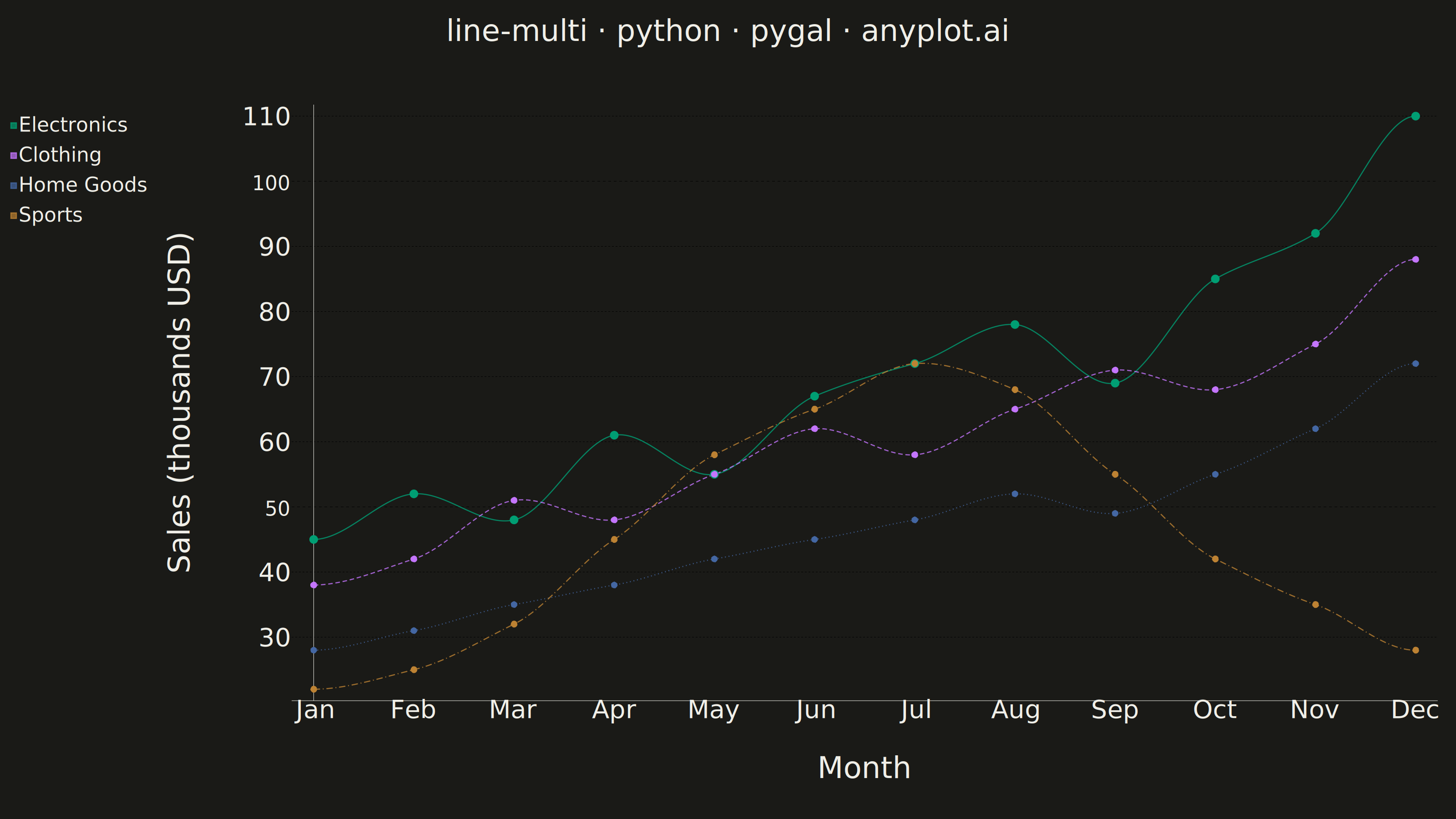
A multi-line plot displays multiple data series on the same axes for direct comparison. Each series is represented by a distinct line with its own color and optional style, making it easy to identify trends, correlations, and divergences between variables. This visualization is essential for comparing related metrics over a common sequence or time period.
""" anyplot.ai
line-multi: Multi-Line Comparison Plot
Library: pygal 3.1.3 | Python 3.13.14
Quality: 94/100 | Updated: 2026-08-05
"""

import os
import sys
from pathlib import Path


# Remove the script's directory from sys.path to avoid import collision
script_dir = str(Path(__file__).parent)
sys.path = [p for p in sys.path if p != script_dir and p != ""]

import pygal
from pygal.style import Style


# Theme tokens (see prompts/default-style-guide.md)
THEME = os.getenv("ANYPLOT_THEME", "light")
PAGE_BG = "#FAF8F1" if THEME == "light" else "#1A1A17"
ELEVATED_BG = "#FFFDF6" if THEME == "light" else "#242420"
INK = "#1A1A17" if THEME == "light" else "#F0EFE8"
INK_SOFT = "#4A4A44" if THEME == "light" else "#B8B7B0"
INK_MUTED = "#6B6A63" if THEME == "light" else "#A8A79F"

# Imprint palette (canonical order)
IMPRINT = (
    "#009E73",  # brand green (brand — first series)
    "#C475FD",  # lavender
    "#4467A3",  # blue
    "#BD8233",  # ochre
)

# Data - Monthly sales for 4 product lines over 12 months
months = ["Jan", "Feb", "Mar", "Apr", "May", "Jun", "Jul", "Aug", "Sep", "Oct", "Nov", "Dec"]

electronics = [45, 52, 48, 61, 55, 67, 72, 78, 69, 85, 92, 110]
clothing = [38, 42, 51, 48, 55, 62, 58, 65, 71, 68, 75, 88]
home_goods = [28, 31, 35, 38, 42, 45, 48, 52, 49, 55, 62, 72]
sports = [22, 25, 32, 45, 58, 65, 72, 68, 55, 42, 35, 28]

# Custom style with theme-adaptive colors
# Sizing per prompts/library/pygal.md "Sizing + Theme for 3200x1800 px"
custom_style = Style(
    background=PAGE_BG,
    plot_background=PAGE_BG,
    foreground=INK,
    foreground_strong=INK,
    foreground_subtle=INK_MUTED,
    colors=IMPRINT,
    font_family='"Helvetica Neue", Helvetica, Arial, "DejaVu Sans", sans-serif',
    title_font_size=66,
    label_font_size=56,
    major_label_font_size=44,
    legend_font_size=44,
    value_font_size=36,
    stroke_width=2.5,
    legend_box_size=30,
)

# Create chart
chart = pygal.Line(
    width=3200,
    height=1800,
    title="line-multi · python · pygal · anyplot.ai",
    x_title="Month",
    y_title="Sales (thousands USD)",
    style=custom_style,
    # Hermite/cardinal interpolation passes through every monthly value
    # exactly (unlike smoothing) while replacing the plain polyline with a
    # gently curved one — a distinctive pygal-only touch that lifts the
    # aesthetic beyond straight-segment defaults.
    interpolate="hermite",
    interpolation_parameters={"type": "cardinal", "c": 0.25},
    interpolation_precision=250,
    show_dots=True,
    dots_size=7,
    show_legend=True,
    legend_at_bottom=False,
    x_label_rotation=0,
    show_y_guides=True,
    show_x_guides=False,
    margin_top=140,
    margin_bottom=90,
    margin_left=100,
    margin_right=40,
    spacing=24,
)

# Add data series — Electronics gets a bolder solid stroke and larger dots to
# lead the eye toward its steady growth story; the remaining series use
# distinct dash patterns for redundant encoding alongside color.
chart.x_labels = months
chart.add("Electronics", electronics, stroke_style={"width": 4}, dots_size=9)
chart.add("Clothing", clothing, stroke_style={"width": 2.5, "dasharray": "10, 6"})
chart.add("Home Goods", home_goods, stroke_style={"width": 2.5, "dasharray": "2, 6"})
chart.add("Sports", sports, stroke_style={"width": 2.5, "dasharray": "14, 6, 2, 6"})

# Save as PNG and HTML
chart.render_to_png(f"plot-{THEME}.png")
with open(f"plot-{THEME}.html", "wb") as f:
    f.write(chart.render())
Runnable source as JSON, for any HTTP client: https://api.anyplot.ai/specs/line-multi/pygal/code. Any spec id and library id listed in llms-full.txt fit the same URL shape; every URL below is complete and callable.
{
  "spec_id": "line-multi",
  "language": "python",
  "library": "pygal",
  "page": "https://anyplot.ai/line-multi/python/pygal",
  "hub": "https://anyplot.ai/line-multi",
  "code_json": "https://api.anyplot.ai/specs/line-multi/pygal/code",
  "spec_json": "https://api.anyplot.ai/specs/line-multi",
  "render_light_png": "https://storage.googleapis.com/anyplot-images/plots/line-multi/python/pygal/plot-light.png",
  "render_dark_png": "https://storage.googleapis.com/anyplot-images/plots/line-multi/python/pygal/plot-dark.png",
  "interactive_light_html": "https://storage.googleapis.com/anyplot-images/plots/line-multi/python/pygal/plot-light.html",
  "interactive_dark_html": "https://storage.googleapis.com/anyplot-images/plots/line-multi/python/pygal/plot-dark.html",
  "quality_score": 94.0,
  "license": "MIT",
  "guide": "https://anyplot.ai/llms.txt"
}
Part of Multi-Line Comparison Plot on anyplot.ai.