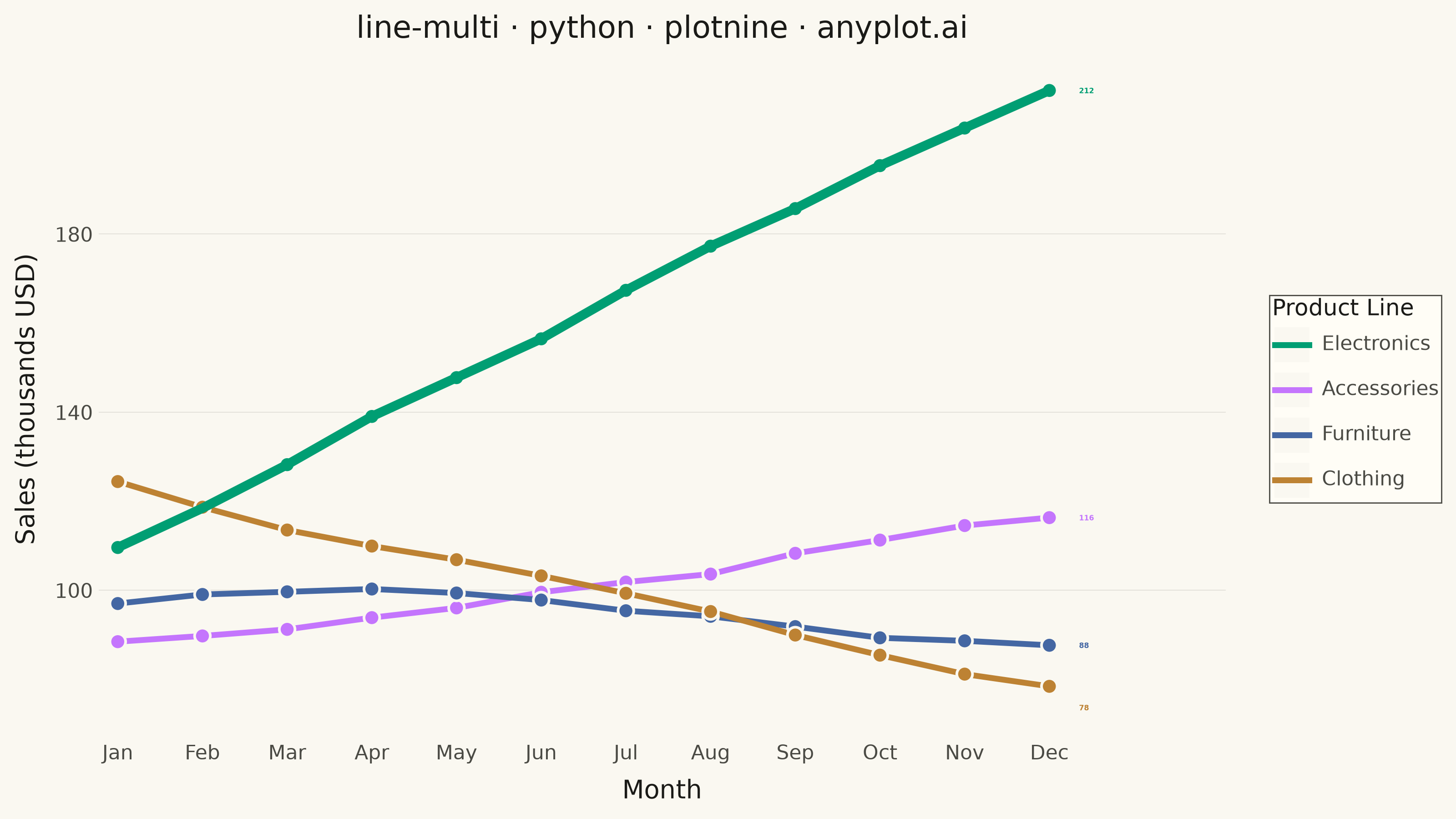
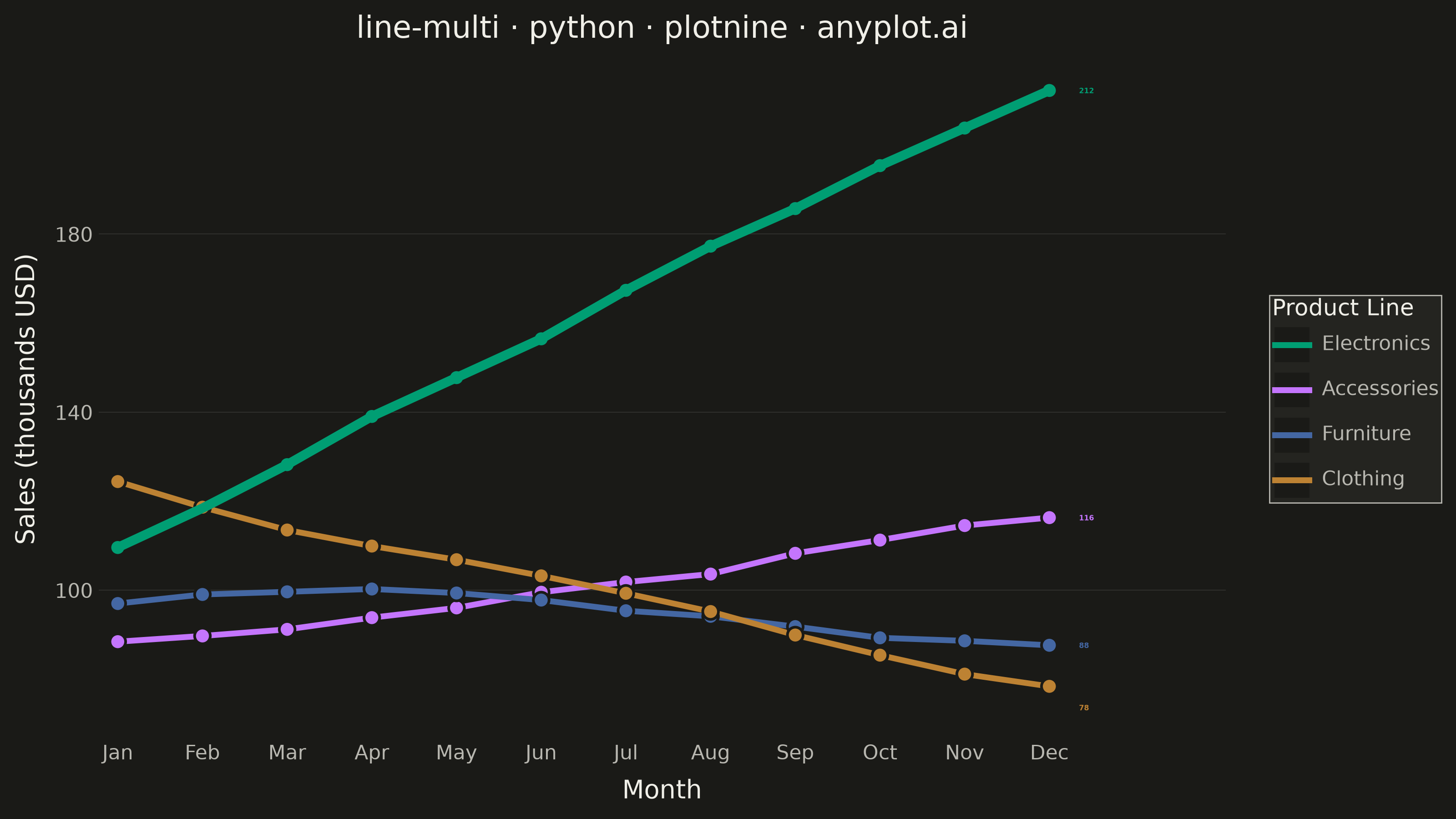
A multi-line plot displays multiple data series on the same axes for direct comparison. Each series is represented by a distinct line with its own color and optional style, making it easy to identify trends, correlations, and divergences between variables. This visualization is essential for comparing related metrics over a common sequence or time period.
""" anyplot.ai
line-multi: Multi-Line Comparison Plot
Library: plotnine 0.15.7 | Python 3.13.14
Quality: 92/100 | Updated: 2026-08-05
"""

import os

import numpy as np
import pandas as pd
from plotnine import (
    aes,
    element_blank,
    element_line,
    element_rect,
    element_text,
    geom_line,
    geom_point,
    geom_text,
    ggplot,
    labs,
    scale_color_manual,
    scale_fill_manual,
    scale_x_continuous,
    theme,
    theme_minimal,
)


# Theme tokens
THEME = os.getenv("ANYPLOT_THEME", "light")
PAGE_BG = "#FAF8F1" if THEME == "light" else "#1A1A17"
ELEVATED_BG = "#FFFDF6" if THEME == "light" else "#242420"
INK = "#1A1A17" if THEME == "light" else "#F0EFE8"
INK_SOFT = "#4A4A44" if THEME == "light" else "#B8B7B0"

# Imprint palette (brand green always first)
IMPRINT = ["#009E73", "#C475FD", "#4467A3", "#BD8233"]

# Data - Monthly sales for 4 product lines over 12 months, category order
# matches the year-end ranking so the legend reads top-to-bottom like the lines
np.random.seed(42)
months = np.arange(1, 13)
month_labels = ["Jan", "Feb", "Mar", "Apr", "May", "Jun", "Jul", "Aug", "Sep", "Oct", "Nov", "Dec"]

electronics = 100 + months * 9 + np.cumsum(np.random.normal(0, 3, 12)) * 0.4
accessories = 85 + months * 3.2 + np.cumsum(np.random.normal(0, 2.5, 12)) * 0.4
furniture = 95 + np.sin(months * 0.4) * 6 + np.cumsum(np.random.normal(0, 2, 12)) * 0.3
clothing = 128 - months * 3.8 + np.cumsum(np.random.normal(0, 2.5, 12)) * 0.4

# Long-format DataFrame for plotnine
df = pd.DataFrame(
    {
        "Month": np.tile(months, 4),
        "Sales": np.concatenate([electronics, accessories, furniture, clothing]),
        "Product": np.repeat(["Electronics", "Accessories", "Furniture", "Clothing"], 12),
    }
)
df["Product"] = pd.Categorical(
    df["Product"], categories=["Electronics", "Accessories", "Furniture", "Clothing"], ordered=True
)

color_map = dict(zip(["Electronics", "Accessories", "Furniture", "Clothing"], IMPRINT, strict=True))
brand_only = df[df["Product"] == "Electronics"]

# Direct end-of-line value labels (year-end sales) so the crossover story reads
# without relying on the legend alone. Labels are spread apart with a minimum
# gap so the close Furniture/Clothing pair at month 12 doesn't collide.
end_labels = (
    df.loc[df["Month"] == 12, ["Product", "Sales"]].sort_values("Sales", ascending=False).reset_index(drop=True)
)
end_labels["label_y"] = end_labels["Sales"]
min_gap = 14
for i in range(1, len(end_labels)):
    if end_labels.loc[i - 1, "label_y"] - end_labels.loc[i, "label_y"] < min_gap:
        end_labels.loc[i, "label_y"] = end_labels.loc[i - 1, "label_y"] - min_gap
end_labels["Month"] = 12
end_labels["Label"] = end_labels["Sales"].round(0).astype(int).astype(str)

# Plot - base lines for all series, brand series (Electronics) redrawn
# thicker on top to lead the eye, plus direct end-of-line value labels
plot = (
    ggplot(df, aes(x="Month", y="Sales", color="Product", group="Product"))
    + geom_line(size=1.3)
    + geom_point(aes(fill="Product"), shape="o", color=PAGE_BG, stroke=0.6, size=2.9)
    + geom_line(data=brand_only, size=2.1, show_legend=False)
    + geom_text(
        data=end_labels,
        mapping=aes(x="Month", y="label_y", label="Label", color="Product"),
        ha="left",
        nudge_x=0.35,
        size=2.8,
        fontweight="bold",
        show_legend=False,
    )
    + scale_color_manual(values=color_map)
    + scale_fill_manual(values=color_map, guide=None)
    + scale_x_continuous(breaks=months, labels=month_labels, expand=(0.02, 0, 0.1, 0.6))
    + labs(
        x="Month", y="Sales (thousands USD)", title="line-multi · python · plotnine · anyplot.ai", color="Product Line"
    )
    + theme_minimal()
    + theme(
        figure_size=(8, 4.5),
        plot_background=element_rect(fill=PAGE_BG, color=PAGE_BG),
        panel_background=element_rect(fill=PAGE_BG),
        panel_grid_major_x=element_blank(),
        panel_grid_minor=element_blank(),
        panel_grid_major_y=element_line(color=INK, size=0.3, alpha=0.12),
        axis_line=element_blank(),
        text=element_text(size=7, color=INK_SOFT),
        axis_title=element_text(size=10, color=INK),
        axis_text=element_text(size=8, color=INK_SOFT),
        plot_title=element_text(size=12, color=INK, ha="center"),
        legend_background=element_rect(fill=ELEVATED_BG, color=INK_SOFT, size=0.5),
        legend_key=element_rect(fill=PAGE_BG, color=None),
        legend_text=element_text(size=8, color=INK_SOFT),
        legend_title=element_text(size=9, color=INK),
        legend_position="right",
    )
)

# Save
plot.save(f"plot-{THEME}.png", dpi=400, width=8, height=4.5, units="in", verbose=False)
Runnable source as JSON, for any HTTP client: https://api.anyplot.ai/specs/line-multi/plotnine/code. Any spec id and library id listed in llms-full.txt fit the same URL shape; every URL below is complete and callable.
{
  "spec_id": "line-multi",
  "language": "python",
  "library": "plotnine",
  "page": "https://anyplot.ai/line-multi/python/plotnine",
  "hub": "https://anyplot.ai/line-multi",
  "code_json": "https://api.anyplot.ai/specs/line-multi/plotnine/code",
  "spec_json": "https://api.anyplot.ai/specs/line-multi",
  "render_light_png": "https://storage.googleapis.com/anyplot-images/plots/line-multi/python/plotnine/plot-light.png",
  "render_dark_png": "https://storage.googleapis.com/anyplot-images/plots/line-multi/python/plotnine/plot-dark.png",
  "quality_score": 92.0,
  "license": "MIT",
  "guide": "https://anyplot.ai/llms.txt"
}
Part of Multi-Line Comparison Plot on anyplot.ai.