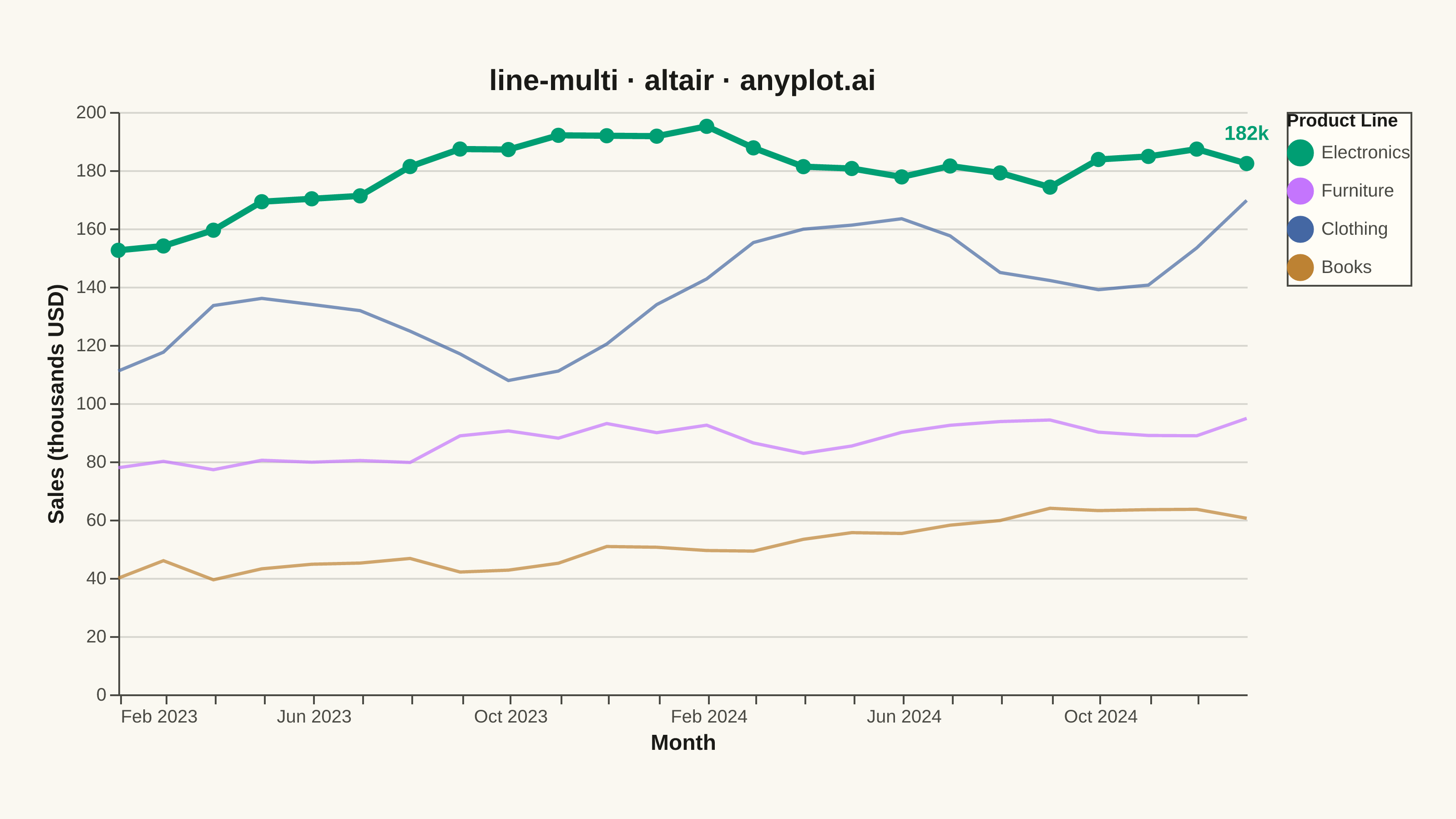
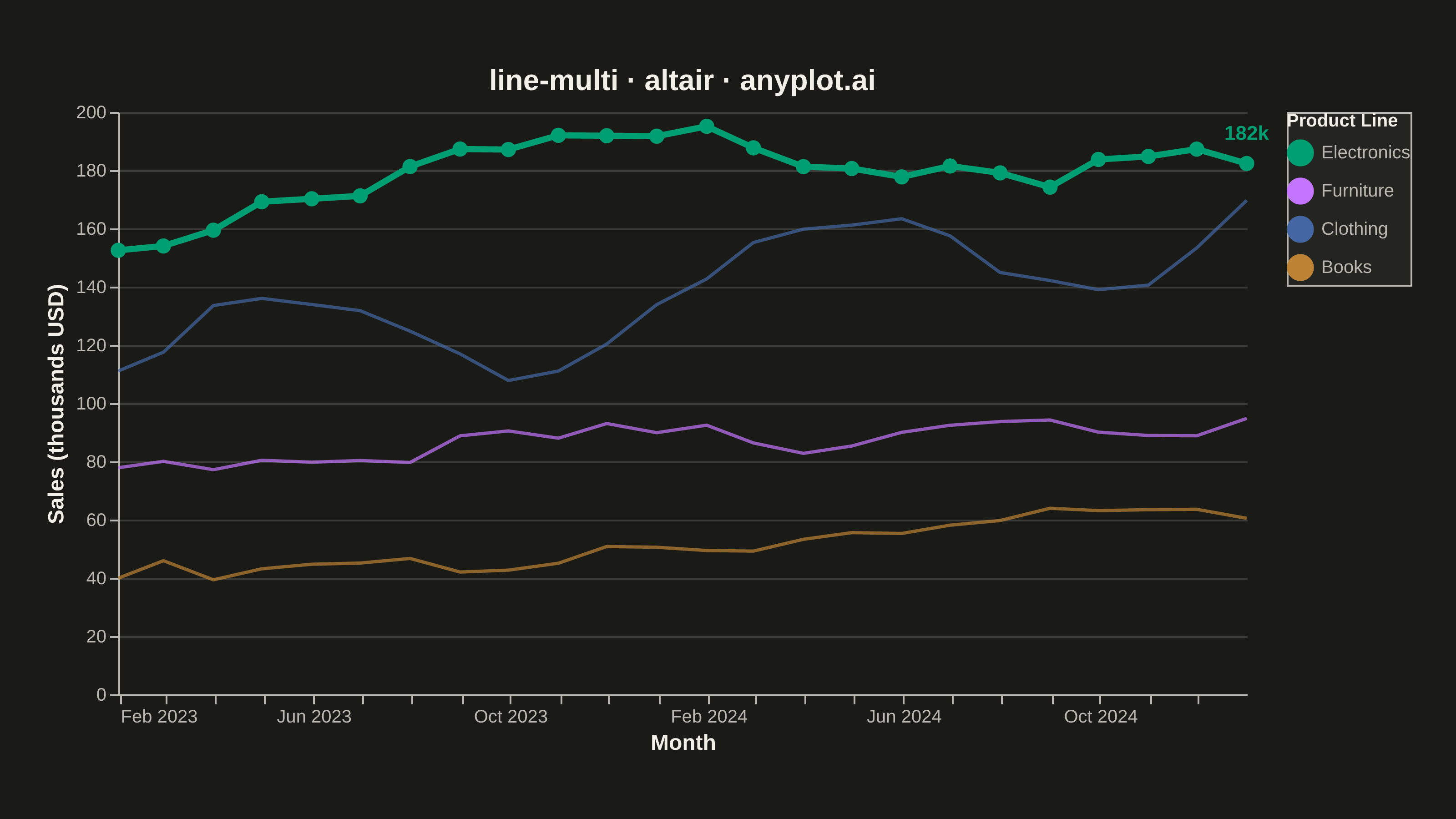
A multi-line plot displays multiple data series on the same axes for direct comparison. Each series is represented by a distinct line with its own color and optional style, making it easy to identify trends, correlations, and divergences between variables. This visualization is essential for comparing related metrics over a common sequence or time period.
""" anyplot.ai
line-multi: Multi-Line Comparison Plot
Library: altair 6.2.2 | Python 3.13.14
Quality: 94/100 | Updated: 2026-08-05
"""

import os

import altair as alt
import numpy as np
import pandas as pd
from PIL import Image


# Theme tokens
THEME = os.getenv("ANYPLOT_THEME", "light")
PAGE_BG = "#FAF8F1" if THEME == "light" else "#1A1A17"
ELEVATED_BG = "#FFFDF6" if THEME == "light" else "#242420"
INK = "#1A1A17" if THEME == "light" else "#F0EFE8"
INK_SOFT = "#4A4A44" if THEME == "light" else "#B8B7B0"

# Imprint palette for categorical data
IMPRINT = ["#009E73", "#C475FD", "#4467A3", "#BD8233"]

# Data - Monthly sales for 4 product lines over 24 months
np.random.seed(42)

months = pd.date_range(start="2023-01-01", periods=24, freq="ME")
products = ["Electronics", "Furniture", "Clothing", "Books"]

# Distinct trends per product line; Electronics is the hero series (brand green, strongest growth)
base = np.linspace(100, 150, 24)
electronics = base + np.cumsum(np.random.randn(24) * 5) + 50
furniture = base * 0.8 + np.cumsum(np.random.randn(24) * 4)
clothing = base * 1.1 + np.sin(np.linspace(0, 4 * np.pi, 24)) * 20 + np.random.randn(24) * 3
books = base * 0.6 + np.cumsum(np.random.randn(24) * 3) - 20

df = pd.DataFrame(
    {
        "Month": np.tile(months, 4),
        "Sales (thousands)": np.concatenate([electronics, furniture, clothing, books]),
        "Product": np.repeat(products, 24),
    }
)

is_hero = alt.datum.Product == "Electronics"

# Shared encodings; strokeWidth/opacity condition on the hero series to build
# a visual hierarchy instead of treating all four lines equally.
base_chart = alt.Chart(df).encode(
    x=alt.X(
        "Month:T",
        title="Month",
        axis=alt.Axis(
            grid=False,
            labelFontSize=10,
            titleFontSize=12,
            format="%b %Y",
            labelColor=INK_SOFT,
            titleColor=INK,
            domainColor=INK_SOFT,
            tickColor=INK_SOFT,
        ),
    ),
    y=alt.Y(
        "Sales (thousands):Q",
        title="Sales (thousands USD)",
        axis=alt.Axis(
            labelFontSize=10,
            titleFontSize=12,
            labelColor=INK_SOFT,
            titleColor=INK,
            domainColor=INK_SOFT,
            tickColor=INK_SOFT,
            gridOpacity=0.15,
            gridColor=INK,
        ),
    ),
    color=alt.Color(
        "Product:N",
        scale=alt.Scale(domain=products, range=IMPRINT),
        legend=alt.Legend(
            title="Product Line",
            titleFontSize=10,
            titleColor=INK,
            labelFontSize=10,
            labelColor=INK_SOFT,
            orient="right",
            symbolStrokeWidth=3,
            symbolSize=140,
            fillColor=ELEVATED_BG,
            strokeColor=INK_SOFT,
        ),
    ),
    strokeWidth=alt.condition(is_hero, alt.value(3.4), alt.value(1.8)),
    opacity=alt.condition(is_hero, alt.value(1.0), alt.value(0.7)),
    tooltip=["Month:T", "Sales (thousands):Q", "Product:N"],
)

lines = base_chart.mark_line()
hero_points = base_chart.transform_filter(is_hero).mark_point(size=70, filled=True)

# Direct-label callout on the hero series' final point (data storytelling)
hero_last = df[df["Product"] == "Electronics"].iloc[[-1]].copy()
hero_last["Label"] = hero_last["Sales (thousands)"].round(0).astype(int).astype(str) + "k"
hero_label = (
    alt.Chart(hero_last)
    .mark_text(align="center", dy=-16, fontSize=11, fontWeight="bold", color=IMPRINT[0])
    .encode(x="Month:T", y="Sales (thousands):Q", text="Label:N")
)

chart = (
    (lines + hero_points + hero_label)
    .properties(
        width=620,
        height=320,
        padding={"left": 0, "right": 0, "top": 0, "bottom": 0},
        background=PAGE_BG,
        title=alt.Title(text="line-multi · altair · anyplot.ai", fontSize=16, anchor="middle", color=INK),
    )
    .configure_view(fill=PAGE_BG, stroke=None, continuousWidth=620, continuousHeight=320)
)

# Save as PNG — hard target 3200x1800 (landscape), see prompts/library/altair.md
chart.save(f"plot-{THEME}.png", scale_factor=4.0)

TW, TH = 3200, 1800
_img = Image.open(f"plot-{THEME}.png").convert("RGB")
_w, _h = _img.size
if _w > TW or _h > TH:
    # vl-convert overshot the inner-view target — a real bug in the chart
    # definition. Fail loudly so impl-repair triggers; never crop (clips
    # title/axis labels and trips the AR-09 edge-clipping auto-reject).
    raise SystemExit(
        f"altair vl-convert produced {_w}x{_h}, exceeds target {TW}x{TH}. "
        f"Shrink chart .properties(width=, height=) values and re-render."
    )
if _w < TW or _h < TH:
    _canvas = Image.new("RGB", (TW, TH), PAGE_BG)
    _canvas.paste(_img, ((TW - _w) // 2, (TH - _h) // 2))
    _canvas.save(f"plot-{THEME}.png")

# Save as HTML for interactivity
chart.interactive().save(f"plot-{THEME}.html")
Runnable source as JSON, for any HTTP client: https://api.anyplot.ai/specs/line-multi/altair/code. Any spec id and library id listed in llms-full.txt fit the same URL shape; every URL below is complete and callable.
{
  "spec_id": "line-multi",
  "language": "python",
  "library": "altair",
  "page": "https://anyplot.ai/line-multi/python/altair",
  "hub": "https://anyplot.ai/line-multi",
  "code_json": "https://api.anyplot.ai/specs/line-multi/altair/code",
  "spec_json": "https://api.anyplot.ai/specs/line-multi",
  "render_light_png": "https://storage.googleapis.com/anyplot-images/plots/line-multi/python/altair/plot-light.png",
  "render_dark_png": "https://storage.googleapis.com/anyplot-images/plots/line-multi/python/altair/plot-dark.png",
  "interactive_light_html": "https://storage.googleapis.com/anyplot-images/plots/line-multi/python/altair/plot-light.html",
  "interactive_dark_html": "https://storage.googleapis.com/anyplot-images/plots/line-multi/python/altair/plot-dark.html",
  "quality_score": 94.0,
  "license": "MIT",
  "guide": "https://anyplot.ai/llms.txt"
}
Part of Multi-Line Comparison Plot on anyplot.ai.