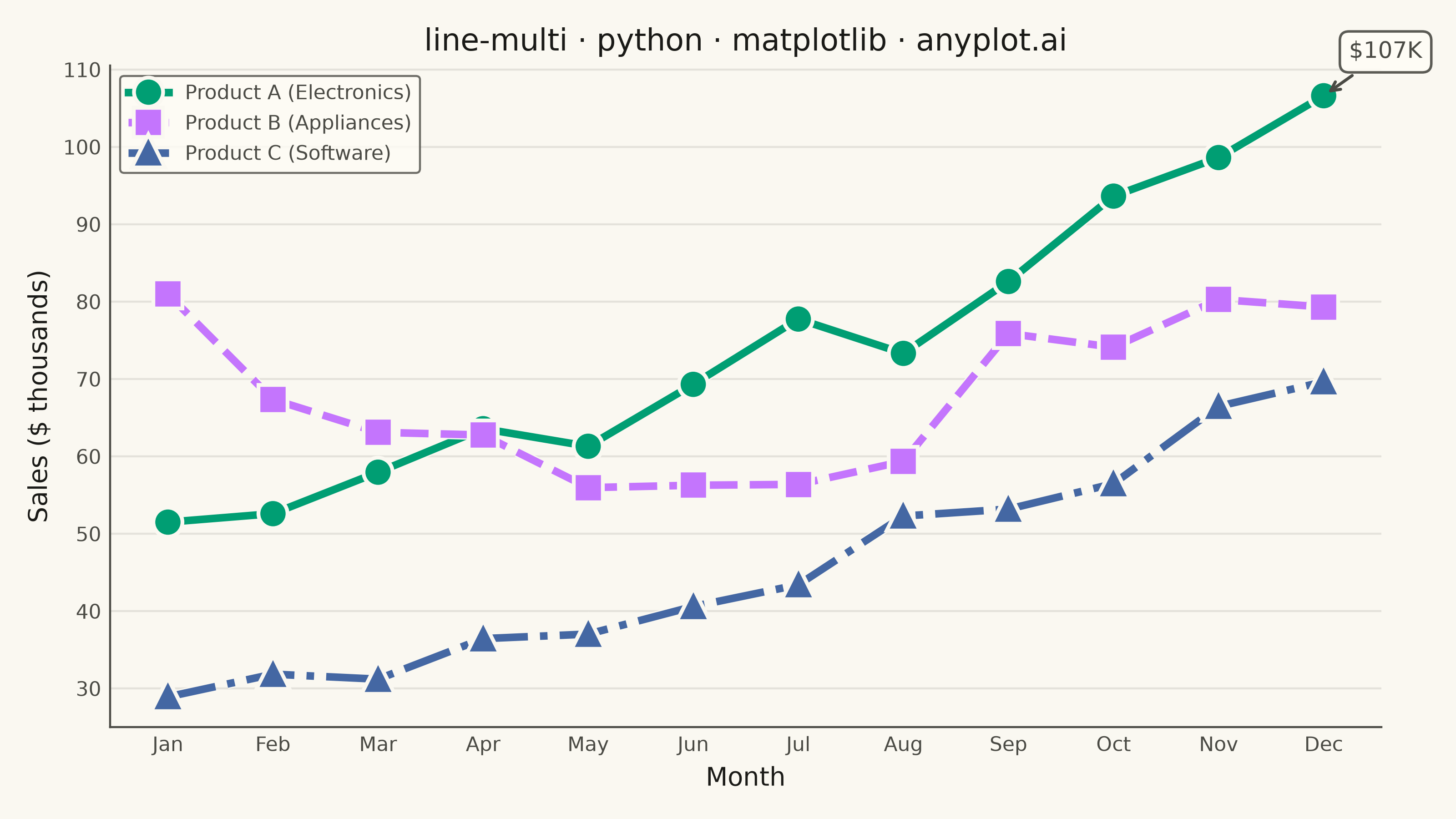
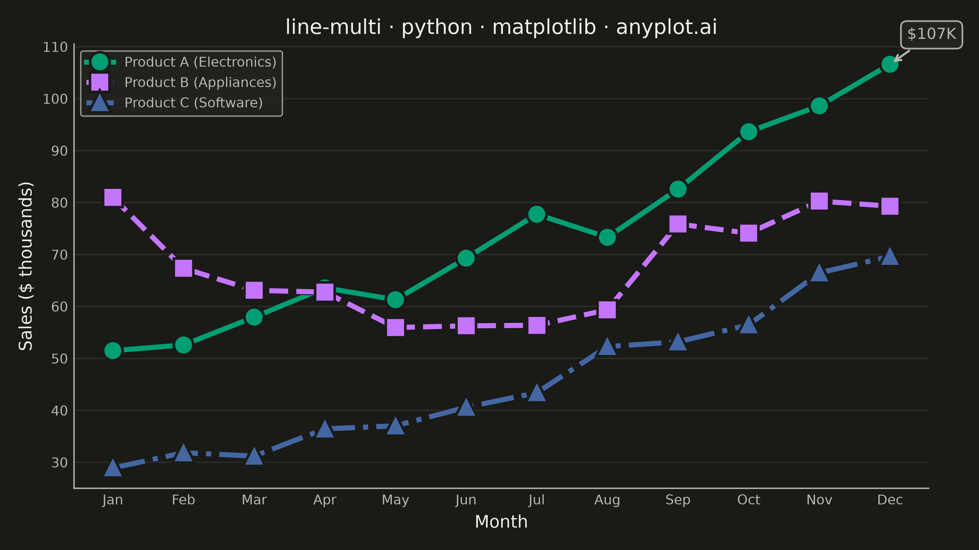
A multi-line plot displays multiple data series on the same axes for direct comparison. Each series is represented by a distinct line with its own color and optional style, making it easy to identify trends, correlations, and divergences between variables. This visualization is essential for comparing related metrics over a common sequence or time period.
""" anyplot.ai
line-multi: Multi-Line Comparison Plot
Library: matplotlib 3.11.1 | Python 3.13.14
Quality: 91/100 | Updated: 2026-08-05
"""

import os

import matplotlib.pyplot as plt
import numpy as np
from matplotlib import patheffects


# Theme tokens
THEME = os.getenv("ANYPLOT_THEME", "light")
PAGE_BG = "#FAF8F1" if THEME == "light" else "#1A1A17"
ELEVATED_BG = "#FFFDF6" if THEME == "light" else "#242420"
INK = "#1A1A17" if THEME == "light" else "#F0EFE8"
INK_SOFT = "#4A4A44" if THEME == "light" else "#B8B7B0"

# Imprint palette (positions 1-3, canonical order)
IMPRINT = ["#009E73", "#C475FD", "#4467A3"]

# Data: Monthly sales (in thousands) for 3 product lines over 12 months
np.random.seed(42)
months = np.arange(1, 13)
month_labels = ["Jan", "Feb", "Mar", "Apr", "May", "Jun", "Jul", "Aug", "Sep", "Oct", "Nov", "Dec"]

# Product A: Steady growth with seasonal bump in Q4
product_a = 50 + np.arange(12) * 3 + np.array([0, 0, 0, 0, 0, 5, 5, 0, 10, 15, 20, 25])
product_a = product_a + np.random.randn(12) * 3

# Product B: Strong start, mid-year dip, recovery
product_b = 80 + np.array([0, -5, -10, -15, -20, -25, -20, -15, -10, -5, 0, 5])
product_b = product_b + np.random.randn(12) * 4

# Product C: New product launch, exponential growth
product_c = 20 + np.exp(np.arange(12) * 0.15) * 10
product_c = product_c + np.random.randn(12) * 2

# Plot
fig, ax = plt.subplots(figsize=(8, 4.5), dpi=400, facecolor=PAGE_BG)
ax.set_facecolor(PAGE_BG)

# Soft halo (matplotlib patheffects) keeps lines legible where they cross the grid
halo = [patheffects.withStroke(linewidth=4, foreground=PAGE_BG)]

# Plot each series with distinct colors, line styles, and markers
ax.plot(
    months,
    product_a,
    color=IMPRINT[0],
    linewidth=3,
    marker="o",
    markersize=9,
    label="Product A (Electronics)",
    linestyle="-",
    path_effects=halo,
)
ax.plot(
    months,
    product_b,
    color=IMPRINT[1],
    linewidth=3,
    marker="s",
    markersize=9,
    label="Product B (Appliances)",
    linestyle="--",
    path_effects=halo,
)
ax.plot(
    months,
    product_c,
    color=IMPRINT[2],
    linewidth=3,
    marker="^",
    markersize=9,
    label="Product C (Software)",
    linestyle="-.",
    path_effects=halo,
)

# Highlight peak value with annotation
max_a_idx = np.argmax(product_a)
ax.annotate(
    f"${product_a[max_a_idx]:.0f}K",
    xy=(months[max_a_idx], product_a[max_a_idx]),
    xytext=(10, 15),
    textcoords="offset points",
    fontsize=9,
    color=INK_SOFT,
    bbox={"boxstyle": "round,pad=0.4", "facecolor": ELEVATED_BG, "edgecolor": INK_SOFT, "alpha": 0.9},
    arrowprops={"arrowstyle": "->", "connectionstyle": "arc3,rad=0", "color": INK_SOFT, "lw": 1.2},
)

# Style
title = "line-multi · python · matplotlib · anyplot.ai"
n = len(title)
title_fontsize = max(8, round(12 * 67 / n)) if n > 67 else 12
ax.set_xlabel("Month", fontsize=10, color=INK)
ax.set_ylabel("Sales ($ thousands)", fontsize=10, color=INK)
ax.set_title(title, fontsize=title_fontsize, fontweight="medium", color=INK)
ax.tick_params(axis="both", labelsize=8, colors=INK_SOFT, labelcolor=INK_SOFT, length=0)

# Set x-axis ticks to show month labels
ax.set_xticks(months)
ax.set_xticklabels(month_labels)

# Grid
ax.yaxis.grid(True, alpha=0.12, linewidth=0.8, color=INK_SOFT)

# Spines
ax.spines["top"].set_visible(False)
ax.spines["right"].set_visible(False)
for s in ("left", "bottom"):
    ax.spines[s].set_color(INK_SOFT)

# Legend
leg = ax.legend(fontsize=8, loc="upper left")
if leg:
    leg.get_frame().set_facecolor(ELEVATED_BG)
    leg.get_frame().set_edgecolor(INK_SOFT)
    leg.get_frame().set_linewidth(0.8)
    plt.setp(leg.get_texts(), color=INK_SOFT)

plt.tight_layout()
plt.savefig(f"plot-{THEME}.png", dpi=400, facecolor=PAGE_BG)
Runnable source as JSON, for any HTTP client: https://api.anyplot.ai/specs/line-multi/matplotlib/code. Any spec id and library id listed in llms-full.txt fit the same URL shape; every URL below is complete and callable.
{
  "spec_id": "line-multi",
  "language": "python",
  "library": "matplotlib",
  "page": "https://anyplot.ai/line-multi/python/matplotlib",
  "hub": "https://anyplot.ai/line-multi",
  "code_json": "https://api.anyplot.ai/specs/line-multi/matplotlib/code",
  "spec_json": "https://api.anyplot.ai/specs/line-multi",
  "render_light_png": "https://storage.googleapis.com/anyplot-images/plots/line-multi/python/matplotlib/plot-light.png",
  "render_dark_png": "https://storage.googleapis.com/anyplot-images/plots/line-multi/python/matplotlib/plot-dark.png",
  "quality_score": 91.0,
  "license": "MIT",
  "guide": "https://anyplot.ai/llms.txt"
}
Part of Multi-Line Comparison Plot on anyplot.ai.