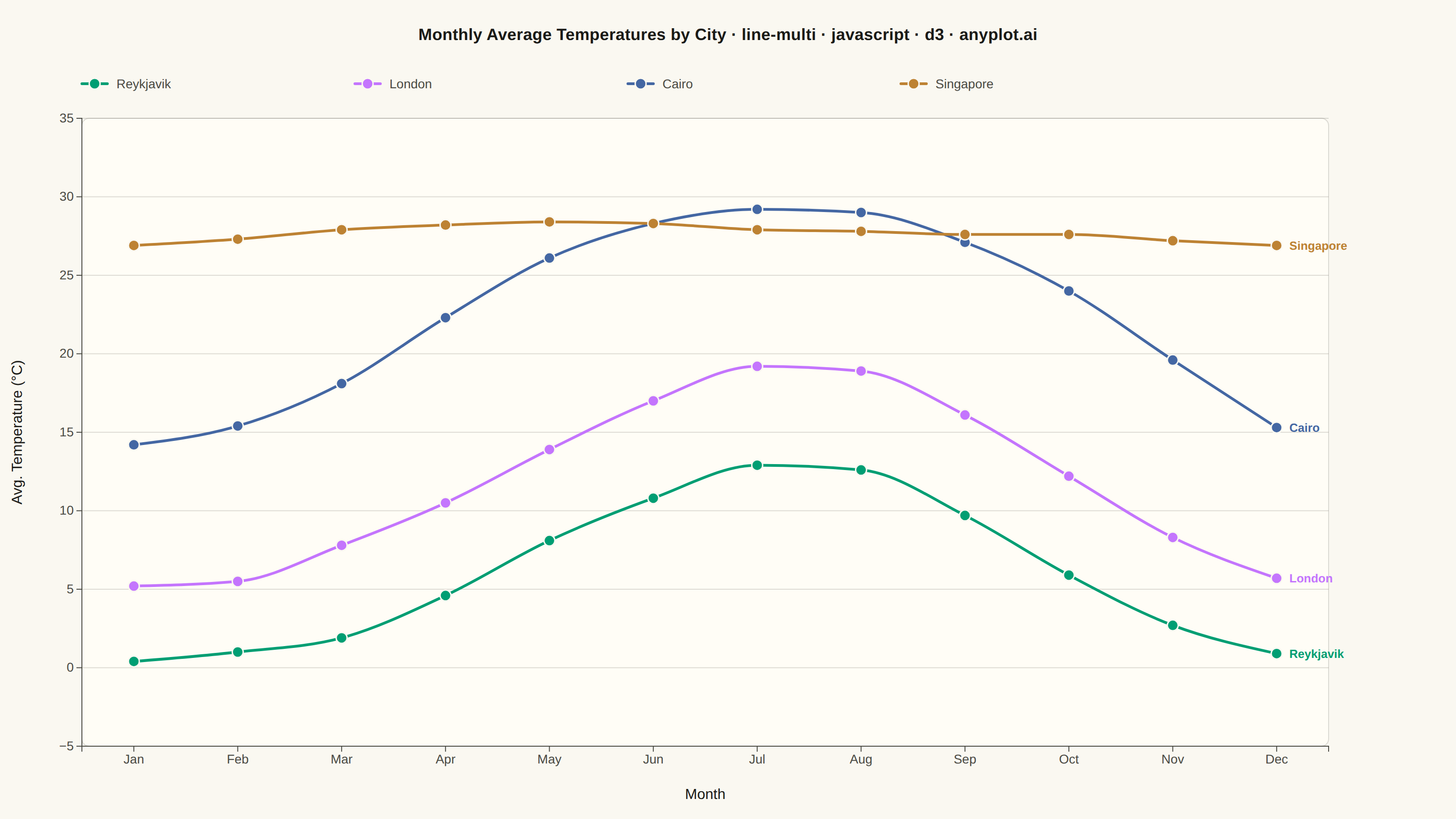
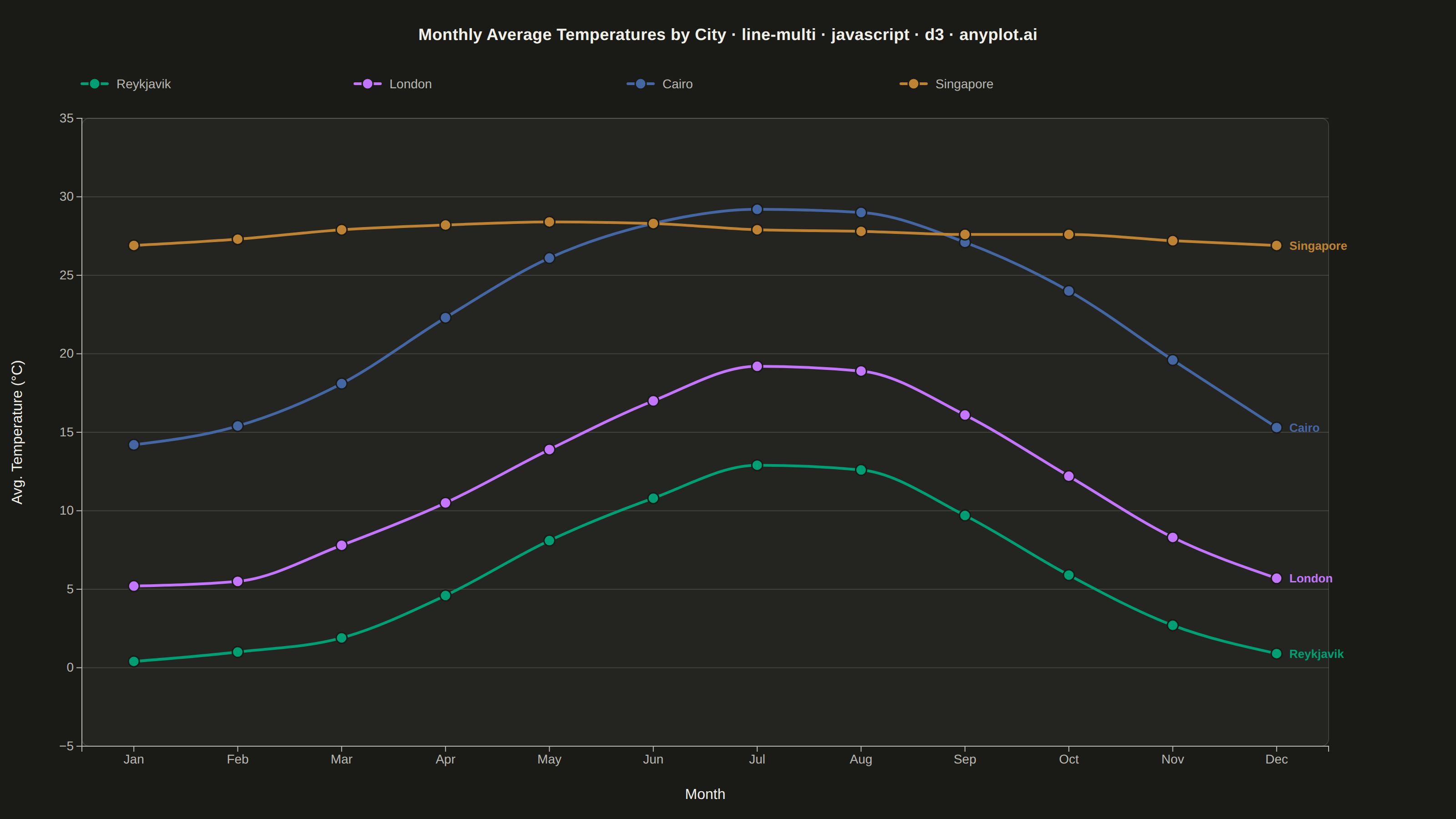
The same plot in 14 other libraries — JavaScript: Chart.js, Apache ECharts, Highcharts, MUI X Charts; Python: Altair, Bokeh, lets-plot, Matplotlib, Plotly, plotnine, Pygal, Seaborn; R: ggplot2; Julia: Makie.jl. Compare all 15 side by side: Multi-Line Comparison Plot in Python, R, Julia and JavaScript.
A multi-line plot displays multiple data series on the same axes for direct comparison. Each series is represented by a distinct line with its own color and optional style, making it easy to identify trends, correlations, and divergences between variables. This visualization is essential for comparing related metrics over a common sequence or time period.
// anyplot.ai
// line-multi: Multi-Line Comparison Plot
// Library: d3 7.9.0 | JavaScript 22.23.1
// Quality: 91/100 | Created: 2026-08-05

const t = window.ANYPLOT_TOKENS;
const { width, height } = window.ANYPLOT_SIZE;

const margin = { top: 130, right: 140, bottom: 80, left: 90 };
const iw = width - margin.left - margin.right;
const ih = height - margin.top - margin.bottom;

// Average monthly temperature (°C) across four cities with distinct climates
const months = [
  "Jan",
  "Feb",
  "Mar",
  "Apr",
  "May",
  "Jun",
  "Jul",
  "Aug",
  "Sep",
  "Oct",
  "Nov",
  "Dec",
];

const series = [
  {
    name: "Reykjavik",
    color: t.palette[0],
    values: [0.4, 1.0, 1.9, 4.6, 8.1, 10.8, 12.9, 12.6, 9.7, 5.9, 2.7, 0.9],
  },
  {
    name: "London",
    color: t.palette[1],
    values: [5.2, 5.5, 7.8, 10.5, 13.9, 17.0, 19.2, 18.9, 16.1, 12.2, 8.3, 5.7],
  },
  {
    name: "Cairo",
    color: t.palette[2],
    values: [
      14.2, 15.4, 18.1, 22.3, 26.1, 28.3, 29.2, 29.0, 27.1, 24.0, 19.6, 15.3,
    ],
  },
  {
    name: "Singapore",
    color: t.palette[3],
    values: [
      26.9, 27.3, 27.9, 28.2, 28.4, 28.3, 27.9, 27.8, 27.6, 27.6, 27.2, 26.9,
    ],
  },
];

const allValues = series.flatMap((s) => s.values);
const yDomain = [
  Math.floor(Math.min(...allValues)) - 2,
  Math.ceil(Math.max(...allValues)) + 2,
];

// Scales
const x = d3.scalePoint().domain(months).range([0, iw]).padding(0.5);
const y = d3.scaleLinear().domain(yDomain).nice().range([ih, 0]);

// SVG mount
const svg = d3
  .select("#container")
  .append("svg")
  .attr("width", width)
  .attr("height", height);
const g = svg
  .append("g")
  .attr("transform", `translate(${margin.left},${margin.top})`);

// Plot-area panel — subtle elevated backdrop for depth beyond the flat page background
g.append("rect")
  .attr("x", 0)
  .attr("y", 0)
  .attr("width", iw)
  .attr("height", ih)
  .attr("rx", 8)
  .attr("fill", t.elevatedBg)
  .attr("stroke", t.grid)
  .attr("stroke-width", 1);

// Y-axis grid lines (horizontal, subtle)
y.ticks(7).forEach((tick) => {
  g.append("line")
    .attr("x1", 0)
    .attr("x2", iw)
    .attr("y1", y(tick))
    .attr("y2", y(tick))
    .attr("stroke", t.grid)
    .attr("stroke-width", 1);
});

// Lines — curveMonotoneX gives a smooth, overshoot-free interpolation between
// the sparse monthly points, reading as a considered curve rather than a raw
// point-to-point polyline
const line = d3
  .line()
  .x((d) => x(d.month))
  .y((d) => y(d.value))
  .curve(d3.curveMonotoneX);

series.forEach((s) => {
  const points = months.map((m, i) => ({ month: m, value: s.values[i] }));

  g.append("path")
    .datum(points)
    .attr("d", line)
    .attr("fill", "none")
    .attr("stroke", s.color)
    .attr("stroke-width", 3)
    .attr("stroke-linejoin", "round")
    .attr("stroke-linecap", "round");

  g.selectAll(`.dot-${s.name}`)
    .data(points)
    .join("circle")
    .attr("cx", (d) => x(d.month))
    .attr("cy", (d) => y(d.value))
    .attr("r", 6)
    .attr("fill", s.color)
    .attr("stroke", t.pageBg)
    .attr("stroke-width", 1.5);

  // Direct end-of-line label, positioned via the y-scale — gives each line
  // its own focal point at a glance instead of relying solely on the legend
  const last = points[points.length - 1];
  g.append("text")
    .attr("x", x(last.month) + 14)
    .attr("y", y(last.value))
    .attr("dy", "0.35em")
    .attr("fill", s.color)
    .style("font-size", "13px")
    .style("font-weight", "600")
    .text(s.name);
});

// X axis (bottom)
const xAxisEl = g
  .append("g")
  .attr("transform", `translate(0,${ih})`)
  .call(d3.axisBottom(x));
xAxisEl.selectAll("text").attr("fill", t.inkSoft).style("font-size", "14px");
xAxisEl.selectAll("line").attr("stroke", t.inkSoft);
xAxisEl.select(".domain").attr("stroke", t.inkSoft);

// Y axis (left)
const yAxisEl = g.append("g").call(d3.axisLeft(y).ticks(7));
yAxisEl.selectAll("text").attr("fill", t.inkSoft).style("font-size", "14px");
yAxisEl.selectAll("line").attr("stroke", t.inkSoft);
yAxisEl.select(".domain").attr("stroke", t.inkSoft);

// Y axis label
svg
  .append("text")
  .attr("transform", "rotate(-90)")
  .attr("x", -(margin.top + ih / 2))
  .attr("y", 24)
  .attr("text-anchor", "middle")
  .attr("fill", t.ink)
  .style("font-size", "16px")
  .style("font-weight", "500")
  .text("Avg. Temperature (°C)");

// X axis label
svg
  .append("text")
  .attr("x", margin.left + iw / 2)
  .attr("y", height - 22)
  .attr("text-anchor", "middle")
  .attr("fill", t.ink)
  .style("font-size", "16px")
  .style("font-weight", "500")
  .text("Month");

// Legend — horizontal row below the title
const legendY = 92;
const legendStartX = margin.left;
const legendGap = 300;

series.forEach((s, i) => {
  const lx = legendStartX + i * legendGap;
  svg
    .append("line")
    .attr("x1", lx)
    .attr("x2", lx + 28)
    .attr("y1", legendY)
    .attr("y2", legendY)
    .attr("stroke", s.color)
    .attr("stroke-width", 3)
    .attr("stroke-linecap", "round");
  svg
    .append("circle")
    .attr("cx", lx + 14)
    .attr("cy", legendY)
    .attr("r", 6)
    .attr("fill", s.color)
    .attr("stroke", t.pageBg)
    .attr("stroke-width", 1.5);
  svg
    .append("text")
    .attr("x", lx + 38)
    .attr("y", legendY + 5)
    .attr("fill", t.inkSoft)
    .style("font-size", "14px")
    .style("font-weight", "500")
    .text(s.name);
});

// Title
svg
  .append("text")
  .attr("x", width / 2)
  .attr("y", 44)
  .attr("text-anchor", "middle")
  .attr("fill", t.ink)
  .style("font-size", "18px")
  .style("font-weight", "700")
  .style("letter-spacing", "0.2px")
  .text(
    "Monthly Average Temperatures by City · line-multi · javascript · d3 · anyplot.ai",
  );
Runnable source as JSON, for any HTTP client: https://api.anyplot.ai/specs/line-multi/d3/code. Any spec id and library id listed in llms-full.txt fit the same URL shape; every URL below is complete and callable.
{
  "spec_id": "line-multi",
  "language": "javascript",
  "library": "d3",
  "page": "https://anyplot.ai/line-multi/javascript/d3",
  "hub": "https://anyplot.ai/line-multi",
  "code_json": "https://api.anyplot.ai/specs/line-multi/d3/code",
  "spec_json": "https://api.anyplot.ai/specs/line-multi",
  "render_light_png": "https://storage.googleapis.com/anyplot-images/plots/line-multi/javascript/d3/plot-light.png",
  "render_dark_png": "https://storage.googleapis.com/anyplot-images/plots/line-multi/javascript/d3/plot-dark.png",
  "interactive_light_html": "https://storage.googleapis.com/anyplot-images/plots/line-multi/javascript/d3/plot-light.html",
  "interactive_dark_html": "https://storage.googleapis.com/anyplot-images/plots/line-multi/javascript/d3/plot-dark.html",
  "quality_score": 91.0,
  "license": "MIT",
  "guide": "https://anyplot.ai/llms.txt"
}
Part of Multi-Line Comparison Plot on anyplot.ai.