The same plot in 14 other libraries — JavaScript: Chart.js, D3.js, Apache ECharts, MUI X Charts; Python: Altair, Bokeh, lets-plot, Matplotlib, Plotly, plotnine, Pygal, Seaborn; R: ggplot2; Julia: Makie.jl. Compare all 15 side by side: Multi-Line Comparison Plot in Python, R, Julia and JavaScript.
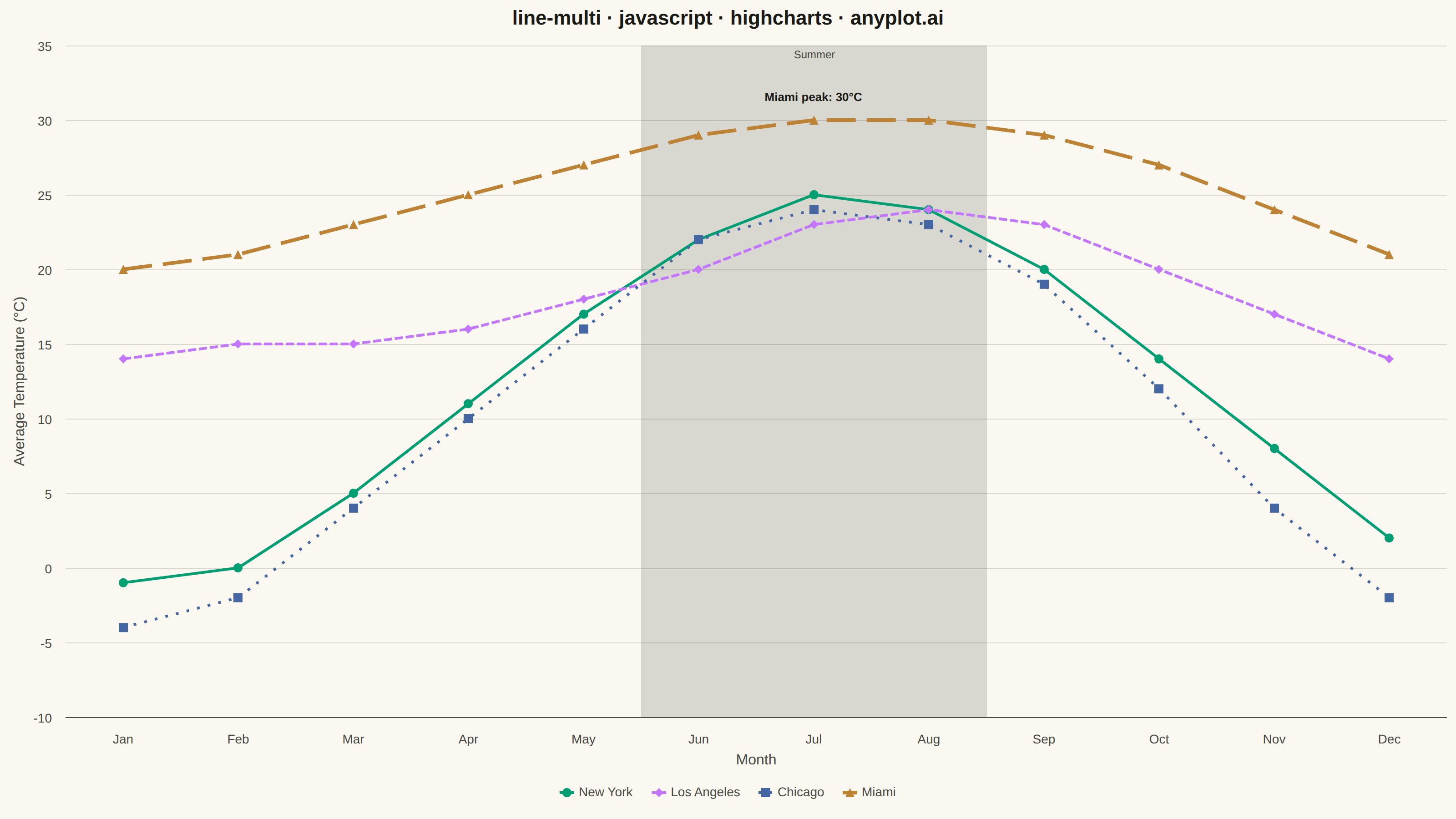
A multi-line plot displays multiple data series on the same axes for direct comparison. Each series is represented by a distinct line with its own color and optional style, making it easy to identify trends, correlations, and divergences between variables. This visualization is essential for comparing related metrics over a common sequence or time period.
// anyplot.ai
// line-multi: Multi-Line Comparison Plot
// Library: highcharts 12.6.0 | JavaScript 22.23.1
// Quality: 92/100 | Created: 2026-08-05

const t = window.ANYPLOT_TOKENS;

// --- Data (in-memory, deterministic) ----------------------------------------
// Average monthly temperature (°C) across four US cities
const months = ["Jan", "Feb", "Mar", "Apr", "May", "Jun",
                "Jul", "Aug", "Sep", "Oct", "Nov", "Dec"];

const newYork    = [-1, 0, 5, 11, 17, 22, 25, 24, 20, 14, 8, 2];
const losAngeles = [14, 15, 15, 16, 18, 20, 23, 24, 23, 20, 17, 14];
const chicago    = [-4, -2, 4, 10, 16, 22, 24, 23, 19, 12, 4, -2];
// Miami's Jul peak is called out with a data label to give the chart a focal point.
const miami = [20, 21, 23, 25, 27, 29,
  { y: 30, dataLabels: { enabled: true, format: "Miami peak: {y}°C",
                          style: { color: t.ink, fontSize: "13px", fontWeight: "600",
                                   textOutline: "none" }, y: -14 } },
  30, 29, 27, 24, 21];

// --- Chart -------------------------------------------------------------------
Highcharts.chart("container", {
  chart: { type: "line", backgroundColor: "transparent", animation: false,
           style: { fontFamily: "inherit" } },
  credits: { enabled: false },
  colors: t.palette,
  title: { text: "line-multi · javascript · highcharts · anyplot.ai",
           style: { color: t.ink, fontSize: "22px", fontWeight: "600" } },
  xAxis: { categories: months,
           lineColor: t.inkSoft, tickColor: t.inkSoft,
           labels: { style: { color: t.inkSoft, fontSize: "14px" } },
           title:  { text: "Month", style: { color: t.inkSoft, fontSize: "16px" } },
           // Subtle band calling out the Jun-Aug summer season as a focal region.
           plotBands: [{ from: 4.5, to: 7.5, color: t.grid,
                          label: { text: "Summer", verticalAlign: "top", y: 14,
                                   style: { color: t.inkSoft, fontSize: "12px" } } }] },
  yAxis: { title: { text: "Average Temperature (°C)",
                     style: { color: t.inkSoft, fontSize: "16px" } },
           gridLineColor: t.grid,
           labels: { style: { color: t.inkSoft, fontSize: "14px" } } },
  legend: { itemStyle: { color: t.inkSoft, fontSize: "14px" },
            itemHoverStyle: { color: t.ink } },
  tooltip: { shared: true, valueSuffix: "°C",
             backgroundColor: t.elevatedBg, borderColor: t.inkSoft,
             style: { color: t.ink, fontSize: "13px" } },
  plotOptions: { series: { animation: false, lineWidth: 3,
                            marker: { enabled: true, radius: 5,
                                      states: { hover: { radiusPlus: 2 } } },
                            states: { hover: { lineWidthPlus: 1 } } } },
  series: [
    { name: "New York", data: newYork, dashStyle: "Solid" },
    { name: "Los Angeles", data: losAngeles, dashStyle: "ShortDash" },
    // Dashed so it stays distinguishable from New York where the lines nearly meet in Jul-Aug.
    { name: "Chicago", data: chicago, dashStyle: "Dot" },
    { name: "Miami", data: miami, dashStyle: "LongDash", lineWidth: 4 },
  ],
});
Runnable source as JSON, for any HTTP client: https://api.anyplot.ai/specs/line-multi/highcharts/code. Any spec id and library id listed in llms-full.txt fit the same URL shape; every URL below is complete and callable.
{
  "spec_id": "line-multi",
  "language": "javascript",
  "library": "highcharts",
  "page": "https://anyplot.ai/line-multi/javascript/highcharts",
  "hub": "https://anyplot.ai/line-multi",
  "code_json": "https://api.anyplot.ai/specs/line-multi/highcharts/code",
  "spec_json": "https://api.anyplot.ai/specs/line-multi",
  "render_light_png": "https://storage.googleapis.com/anyplot-images/plots/line-multi/javascript/highcharts/plot-light.png",
  "render_dark_png": "https://storage.googleapis.com/anyplot-images/plots/line-multi/javascript/highcharts/plot-dark.png",
  "interactive_light_html": "https://storage.googleapis.com/anyplot-images/plots/line-multi/javascript/highcharts/plot-light.html",
  "interactive_dark_html": "https://storage.googleapis.com/anyplot-images/plots/line-multi/javascript/highcharts/plot-dark.html",
  "quality_score": 92.0,
  "license": "MIT",
  "guide": "https://anyplot.ai/llms.txt"
}
Part of Multi-Line Comparison Plot on anyplot.ai.