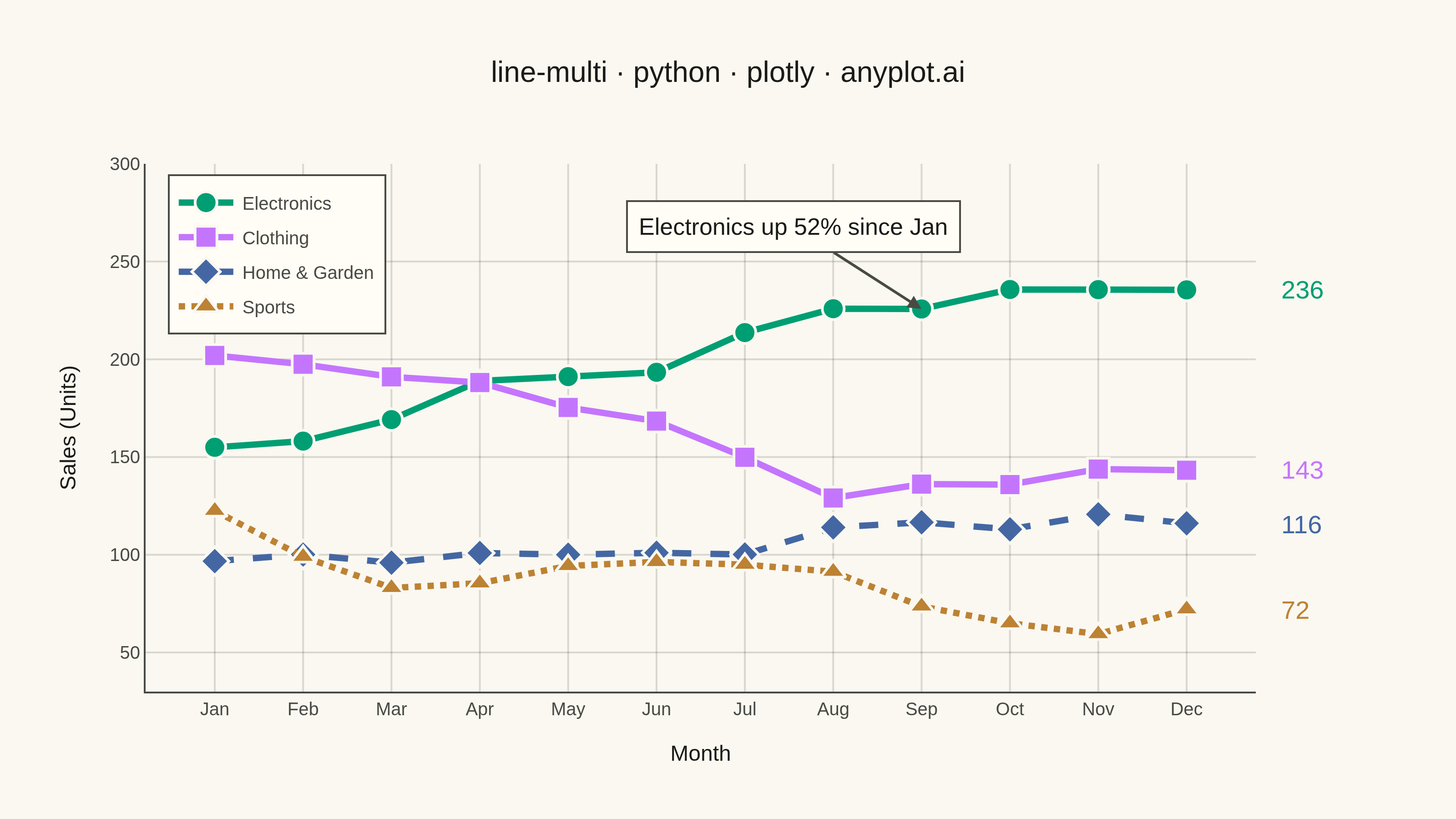
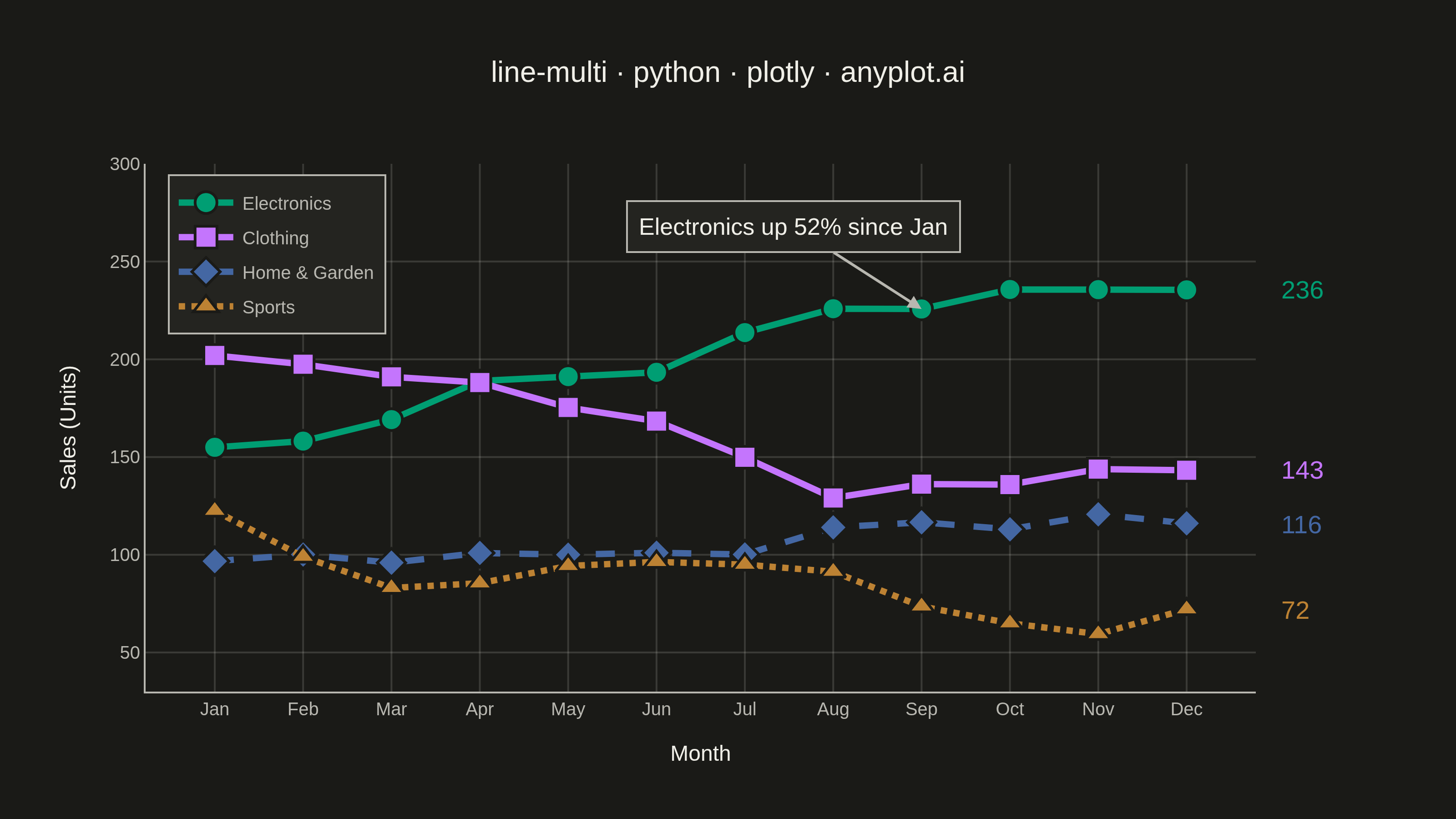
A multi-line plot displays multiple data series on the same axes for direct comparison. Each series is represented by a distinct line with its own color and optional style, making it easy to identify trends, correlations, and divergences between variables. This visualization is essential for comparing related metrics over a common sequence or time period.
""" anyplot.ai
line-multi: Multi-Line Comparison Plot
Library: plotly 6.9.0 | Python 3.13.14
Quality: 91/100 | Updated: 2026-08-05
"""

import os

import numpy as np
import plotly.graph_objects as go


# Theme tokens (see prompts/default-style-guide.md)
THEME = os.getenv("ANYPLOT_THEME", "light")
PAGE_BG = "#FAF8F1" if THEME == "light" else "#1A1A17"
ELEVATED_BG = "#FFFDF6" if THEME == "light" else "#242420"
INK = "#1A1A17" if THEME == "light" else "#F0EFE8"
INK_SOFT = "#4A4A44" if THEME == "light" else "#B8B7B0"
GRID = "rgba(26,26,23,0.15)" if THEME == "light" else "rgba(240,239,232,0.15)"

# Imprint palette (positions 1-4 for 4 series)
IMPRINT = ["#009E73", "#C475FD", "#4467A3", "#BD8233"]

# Data - monthly sales (units) for 4 product lines over 12 months
np.random.seed(42)
months = ["Jan", "Feb", "Mar", "Apr", "May", "Jun", "Jul", "Aug", "Sep", "Oct", "Nov", "Dec"]

# Product sales with distinct trends: rising, seasonal decline, rising, flat
electronics = 150 + np.cumsum(np.random.randn(12) * 10) + np.linspace(0, 50, 12)
clothing = 200 + np.cumsum(np.random.randn(12) * 8) + 20 * np.sin(np.linspace(0, 2 * np.pi, 12))
home_garden = 100 + np.cumsum(np.random.randn(12) * 6) + np.linspace(0, 30, 12)
sports = 120 + np.cumsum(np.random.randn(12) * 12)

series = [
    ("Electronics", electronics, "circle", "solid"),
    ("Clothing", clothing, "square", "solid"),
    ("Home & Garden", home_garden, "diamond", "dash"),
    ("Sports", sports, "triangle-up", "dot"),
]

# Plot
fig = go.Figure()

for i, (name, values, symbol, dash) in enumerate(series):
    color = IMPRINT[i]
    line_style = dict(color=color, width=3.5)
    if dash != "solid":
        line_style["dash"] = dash
    fig.add_trace(
        go.Scatter(
            x=months,
            y=values,
            name=name,
            mode="lines+markers",
            line=line_style,
            marker=dict(size=12, symbol=symbol, line=dict(width=1.5, color=PAGE_BG)),
            hovertemplate=f"{name}: %{{y:.0f}} units<extra></extra>",
        )
    )
    # Direct end-of-line value label - reinforces the closing value per
    # series without competing for space with the (name-carrying) legend.
    fig.add_annotation(
        x=1.02,
        xref="paper",
        y=values[-1],
        yref="y",
        text=f"{values[-1]:.0f}",
        showarrow=False,
        xanchor="left",
        yanchor="middle",
        font=dict(size=14, color=color),
    )

# Callout highlighting the standout trend for data storytelling
growth_pct = (electronics[-1] - electronics[0]) / electronics[0] * 100
fig.add_annotation(
    x=months[8],
    y=electronics[8],
    xref="x",
    yref="y",
    text=f"Electronics up {growth_pct:.0f}% since Jan",
    showarrow=True,
    arrowhead=2,
    arrowwidth=1.5,
    arrowcolor=INK_SOFT,
    ax=-70,
    ay=-45,
    font=dict(size=13, color=INK),
    bgcolor=ELEVATED_BG,
    bordercolor=INK_SOFT,
    borderwidth=1,
    borderpad=6,
)

# Style
fig.update_layout(
    autosize=False,
    title=dict(
        text="line-multi · python · plotly · anyplot.ai", font=dict(size=16, color=INK), x=0.5, xanchor="center"
    ),
    xaxis=dict(
        title=dict(text="Month", font=dict(size=12, color=INK)),
        tickfont=dict(size=10, color=INK_SOFT),
        showgrid=True,
        gridwidth=1,
        gridcolor=GRID,
        linecolor=INK_SOFT,
    ),
    yaxis=dict(
        title=dict(text="Sales (Units)", font=dict(size=12, color=INK)),
        tickfont=dict(size=10, color=INK_SOFT),
        showgrid=True,
        gridwidth=1,
        gridcolor=GRID,
        linecolor=INK_SOFT,
        # Headroom above the data max keeps the legend clear of the lines
        # instead of overlapping the Jan/Feb Electronics & Clothing points.
        range=[30, 300],
    ),
    legend=dict(
        font=dict(size=10, color=INK_SOFT),
        x=0.02,
        y=0.98,
        xanchor="left",
        yanchor="top",
        bgcolor=ELEVATED_BG,
        bordercolor=INK_SOFT,
        borderwidth=1,
    ),
    paper_bgcolor=PAGE_BG,
    plot_bgcolor=PAGE_BG,
    margin=dict(l=80, r=110, t=90, b=70),
    hovermode="x unified",
)

# Save
fig.write_image(f"plot-{THEME}.png", width=800, height=450, scale=4)
fig.write_html(f"plot-{THEME}.html", include_plotlyjs="cdn")
Runnable source as JSON, for any HTTP client: https://api.anyplot.ai/specs/line-multi/plotly/code. Any spec id and library id listed in llms-full.txt fit the same URL shape; every URL below is complete and callable.
{
  "spec_id": "line-multi",
  "language": "python",
  "library": "plotly",
  "page": "https://anyplot.ai/line-multi/python/plotly",
  "hub": "https://anyplot.ai/line-multi",
  "code_json": "https://api.anyplot.ai/specs/line-multi/plotly/code",
  "spec_json": "https://api.anyplot.ai/specs/line-multi",
  "render_light_png": "https://storage.googleapis.com/anyplot-images/plots/line-multi/python/plotly/plot-light.png",
  "render_dark_png": "https://storage.googleapis.com/anyplot-images/plots/line-multi/python/plotly/plot-dark.png",
  "interactive_light_html": "https://storage.googleapis.com/anyplot-images/plots/line-multi/python/plotly/plot-light.html",
  "interactive_dark_html": "https://storage.googleapis.com/anyplot-images/plots/line-multi/python/plotly/plot-dark.html",
  "quality_score": 91.0,
  "license": "MIT",
  "guide": "https://anyplot.ai/llms.txt"
}
Part of Multi-Line Comparison Plot on anyplot.ai.