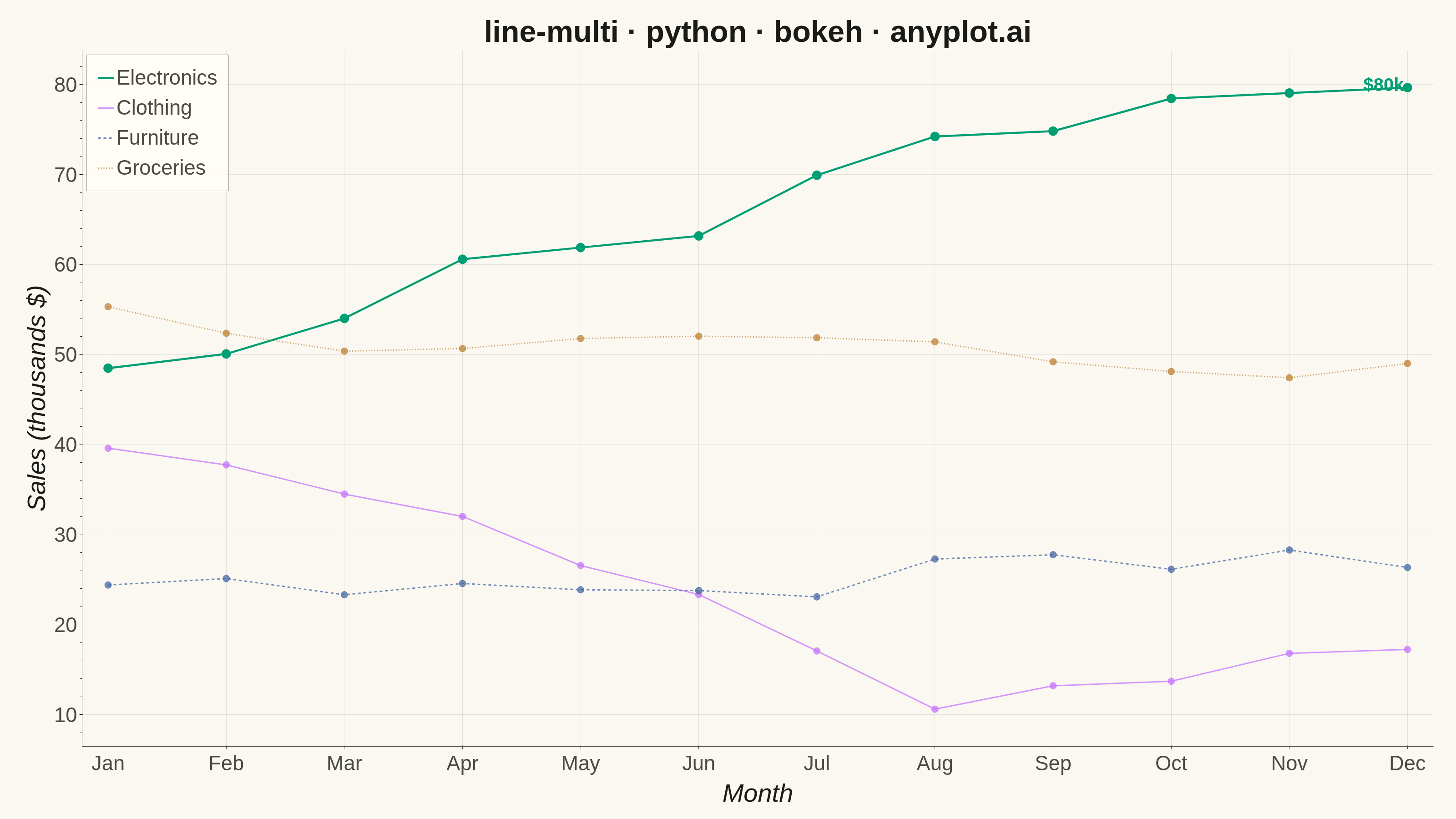
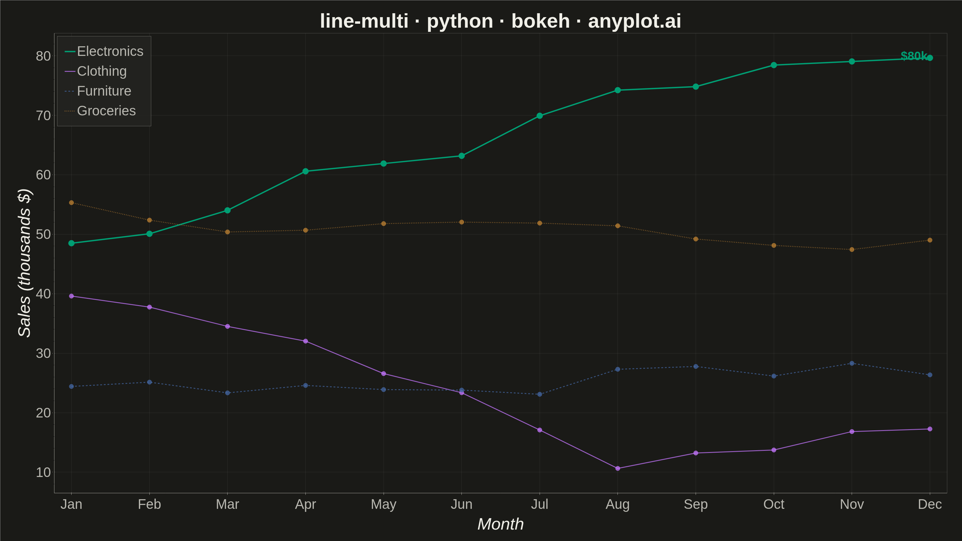
A multi-line plot displays multiple data series on the same axes for direct comparison. Each series is represented by a distinct line with its own color and optional style, making it easy to identify trends, correlations, and divergences between variables. This visualization is essential for comparing related metrics over a common sequence or time period.
""" anyplot.ai
line-multi: Multi-Line Comparison Plot
Library: bokeh 3.9.2 | Python 3.13.14
Quality: 91/100 | Updated: 2026-08-05
"""

import os
import time
from pathlib import Path

import numpy as np
from bokeh.io import output_file, save
from bokeh.models import ColumnDataSource, HoverTool, Label
from bokeh.plotting import figure
from selenium import webdriver
from selenium.webdriver.chrome.options import Options


# Theme tokens (see prompts/default-style-guide.md "Theme-adaptive Chrome")
THEME = os.getenv("ANYPLOT_THEME", "light")
PAGE_BG = "#FAF8F1" if THEME == "light" else "#1A1A17"
ELEVATED_BG = "#FFFDF6" if THEME == "light" else "#242420"
INK = "#1A1A17" if THEME == "light" else "#F0EFE8"
INK_SOFT = "#4A4A44" if THEME == "light" else "#B8B7B0"

# Imprint palette (first series is always #009E73)
IMPRINT_PALETTE = ["#009E73", "#C475FD", "#4467A3", "#BD8233"]

# Data: monthly sales (thousands $) for 4 product lines over 12 months
np.random.seed(42)
months = np.arange(1, 13)
month_labels = ["Jan", "Feb", "Mar", "Apr", "May", "Jun", "Jul", "Aug", "Sep", "Oct", "Nov", "Dec"]

electronics = 45 + np.cumsum(np.random.randn(12) * 3) + months * 2
clothing = 35 + np.cumsum(np.random.randn(12) * 2.5) + np.sin(months * np.pi / 6) * 8
furniture = 25 + np.cumsum(np.random.randn(12) * 2) + months * 0.5
groceries = 55 + np.cumsum(np.random.randn(12) * 1.5)

series_names = ["Electronics", "Clothing", "Furniture", "Groceries"]
series_data = [electronics, clothing, furniture, groceries]
line_dashes = ["solid", "solid", "dashed", "dotted"]

# Electronics closes the year as the strongest performer — give it visual
# emphasis (full opacity, thicker line) so the eye has a focal point; the
# other series recede slightly but stay fully legible.
focal_series = "Electronics"

# Figure — 3200x1800 landscape canvas (see prompts/library/bokeh.md "Canvas — hard rule")
title = "line-multi · python · bokeh · anyplot.ai"
p = figure(
    width=3200,
    height=1800,
    title=title,
    x_axis_label="Month",
    y_axis_label="Sales (thousands $)",
    toolbar_location=None,  # avoids the ~30-50px toolbar padding that shrinks the PNG
    min_border_bottom=160,
    min_border_left=180,
    min_border_top=110,
    min_border_right=50,
)

for name, data, color, dash in zip(series_names, series_data, IMPRINT_PALETTE, line_dashes, strict=True):
    source = ColumnDataSource(data={"x": months, "y": data, "month": month_labels})
    is_focal = name == focal_series

    p.line(
        x="x",
        y="y",
        source=source,
        line_width=4.5 if is_focal else 3,
        line_color=color,
        line_dash=dash,
        line_alpha=1.0 if is_focal else 0.75,
        legend_label=name,
    )
    scatter = p.scatter(
        x="x", y="y", source=source, size=20 if is_focal else 15, color=color, alpha=1.0 if is_focal else 0.75
    )

    hover = HoverTool(renderers=[scatter], tooltips=[("Month", "@month"), ("Sales", "$@y{0,0.0}k")])
    p.add_tools(hover)

# End-of-line value annotation on the focal series — reinforces the "strongest
# performer" story beyond what the line/marker emphasis alone conveys.
focal_index = series_names.index(focal_series)
focal_end_x, focal_end_y = months[-1], series_data[focal_index][-1]
end_label = Label(
    x=focal_end_x,
    y=focal_end_y,
    text=f"${focal_end_y:.0f}k",
    text_font_size="30pt",
    text_font_style="bold",
    text_color=IMPRINT_PALETTE[focal_index],
    text_align="right",
    text_baseline="bottom",
    x_offset=-8,
    y_offset=-16,
)
p.add_layout(end_label)

# Legend — inside the plot frame, click a label to hide that series
if p.legend:
    p.legend.location = "top_left"
    p.legend.click_policy = "hide"
    p.legend.label_text_font_size = "34pt"
    p.legend.glyph_height = 36
    p.legend.glyph_width = 36
    p.legend.spacing = 14
    p.legend.padding = 24
    p.legend.background_fill_color = ELEVATED_BG
    p.legend.background_fill_alpha = 0.9
    p.legend.border_line_color = INK_SOFT
    p.legend.label_text_color = INK_SOFT

# Title styling
p.title.text_font_size = "50pt"
p.title.align = "center"
p.title.text_color = INK

# Axis label styling
p.xaxis.axis_label_text_font_size = "42pt"
p.yaxis.axis_label_text_font_size = "42pt"
p.xaxis.axis_label_text_color = INK
p.yaxis.axis_label_text_color = INK
p.xaxis.major_label_text_font_size = "34pt"
p.yaxis.major_label_text_font_size = "34pt"
p.xaxis.major_label_text_color = INK_SOFT
p.yaxis.major_label_text_color = INK_SOFT

# Axis and grid styling
p.xaxis.axis_line_color = INK_SOFT
p.yaxis.axis_line_color = INK_SOFT
p.xaxis.major_tick_line_color = INK_SOFT
p.yaxis.major_tick_line_color = INK_SOFT
p.xgrid.grid_line_color = INK
p.ygrid.grid_line_color = INK
p.xgrid.grid_line_alpha = 0.10
p.ygrid.grid_line_alpha = 0.10

# Background — no outer frame, for a cleaner, more minimal look
p.background_fill_color = PAGE_BG
p.border_fill_color = PAGE_BG
p.outline_line_color = None

# Generous breathing room around the data
p.y_range.range_padding = 0.12
p.x_range.range_padding = 0.04

# Month tick labels
p.xaxis.ticker = list(range(1, 13))
p.xaxis.major_label_overrides = dict(zip(range(1, 13), month_labels, strict=True))

# Save HTML
output_file(f"plot-{THEME}.html")
save(p)

# Screenshot with headless Chrome — Selenium 4 auto-resolves a working driver.
W, H = 3200, 1800
opts = Options()
for arg in (
    "--headless=new",
    "--no-sandbox",
    "--disable-dev-shm-usage",
    "--disable-gpu",
    f"--window-size={W},{H}",
    "--hide-scrollbars",
):
    opts.add_argument(arg)
driver = webdriver.Chrome(options=opts)
driver.set_window_size(W, H)
driver.get(f"file://{Path(f'plot-{THEME}.html').resolve()}")
# Headless Chrome's --window-size sets the OUTER window, which still reserves
# a phantom title-bar height even headless — pin the viewport exactly via CDP.
driver.execute_cdp_cmd(
    "Emulation.setDeviceMetricsOverride", {"width": W, "height": H, "deviceScaleFactor": 1, "mobile": False}
)
time.sleep(3)  # let bokeh's JS render the canvas
driver.save_screenshot(f"plot-{THEME}.png")
driver.quit()
Runnable source as JSON, for any HTTP client: https://api.anyplot.ai/specs/line-multi/bokeh/code. Any spec id and library id listed in llms-full.txt fit the same URL shape; every URL below is complete and callable.
{
  "spec_id": "line-multi",
  "language": "python",
  "library": "bokeh",
  "page": "https://anyplot.ai/line-multi/python/bokeh",
  "hub": "https://anyplot.ai/line-multi",
  "code_json": "https://api.anyplot.ai/specs/line-multi/bokeh/code",
  "spec_json": "https://api.anyplot.ai/specs/line-multi",
  "render_light_png": "https://storage.googleapis.com/anyplot-images/plots/line-multi/python/bokeh/plot-light.png",
  "render_dark_png": "https://storage.googleapis.com/anyplot-images/plots/line-multi/python/bokeh/plot-dark.png",
  "interactive_light_html": "https://storage.googleapis.com/anyplot-images/plots/line-multi/python/bokeh/plot-light.html",
  "interactive_dark_html": "https://storage.googleapis.com/anyplot-images/plots/line-multi/python/bokeh/plot-dark.html",
  "quality_score": 91.0,
  "license": "MIT",
  "guide": "https://anyplot.ai/llms.txt"
}
Part of Multi-Line Comparison Plot on anyplot.ai.