The same plot in 14 other libraries — JavaScript: Chart.js, D3.js, Apache ECharts, Highcharts; Python: Altair, Bokeh, lets-plot, Matplotlib, Plotly, plotnine, Pygal, Seaborn; R: ggplot2; Julia: Makie.jl. Compare all 15 side by side: Multi-Line Comparison Plot in Python, R, Julia and JavaScript.
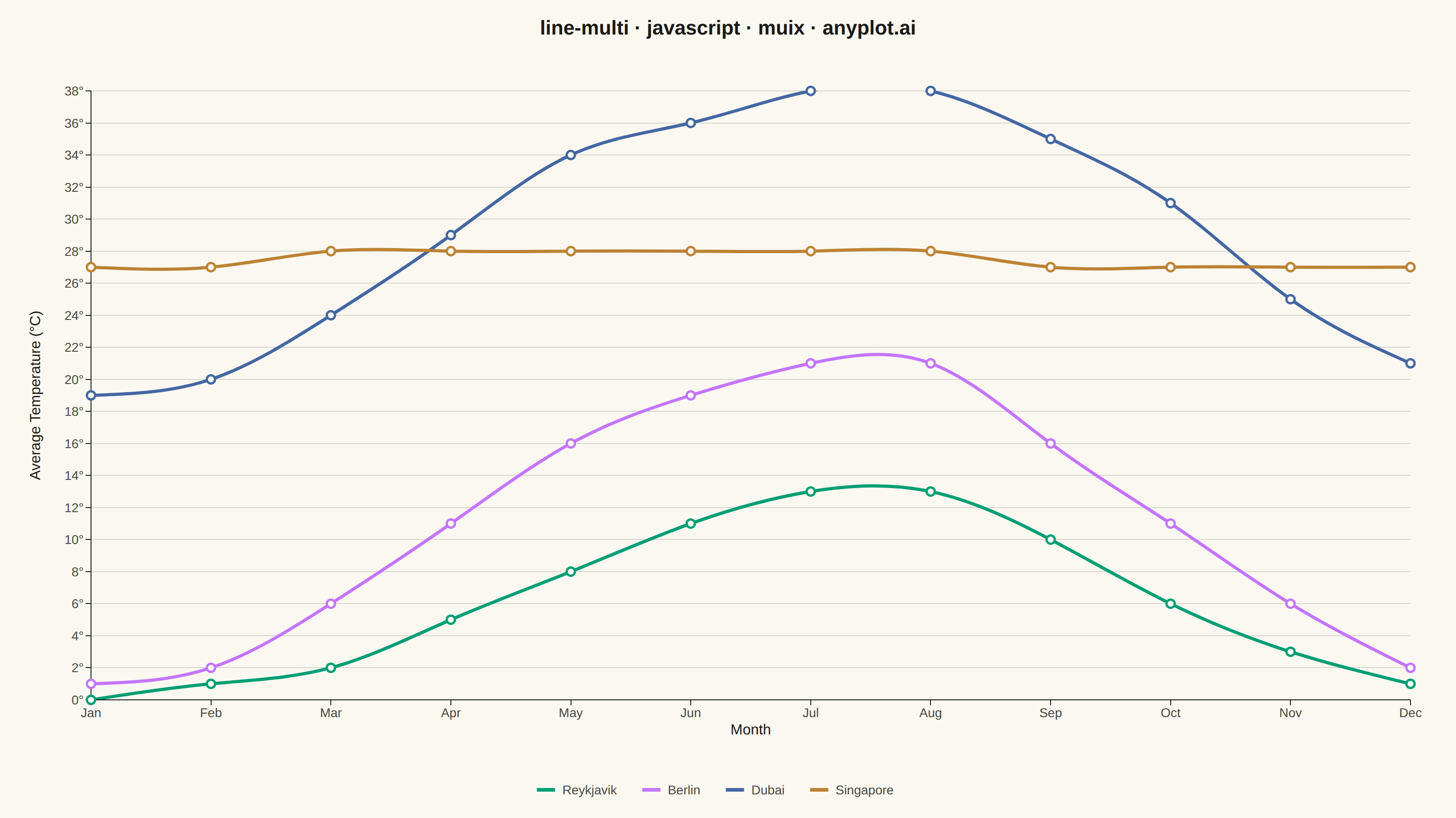
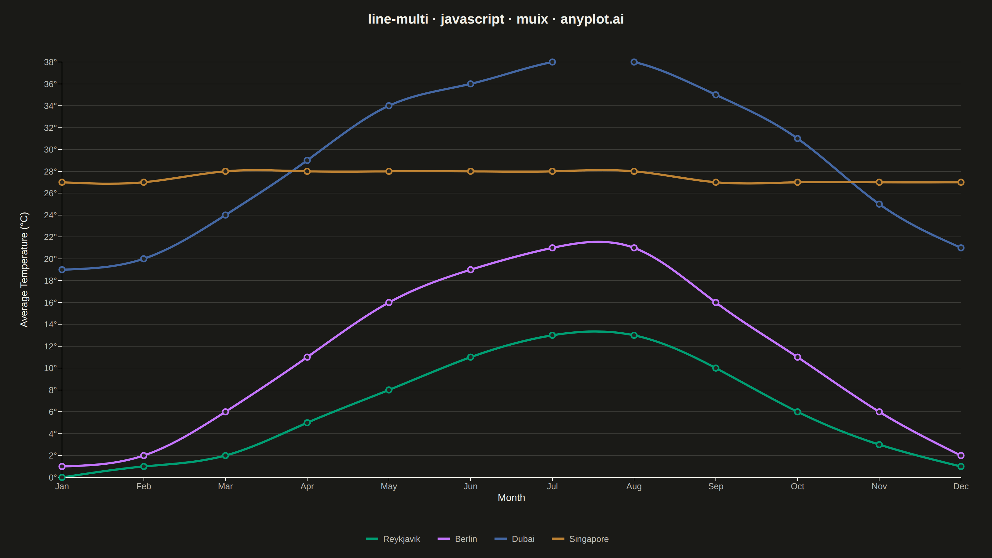
A multi-line plot displays multiple data series on the same axes for direct comparison. Each series is represented by a distinct line with its own color and optional style, making it easy to identify trends, correlations, and divergences between variables. This visualization is essential for comparing related metrics over a common sequence or time period.
// anyplot.ai
// line-multi: Multi-Line Comparison Plot
// Library: muix 7.29.1 | JavaScript 22.23.1
// Quality: 83/100 | Created: 2026-08-05
//# anyplot-orientation: landscape
// anyplot.ai
// line-multi: Multi-Line Comparison Plot
// Library: MUI X Charts | React | Node 22
// License: @mui/x-charts — MIT (community). Pro/Premium are out of scope.
// Quality: pending | Created: 2026-08-05

import { LineChart } from "@mui/x-charts/LineChart";
import { ChartsReferenceLine } from "@mui/x-charts/ChartsReferenceLine";
import Box from "@mui/material/Box";
import Typography from "@mui/material/Typography";

const t = window.ANYPLOT_TOKENS;
const sz = window.ANYPLOT_SIZE;

// Average monthly temperature (°C) across four cities spanning distinct
// climate zones — the crossover between Singapore and Dubai each spring/
// autumn is the reason a multi-line comparison earns its place here.
const months = ["Jan", "Feb", "Mar", "Apr", "May", "Jun", "Jul", "Aug", "Sep", "Oct", "Nov", "Dec"];

const reykjavik = [0, 1, 2, 5, 8, 11, 13, 13, 10, 6, 3, 1];
const berlin = [1, 2, 6, 11, 16, 19, 21, 21, 16, 11, 6, 2];
const dubai = [19, 20, 24, 29, 34, 36, 38, 38, 35, 31, 25, 21];
const singapore = [27, 27, 28, 28, 28, 28, 28, 28, 27, 27, 27, 27];

export default function Chart() {
  return (
    <Box sx={{ position: "relative", width: sz.width, height: sz.height }}>
      <Typography
        sx={{
          position: "absolute",
          top: 14,
          left: 0,
          right: 0,
          textAlign: "center",
          color: t.ink,
          fontSize: 22,
          fontWeight: 600,
          zIndex: 1,
          pointerEvents: "none",
        }}
      >
        line-multi · javascript · muix · anyplot.ai
      </Typography>

      <LineChart
        width={sz.width}
        height={sz.height}
        skipAnimation
        margin={{ top: 100, bottom: 130, left: 100, right: 50 }}
        colors={[t.palette[0], t.palette[1], t.palette[2], t.palette[3]]}
        grid={{ horizontal: true }}
        sx={{
          "& .MuiLineElement-root": { strokeWidth: 3.5 },
          "& .MuiMarkElement-root": { strokeWidth: 2.5 },
        }}
        xAxis={[
          {
            id: "month",
            scaleType: "point",
            data: months,
            label: "Month",
            tickLabelStyle: { fontSize: 14, fill: t.inkSoft },
            labelStyle: { fontSize: 16, fill: t.ink },
          },
        ]}
        yAxis={[
          {
            id: "temp",
            label: "Average Temperature (°C)",
            valueFormatter: (v) => `${v}°`,
            // tickFontSize only feeds the axis-label offset calculation (not the
            // rendered tick size, which tickLabelStyle.fontSize controls below) —
            // bumped so the rotated label clears our wide "38°"-style ticks.
            tickFontSize: 40,
            tickLabelStyle: { fontSize: 14, fill: t.inkSoft },
            labelStyle: { fontSize: 16, fill: t.ink },
          },
        ]}
        series={[
          {
            id: "reykjavik",
            data: reykjavik,
            label: "Reykjavik",
            curve: "monotoneX",
            showMark: true,
            xAxisId: "month",
            yAxisId: "temp",
          },
          {
            id: "berlin",
            data: berlin,
            label: "Berlin",
            curve: "monotoneX",
            showMark: true,
            xAxisId: "month",
            yAxisId: "temp",
          },
          {
            id: "dubai",
            data: dubai,
            label: "Dubai",
            curve: "monotoneX",
            showMark: true,
            xAxisId: "month",
            yAxisId: "temp",
          },
          {
            id: "singapore",
            data: singapore,
            label: "Singapore",
            curve: "monotoneX",
            showMark: true,
            xAxisId: "month",
            yAxisId: "temp",
          },
        ]}
        slotProps={{
          legend: {
            position: { vertical: "bottom", horizontal: "middle" },
            direction: "row",
            itemMarkWidth: 20,
            itemMarkHeight: 4,
            markGap: 8,
            itemGap: 28,
            labelStyle: { fontSize: 14, fill: t.inkSoft },
          },
        }}
      >
        {/* Dubai/Singapore trade seasonal lead twice a year — mark both crossovers. */}
        <ChartsReferenceLine
          x="Apr"
          axisId="month"
          label="crossover"
          labelAlign="start"
          spacing={{ x: 6, y: 4 }}
          labelStyle={{ fontSize: 12, fill: t.inkSoft }}
          lineStyle={{ stroke: t.inkSoft, strokeDasharray: "4 4", strokeWidth: 1.5 }}
        />
        <ChartsReferenceLine
          x="Nov"
          axisId="month"
          label="crossover"
          labelAlign="start"
          spacing={{ x: 6, y: 4 }}
          labelStyle={{ fontSize: 12, fill: t.inkSoft }}
          lineStyle={{ stroke: t.inkSoft, strokeDasharray: "4 4", strokeWidth: 1.5 }}
        />
      </LineChart>
    </Box>
  );
}
Runnable source as JSON, for any HTTP client: https://api.anyplot.ai/specs/line-multi/muix/code. Any spec id and library id listed in llms-full.txt fit the same URL shape; every URL below is complete and callable.
{
  "spec_id": "line-multi",
  "language": "javascript",
  "library": "muix",
  "page": "https://anyplot.ai/line-multi/javascript/muix",
  "hub": "https://anyplot.ai/line-multi",
  "code_json": "https://api.anyplot.ai/specs/line-multi/muix/code",
  "spec_json": "https://api.anyplot.ai/specs/line-multi",
  "render_light_png": "https://storage.googleapis.com/anyplot-images/plots/line-multi/javascript/muix/plot-light.png",
  "render_dark_png": "https://storage.googleapis.com/anyplot-images/plots/line-multi/javascript/muix/plot-dark.png",
  "interactive_light_html": "https://storage.googleapis.com/anyplot-images/plots/line-multi/javascript/muix/plot-light.html",
  "interactive_dark_html": "https://storage.googleapis.com/anyplot-images/plots/line-multi/javascript/muix/plot-dark.html",
  "quality_score": 83.0,
  "license": "MIT",
  "guide": "https://anyplot.ai/llms.txt"
}
Part of Multi-Line Comparison Plot on anyplot.ai.