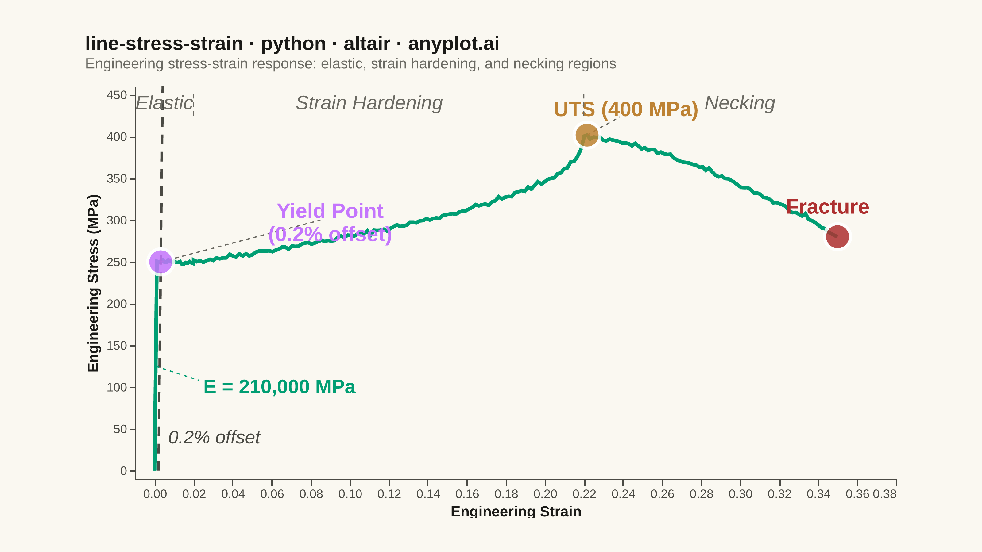
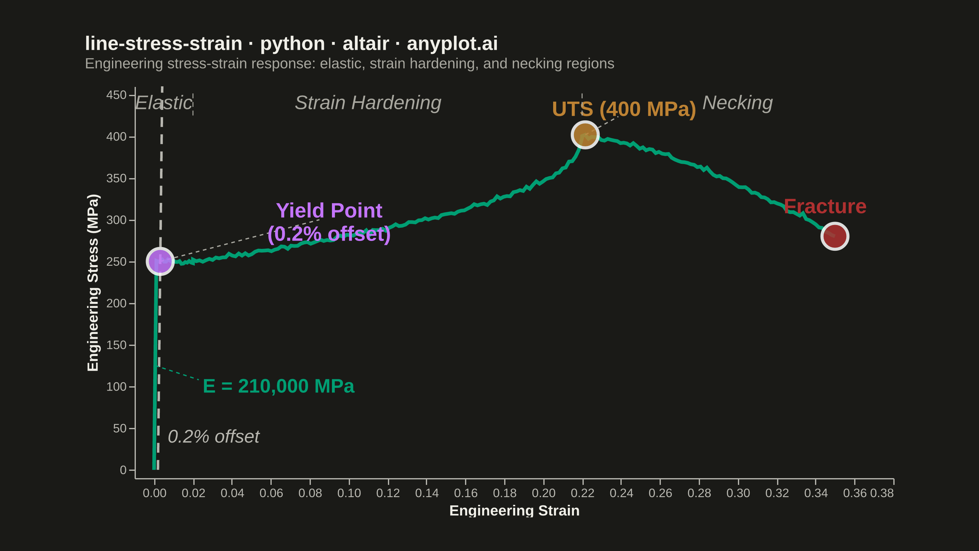
An engineering stress-strain curve visualizes the relationship between applied stress (MPa) and resulting strain (dimensionless) in a material under uniaxial tensile loading. The curve reveals distinct mechanical behavior regions — elastic deformation, yielding, strain hardening, and necking — culminating in fracture. It is the foundational plot for characterizing material mechanical properties and comparing material performance.
""" anyplot.ai
line-stress-strain: Engineering Stress-Strain Curve
Library: altair 6.2.1 | Python 3.13.14
Quality: 91/100 | Updated: 2026-06-21
"""

import importlib
import os
import sys

from PIL import Image


# Remove the script directory from sys.path so `altair` resolves to the installed package, not this file
sys.path[:] = [p for p in sys.path if os.path.abspath(p or ".") != os.path.dirname(os.path.abspath(__file__))]
alt = importlib.import_module("altair")
np = importlib.import_module("numpy")
pd = importlib.import_module("pandas")

# Theme tokens — Imprint palette + theme-adaptive chrome
THEME = os.getenv("ANYPLOT_THEME", "light")
PAGE_BG = "#FAF8F1" if THEME == "light" else "#1A1A17"
ELEVATED_BG = "#FFFDF6" if THEME == "light" else "#242420"
INK = "#1A1A17" if THEME == "light" else "#F0EFE8"
INK_SOFT = "#4A4A44" if THEME == "light" else "#B8B7B0"
INK_MUTED = "#6B6A63" if THEME == "light" else "#A8A79F"
# Imprint categorical palette — position 1 (brand green) is always the primary series
IMPRINT_PALETTE = ["#009E73", "#C475FD", "#4467A3", "#BD8233", "#AE3030", "#2ABCCD", "#954477", "#99B314"]
BRAND = IMPRINT_PALETTE[0]  # main stress-strain curve

# Data — mild steel tensile test (realistic mechanical properties)
np.random.seed(42)
youngs_modulus = 210000  # MPa
yield_strength = 250  # MPa
uts = 400  # MPa (ultimate tensile strength)
uts_strain = 0.22
fracture_strain = 0.35
yield_strain = yield_strength / youngs_modulus  # ≈ 0.00119

# Build curve by region: elastic → yield plateau → strain hardening → necking
n_e, n_p, n_h, n_n = 60, 20, 120, 80
strain_e = np.linspace(0, yield_strain, n_e)
strain_p = np.linspace(yield_strain, 0.02, n_p)
strain_h = np.linspace(0.02, uts_strain, n_h)
strain_n = np.linspace(uts_strain, fracture_strain, n_n)

t_h = (strain_h - 0.02) / (uts_strain - 0.02)
t_n = (strain_n - uts_strain) / (fracture_strain - uts_strain)

stress_e = youngs_modulus * strain_e
stress_p = np.full(n_p, yield_strength) + np.random.normal(0, 1.5, n_p)
stress_h = yield_strength + (uts - yield_strength) * (1 - (1 - t_h) ** 0.45) + np.random.normal(0, 1.5, n_h)
stress_n = uts - (uts - 280) * t_n**1.5 + np.random.normal(0, 1.5, n_n)

strain_all = np.concatenate([strain_e, strain_p, strain_h, strain_n])
stress_all = np.concatenate([stress_e, stress_p, stress_h, stress_n])
df = pd.DataFrame({"Strain": strain_all, "Stress": stress_all})

# 0.2% offset line — parallel to elastic region, offset by 0.002 strain
offset = 0.002
offset_end = yield_strain + offset + 0.003
offset_df = pd.DataFrame({"Strain": [offset, offset_end], "Stress": [0.0, youngs_modulus * (offset_end - offset)]})

# Young's modulus slope indicator (visible dashed line in elastic region)
slope_df = pd.DataFrame({"Strain": [0.0, yield_strain * 0.75], "Stress": [0.0, youngs_modulus * yield_strain * 0.75]})

# Critical key points
uts_idx = int(np.argmax(stress_all))
key_points_df = pd.DataFrame(
    {
        "Strain": [offset + yield_strength / youngs_modulus, strain_all[uts_idx], strain_all[-1]],
        "Stress": [float(yield_strength), float(stress_all[uts_idx]), float(stress_all[-1])],
        "Point": ["Yield Point", "UTS", "Fracture"],
    }
)
kp = key_points_df.set_index("Point")

# Imprint point colors: lavender (yield), ochre (UTS peak), matte red (fracture = semantic failure)
point_scale = alt.Scale(
    domain=["Yield Point", "UTS", "Fracture"], range=[IMPRINT_PALETTE[1], IMPRINT_PALETTE[3], IMPRINT_PALETTE[4]]
)

# Label positions — displaced away from crowded elastic zone near the y-axis
label_df = pd.DataFrame(
    {
        "Strain": [0.09, kp.loc["UTS", "Strain"] + 0.02, kp.loc["Fracture", "Strain"] - 0.005],
        "Stress": [
            kp.loc["Yield Point", "Stress"] + 60,
            kp.loc["UTS", "Stress"] + 30,
            kp.loc["Fracture", "Stress"] + 35,
        ],
        "text": ["Yield Point\n(0.2% offset)", f"UTS ({uts} MPa)", "Fracture"],
        "Point": ["Yield Point", "UTS", "Fracture"],
    }
)

# Connector lines from displaced labels to their key points
connector_df = pd.DataFrame(
    {
        "Strain": [kp.loc["Yield Point", "Strain"], 0.085, kp.loc["UTS", "Strain"], kp.loc["UTS", "Strain"] + 0.017],
        "Stress": [
            kp.loc["Yield Point", "Stress"],
            kp.loc["Yield Point", "Stress"] + 50,
            kp.loc["UTS", "Stress"],
            kp.loc["UTS", "Stress"] + 22,
        ],
        "group": [0, 0, 1, 1],
    }
)

# Region labels and subtle vertical separators
region_df = pd.DataFrame(
    {"Strain": [0.005, 0.11, 0.30], "Stress": [440, 440, 440], "text": ["Elastic", "Strain Hardening", "Necking"]}
)
region_sep_df = pd.DataFrame(
    {"Strain": [0.02, 0.02, uts_strain, uts_strain], "Stress": [425, 455, 425, 455], "sep": [0, 0, 1, 1]}
)

# Modulus annotation connector: slope midpoint → text label
modulus_conn_df = pd.DataFrame(
    {"Strain": [yield_strain * 0.5, 0.023], "Stress": [youngs_modulus * yield_strain * 0.5, 108]}
)

# Shared axis scales
x_scale = alt.Scale(domain=[-0.01, 0.38])
y_scale = alt.Scale(domain=[-10, 460])

# Title — 49 chars, under the 67-char baseline (no font-size scaling needed)
title_str = "line-stress-strain · python · altair · anyplot.ai"

# Nearest-point hover selection (enhances the interactive HTML experience)
nearest = alt.selection_point(nearest=True, on="pointerover", fields=["Strain"], empty=False)

# Chart layers
curve = (
    alt.Chart(df)
    .mark_line(strokeWidth=3, color=BRAND)
    .encode(
        x=alt.X("Strain:Q", scale=x_scale, title="Engineering Strain"),
        y=alt.Y("Stress:Q", scale=y_scale, title="Engineering Stress (MPa)"),
        tooltip=[alt.Tooltip("Strain:Q", format=".4f"), alt.Tooltip("Stress:Q", format=".1f", title="Stress (MPa)")],
    )
)

slope_line = (
    alt.Chart(slope_df)
    .mark_line(strokeWidth=2.5, strokeDash=[12, 4], color=BRAND)
    .encode(x=alt.X("Strain:Q", scale=x_scale), y=alt.Y("Stress:Q", scale=y_scale))
)

offset_line = (
    alt.Chart(offset_df)
    .mark_line(strokeWidth=2, strokeDash=[8, 6], color=INK_SOFT)
    .encode(x=alt.X("Strain:Q", scale=x_scale), y=alt.Y("Stress:Q", scale=y_scale))
)

connectors = (
    alt.Chart(connector_df)
    .mark_line(strokeWidth=1, strokeDash=[3, 3], color=INK_MUTED)
    .encode(x=alt.X("Strain:Q", scale=x_scale), y=alt.Y("Stress:Q", scale=y_scale), detail="group:N")
)

modulus_conn = (
    alt.Chart(modulus_conn_df)
    .mark_line(strokeWidth=1, strokeDash=[3, 3], color=BRAND)
    .encode(x=alt.X("Strain:Q", scale=x_scale), y=alt.Y("Stress:Q", scale=y_scale))
)

points = (
    alt.Chart(key_points_df)
    .mark_point(filled=True, size=450, stroke="white", strokeWidth=2.5)
    .encode(
        x=alt.X("Strain:Q", scale=x_scale),
        y=alt.Y("Stress:Q", scale=y_scale),
        color=alt.Color("Point:N", scale=point_scale, legend=None),
        opacity=alt.condition(nearest, alt.value(1.0), alt.value(0.85)),
        tooltip=[
            alt.Tooltip("Point:N"),
            alt.Tooltip("Strain:Q", format=".4f"),
            alt.Tooltip("Stress:Q", format=".1f", title="Stress (MPa)"),
        ],
    )
    .add_params(nearest)
)

point_labels = (
    alt.Chart(label_df)
    .mark_text(fontSize=17, fontWeight="bold", lineBreak="\n")
    .encode(
        x=alt.X("Strain:Q", scale=x_scale),
        y=alt.Y("Stress:Q", scale=y_scale),
        text="text:N",
        color=alt.Color("Point:N", scale=point_scale, legend=None),
    )
)

region_text = (
    alt.Chart(region_df)
    .mark_text(fontSize=16, fontStyle="italic", fontWeight=500, color=INK_MUTED)
    .encode(x=alt.X("Strain:Q", scale=x_scale), y=alt.Y("Stress:Q", scale=y_scale), text="text:N")
)

region_seps = (
    alt.Chart(region_sep_df)
    .mark_line(strokeWidth=0.8, strokeDash=[4, 3], color=INK_MUTED)
    .encode(x=alt.X("Strain:Q", scale=x_scale), y=alt.Y("Stress:Q", scale=y_scale), detail="sep:N")
)

modulus_label = pd.DataFrame({"Strain": [0.025], "Stress": [100], "text": [f"E = {youngs_modulus:,} MPa"]})
modulus_text = (
    alt.Chart(modulus_label)
    .mark_text(fontSize=16, align="left", fontWeight="bold", color=BRAND)
    .encode(x=alt.X("Strain:Q", scale=x_scale), y=alt.Y("Stress:Q", scale=y_scale), text="text:N")
)

offset_label = pd.DataFrame({"Strain": [offset + 0.005], "Stress": [40], "text": ["0.2% offset"]})
offset_text = (
    alt.Chart(offset_label)
    .mark_text(fontSize=15, align="left", fontStyle="italic", color=INK_SOFT)
    .encode(x=alt.X("Strain:Q", scale=x_scale), y=alt.Y("Stress:Q", scale=y_scale), text="text:N")
)

# Combine all layers
chart = (
    alt.layer(
        curve,
        slope_line,
        offset_line,
        connectors,
        modulus_conn,
        points,
        point_labels,
        region_seps,
        region_text,
        modulus_text,
        offset_text,
    )
    .properties(
        width=620,
        height=320,
        background=PAGE_BG,
        padding={"left": 0, "right": 0, "top": 0, "bottom": 0},
        title=alt.Title(
            title_str,
            fontSize=16,
            subtitle="Engineering stress-strain response: elastic, strain hardening, and necking regions",
            subtitleFontSize=12,
            subtitleColor=INK_MUTED,
            anchor="start",
            offset=12,
        ),
    )
    .configure_view(fill=PAGE_BG, strokeWidth=0, continuousWidth=620, continuousHeight=320)
    .configure_axis(
        labelFontSize=10,
        titleFontSize=12,
        labelColor=INK_SOFT,
        titleColor=INK,
        domainColor=INK_SOFT,
        tickColor=INK_SOFT,
        grid=False,
    )
    .configure_title(color=INK)
    .configure_legend(fillColor=ELEVATED_BG, strokeColor=INK_SOFT, labelColor=INK_SOFT, titleColor=INK)
    .interactive()
)

# Save PNG with canvas-size enforcement (3200 × 1800 landscape target)
chart.save(f"plot-{THEME}.png", scale_factor=4.0)

TW, TH = 3200, 1800
_img = Image.open(f"plot-{THEME}.png").convert("RGB")
_w, _h = _img.size
if _w > TW or _h > TH:
    raise SystemExit(
        f"altair vl-convert produced {_w}×{_h}, exceeds target {TW}×{TH}. "
        f"Shrink chart .properties(width=, height=) values and re-render."
    )
if _w < TW or _h < TH:
    _bg_hex = PAGE_BG.lstrip("#")
    _bg_rgb = (int(_bg_hex[0:2], 16), int(_bg_hex[2:4], 16), int(_bg_hex[4:6], 16))
    _canvas = Image.new("RGB", (TW, TH), _bg_rgb)
    _canvas.paste(_img, ((TW - _w) // 2, (TH - _h) // 2))
    _canvas.save(f"plot-{THEME}.png")

chart.save(f"plot-{THEME}.html")
Runnable source as JSON, for any HTTP client: https://api.anyplot.ai/specs/line-stress-strain/altair/code. Any spec id and library id listed in llms-full.txt fit the same URL shape; every URL below is complete and callable.
{
  "spec_id": "line-stress-strain",
  "language": "python",
  "library": "altair",
  "page": "https://anyplot.ai/line-stress-strain/python/altair",
  "hub": "https://anyplot.ai/line-stress-strain",
  "code_json": "https://api.anyplot.ai/specs/line-stress-strain/altair/code",
  "spec_json": "https://api.anyplot.ai/specs/line-stress-strain",
  "render_light_png": "https://storage.googleapis.com/anyplot-images/plots/line-stress-strain/python/altair/plot-light.png",
  "render_dark_png": "https://storage.googleapis.com/anyplot-images/plots/line-stress-strain/python/altair/plot-dark.png",
  "interactive_light_html": "https://storage.googleapis.com/anyplot-images/plots/line-stress-strain/python/altair/plot-light.html",
  "interactive_dark_html": "https://storage.googleapis.com/anyplot-images/plots/line-stress-strain/python/altair/plot-dark.html",
  "quality_score": 91.0,
  "license": "MIT",
  "guide": "https://anyplot.ai/llms.txt"
}
Part of Engineering Stress-Strain Curve on anyplot.ai.