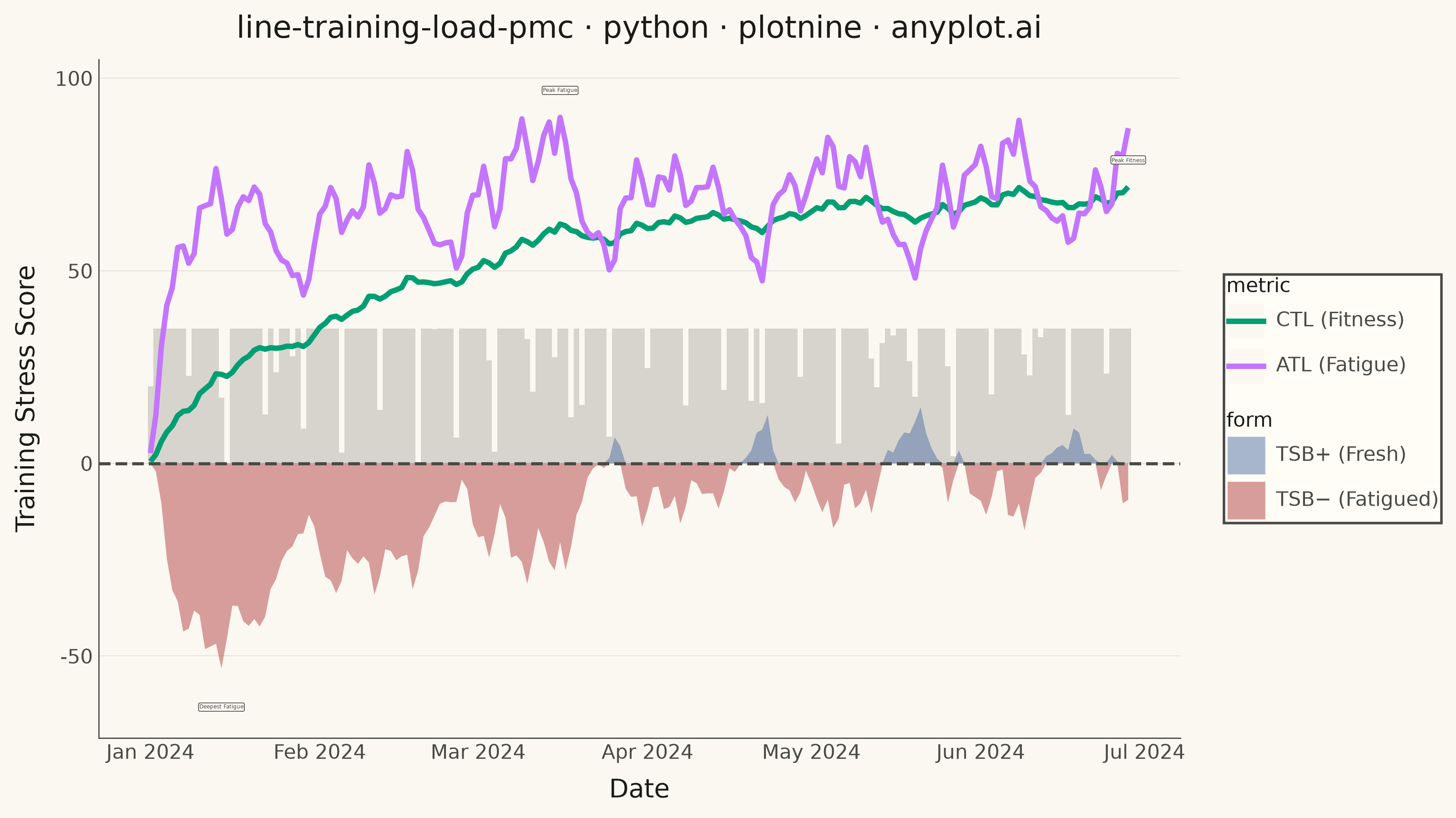
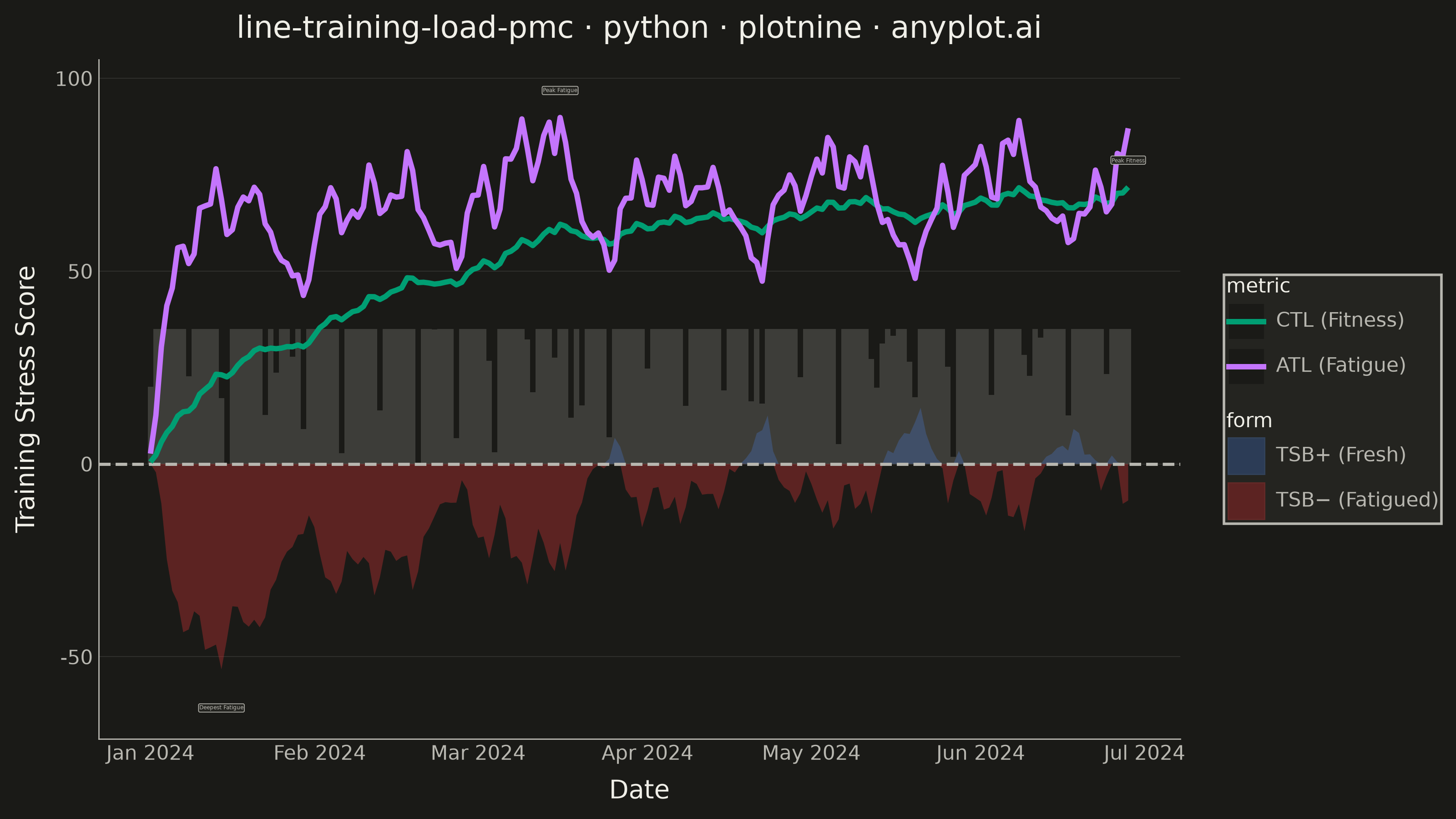
A Performance Management Chart (PMC), popularized by TrainingPeaks, summarizes an endurance athlete's training history on a single shared time axis. Two exponentially-smoothed lines track Chronic Training Load (CTL, "fitness", ~42-day time constant) and Acute Training Load (ATL, "fatigue", ~7-day time constant), while a filled area or band shows Training Stress Balance (TSB, "form" = CTL − ATL) above and below a zero baseline. Daily Training Stress Score (TSS) values appear as points or thin vertical bars, giving the raw workout intensity behind the smoothed trends. The chart reveals whether an athlete is building fitness, accumulating fatigue, or freshening up (positive form) for a target event.
""" anyplot.ai
line-training-load-pmc: Training Load Performance Management Chart
Library: plotnine 0.15.7 | Python 3.13.13
Quality: 88/100 | Created: 2026-06-13
"""

import os
import sys


# Remove this script's directory from sys.path so 'plotnine' resolves to the installed package
_here = os.path.dirname(os.path.abspath(__file__))
if _here in sys.path:
    sys.path.remove(_here)

import numpy as np
import pandas as pd
from plotnine import (
    aes,
    element_blank,
    element_line,
    element_rect,
    element_text,
    geom_col,
    geom_hline,
    geom_label,
    geom_line,
    geom_ribbon,
    ggplot,
    labs,
    scale_color_manual,
    scale_fill_manual,
    scale_x_date,
    theme,
    theme_minimal,
)


# Theme tokens
THEME = os.getenv("ANYPLOT_THEME", "light")
PAGE_BG = "#FAF8F1" if THEME == "light" else "#1A1A17"
ELEVATED_BG = "#FFFDF6" if THEME == "light" else "#242420"
INK = "#1A1A17" if THEME == "light" else "#F0EFE8"
INK_SOFT = "#4A4A44" if THEME == "light" else "#B8B7B0"
INK_MUTED = "#6B6A63" if THEME == "light" else "#A8A79F"

# Imprint palette — first series always #009E73
COLOR_CTL = "#009E73"  # Imprint position 1 — CTL/Fitness line
COLOR_ATL = "#C475FD"  # Imprint position 2 — ATL/Fatigue line
COLOR_FRESH = "#4467A3"  # Imprint position 3 — positive TSB (fresh, blue)
COLOR_FATIGUED = "#AE3030"  # Imprint semantic red — negative TSB (fatigued)

# Data: 180-day training block (Jan–Jun 2024, one athlete)
np.random.seed(42)
n_days = 180
dates = pd.date_range("2024-01-01", periods=n_days, freq="D")

# Weekly training cycles with recovery weeks every 4th week
tss_values = np.zeros(n_days)
for i in range(n_days):
    dow = i % 7
    week = i // 7
    if dow == 0:
        tss_values[i] = max(0.0, np.random.normal(15, 10))
    elif week % 4 == 3:
        tss_values[i] = max(0.0, np.random.normal(45, 15))
    elif dow in (2, 5):
        tss_values[i] = max(0.0, np.random.normal(130, 25))
    elif dow in (1, 3, 4):
        tss_values[i] = max(0.0, np.random.normal(80, 20))
    else:
        tss_values[i] = max(0.0, np.random.normal(40, 12))

tss_values = np.clip(tss_values, 0.0, 200.0)

# Standard PMC EWMA (tau=42 for CTL, tau=7 for ATL)
ctl_alpha = 1.0 - np.exp(-1.0 / 42)
atl_alpha = 1.0 - np.exp(-1.0 / 7)

ctl = np.zeros(n_days)
atl = np.zeros(n_days)
tsb = np.zeros(n_days)
ctl[0] = tss_values[0] * ctl_alpha
atl[0] = tss_values[0] * atl_alpha

for i in range(1, n_days):
    ctl[i] = ctl[i - 1] + ctl_alpha * (tss_values[i] - ctl[i - 1])
    atl[i] = atl[i - 1] + atl_alpha * (tss_values[i] - atl[i - 1])
    tsb[i] = ctl[i - 1] - atl[i - 1]

# Cap TSS bars at 35 units so they stay near the baseline without dominating CTL/ATL lines
tss_capped = np.minimum(tss_values, 35)

# Base dataframe (TSS bars — capped to sit near the bottom)
df_tss = pd.DataFrame({"date": dates, "tss": tss_capped})

# Long-format CTL/ATL lines (ordered: CTL first in legend)
df_lines = pd.concat(
    [
        pd.DataFrame({"date": dates, "value": ctl, "metric": "CTL (Fitness)"}),
        pd.DataFrame({"date": dates, "value": atl, "metric": "ATL (Fatigue)"}),
    ],
    ignore_index=True,
)
df_lines["metric"] = pd.Categorical(df_lines["metric"], categories=["CTL (Fitness)", "ATL (Fatigue)"], ordered=True)

# TSB ribbon data — split into positive (fresh) and negative (fatigued) portions
df_tsb = pd.concat(
    [
        pd.DataFrame({"date": dates, "tsb_ymin": 0.0, "tsb_ymax": np.maximum(tsb, 0.0), "form": "TSB+ (Fresh)"}),
        pd.DataFrame({"date": dates, "tsb_ymin": np.minimum(tsb, 0.0), "tsb_ymax": 0.0, "form": "TSB− (Fatigued)"}),
    ],
    ignore_index=True,
)
df_tsb["form"] = pd.Categorical(df_tsb["form"], categories=["TSB+ (Fresh)", "TSB− (Fatigued)"], ordered=True)

# Key training events for annotation
peak_atl_idx = int(np.argmax(atl))
min_tsb_idx = int(np.argmin(tsb))
peak_ctl_idx = int(np.argmax(ctl))

df_events = pd.DataFrame(
    {
        "date": [dates[peak_atl_idx], dates[min_tsb_idx], dates[peak_ctl_idx]],
        "y": [atl[peak_atl_idx] + 7, tsb[min_tsb_idx] - 10, ctl[peak_ctl_idx] + 7],
        "label": ["Peak Fatigue", "Deepest Fatigue", "Peak Fitness"],
    }
)

# Title — 56 chars, under 67-char baseline, no font scaling needed
title = "line-training-load-pmc · python · plotnine · anyplot.ai"
title_n = len(title)
title_fontsize = max(8, round(12 * 67 / title_n)) if title_n > 67 else 12

# Plot
plot = (
    ggplot(df_tss, aes(x="date"))
    # Daily TSS as light muted bars near the bottom (capped at 35 TSS units)
    + geom_col(aes(y="tss"), fill=INK_MUTED, alpha=0.25, width=1.0)
    # TSB ribbon: blue above zero (fresh), red below zero (fatigued)
    + geom_ribbon(aes(x="date", ymin="tsb_ymin", ymax="tsb_ymax", fill="form"), data=df_tsb, alpha=0.45)
    # Zero reference line separating fresh from fatigued form
    + geom_hline(yintercept=0, color=INK_SOFT, size=0.7, linetype="dashed")
    # CTL and ATL smooth trend lines
    + geom_line(aes(x="date", y="value", color="metric"), data=df_lines, size=1.2)
    # Key event callout labels
    + geom_label(
        aes(x="date", y="y", label="label"),
        data=df_events,
        size=2.2,
        color=INK_SOFT,
        fill=ELEVATED_BG,
        label_padding=0.15,
        label_size=0.3,
        ha="center",
    )
    + scale_color_manual(values={"CTL (Fitness)": COLOR_CTL, "ATL (Fatigue)": COLOR_ATL}, name="")
    + scale_fill_manual(values={"TSB+ (Fresh)": COLOR_FRESH, "TSB− (Fatigued)": COLOR_FATIGUED}, name="")
    + scale_x_date(date_labels="%b %Y", date_breaks="1 month")
    + labs(title=title, x="Date", y="Training Stress Score")
    + theme_minimal()
    + theme(
        figure_size=(8, 4.5),
        text=element_text(size=7, color=INK_SOFT),
        plot_title=element_text(size=title_fontsize, color=INK),
        axis_title=element_text(size=10, color=INK),
        axis_text=element_text(size=8, color=INK_SOFT),
        legend_text=element_text(size=8, color=INK_SOFT),
        legend_title=element_text(size=8, color=INK),
        legend_background=element_rect(fill=ELEVATED_BG, color=INK_SOFT),
        plot_background=element_rect(fill=PAGE_BG, color=PAGE_BG),
        panel_background=element_rect(fill=PAGE_BG),
        panel_grid_major_y=element_line(color=INK, size=0.3, alpha=0.12),
        panel_grid_major_x=element_blank(),
        panel_grid_minor=element_blank(),
        axis_line=element_line(color=INK_SOFT, size=0.5),
        panel_border=element_blank(),
    )
)

# Save
plot.save(f"plot-{THEME}.png", dpi=400, width=8, height=4.5, units="in")
Runnable source as JSON, for any HTTP client: https://api.anyplot.ai/specs/line-training-load-pmc/plotnine/code. Any spec id and library id listed in llms-full.txt fit the same URL shape; every URL below is complete and callable.
{
  "spec_id": "line-training-load-pmc",
  "language": "python",
  "library": "plotnine",
  "page": "https://anyplot.ai/line-training-load-pmc/python/plotnine",
  "hub": "https://anyplot.ai/line-training-load-pmc",
  "code_json": "https://api.anyplot.ai/specs/line-training-load-pmc/plotnine/code",
  "spec_json": "https://api.anyplot.ai/specs/line-training-load-pmc",
  "render_light_png": "https://storage.googleapis.com/anyplot-images/plots/line-training-load-pmc/python/plotnine/plot-light.png",
  "render_dark_png": "https://storage.googleapis.com/anyplot-images/plots/line-training-load-pmc/python/plotnine/plot-dark.png",
  "quality_score": 88.0,
  "license": "MIT",
  "guide": "https://anyplot.ai/llms.txt"
}
Part of Training Load Performance Management Chart on anyplot.ai.